
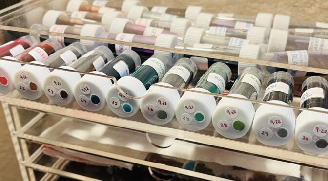
I was really intrigued by the shape of Akkerman’s bottles. They look antique and have a glass marble in the neck which is to help make filling the pen easier. It’s a really interesting idea! I sampled this month out of vials, but I may decide I need a whole bottle of at least one color so I can try out this whole marble thing. I believe the inks I sampled this month were from a line to honor their 100 years of existence in 2010, and the names are related to the city of The Hague. Fun!
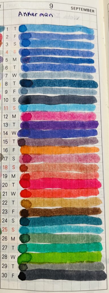
It didn’t take me long to realize I was going to be sampling colors grouped together – which ended up being something I found really pleasing – for some reason? Although I wish the purple group had been larger, sigh. Quite the variety of blues and reds. The greens were also a small group – so my two favorite colors, the least number of inks. Boooo.
None of these popped out at me, but I have heard they are very solid and reliable inks. So I assume at some point in the future I’ll need one for a good basic color. They performed well and consistently when I was sampling them. More specifics with the color groupings below!
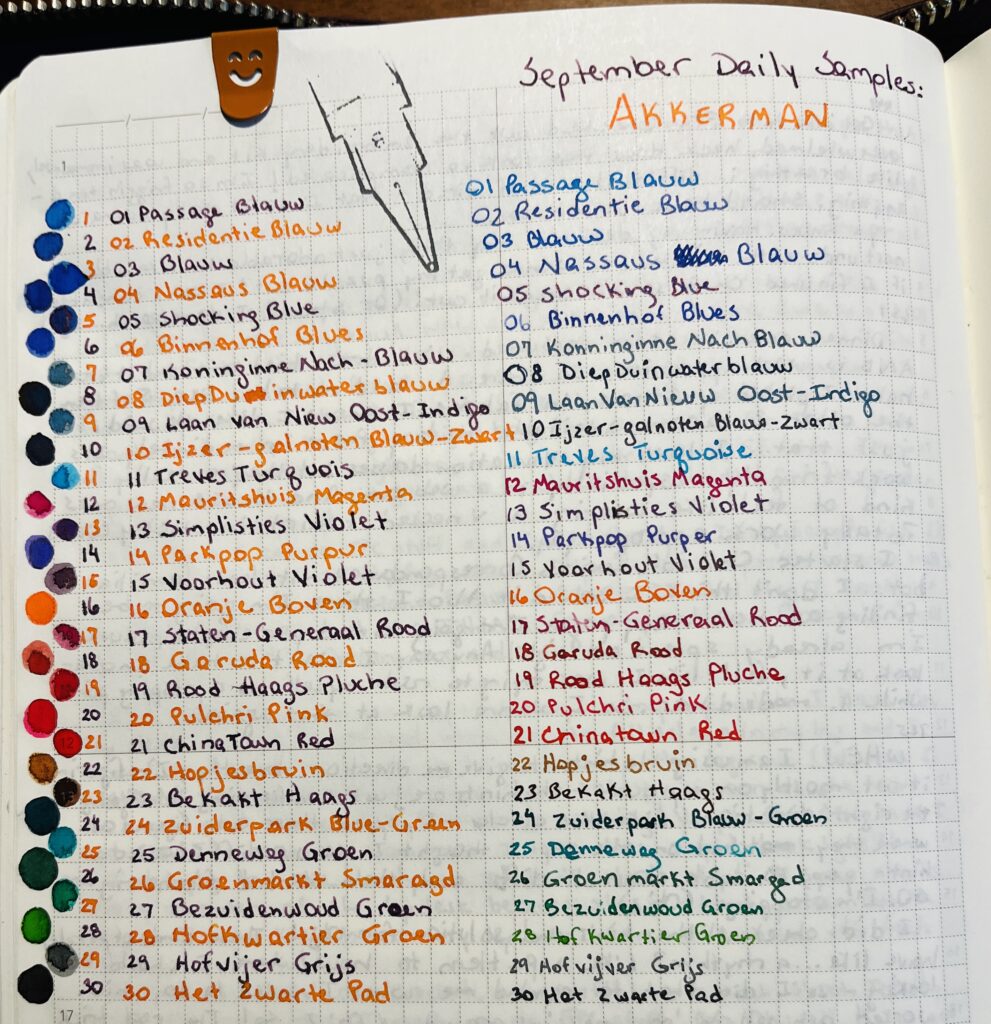
The Blues! Listed in order seen on photo from top to bottom.
01 Passage Blauw
02 Redidentie Blauw
03 Blauw
04 Nassaus Blauw
05 Shocking Blue
06 Binnenhof Blues
07 Koninginne Nach-Blauw
08 DiepDuin Water Blauw
09 Laan van Niew Oost-Indigo
10 Ijzer-galnoten Blauw-Zwart
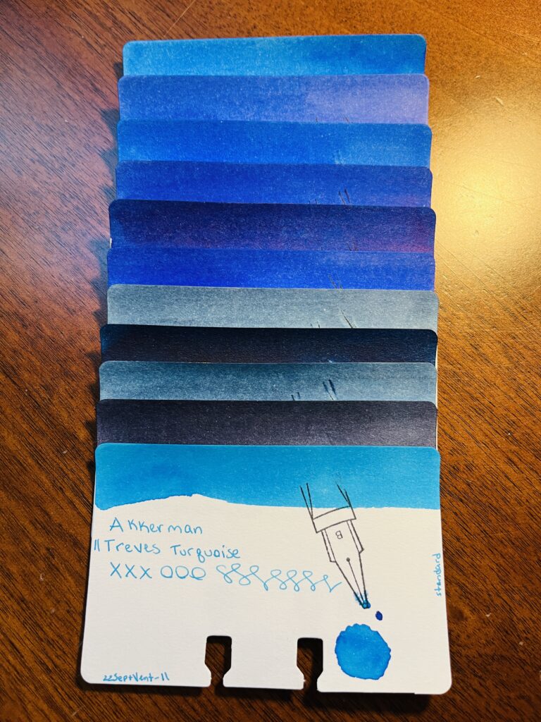
11 Treves Turquois
I think by the fourth or fifth blue I was just impressed at how many blues their were already and still to come! I like that there is a wide variety and that none of them look exactly the same. There are two or three in there that are similar, but still distinct. And 05, Shocking Blue, looks like something I’ll use in a future palette…
The Purples!
12 Mauritshuis Magenta
13 Simplisties Violet
14 Parkpop Purpur
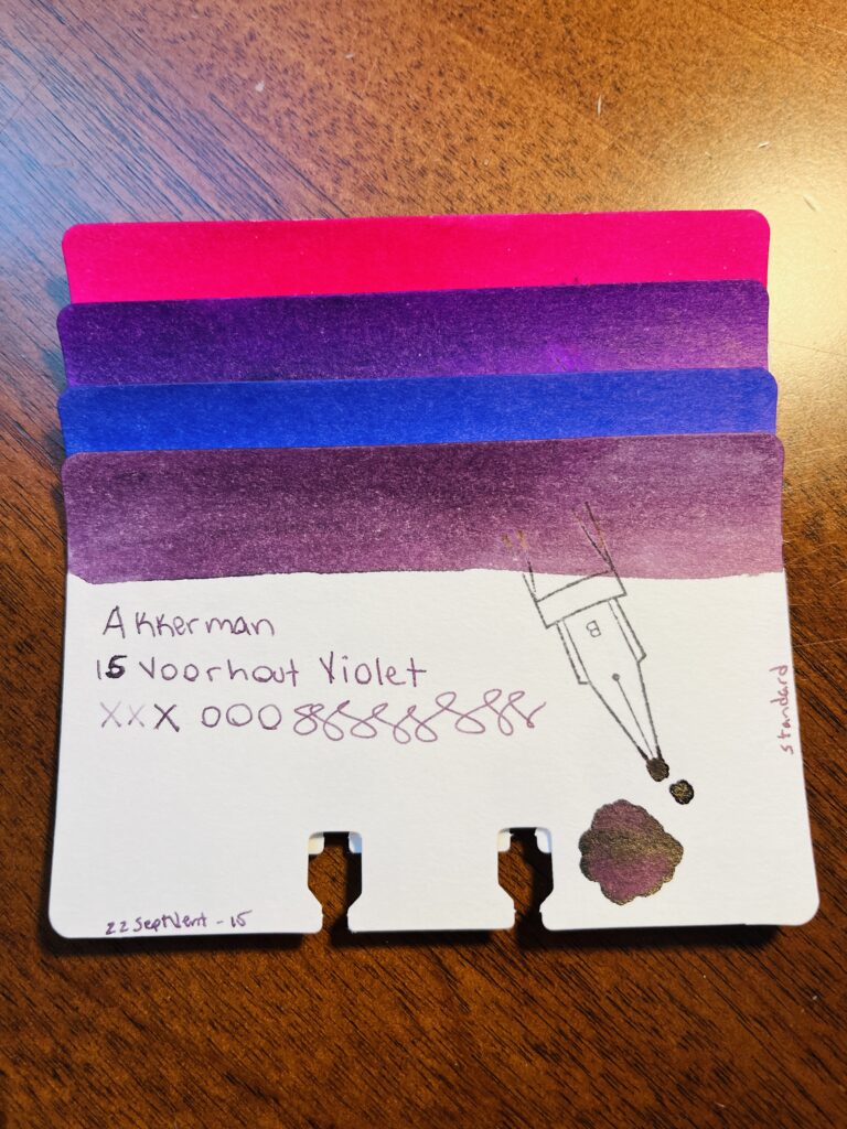
15 Voorhout Violet
There weren’t as many of these, but I do love them. I’m not a huge fan of magenta’s, but the other three are really pretty, and I hope I have an excuse to use them soon. Especially that 13, Simplisties Violet!
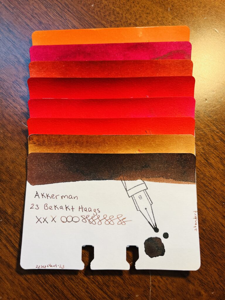
The Reds! Okay maybe more than just reds…
16 Oranje Boven
17 Staten-Generaal Rood
18 Garuda Rood
19 Rood Haags Pluche
20 Pulchri Pink
21 ChinaTown Red
22 Hopjesbruin
23 Bekakt Haags
Okay, so there is an orange and some tan/browns mixed into this pile, but its close enough! Let’s call these Fall colors instead of just Reds…Red is not my favorite color ink, but I found a couple of these intriguing. Super not a fan or tan/brown but they are still solid colors. And orange is becoming a favorite ink color for some reason, so glad that I got at least one of those!
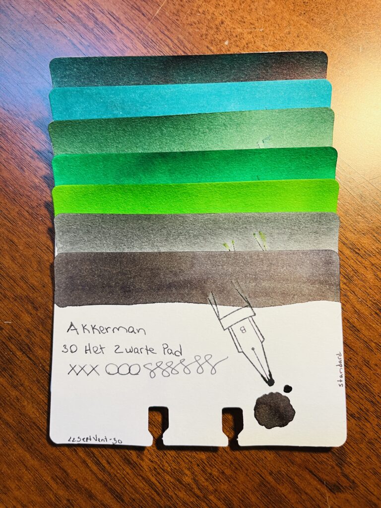
The Greens!
24 Zuiderpark Blue-Green
25 Denneweg Groen
26 Goenmarkt Smaragd
27 Bezuidenwoud Groen
28 Hofkwartier Groen
29 Hofvijer Grijs
30 Het Zwarte Pad
Greens! I’m always looking for good greens, because they go well with purples! There is a good variety here. There are also two greys which is nice. The only color really missing is a yellow, but not a bad rainbow!
Overall I enjoyed this month’s inks. None of them seemed to really be problematic at all, and all of them will be solid additions to my library. Now…which one do I buy a bottle of… 🙂