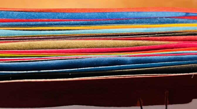
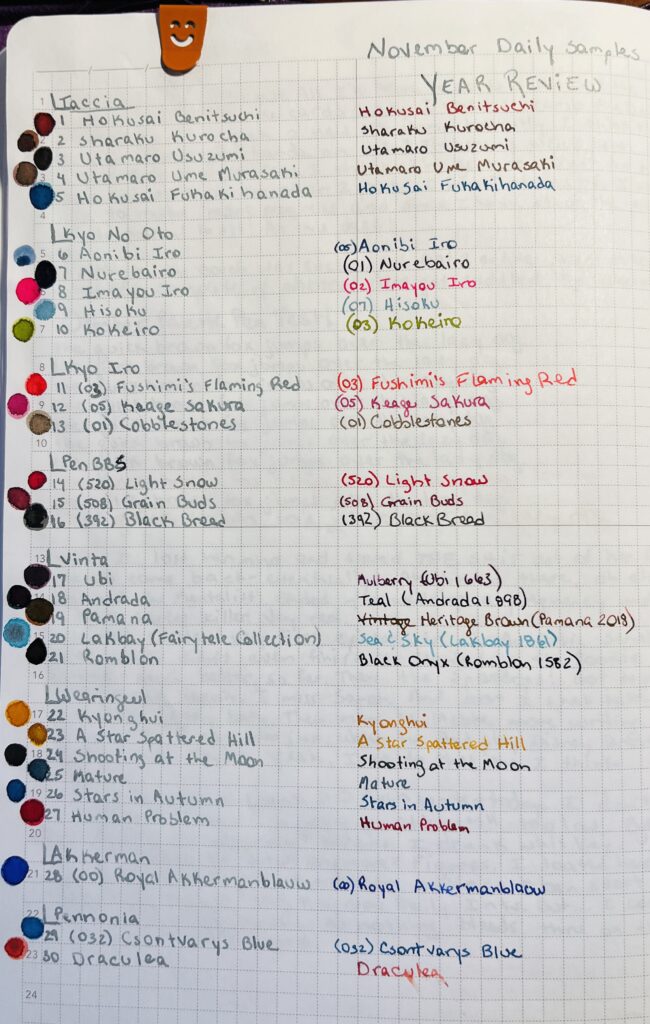
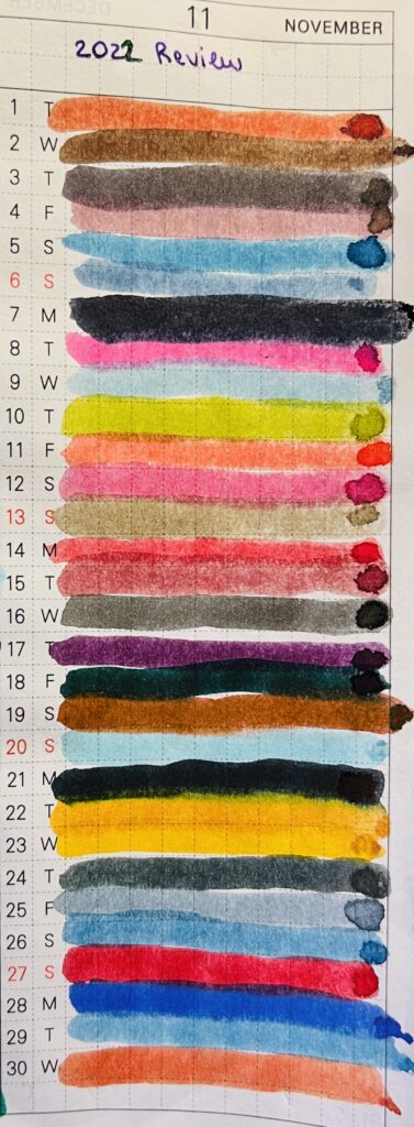
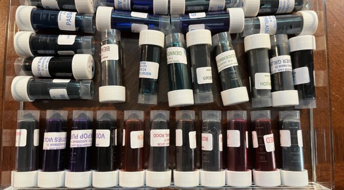
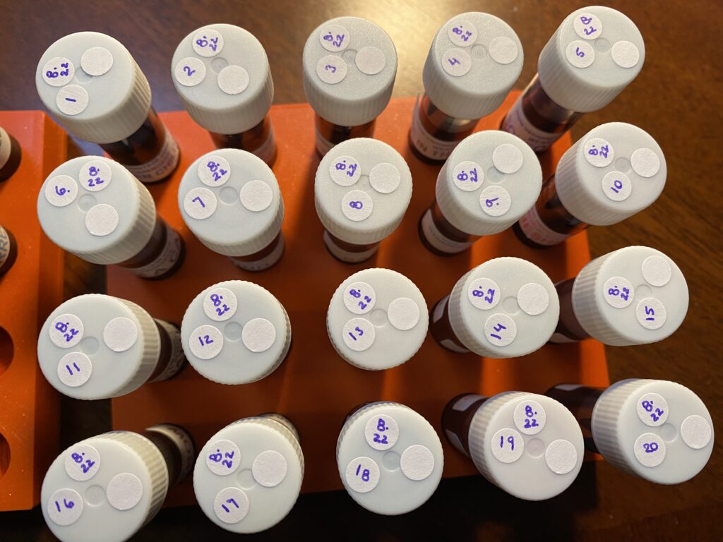
Whew, using the word review twice in one title is super annoying. I’ll have to think of something better the next time I do this. Anyway – this month’s daily samples are using 8 different ink brands.
I pulled each sample randomly from a pile that gives me enough samples for November and January. Then I grouped the inks by brand, so I’ll be showing them grouped like that here. However! I wasn’t thinking and did not take the opportunity to order them by number – if they had one – or by series – if they had one. So, in January, I have to remember that! But, let’s look at the November daily samples:
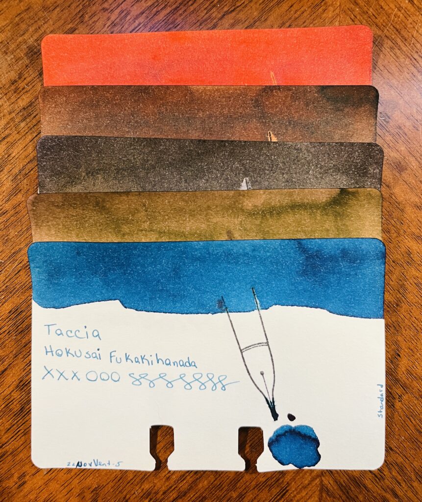
Taccia: Hokusai Benitsuchi: rusty brown, dark red with orange hints. Sharaku Kurocha: Brown. Very straightforward brown. Utamaro Usuzumi: Black, slight sheen. Utamaro Ume Murasaki: A brownish pink. Hokusai Kukakihanada: Ocean/whale blue – maybe not literally, but that is what it makes me think of?
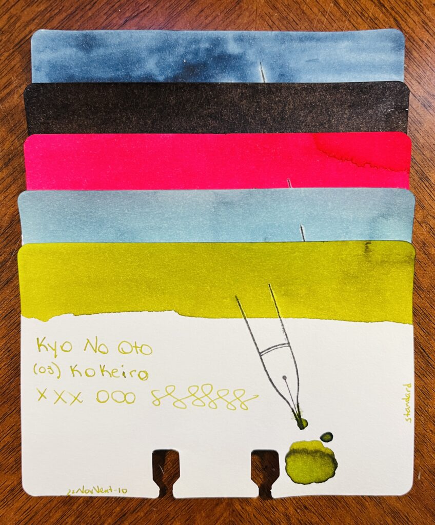
Kyo No Oto: Aonibi Iro, Nurebairo, Iamyou Iro, Hisoku, Kokeiro
Kyo No Oto: 05 Aonibi Iro: Mushy denim blue. 01 Nurebairo: I can’t tell if this is sheen or not? I feel like it is. Super darkest blue with just like…a wet colored sheen honestly? 02 Iamyou Iro: Bright pink, red tones. 07 Hisoku: Light to medium blue, readable, might be chromatic… 03 Kokeiro: Writes out like pea soup, dries to a goose poop greeny brown.
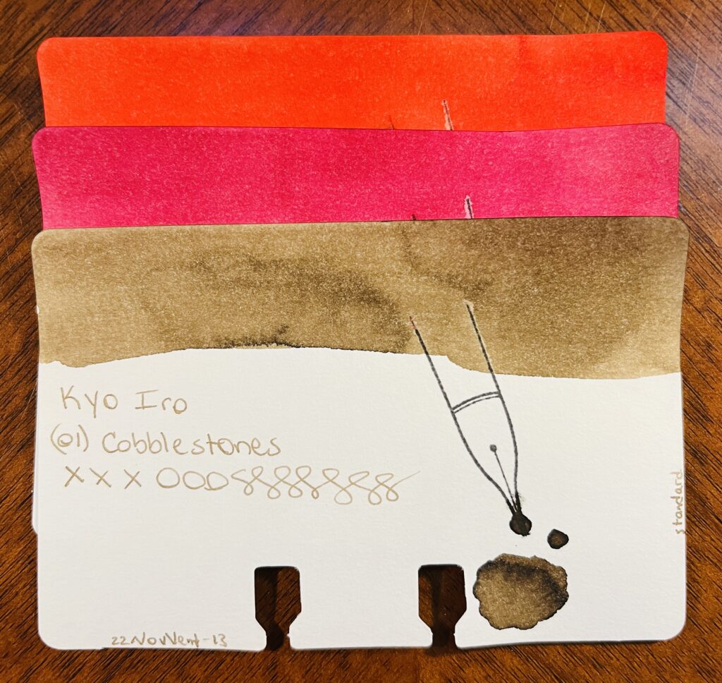
Kyo Iro: 03 Fushimi’s Flaming Red: Bright red, leaning towards a dark pink. 05 Keage Sakura: Nice cherry blossom pink. 01 Cobblestones: A really soft brown, or a brown tuned grey? Perfect for cobblestones.
PenBBS: (520) Light Snow, (508) Grain Buds, (392) Black Bread
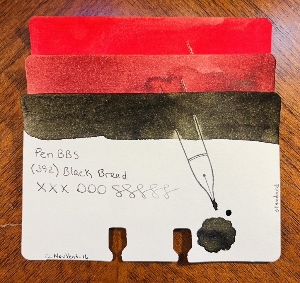
PenBBS: 520 Light Snow: Fall red, orange tones when it’s written lighter. 508 Grain Buds: Makes me think of coffee, both to drink when it’s dark and to stain. 329 Black Bread: Black! A very dark grey is what it dries to.
Vinta: Ubi, Andrada, Pamana, Lakbay, Romblon
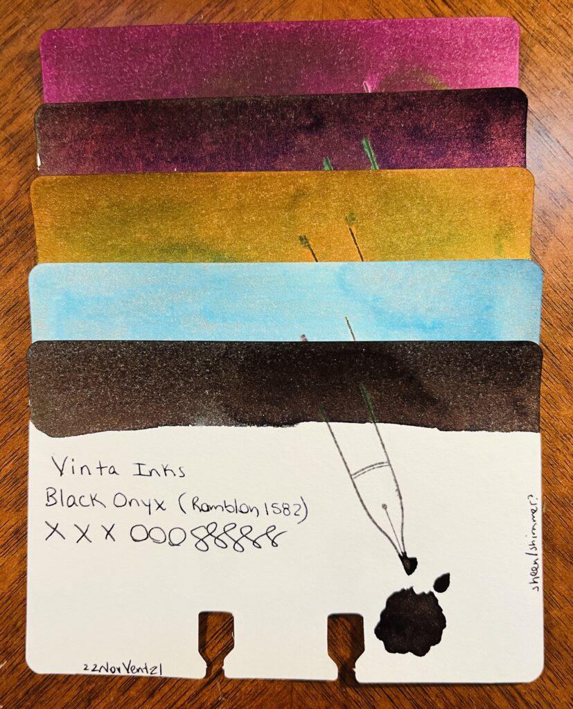
Vinta: Mulberry Ubi 1663: Mulberry purple, dark, only noticeably purple in the light. Teal Andrata 1898: Dark teal hidden under a purple sheen – or at least it looks like an almost black purple, I suppose it could be read mixing with the teal? Heritage Brown Pamana 2018: Orangey brown with a green sheen. Sea & Sky Lakbay 1861: Pretty, light blue, pink shimmer, not sure how much the shimmer comes thru, but when it does, pretty! Kind of dirty looking in the swatch tho. Black Onyx Romblon 1582: Black/green undertones to the ink, faint dark purple sheen, and a very faint shimmer? Can’t see it in the vial, just the swatches. In writing it’s hard to see because of the sheen so…secret shimmer? I like it tho. For a black ink, nice subtle colors if you look at it right.
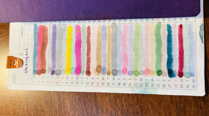
Wearingeul: Kyonghui, A Star Spattered Hill, Shooting at the Moon, Mature, Stars in Autumn, Human Problem
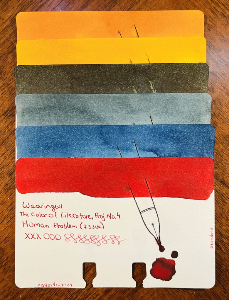
Wearingeul: Color of Literature, Project 4, Kyonghui: A sort of tan gold…reminds me of the color you’d see on plastics from the 80’s. Color of Literature, Project 1, A Star Spattered Hill: A buttery yellow, warm brown tone, gold shimmer. Pretty! Color of Literature, Project 1, Shooting at the Moon: Dark ink with a faint sheen. The color reminds me of a night sky and that hazy halo that you can see sometimes around the moon. Demian Literature, Mature: Medium denim blue, grey tones as it dries. Color of Literature, Project 1, Stars in Autumn: Medium to dark blue with blue shimmer. I feel like I really like this one, the swatch came out really pretty. Color of Literature, Project 4, Human Problem (Issue): Interesting that an ink called ‘Human Problem’ is the color of blood?
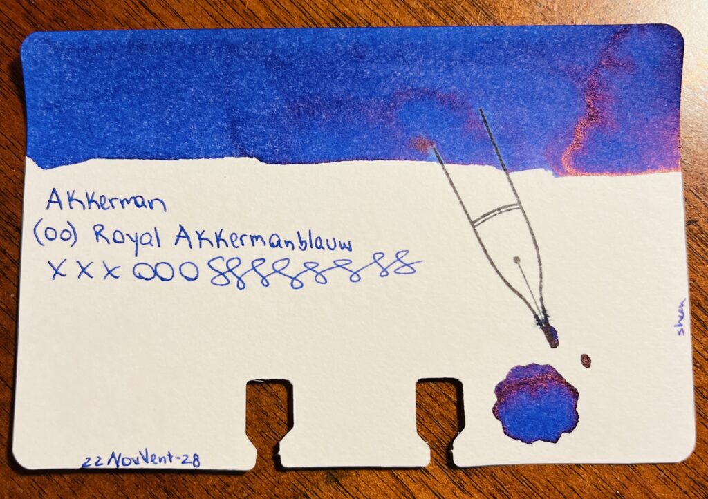
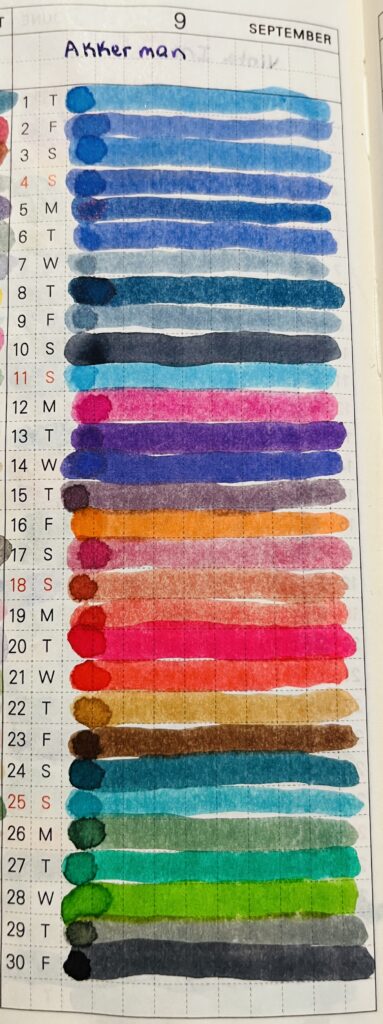
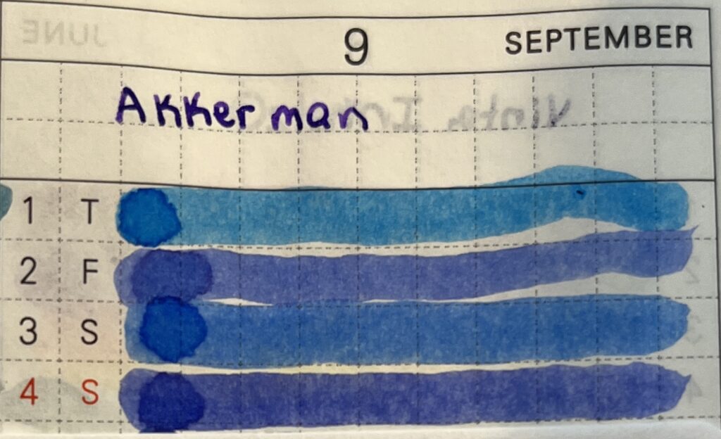
Akkerman: (00) Royal Akkermanblauw
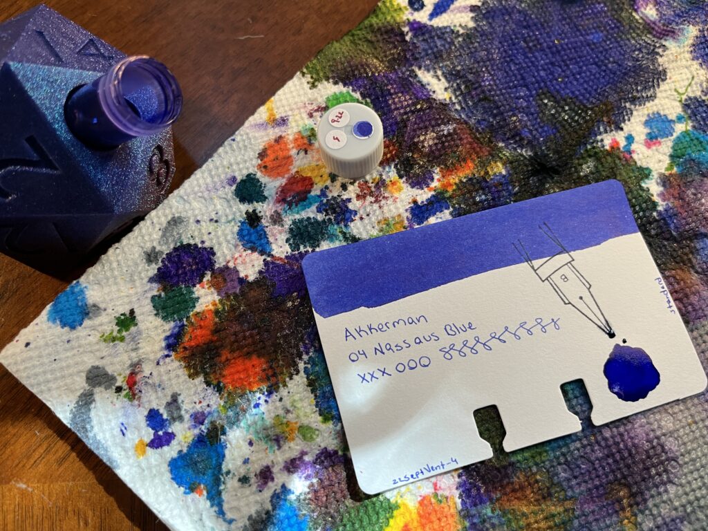
Akkerman: 00 Royal Akkermanblauw: Medium dark blue, reddish sheen, looks purple. Subtle.
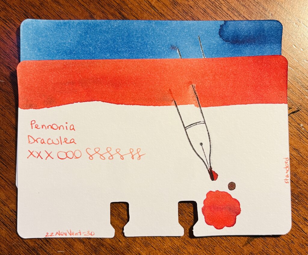
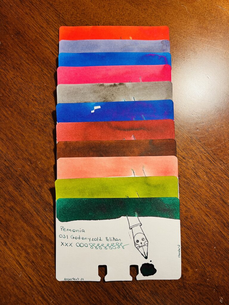
Pennonia: (032) Csontvarys Blue, Draculea
Pennonia: 032 Csontvarys Blue: A sort of sky blue with denim darker blue tones. Draculea: An orangeish red? Or a reddish orange? Sort of a fall color.
It was nice revisiting these brands. I am looking forward to finishing out these in January!
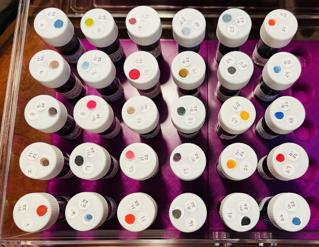
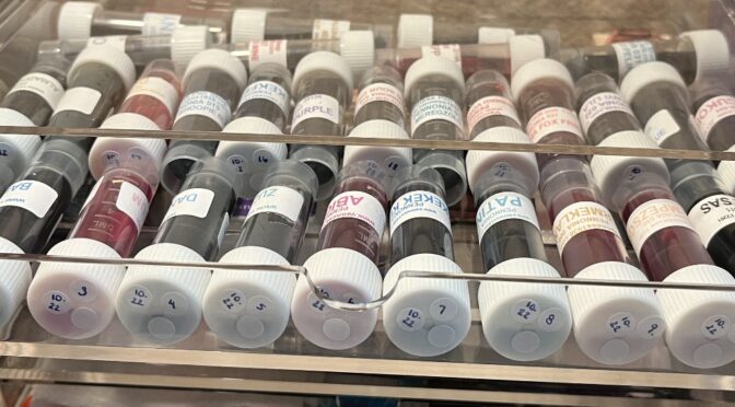
Month of iiiiinks! Look at all of those pretty vials of ink!
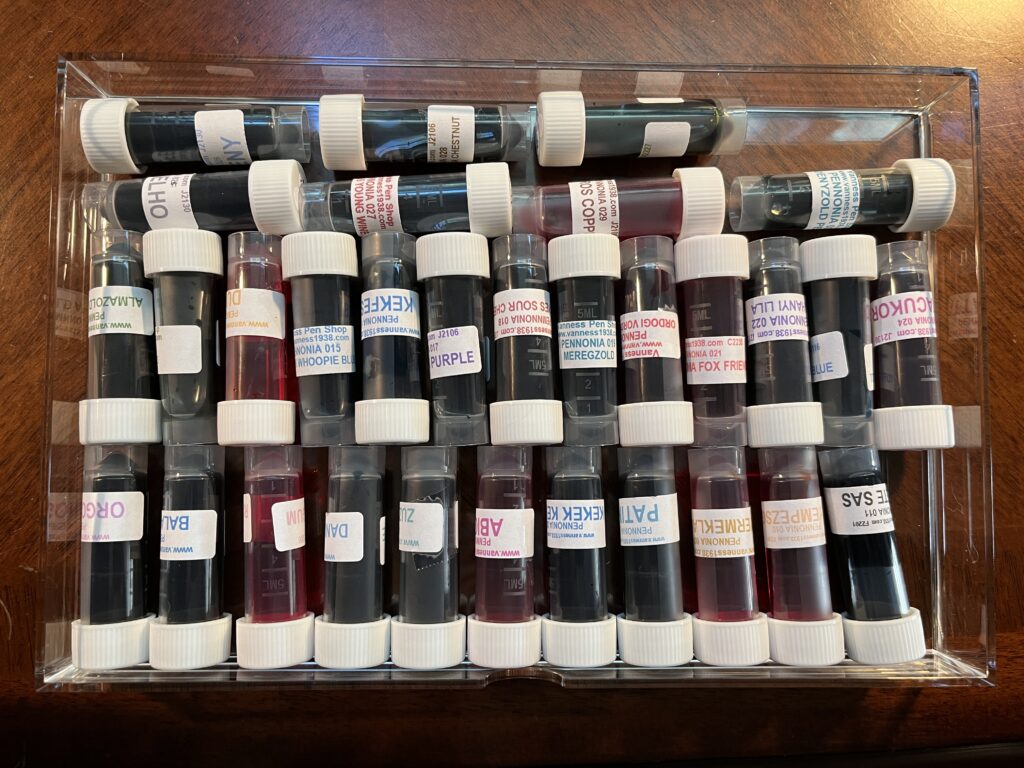
Pennonia Inks! I found this page on how to pronounce the inks names and I was incredibly entertained. 😂 This brand has raaaange heck.
Heckin messed up the
11th haha look at that mess! At least it was with two pretty colors.
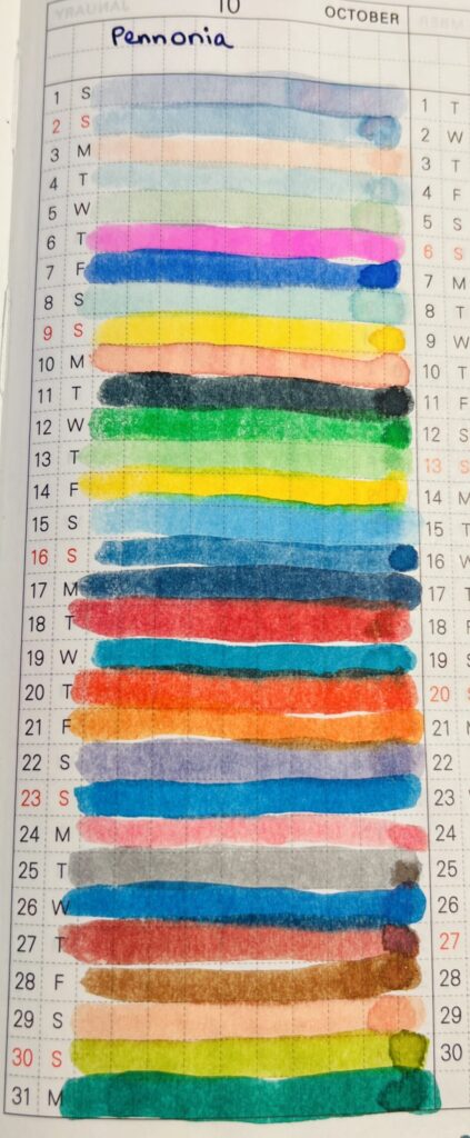
Now, I couldn’t figure out a way to really group these, so we’re just going to look at 10ish at a time. There are darks, lights, saturated, chromatic, pretty much everything but shimmer. And! This was one of those inks with a small enough library (at the time I was looking) that I could finish out almost the entire thing in one month! I have one more which I’ll try in my November set of Daily Samples. Let’s take a look! It was a little strange having so many pastel type shades at the beginning of a spoop month haha.
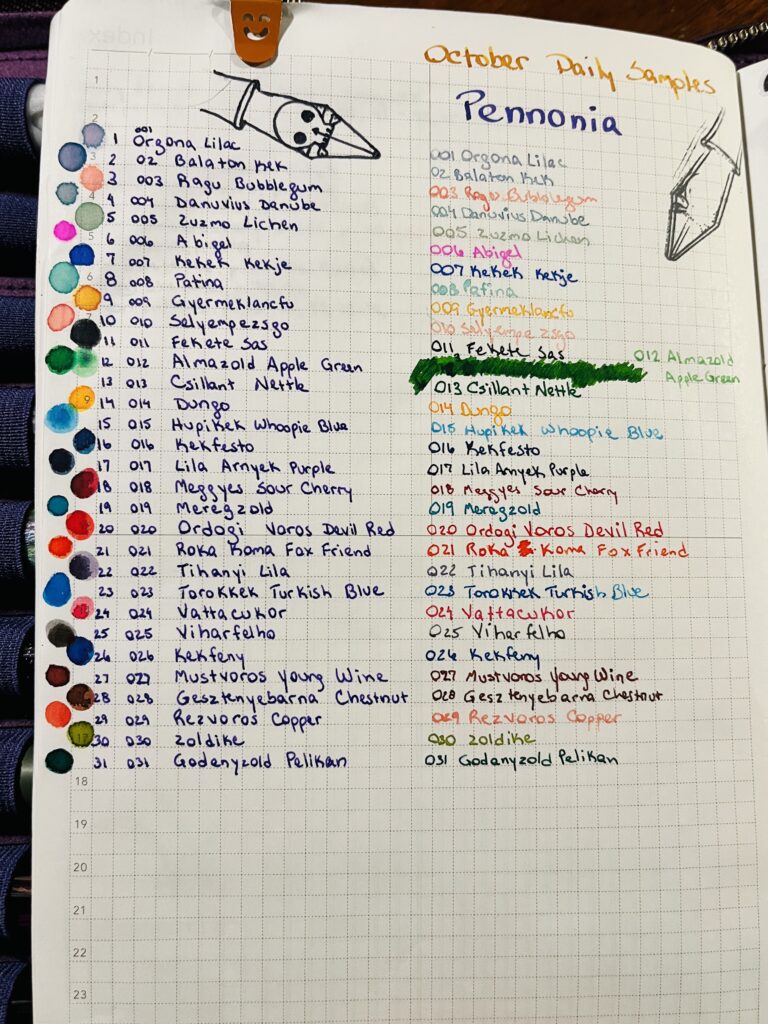
Pennonia 001 – 010!
001 Orgona Lilac – Another blue lilac, multi chromatic, but on the light side. Reminds me of fairy wings.
002 Balaton Kek – Multi-chromatic blues, faintest hint of lavender.
003 Ragu Bubblegum – Very light peach, soft and pretty.
004 Danuvius Danube – Light blue, with some pink shading, another multi-chromatic!
005 Zuzmo Lichen – Soft green, fresh looking, orange shadinf which doesn’t muddy it – unusual! And the last of the multi-chromatics for a while.
006 Abigel – Oh heck a hot pink! And readable!
007 Kekek Kekje – I like this blue, medium dark, jewel tone, performs really well.
008 Patina – Light teal, fairly readable, reminds me of a copper patina. Without the copper.
009 Gyermeklancfu – Burnt orange yellow.
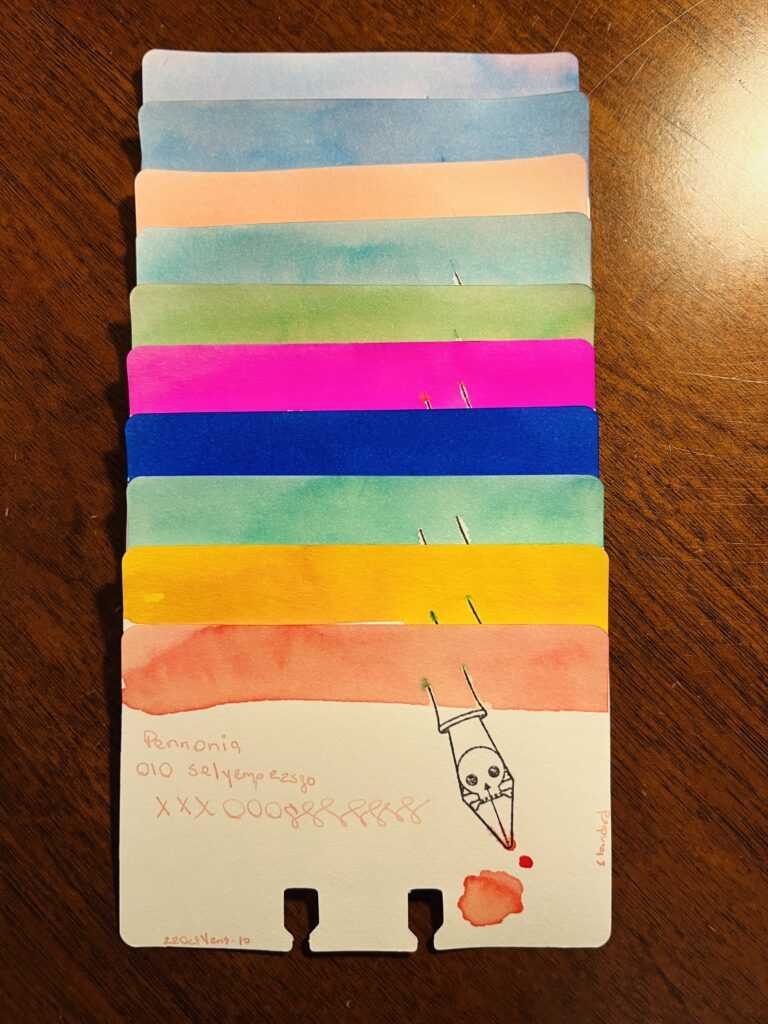
010 Selyempezsgo – Pale peach, reminds me of tea! I like tea.
Pennonia 011 – 020!
011 Fekete Sas – Blue black, fun to write with, not a fun color tho.
012 Almazold Apple Green – Nice dark green, darker medium green.
013 Csillant Nettle – Reminds me of that first Granny’s Apple green apple of the summer – did that make sense? It makes sense. Ahem.
014 Dungo – Butter yellow, no! Egg yolk yellow.
015 Hupikek Whoopie Blue – Brigth blue, pool/beach blue.
016 Kekfesto – Nice standard dark blue, light blue is nice too.
017 Lila Arnyek Purple – Not one bit of purple in this ink, disappointed. However this dark blue ink is fun to write with, very well behaved and controlled. (But no purple, grumble grumble grumble.)
018 Meggyes Sour Cherry – Reminds me of cherry juice, not maraschino, like the bourbon soaked cherries we get sometimes.
019 Meregzold – Teal! Good teal.
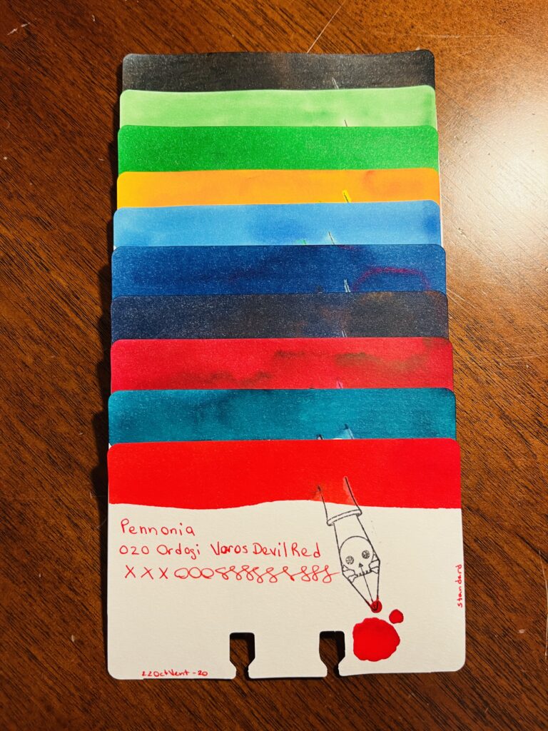
020 Ordogi Volos Devil Red – Bright lipstick red. More pink than devil red.
Pennonia 021 – 031!
021 Roka Koma Fox Friend – Bright orange, with a red base that grounds it nicely.
022 Tihanyi Lila – Reminds me of the ink I have called Nightshade but a touch more purple. Shading inks are really interesting.
023 Torokkek Turkish Blue – Sheeny blue, purple sheen, dense lighter blue, with some aquamarine. Complicated ink!
024 Vattacukor – Dark pink. Rose pink, has a flower petal softness to it.
025 Viharfelho – Dark grey when wet, fades to a medium grey when dry.
026 Kekfeny – Medium blue, red sheen = purple! Yay purple.
027 Mustvoros Young Wine – Reddish orangeish/brownish tones?
028 Gesztenyebarna Chestnut – Maybe not a chestnut brown, exactly, but definitely brown.
029 Rezvoros Copper – Pastel, peach color – might be chromatic?
030 Zoldike – Grass green, yellow/tan undertones.
031 Godenyzold Pelikan – ooo caught the sheen! Dark green/teal, hint of reddish sheen.
Whew! Quite the month. I do miss shimmers tho!
All of my Pennonia colors!
I’ve got another set of solid standard inks in my collection. Two months in a row of no shimmer is tough tho, so looking forward to next month’s samples! Altho those chromatics were fun. These were nice and low maintenance. Which I hilariously appreciate.
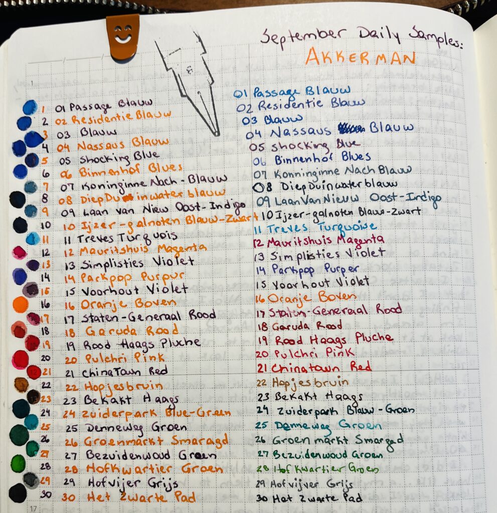
I was really intrigued by the shape of Akkerman’s bottles. They look antique and have a glass marble in the neck which is to help make filling the pen easier. It’s a really interesting idea! I sampled this month out of vials, but I may decide I need a whole bottle of at least one color so I can try out this whole marble thing. I believe the inks I sampled this month were from a line to honor their 100 years of existence in 2010, and the names are related to the city of The Hague. Fun!
I like to list the inks out ahead of time and then rewrite them in that day’s ink sample, also I find making the color dots every day very fun. Look at how fun that looks!
It didn’t take me long to realize I was going to be sampling colors grouped together – which ended up being something I found really pleasing – for some reason? Although I wish the purple group had been larger, sigh. Quite the variety of blues and reds. The greens were also a small group – so my two favorite colors, the least number of inks. Boooo. None of these popped out at me, but I have heard they are very solid and reliable inks. So I assume at some point in the future I’ll need one for a good basic color. They performed well and consistently when I was sampling them. More specifics with the color groupings below!
So many blues! Each distinct.
The Blues! Listed in order seen on photo from top to bottom.
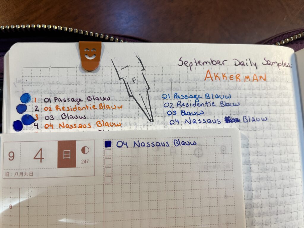
01 Passage Blauw
02 Redidentie Blauw
03 Blauw
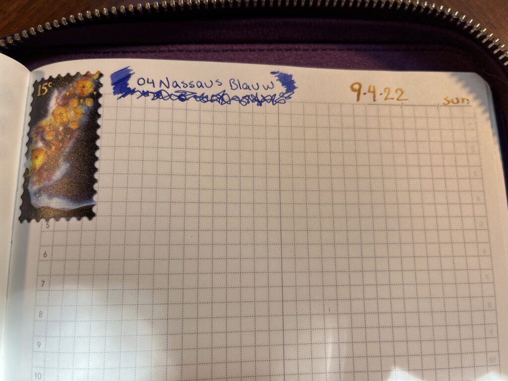
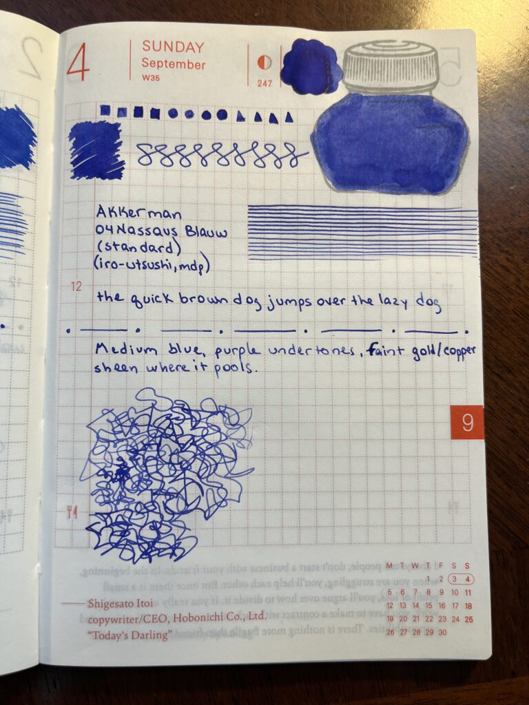
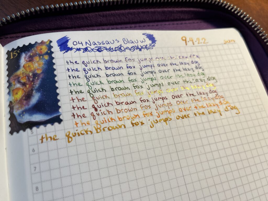
04 Nassaus Blauw
05 Shocking Blue
06 Binnenhof Blues
07 Koninginne Nach-Blauw
08 DiepDuin Water Blauw
09 Laan van Niew Oost-Indigo
10 Ijzer-galnoten Blauw-Zwart
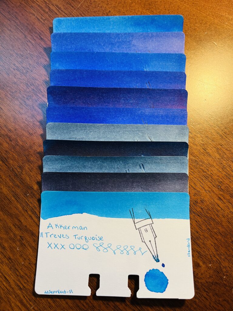
11 Treves Turquois
I think by the fourth or fifth blue I was just impressed at how many blues their were already and still to come! I like that there is a wide variety and that none of them look exactly the same. There are two or three in there that are similar, but still distinct. And 05, Shocking Blue, looks like something I’ll use in a future palette…
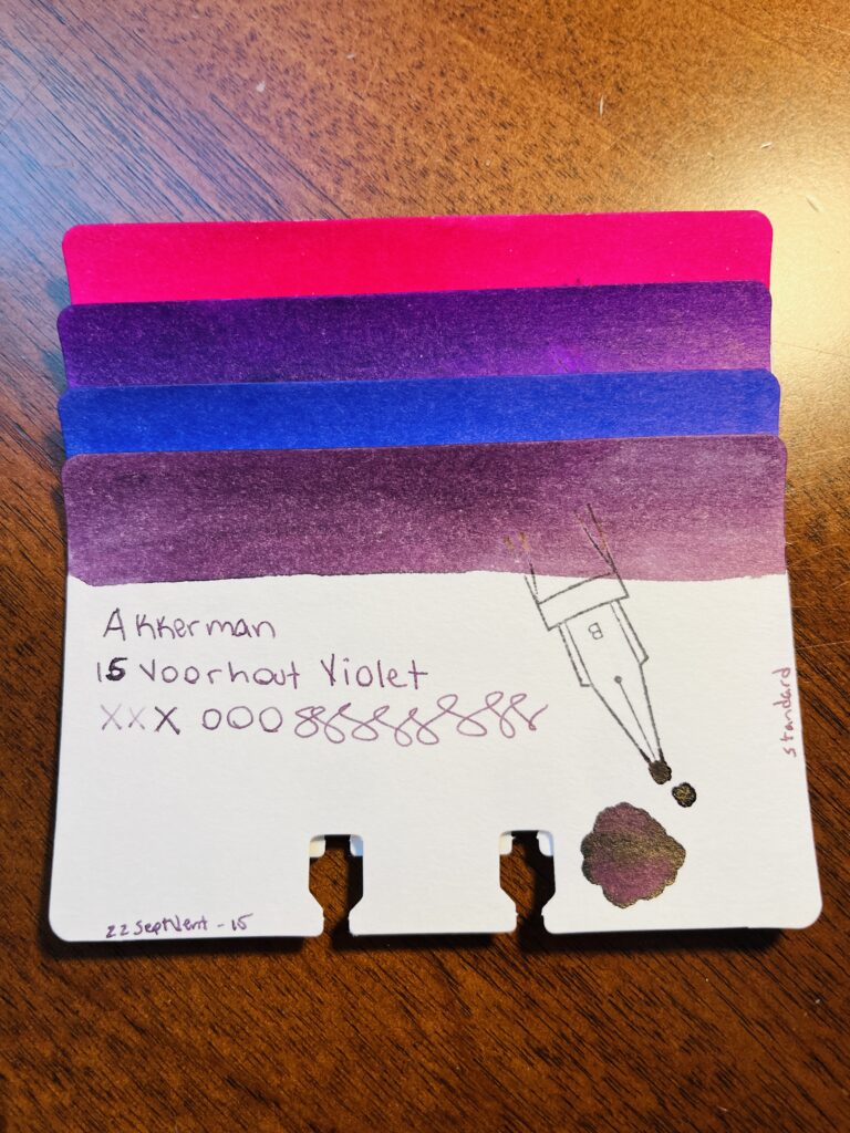
4 purples – only 4! And that’s only if you consider Magenta a purple which…I sometimes do not. Sad Spoon.
The Purples!
12 Mauritshuis Magenta
13 Simplisties Violet
14 Parkpop Purpur
15 Voorhout Violet
There weren’t as many of these, but I do love them. I’m not a huge fan of magenta’s, but the other three are really pretty, and I hope I have an excuse to use them soon. Especially that 13, Simplisties Violet!
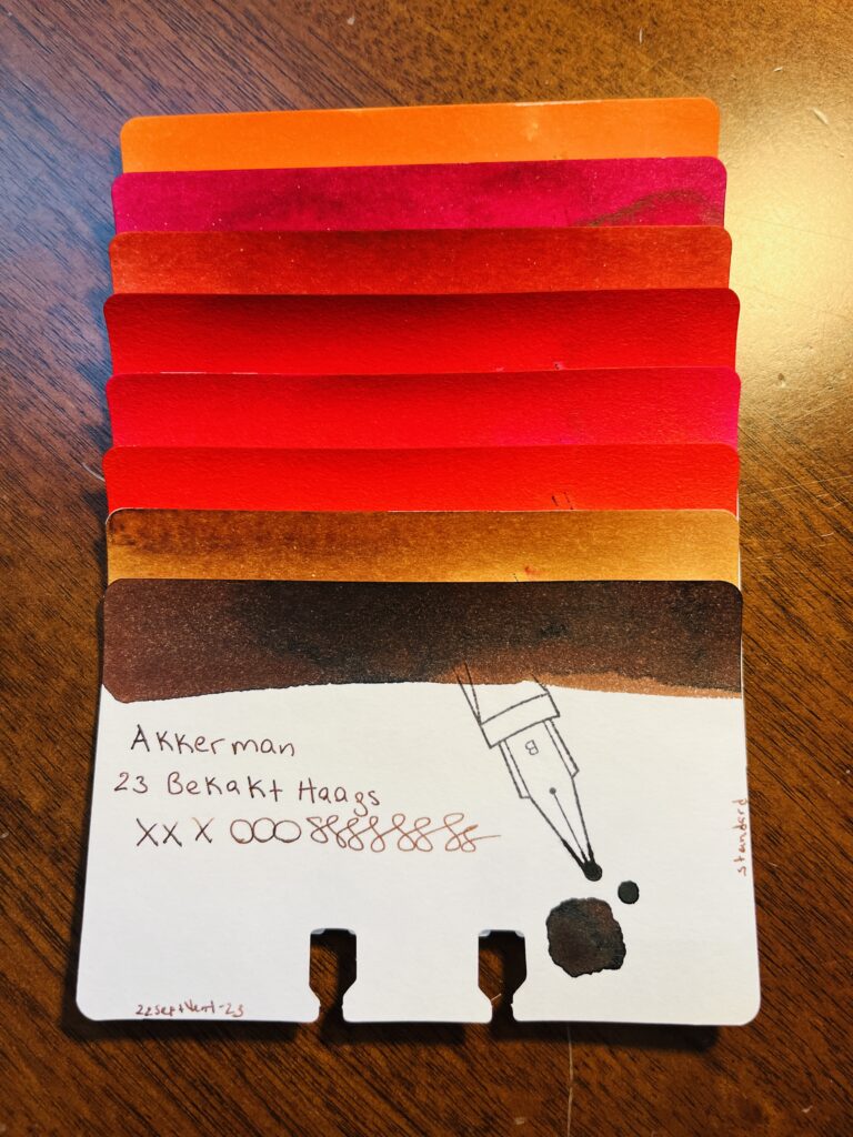
The Reds! Okay maybe more than just reds…
16 Oranje Boven
17 Staten-Generaal Rood
18 Garuda Rood
19 Rood Haags Pluche
20 Pulchri Pink
21 ChinaTown Red
22 Hopjesbruin
23 Bekakt Haags
Okay, so there is an orange and some tan/browns mixed into this pile, but its close enough! Let’s call these Fall colors instead of just Reds…Red is not my favorite color ink, but I found a couple of these intriguing. Super not a fan or tan/brown but they are still solid colors. And orange is becoming a favorite ink color for some reason, so glad that I got at least one of those!
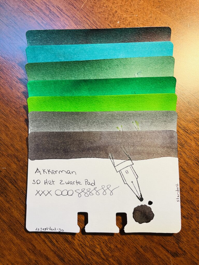
Greens and greys!
The Greens!
24 Zuiderpark Blue-Green
25 Denneweg Groen
26 Goenmarkt Smaragd
27 Bezuidenwoud Groen
28 Hofkwartier Groen
29 Hofvijer Grijs
30 Het Zwarte Pad
Greens! I’m always looking for good greens, because they go well with purples! There is a good variety here. There are also two greys which is nice. The only color really missing is a yellow, but not a bad rainbow!
Overall I enjoyed this month’s inks. None of them seemed to really be problematic at all, and all of them will be solid additions to my library. Now…which one do I buy a bottle of… 🙂
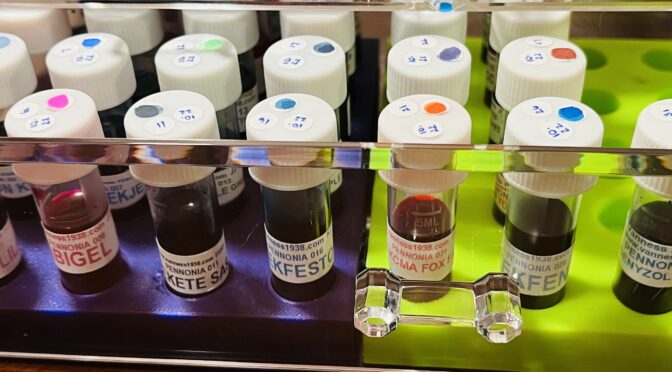
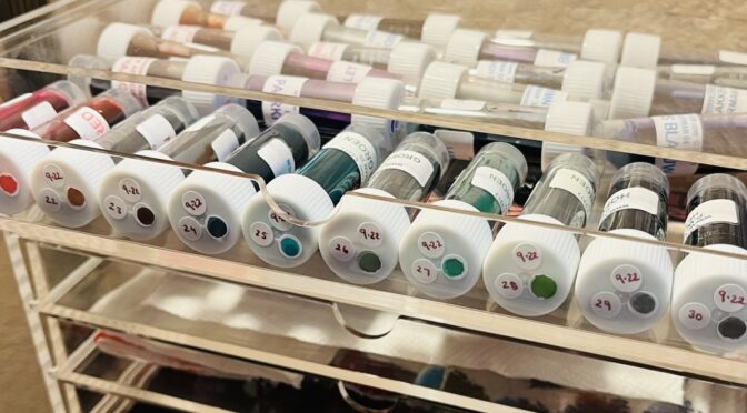
31 Pennonia ink sample vials – October is going to be fun!
Pennonia is another manufacturer that numbers their inks, and it snagged my interest again. The company is based out of Romania, started in 2018, and is owned but what looks like a very passionate fountain pen ink maker! Something he calls out is that from what he knows, he was the first to introduce mixable shimmer powers and mixable liquid shimmer additives to the community. Which I want to look into – immediately! I do love me my shimmer.
I am not sure if any of these have shimmer in them because while I do handle them I specifically try not to really look at what is in the vial. So we shall see! If I had to guess, I am betting there are no shimmer inks, due to the comment about additives! Let’s see if I’m right at the end of the month…
This is the order I will be sampling these in the month of October, and apologies if I got any spellings wrong, I double checked them but my auto correct is aggressive:
001 Orgona Lilac
002 Balaton Kek
003 Ragu Bubblegum
004 Danuvius Danube
005 Zuzmo Lichen
006 Abigel
007 Kekek Kekje
008 Patina
009 Gyermeklancfu
010 Selyempezsgo
011 Fekete Sas
012 Almazold Apple Green
013 Csillant Nettle
014 Dungo
015 Hupikek Whoopie Blue
016 Kekfesto
017 Lila Arnyek Purple
018 Meggyes Sour Cherry
019 Meregzold
020 Ordogi Volos Devil Red
021 Roka Koma Fox Friend
022 Tihanyi Lila
023 Torokkek Turkish Blue
024 Vattacukor
025 Viharfelho
026 Kekfeny
027 Mustvoros Young Wine
028 Gesztenyebarna Chestnut
029 Rezvoros Copper
030 Zoldike
031 Godenyzold Pelikan
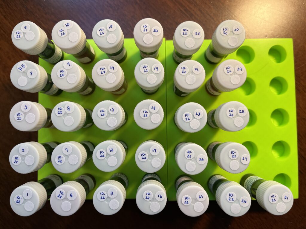
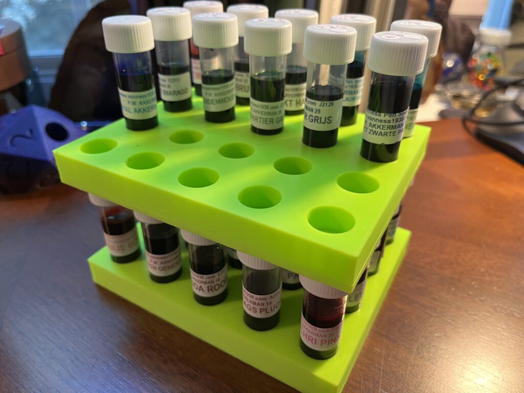
31 Pennonia inks in the awesome vial trays my husband designed and printed for me!
Any one wondering why I started sampling a new ink every day? It hit me one day that it was multi dimensional. Originally I thought it was just because of how delighted I was sampling inks when I got the 2021 Inkvent Calendar. It was more than a year into the pandemic – I needed some good distractions. Advent calendars are something you open once a day for 25 days – a small joy, for 25 days in a row. I got about a week into it and I was hooked. I decided to rebuild the 2019 Inkvent calendar, to open in November, then thought in December I could try out some more shimmer inks, then…it continued.
What it turned into was a Routine – with a capitol R. Routines for me are fairly inflexible and are intended to set a tone or a mood. They tend to be coupled with what I’ve been calling Transitions and Sectors (an idea I developed after reading Jamie Knight & Lion’s ideas on tunnels, mine are more about orienting myself in space, to help me navigate). Routines are comforting for me as an Autistic with ADHD, and it’s something that becomes easy to follow, which is helpful when I am low on spoons, or overwhelmed, or exhausted. And Sectors are helpful because I have set up spaces that are intended for a small palette of topics. A lot of people do this actually, not just Autistics or ADHD – someone might have a workshop or a craft room. I do something similar but with a lot of intentionality and practiced focus. Which tends to result in a heightened state of concentration – but only on what is intended in that space – or sector. For example, if I am in my study, which is not a space I use for work, I find it very difficult to concentrate on a work topic. But when I am in my office, which is the Sector I use for work – I find it’s easy to concentrate on work.
What does all of this have to do with pens????? Well. Routines and Transitions and Sectors are how I manage my need for executive functions. It’s basically how I get myself to do stuff haha. And I’ve done a lot of research and thinking about how to get myself to engage with things, when I hit a period of Autistic Burnout in 2021. Actually, I developed this thinking alongside my interest in fountain pens and inks. For several reasons I am continuing to discover and develop, a solid way for me to engage in something is to tie it into fountain pens and inks.
For example. Getting out of bed can be difficult because of the energy it takes to get started when waking up in pain. And getting out of bed will only increase the pain. When you wake up in pain every day, for years, the motivation to get out of bed dwindles. But. You’ve gotta get out of bed. Sounds simple, doesn’t it? Not when you have Chronic Pain and are ADHD. So, I handle this with Routines and Transitions and Sectors. Getting out of bed means I get to go to the desk in my study, which is the Sector that is set up for me to sample inks. The Routine is what I do to get from bed to desk. The Sector is the desk in the study. And the Transition is the time between bed and eating breakfast. Most times, that’s enough. Our morning routine accommodates the time it takes – I do this while Aaron makes breakfast. Once I am at that desk, I am comfortable and I have a a defined task which I don’t even have to think too hard about. I can complete a task that I enjoy, first thing in the morning. The routine is calming, soothing.
Sitting at that desk is comfortable because every thing I need is within reach. There is only the usual expected chaos in the house (dogs going out, getting fed, kitchen noises). I have a pre defined and agreed on amount of time to do something I find extremely comforting, and sets me up to use my systems for the rest of the day. Timing is extremely important, but I’ll get into that later. The routine we have in the morning, when I am in the sector for pens and inks, I am specifically looking for what my range of motion, pain levels, and sensory sensitivities will be like that day. And all of that data helps me be successful with my day.
There are big movements – walking, transferring from one chair to another. I get that data from getting to my desk from the bedroom, getting dressed. There are small movements – opening drawers to get the supplies I use, manipulating those tools to apply the ink to the sample card and my notebooks with a q-tip and a dip pen. There are big sounds – boiling kettle, talking to the dogs, dishes hitting the counter. There are small sounds – drawers opening, tea being poured, pen on paper.
If I have trouble getting from my wheelchair to the desk chair, or reaching out to the drawer, or handling the pen, then I know I need to be very careful with my movements that day. If I’m careful, I can conserve energy, instead of wasting it and finding out the hard way that I should have been careful. If the sounds in the kitchen are overwhelming me then I know I need to be careful with sounds and other sensory input like light or textures or food. If I am careful and wear noise canceling headphones, dim the lights preemptively, don’t eat stressful foods, then I can prevent a melt down. Or at least reduce the likelihood.
Over time this routine solidified into something I need to get myself going in the morning. Some people go for a run, or sit on the porch with a hot cup of coffee, or journal for an hour. I listen to tea being made and sample inks.
Alright, you know those posts I have about the daily samples? Well, let’s get into the technical specifics of how I currently do my daily morning ink and pen routine. I assume someone out there will get something out of it. Here we go!
Step One:
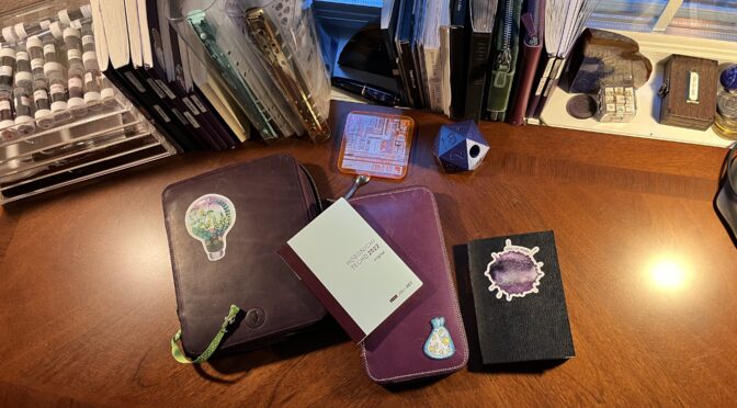
Set up the notebooks. For this I add some stickers to the pages where I start today in my Captain’s Log, and that day’s page in my Nightly Journal. I also pull out my Daily Sample Journal.
Step Two:
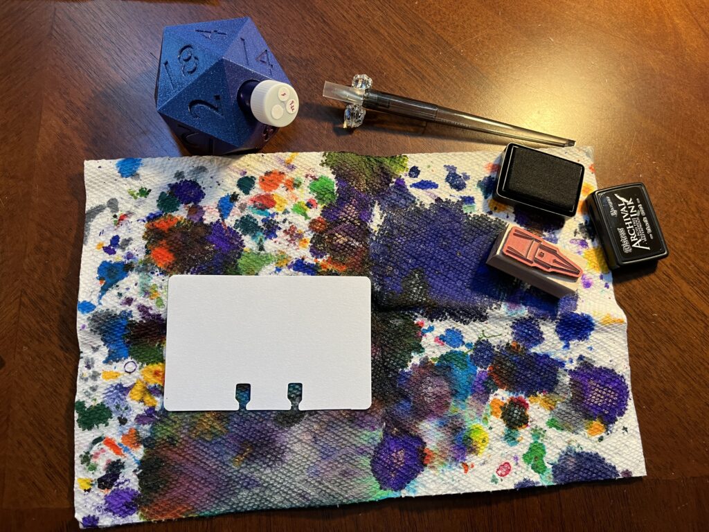
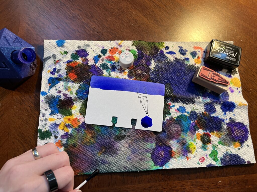
Pull out the sampling supplies. First, the sample vial, which I put in the 3D printed d20 vial holder Aaron made me. Next I pull out the nib stamp I am using that month and the ink pad for it. Then the dip pen I am using – currently an Iro-utsushi, metal nib instead of glass. Last the two paper towels I use – one where I can catch any spills and one where I can rest the q-tip when I am done with it.
Step Three:
This is where I start putting ink down on paper. I use a q-tip to pick up ink from the vial and swab the top of a sample card. Then I’ll stamp the card with that month’s nib stamp. Next I pick up a little more ink and use it to make a puddle of ink on the card, making it look like the ink is dripping off the tip of the stamped ink nib.
Step 4:
I use this q-tip in seven spots, funnily enough. The swab at the top of the card, the ink puddle on the card, an ink puddle on that days journal sample page, a dot on top of the vial lid, a dot next to the name of the ink written out in that month’s list, then I swab in the ink bottle stamp on that days page, then!
Step Five:
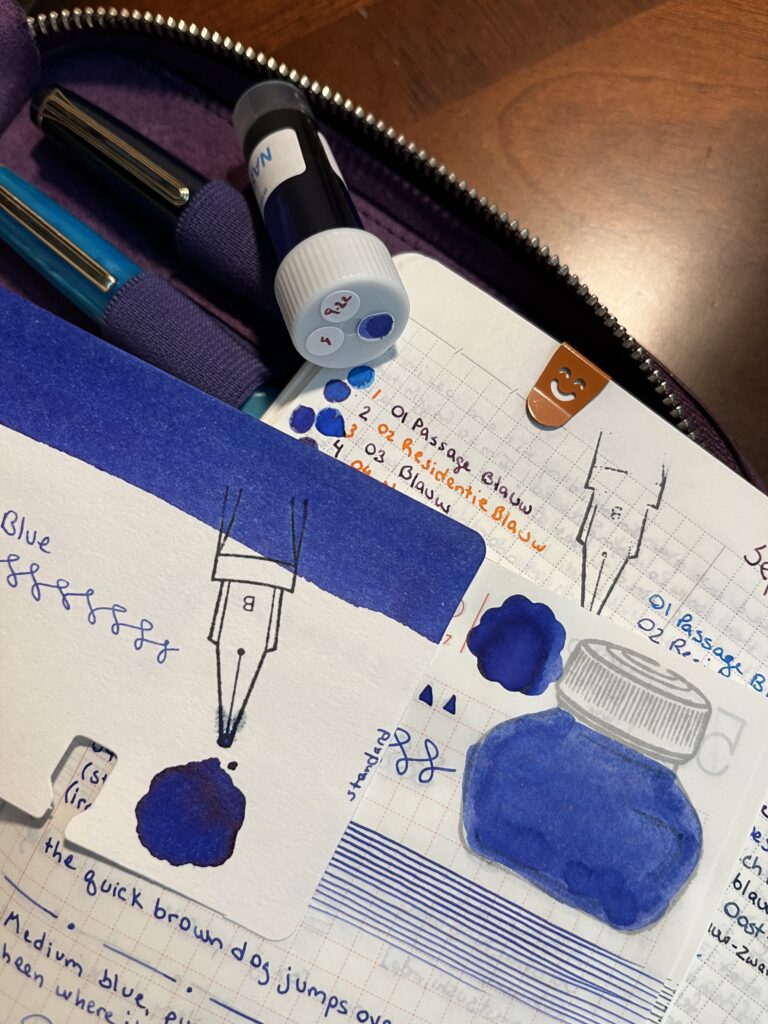
Seventh and finally for the q-tip, a line of ink on the page that lists every day of months in a column. And then I rest it on a paper towel because it pulls the rest of the ink out slowly and sometimes you can see some really interesting color separations. Once the q-tip is done – moving on to using the dip pen. I start with the Captain’s Log and Nightly Journal – I write out the name of the ink on the page I list all of that month’s inks next to itself. Then I write it again at the top of that days Nightly Journal page, and fill in a square – the top of those pages have a very short checklist, so I basically color in the box you’d normally mark when something is done.
Step Seven:
Next is the sample card. I put the ink manufacturer, series if applicable, name, and some test x’s, o’s, and interconnected s’s. I also add which month it is usually by year, month, “vent” and the day – for example, 22SeptVent-4. And last I put the kind of ink it is on the right edge of the card – standard, shimmer, or sheen – those are the three types I’ve sampled so far. Well, ColorVerse calls their shimmers “glistening” and there are some shading inks that go by different shades.
Step Eight:
I write the name of the ink in one last spot in my Captain’s Log – that days first page.
Step Nine:
Then I switch over to the Daily Ink Sample Journal. I make 4 squares, 4 circles, and 4 triangles all filled in. Then I scribble a square to be as saturated as I can make it. Then more interconnected squiggles. Below that I put the same info I had on the sample card – manufacturer, series, name and then whether it is a standard ink or not, and finally which dip pen I am using. Beside that I draw straight lines until the ink starts to fade. Below that I write “the quick brown fox jumps over the lazy dog” because that phrase has every single letter of the English alphabet at least one. Then a line of dots and dashes. Then a description and my FEELINGS about the ink. Lastly, after one last dip into the vial, I draw what I call my sharp squiggles – it’s just a mess really, but I find the motions soothing and the visual appealing.
Step Ten:
I finish by testing all of the pens I have inked that day. I started doing this when I would find a pen wasn’t working well in the middle of the word day which was so very frustrating! So the pen test gives me an idea of which ones to avoid that day haha. In this photo I just repeat the quick brown fox sentence, but really I’ll just write down my thoughts, changing pen colors on every line.
And that’s it! When I first got started with this I would just ink up the sample card, usually just with a square swab applied by q-tip and the ink manufacturer and name. I added the daily sample journal later. Then I added writing it in my Captain’s Log, then my nightly journal, etc. It has evolved over time. I switched from a glass nib dip pen to a metal nib – recently, actually. I’ve changed up the kind of sample cards I use for samples and I have changed the format I use on the card. Huh…this line of thought could end up being a whole other post. So I will leave it there!
I want to share these kinds of things in case it is helpful to someone. And I love collecting this data and putting it somewhere, so throwing it on this blog seems like a good place for it.
“Did you know” is often followed by an Autistic info dumping and the joy and excitement is contagious. I ended up with half a dozen pages of notes and hit 2000 words without getting to the end of the inks and was thinking, oh maybe I should have several posts… Which is when I realized, oh wait I can edit things. 🙂 So I present to you the heavily edited version of the info dump Aaron ended up listening to. I am lucky he finds me adorable.
This was an AWESOME month of samples, I absolutely loved it, because each series gave me a new-to-me author to look into or old classics to check out again. I ended up doing a bunch of research, just for fun! I found out a bunch of stuff and ended up picking up most if not all of these books in book book form, and I’m still reading them, and looking into more things, because one thing leads to another! For me the enjoyment this month was both sampling these neat inks and also the other stuff I found out, so that is what I will be sharing with you today! I can’t WAIT to try out more Wearingeul inks. I’m using one in a pen for September, and it is currently one of my favorites. (It’s Flowing Leaves, for the record.)
Oh, also? FOUR grey shimmer inks. Five if you count Tin Woodman that has a matching vial of shimmer to mix in. (Yes, you heard that correctly – the shimmer is SEPARATE from the ink itself…on purpose…)
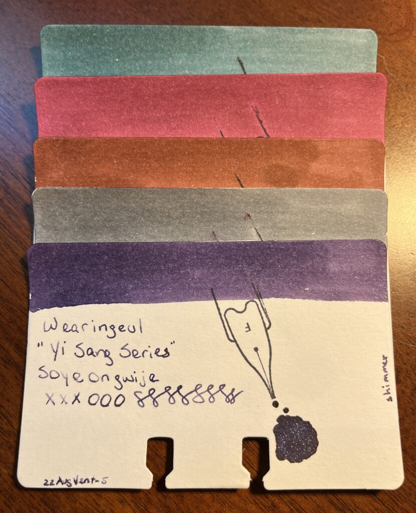
Yi Sand Series, 13 Children, A Taxidermied Genius, Architecture Infinite Cube, Me In The Mirror, Soyeongwije
Did you know…Yi Sang was a Korean poet who died at 27 from tuberculosis and grew up in a Korea occupied by Japan. His work plays with identity, imagery, spacing, pacing, and rhythm. I read a couple of really interesting pieces that seem to be referring to his illness and how it affects his home and family. I empathize with this, being disabled myself. I saw a lot of playfulness tempered by a grief that was multifaceted in nature. ALSO he was one of the first Surrealist poets – which is neat. His poetry is engrossing, for the record, I kept reading the next one and then the next one and then the…
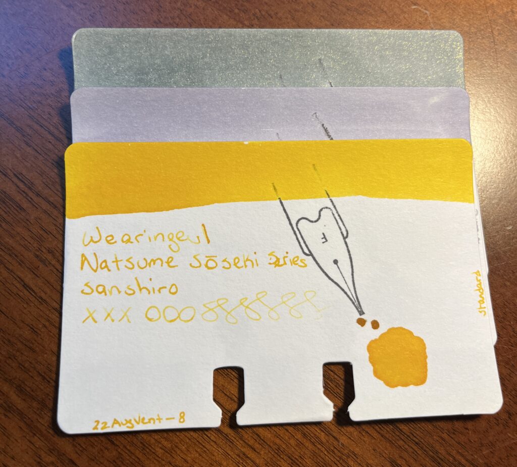
Natsume Soseki Series, I am a Cat, Mind, Sanshiro
Did you know…Natsume Soseki was a Japanese novelist who is well known for writing a book still used in Japanese schools today titled “I am a cat.” It is a satirical novel from the point of view of a cat, and it plays with formal speaking and classism. AND there is a video game called Ace Attorney, the protagonists name is Soseki Natsume – sound familiar? And the character has a cat named “Wagahai” which is the narrator cat’s preferred pronouns from “I am a cat” and is rarely used nowadays except to refer to pompous and anthropomorphic animals.
Oh also, I fell down a ridiculous rabbit hole when I started looking for one of his novels which I thought was called “The Mind” – the name of one of the inks I sampled – but couldn’t see it in the Wikipedia article list of his work. Ready for this?
When I couldn’t find “The Mind” in his book list, I googled what “the mind” was in Japanese – it’s “kokoro.” Neat, so I went back to the list, sure enough, Kokoro is listed as one of his novels. Naturally I look at THAT Wikipedia article, which declared “kokoro” translates literally to “heart.” What? Wait a sec…I double checked my google search – what a scholar am I – and translated “heart” to Japanese – and got “shinzo.” So. Completely different. Let’s try translating “kokoro” to English – got “heart.” Great. That clears up nothing. WELL. Back in the Kokoro Wiki article, it elaborates that the word has shades of meaning and could be translated to “the heart of things” or “feelings.” I know only enough about Japanese to make my “yep, that sounds right,” about how complicated this is face. And moved on. Wait! The ink bottle label has Japanese characters on it – what does that translate too??
See? Rabbit hole. Such fun.
This series had the second grey shimmer. Delightfully distinct, I will say.
Whew, that was a lot. Trust me when I say there was MORE.
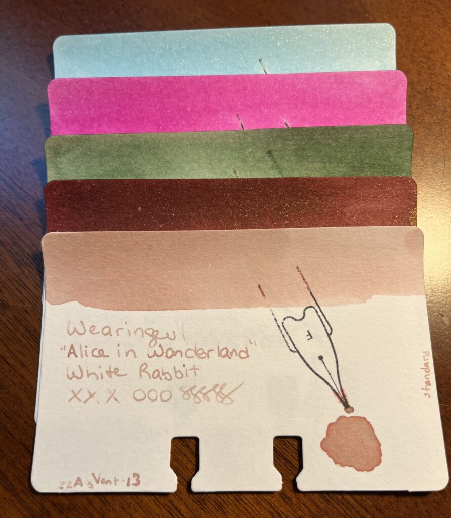
Alice in Wonderland Series, Alice, Cheshire Cat, Mad Hatter, Queen of Hearts, White Rabbit
Speaking of rabbit holes…I was really pleased by how the ink colors matched with the characters – when the ink names don’t match the color it bugs me.
I haven’t ever read the original Alice in Wonderland (Lewis Carroll) – I am looking forward to it, I’ve read that it is WEIRD.
Did you know… Alice in Wonderland is considered “literary nonsense” which is a thing, seriously, I looked. Literary nonsense started being recognized in the 1900’s and is categorized by the conventions of subverting “language conventions or logical reasoning.” This effect of nonsense is usually an excess of logic, rather than the absence of it. Humor comes from it’s nonsensical nature rather than a punchline. Also, L. Frank Baum thought it was incoherent. Fun!
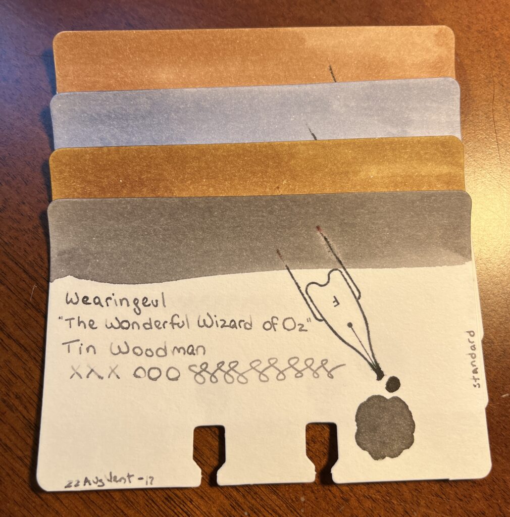
The Wonderful Wizard of Oz, Cowardly Lion, Dorothy, Scarecrow, Tin Woodman
Speaking of L. Frank Baum…
Did you know…The Wonderful Wizard of Oz was in part influenced by Lewis Carroll’s Alice in Wonderland? Yep, despite thinking it was incoherent, both authors believed children’s books should be fun, and not just moral lessons.
These inks were really muted which made me sad and THEN I discovered that there are 5 “glitter potions” which I got all excited about! Brain, Brave, and Heart make sense, because there is a Scarecrow, Cowardly Lion, and Tin Woodman inks, but the other two are Emerald City and Silver Shoes – Didn’t Dorothy wear ruby slippers? Are they different in the book? I have to check out the glitter potions still – could be interesting.
I haven’t read this original either. Yay books!
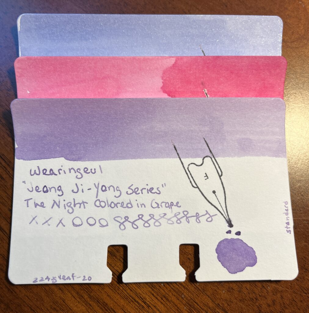
Jeong Ji-yong Series, A Watery Star, Floating Cloud, The Night Colored in Grape
Did you know…that Jeong Ji-yong’s work has three phases, the first of which is a sort of sensual phase, then a religious one, then a more traditional one. These three inks are pulling from three poems from his first phase, which called into imagery of the sea often.
A Watery Star is from “Windowpane” (1929)
Floating Cloud is from “Home” (1927)
The Night Colored in Grape is from “The Dream of Wind and Waves” (1922)
He was also a Korean poet! That’s two at this point.
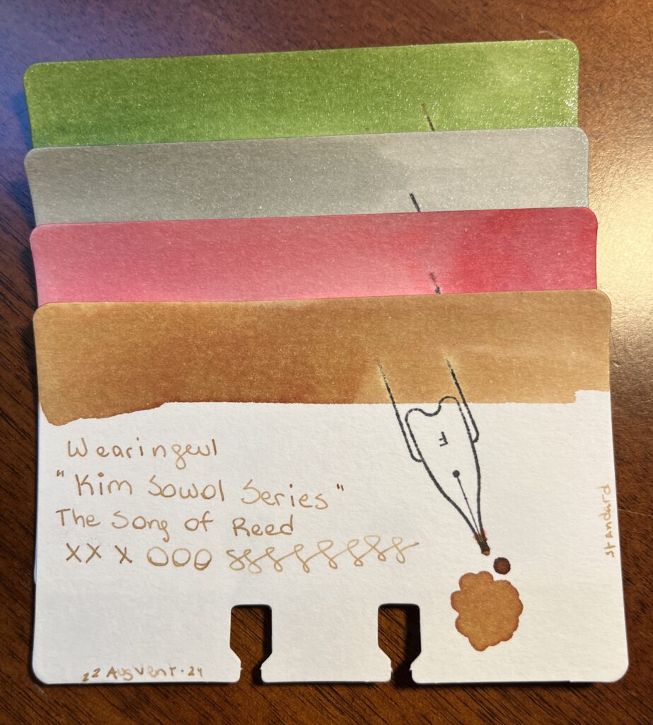
Did you know…Kim Sowol is our third Korean poet? I didn’t find a ton on this one – but I found it interesting that all four of the authors from Korea/Japan at this point were all writing in the same time periods. I couldn’t link the inks with his poems, but I did find a note that his poetry called Korean folk songs to mind, and these titles make sense with that in mind haha.
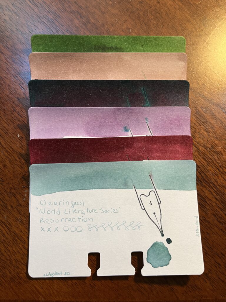
World Literature Series, Beneath the Wheel, Don Quixote, For Whom The Bell Tolls, Jane Eyre, Metamorphosis, Resurrection
Alright this was a series of books by different authors that have nothing to do with each other! They’re all from different countries, come from different time periods, and deal with different topics. Which is probably the point of a World Literature Series… Here is a random fact about each one:
Beneath the Wheel (Hesse, 1906) was reissued in 1957 as The Prodigy.
Don Quixote (de Cervantes, 1605) often labeled as the first modern novel.
For Whom The Bell Tolls (Hemmingway, 1940) title comes from John Donne’s series of meditations and prayers on health, pain, and sickness.
Jane Eyre (Brontë, 1847) revolutionized prose fiction – a Bildungsroman which is a literary genre reflecting “coming of age” themes.
Metamorphosis (Kafka, 1915) this is a super weird book, seriously. Starts with a dude turning into a giant bug. And continues from there.
Resurrection (Tolstoy, 1899) was the last of his major long fiction works published in his life time.
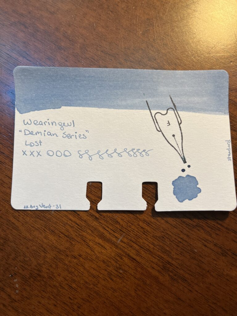
Demian Series, Lost
Dieman? Nope – Demian! I only sampled one of the two inks from this series – saving the second one for Catch All Month in November. So tune in next time. 🙂
Can you tell I had a heck of a lot of fun here? I wonder if I’ll be able to do something similar with the other inks. I know Vinta inks are all linked to stories and fables and stuff – so that could be a fun historical review? That’s a good idea, thanks internet!
I made a note of where I first saw an Akkerman ink referenced, and have lost it somehow. Sigh. I keep starting new notebooks so I can find things easier but I REFUSE to pull my ink stuff out of my Captain’s Log. Refuse.
Besides, it was probably on the Pen Addict blog, let’s be honest. I am read that blog all the time. I have learned a thousand things from it. Highly recommend. Actually, I love it so much, I am working my way backwards, as I keep up to date with the latest. It is a little weird seeing posts from near the beginning of the pandemic – I think I’m back in early 2020 at this point.
What decided me on this one for this month was the numbered aspect actually. Numbered inks are both satisfying and have the potential to make me go a little out of control – if for example, I only need 30 or 31 of them but there are 70 in total… And if any of these names are misspelled, I am sorry, I may have lost one or two battles with the auto correct.
Akkerman Ink Samples
01 Passage Blauw
02 Redidentie Blauw
03 Blauw
04 Nassaus Blauw
05 Shocking Blue
06 Binnenhof Blues
07 Koninginne Nach-Blauw
08 DiepDuin Water Blauw
09 Laan van Niew Oost-Indigo
10 Ijzer-galnoten Blauw-Zwart
11 Treves Turquois
12 Mauritshuis Magenta
13 Simplisties Violet
14 Parkpop Purpur
15 Voorhout Violet
16 Oranje Boven
17 Staten-Generaal Rood
18 Garuda Rood
19 Rood Haags Pluche
20 Pulchri Pink
21 ChinaTown Red
22 Hopjesbruin
23 Bekakt Haags
24 Zuiderpark Blue-Green
25 Denneweg Groen
26 Goenmarkt Smaragd
27 Bezuidenwoud Groen
28 Hofkwartier Groen
29 Hofvijer Grijs
30 Het Zwarte Pad
I am pretending I can understand what some of those mean, like Groen – green, clearly. Rood – red. Blauw – blue. We’ll certainly find out once I break into these!
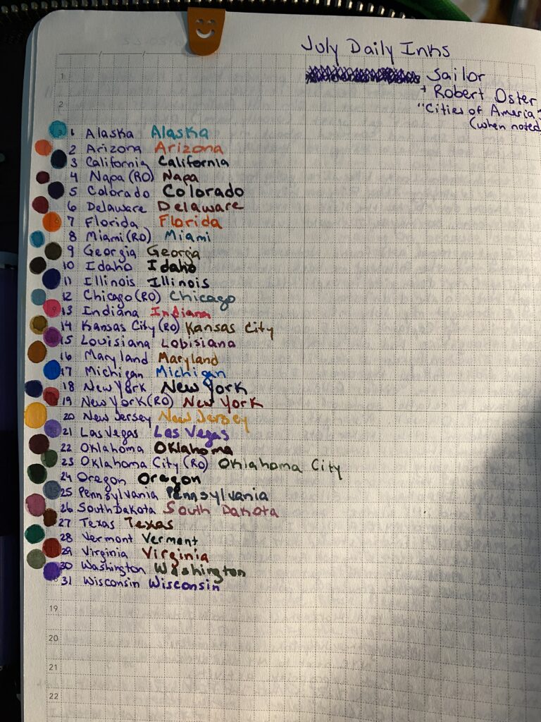
For July I went with a theme for my Daily Ink Samples for the first time. I saw a post about an ink that was named after a state and I was like, hmmmm. July 4th, could do USA themed. Now I will say this – I am NOT thrilled with the USA in general right now. But, if I could find 31 inks that were state related, then. Thought it might be interesting.
I could only find 24 inks from Sailor that had state names, so I filled in with another 7 from a Robert Oster series “Cities of America.” And I ordered the states alphabetically and put in the cities with the state if there was one, or where a state would be if it was missing.
Sailor Ink has never given me any trouble, and this set of samples followed suit. Robert Oster was a manufacturer I did samples from earlier in the year, so it was nice to have some more from them. There was only one shimmer ink in this pack – and it was from Robert Oster – which made me realize I don’t know if Sailor even makes shimmer inks! So I will be going to look into that at some point!
There were a lot of browns. I do not like the color brown. These were…nice browns. For that color. I suppose. But when the Georgia ink is brown instead of a peach for like Georgia peach, I got grumpy. Which is not the inks fault, but still!
The tracking page I use to list all of the ink names and a dot of that inks color next to the name.
Sailor:
Alaska
Arizona
California
(Robert Oster) Napa
Colorado
Delaware
Florida
(Robert Oster) Miami
Georgia
Idaho
Illinois
(Robert Oster) Chicago
Indiana
(Robert Oster) Kansas City
Louisiana
Maryland
Michigan
New York
(Robert Oster) New York City
New Jersey
(Robert Oster) Las Vegas
Oklahoma
(Robert Oster) Oklahoma City
Oregon
Pennsylvania
South Dakota
Texas
Vermont
Virginia
Washington
Wisconsin
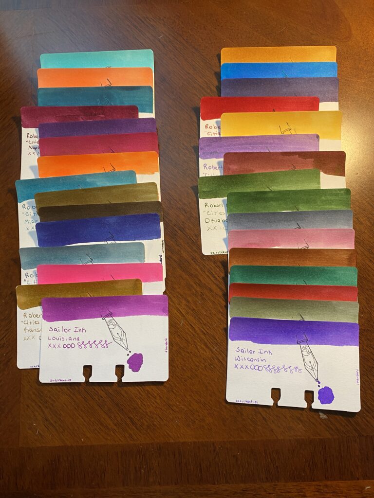
31 Ink Sample Cards, in two columns.
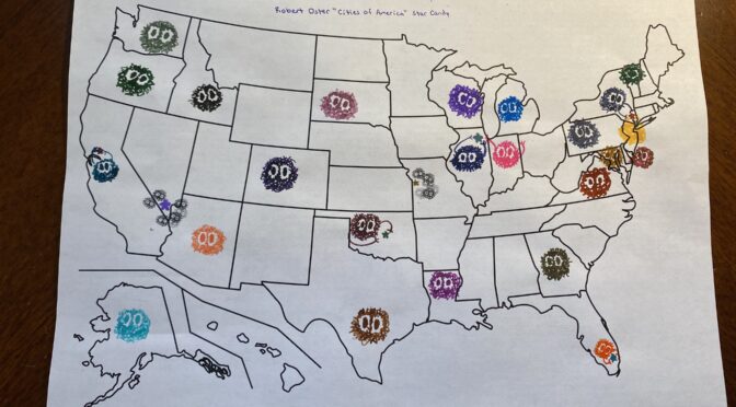
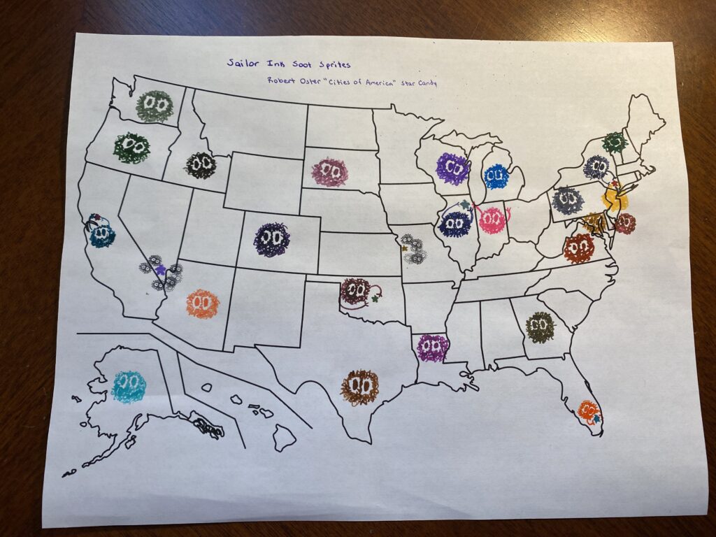
Then things got weird! I decided to put all of the inks on a US Map – but the paper was regular printer paper, and the inks did not go down great. A lot of the inks bleed and made the soot sprites or candy stars look kind of creepy. But Aaron’s whole face lit up when he saw this – worth it.
US map populated by different color soot sprites and candy stars.
Not sure I am going to theme my Daily Ink Samples again…I might just stick to a single manufacturer per month -for as long as I can. We shall see!
To be honest, I often pick which samples I am going to try out by what is actively available AS a sample because some things – like ColorVerse – seem to be almost impossible to find. Maybe I need to look around some more…
Which brings me to Wearingeul. I’d seen posts on Instagram of inks with some intriguing names linked back to this manufacturer, and I found a place that does samples last month. Hooray! The ink name that first intrigued me was “A Watery Star” which brought such an interesting image into my mind. I think the next one I saw was “A Taxidermied Genius” and I thought, okay where can I find more of this awesomeness.
When I start looking for ink samples these days I just google the manufacturer + sample and see what pops up. Often I get vanness1938.com as a first result, which was where I did get these this time. But I also look for a site that will tell me anything about the inks. Which brought me to the Hamilton Pen Company. They have all of the series sorted out with a nice tool in the side bar, so I could easily see which inks belonged to which series.
What further intrigued me about these inks is that the series are all associated with literature. One of them is even called “World Literature Series.” Ink colors associated with books? Yes please. I am a book lover, and the idea of inks associated with literature sounded awesome. I have also discovered that if an ink is named something and then the color of that ink does not match the name – let’s say the ink is named “Verdant Grass” but the color is like. Orange. Then it makes me super grumpy.
So a series of inks that are “re-interpreted novels”? I am expecting the ink colors to make SENSE. For example, one of the series is “Alice in Wonderland” and one of those inks is Alice, and the Alice ink is a light blue with light gold glitter. In my head, that matches what I think of when I think of the character from Alice in Wonderland. She’s blonde and wears a blue dress – matchy matchy.
What will be trickier is some of the inks that come from an author I am unfamiliar with. But that also means I have some fun opportunities for research and also finding out about some new books to read.
That was my thought process when looking at these – and the next thing I had to figure out was how to get exactly 31 of them. That was fun. I basically wrote down every single series and figured out which ones to Tetris together to equal 31. Then when I went to pick up the samples, an ink in one series was unavailable. Sigh. So I picked up a 2 ink series and have an extra yay.
And here are the inks I picked up to sample this month:
Sample Vials from above.
Yi Sang Series
13 Children
A Taxidermied Genius
Architecture Infinite Cube
Me In The Mirror
Soyeongwije
Natsume Soseki Series
I am a cat
Mind
San shirt
Alice in Wonderland
Alice
Cheshire Cat
Mad Hatter
Queen of Hearts
White Rabbit
The Wonderful Wizard of Oz
Cowardly Lion
Dorothy
Scarecrow
Tin Woodman
Jeong Ji-yong Series
A Watery Star
Floating Clouds
The Night Colored in Grape
Kim Sowol Series
Flowing Leaves
Half Moon with Dimmed Light
The Flowers on the Way
The Song of Reed
World Literature Series
Beneath the Wheel
Don Quixote
For Whom The Bell Tolls
Jane Eyre
Metamorphosis
Resurrection
Demian Series
Lost
Mature (this one is extra)
Now all we have to do is sample each ink, one at a time, and see how these turn out. I’ll be reading up on some of these authors I am unfamiliar with so I’ll report back if I find anything interesting!
An #ActuallyAutistic #ADHD #AmbulatoryWheelchairUser With Opinions