Tag Archives: PenBBS

February Palette Review!

Hullo folks, this one is being posted suuuuper late because February was a ROUGH month in our house. Lotsa meltdowns, broke my favorite fountain pen (Magic Green), lotsa possible exposure to covid, all kinds of fun stressful things. But never mind! Let’s talk pens. And inks. Fun stuff for real real.
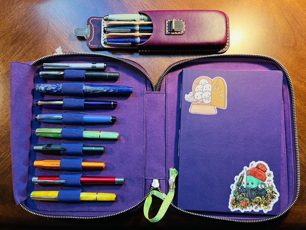
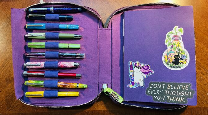
Pen/Ink Palette:
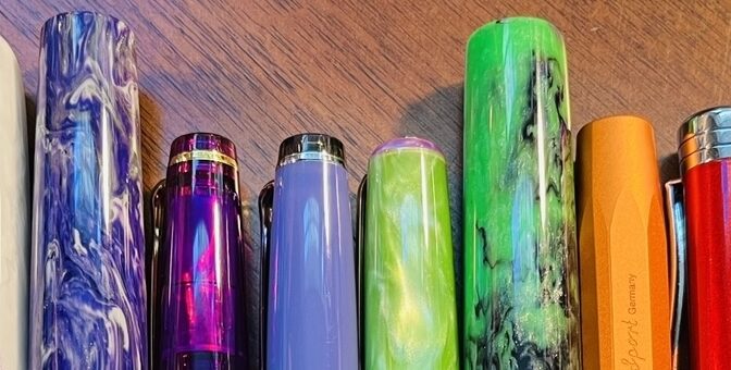
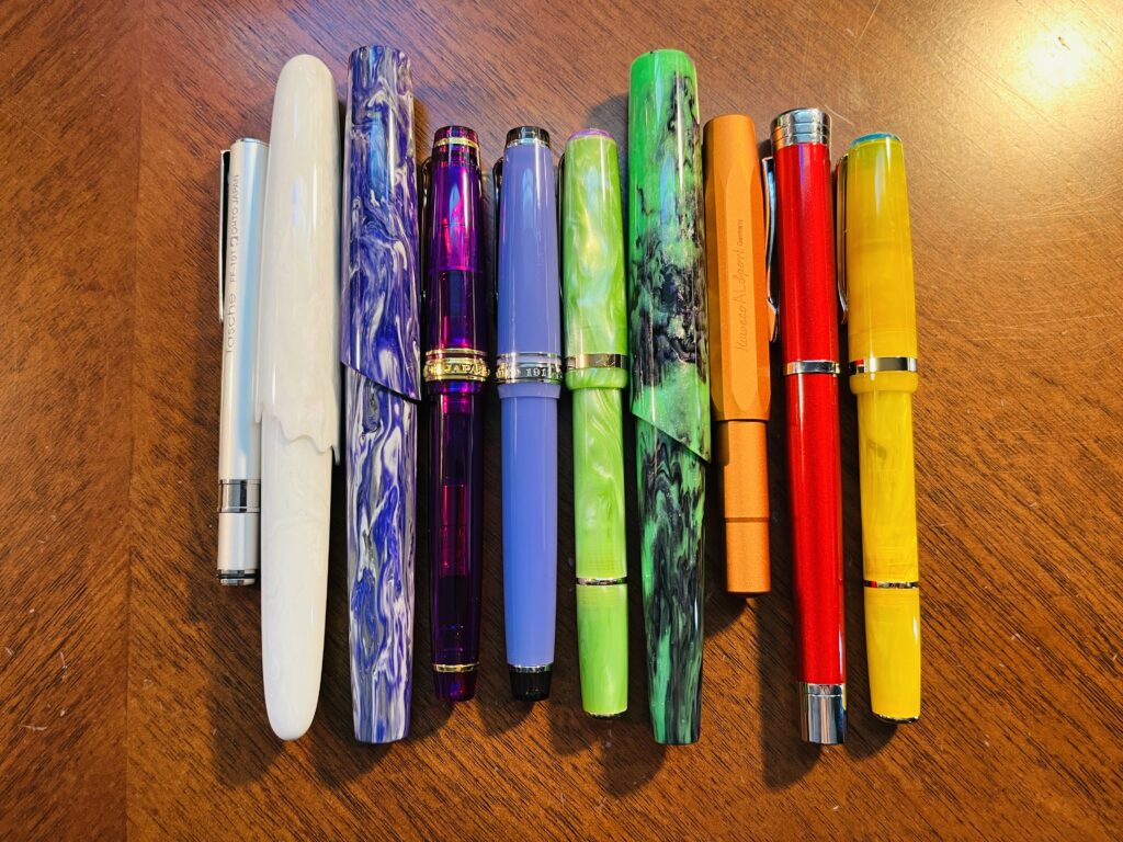
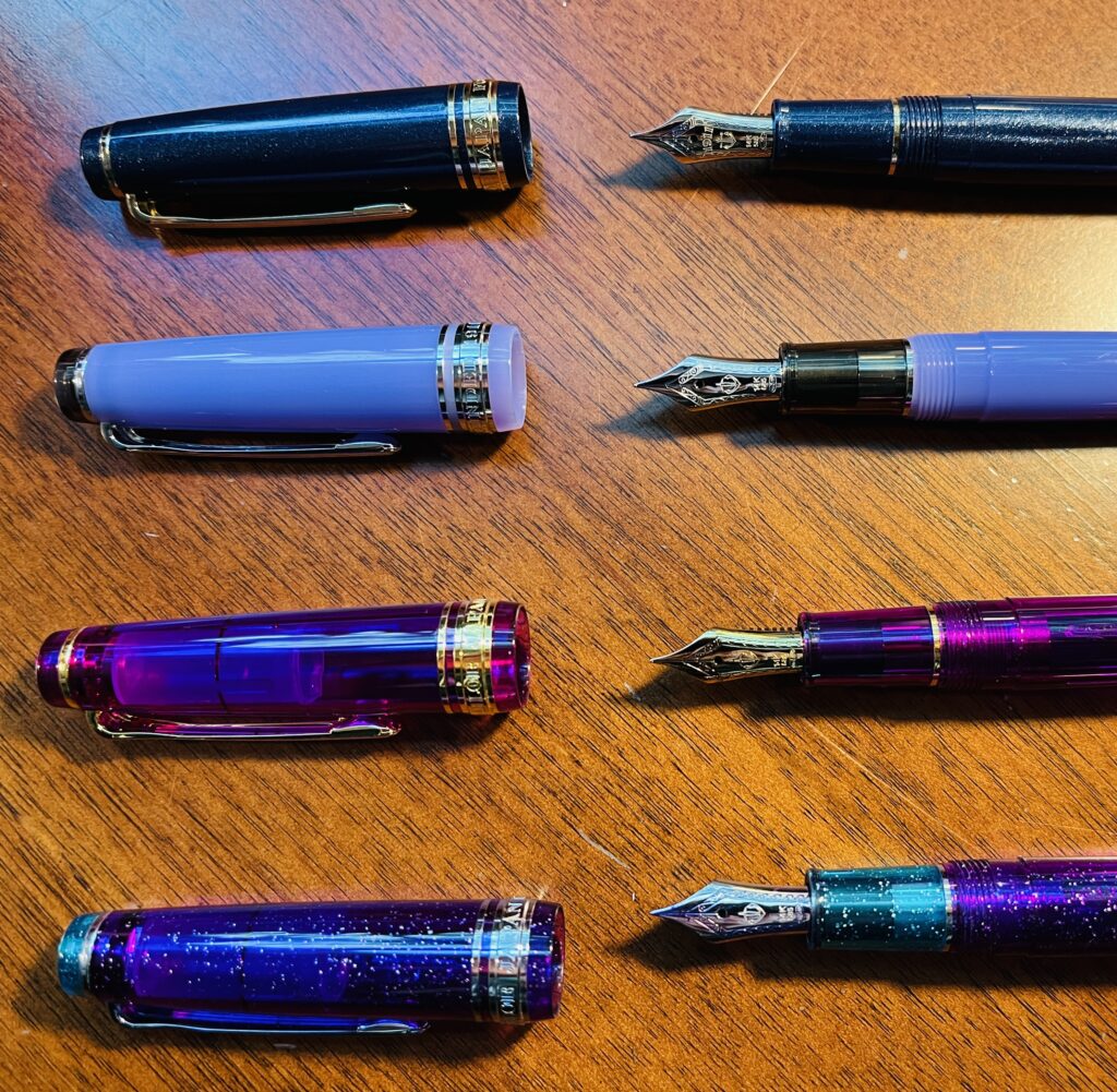
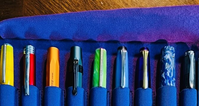
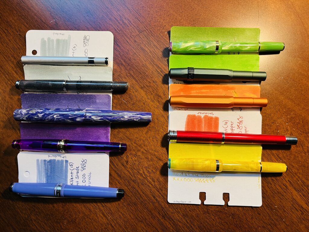
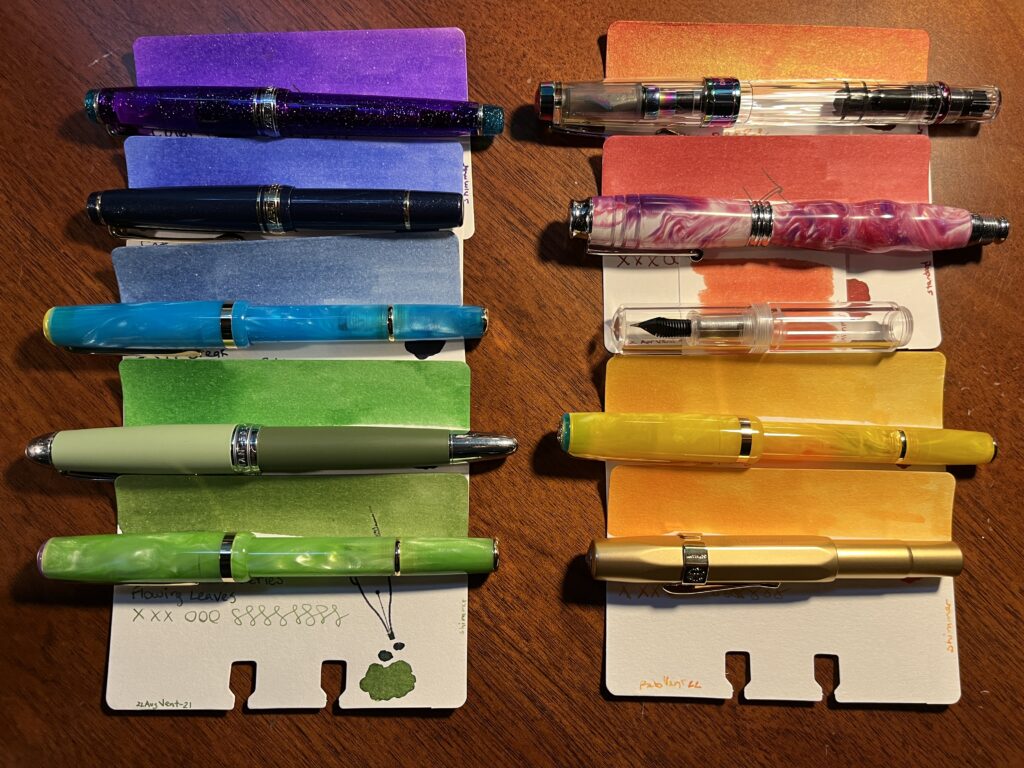
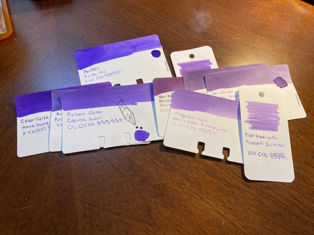
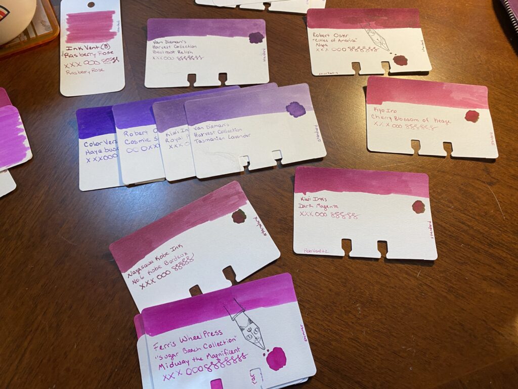
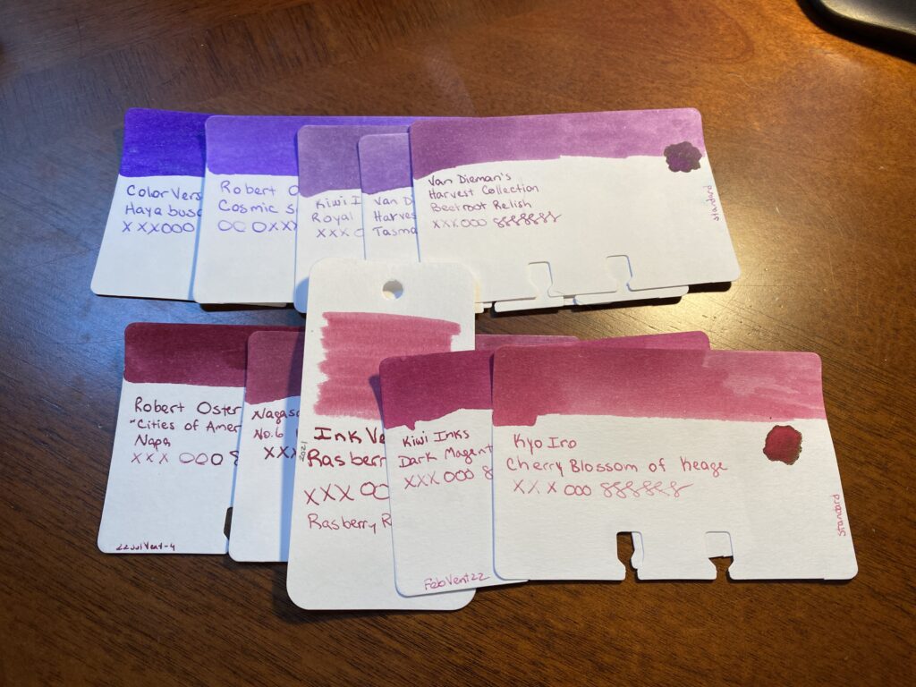
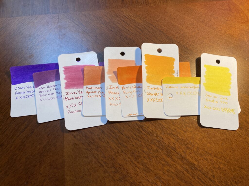
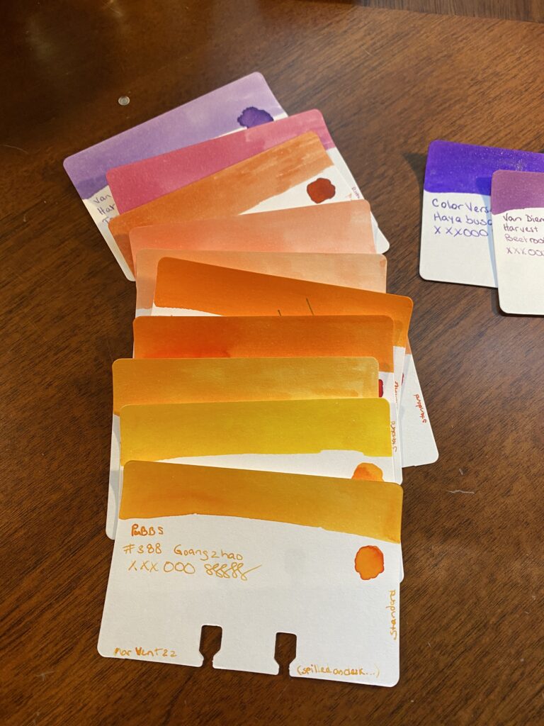
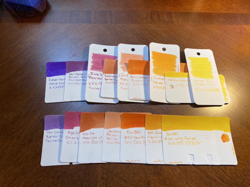
My theme for February was our wedding colors, purple and green because I do not like reds and pinks so when I think of love, I think of those colors! I did include one pink but it was more of a peach so, cheated a little bit.

Two pens on a palette journal page. One is a slightly translucent warm purple with gold trim, and the other is a swirly cool purple mixed with white.
Sailor Pro Gear Slim and a London Pen Co. Christopher 13 Jr., loved for different reasons haha.

Favorite:
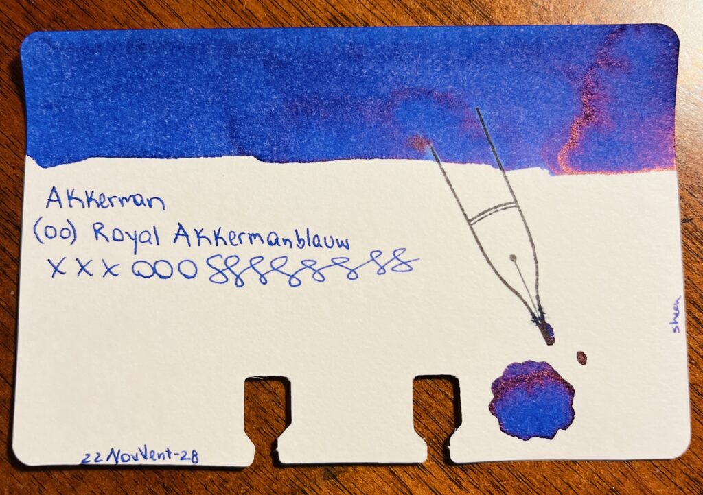
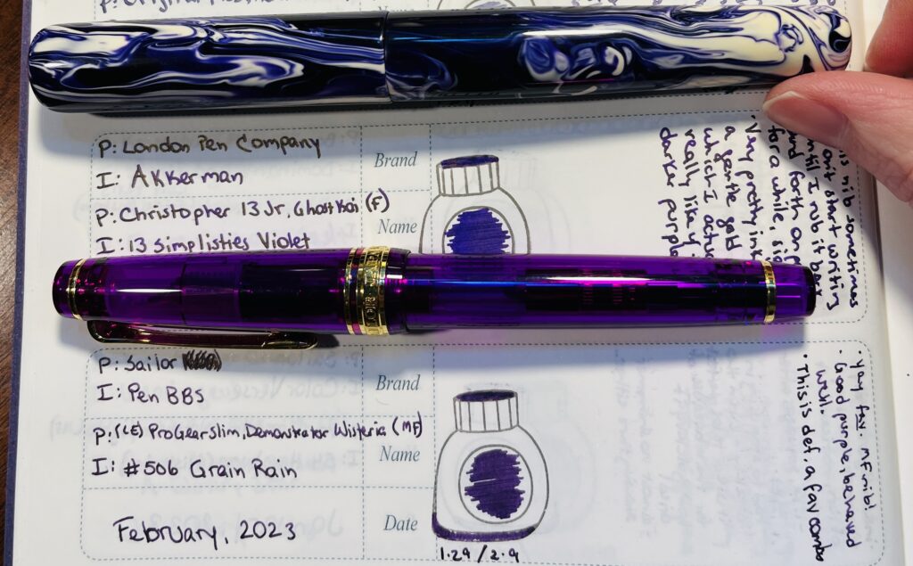
I had a tie in favorites this month. Both of these pens worked so well with the inks in them – and NEITHER ink was a shimmer! Yeah, surprised me too. I had Akkerman 13 Simplisties in the London Pen Co. pen, and PenBBS #506 Grain Rain in the Sailor. They were very soothing to write with which I definitely needed the latter half of the month. Very reluctant to put these away when the ink ran out!

Least Favorite:
I am going to write about the Magic Green drama in another post, so I’ll put a different pen in this spot.
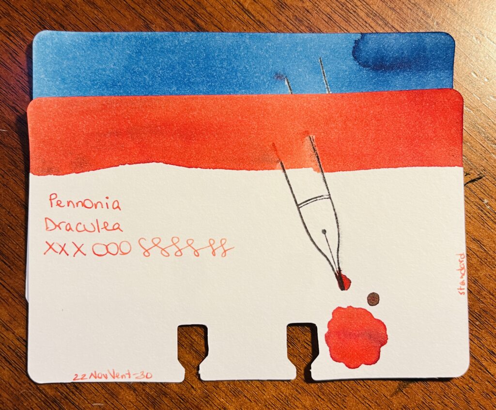
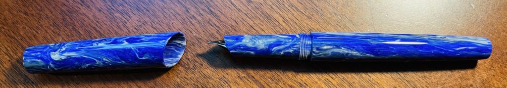
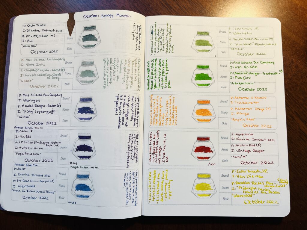
There were actually a couple of pen combos I was having trouble with this month, I really need to stop buying vacuum pens for example. But the least favorite I settled on was a Mad Science Pen Company pen with a 1.1 stub nib and Diamine Inkvent 2022 Alpine. Pen worked great, fine performance flow wise. But the ink was basically black on most of the papers I used it with. Very very faint green in the right light. Silver sheen was pretty visible, but I found the whole thing kind of unappealing. So I think I found one of the few shimmers that looks WORSE in a broad nib! I will do a comparison. Some day.

Learned:
Uhm. I think the biggest thing I learned was really WHY the Magic Green pen was magic for me. Oh and that I really do not like vacuum pens. I have 3. I think I am done at this point haha. Oh and the Osprey nib was annoying – I don’t think flexible nibs are for me. Two years in a row I had a very disappointing February pen/ink experience. Ah well. Third years the charm right?
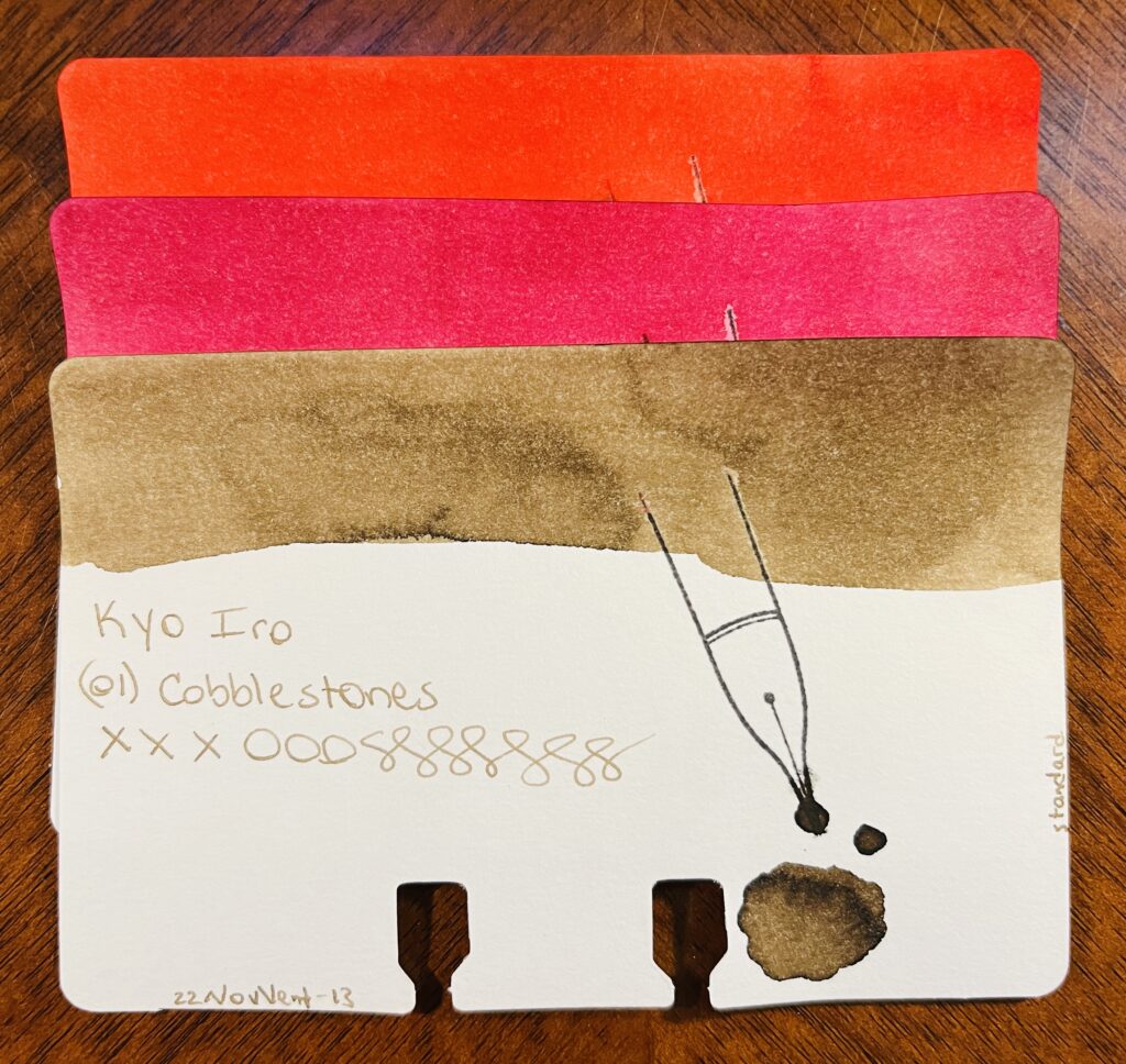
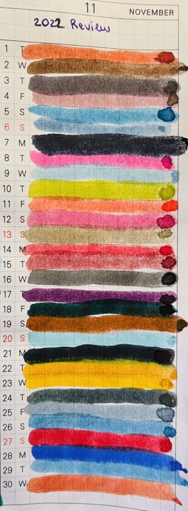
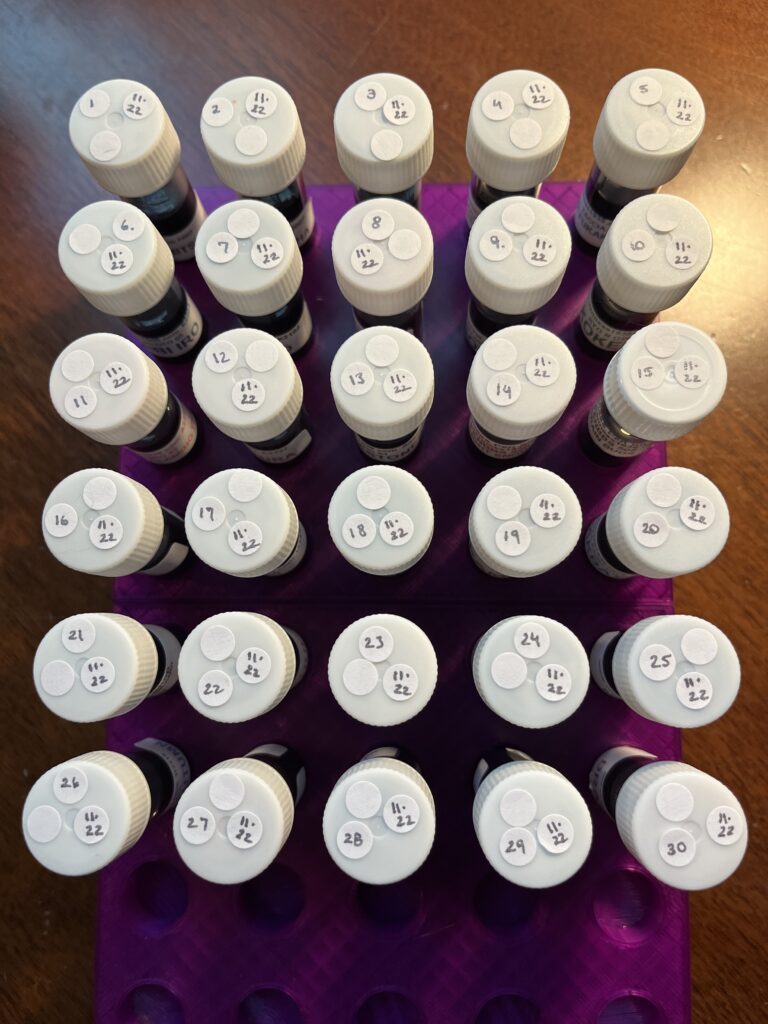
Daily Samples:
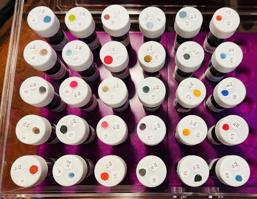
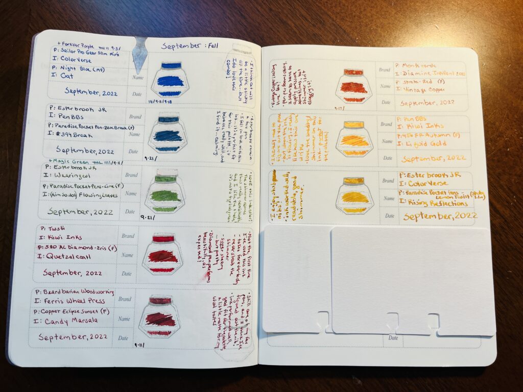
I forget exactly why I picked up so many PenBBS samples but. I did. So another month of PenBBS samples! I do like how these inks behave overall, so this was a nice, chill, reliable start to my day!
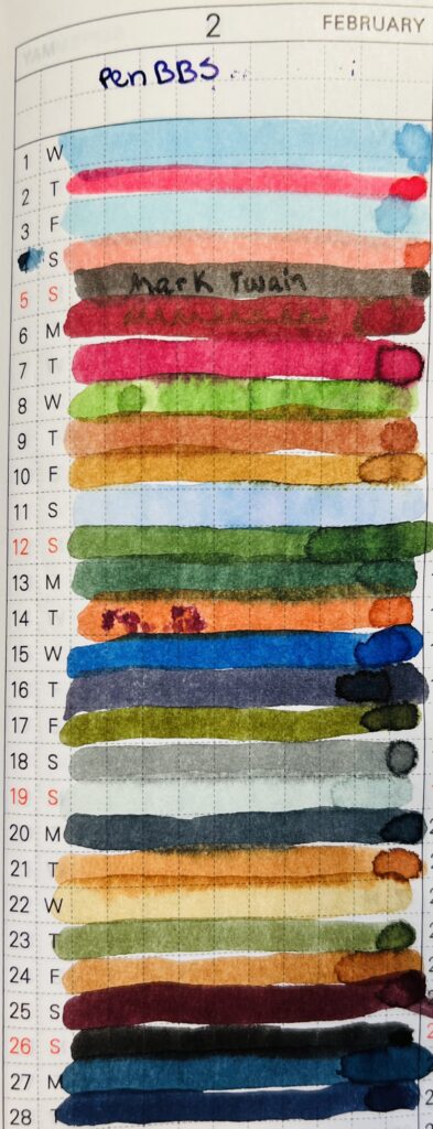
“PenBBS” and “February” are at the top of the page. There are 30 different colored thick lines of ink. Each line is numbered 1-30.
I have started using this part of the notebook to find colors I want to use for my palette – and it is brilliant.

Favorite:
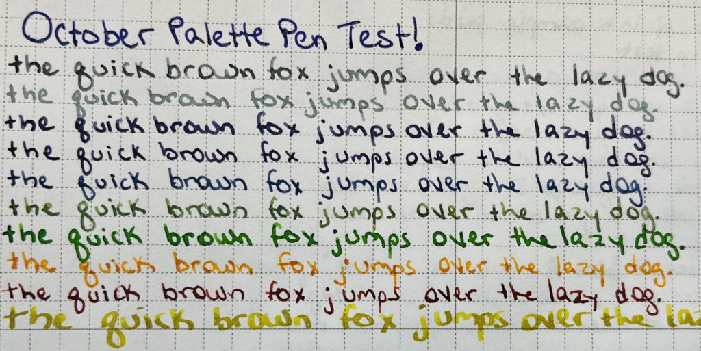
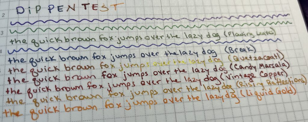
Honestly, I was mostly just enjoying how the ink performed. But wasn’t too excited about the colors this month. I did enjoy the weird of #408 Xiamen on the 11th. You can kind of see it in the photo how the ink sort of shades, it’s mostly a pastel blue but there are brief and very faint hints of pink. It’s too light to write with but I bet the chromatography of it is going to be SUPER fun. Whenever I get into that.
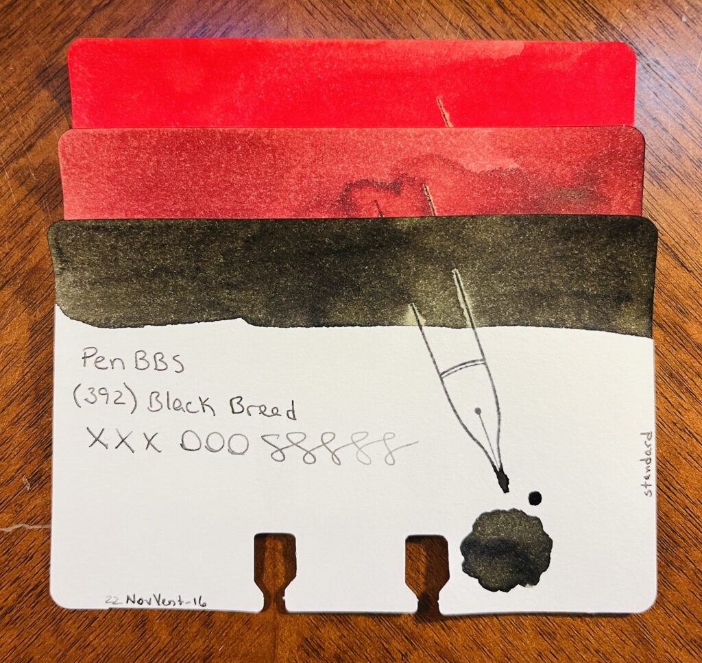
Least Favorite:
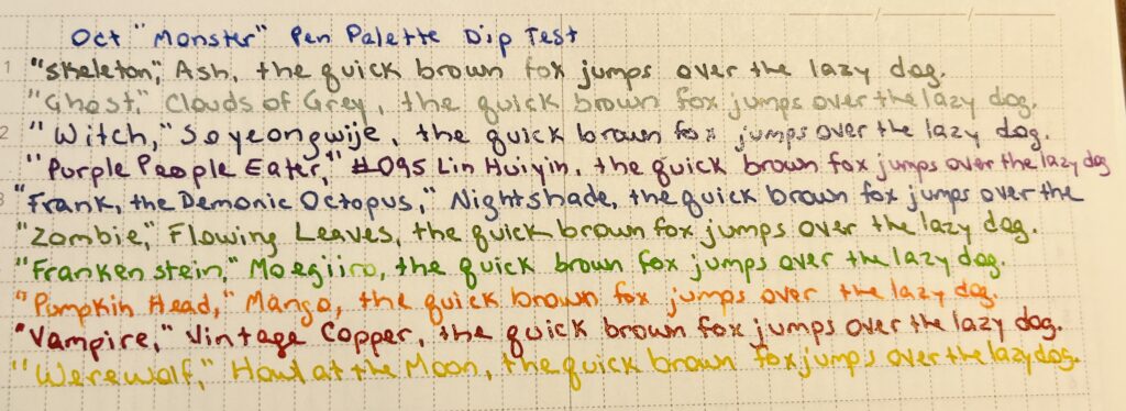
No real strong feelings for the daily samples this month so I guess I’ll go with #387 Mark Twain because it ended up being a pretty basic black. I don’t think I have ever used a black ink. Nor will I!

Learned:
I should probably stop just buying sets of ink to get all of the numbers. Maybe. But it is easier. I am not sure how much longer I’ll end up doing daily samples, which I realized this month. I still find it soothing, and I still appreciate including it in my daily routine. And I DID just start a year long planner for this haha. I probably won’t abandon this until I find something else to replace it, but I will be building some fairly odd palettes in future, often augmented by the Subscriptions samples.

Subscription Samples:
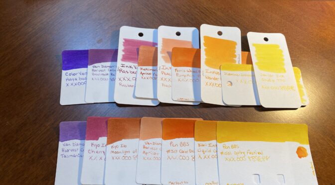
Nope! I got Truphae and Ink Flight but I did NOT sample them in February because for my March Daily Samples, I only had 20 inks. And 12 samples fills in the last 11 needed nicely.

So that’s it. I was incredibly focused on March starting for a couple of reasons – I am trying out planner specific stickers in March from HubmanChubgirl for one, which could be fun – and for another thing, it would be a brand new month to hopefully not go horribly. Also, one month closer to my birthday, yay!
Thank you for your patience my delightful readers!

November Daily Samples, Review: 2022 Samples Review

Whew, using the word review twice in one title is super annoying. I’ll have to think of something better the next time I do this. Anyway – this month’s daily samples are using 8 different ink brands.

A notebook page with a list of inks (these will be shared in the posts below) written in silver ink and then rewritten to the right in the color of the ink named. At the top of the page the text reads “November Daily Samples Year Review” in silver ink.

I pulled each sample randomly from a pile that gives me enough samples for November and January. Then I grouped the inks by brand, so I’ll be showing them grouped like that here. However! I wasn’t thinking and did not take the opportunity to order them by number – if they had one – or by series – if they had one. So, in January, I have to remember that! But, let’s look at the November daily samples:

5 ink sample cards stacked on top of each other. Only the bottom one is visible, and you can see the ink swatch at the top, the name of the brand of ink, the name of the ink, xxxooosssssss, a stamp of a fountain pen nib, a pool of the ink, text at the bottom left reading “22NovVent-5” and on the right edge of the card is the text “standard.” From top to bottom there is a reddish ink, three various brown inks, and a blue ink.
Taccia: Hokusai Benitsuchi, Sharaku Kurocha, Utamaro Usuzumi, Utamaro Ume Murasaki, Hokusai Fukakihanada

Taccia:
Hokusai Benitsuchi: rusty brown, dark red with orange hints.
Sharaku Kurocha: Brown. Very straightforward brown.
Utamaro Usuzumi: Black, slight sheen.
Utamaro Ume Murasaki: A brownish pink.
Hokusai Kukakihanada: Ocean/whale blue – maybe not literally, but that is what it makes me think of?

5 ink sample cards stacked on top of each other. Only the bottom one is visible, and you can see the ink swatch at the top, the name of the brand of ink, the name of the ink, xxxooosssssss, a stamp of a fountain pen nib, a pool of the ink, text at the bottom left reading “22NovVent-10” and on the right edge of the card is the text “standard.” From top to bottom there is a blue, a black, a pink-red, a lighter blue and a light green.
Kyo No Oto: Aonibi Iro, Nurebairo, Iamyou Iro, Hisoku, Kokeiro

Kyo No Oto:
05 Aonibi Iro: Mushy denim blue.
01 Nurebairo: I can’t tell if this is sheen or not? I feel like it is. Super darkest blue with just like…a wet colored sheen honestly?
02 Iamyou Iro: Bright pink, red tones.
07 Hisoku: Light to medium blue, readable, might be chromatic…
03 Kokeiro: Writes out like pea soup, dries to a goose poop greeny brown.

3 ink sample cards stacked on top of each other. Only the bottom one is visible, and you can see the ink swatch at the top, the name of the brand of ink, the name of the ink, xxxooosssssss, a stamp of a fountain pen nib, a pool of the ink, text at the bottom left reading “22NovVent-13” and on the right edge of the card is the text “standard.” From top to bottom there is a orangey-red, a pink, and a light brown.
Kyo Iro: (03) Fushimi’s Flaming Red, (05) Keage Sakura, (01) Cobblestones

Kyo Iro:
03 Fushimi’s Flaming Red: Bright red, leaning towards a dark pink.
05 Keage Sakura: Nice cherry blossom pink.
01 Cobblestones: A really soft brown, or a brown tuned grey? Perfect for cobblestones.

3 ink sample cards stacked on top of each other. Only the bottom one is visible, and you can see the ink swatch at the top, the name of the brand of ink, the name of the ink, xxxooosssssss, a stamp of a fountain pen nib, a pool of the ink, text at the bottom left reading “22NovVent-16” and on the right edge of the card is the text “standard.” From top to bottom there is a brighter red, a more sedate red, and a blackish brown.
PenBBS: (520) Light Snow, (508) Grain Buds, (392) Black Bread

PenBBS:
520 Light Snow: Fall red, orange tones when it’s written lighter.
508 Grain Buds: Makes me think of coffee, both to drink when it’s dark and to stain.
329 Black Bread: Black! A very dark grey is what it dries to.

5 ink sample cards stacked on top of each other. Only the bottom one is visible, and you can see the ink swatch at the top, the name of the brand of ink, the name of the ink, xxxooosssssss, a stamp of a fountain pen nib, a pool of the ink, text at the bottom left reading “22NovVent-21” and on the right edge of the card is the text “standard.” From top to bottom there is a a light maroon, a darker maroon, gold, light blue, and a dark brown.
Vinta: Ubi, Andrada, Pamana, Lakbay, Romblon

Vinta:
Mulberry Ubi 1663: Mulberry purple, dark, only noticeably purple in the light.
Teal Andrata 1898: Dark teal hidden under a purple sheen – or at least it looks like an almost black purple, I suppose it could be read mixing with the teal?
Heritage Brown Pamana 2018: Orangey brown with a green sheen.
Sea & Sky Lakbay 1861: Pretty, light blue, pink shimmer, not sure how much the shimmer comes thru, but when it does, pretty! Kind of dirty looking in the swatch tho.
Black Onyx Romblon 1582: Black/green undertones to the ink, faint dark purple sheen, and a very faint shimmer? Can’t see it in the vial, just the swatches. In writing it’s hard to see because of the sheen so…secret shimmer? I like it tho. For a black ink, nice subtle colors if you look at it right.

6 ink sample cards stacked on top of each other. Only the bottom one is visible, and you can see the ink swatch at the top, the name of the brand of ink, the name of the ink, xxxooosssssss, a stamp of a fountain pen nib, a pool of the ink, text at the bottom left reading “22NovVent-27” and on the right edge of the card is the text “standard.” From top to bottom there is an orange ish, then a yellow, a dark greenish, lighter blue, darker blue, and a bright red.
Wearingeul: Kyonghui, A Star Spattered Hill, Shooting at the Moon, Mature, Stars in Autumn, Human Problem

Wearingeul:
Color of Literature, Project 4, Kyonghui: A sort of tan gold…reminds me of the color you’d see on plastics from the 80’s.
Color of Literature, Project 1, A Star Spattered Hill: A buttery yellow, warm brown tone, gold shimmer. Pretty!
Color of Literature, Project 1, Shooting at the Moon: Dark ink with a faint sheen. The color reminds me of a night sky and that hazy halo that you can see sometimes around the moon.
Demian Literature, Mature: Medium denim blue, grey tones as it dries.
Color of Literature, Project 1, Stars in Autumn: Medium to dark blue with blue shimmer. I feel like I really like this one, the swatch came out really pretty.
Color of Literature, Project 4, Human Problem (Issue): Interesting that an ink called ‘Human Problem’ is the color of blood?

A single sample card, blue ink with a reddish sheen swatch on the top. The text says “Akkerman (00) Royal Akkermanblauw, xxxooosssssss and 22NovVent-28. On the right side of the card the text says “sheen” and there is a pool of ink below a stamp of a nib.
Akkerman: (00) Royal Akkermanblauw

Akkerman:
00 Royal Akkermanblauw: Medium dark blue, reddish sheen, looks purple. Subtle.

2 ink sample cards stacked on top of each other. Only the bottom one is visible, and you can see the ink swatch at the top, the name of the brand of ink, the name of the ink, xxxooosssssss, a stamp of a fountain pen nib, a pool of the ink, text at the bottom left reading “22NovVent-30” and on the right edge of the card is the text “standard.” From top to bottom there is a lighter blue and an orange ish red.
Pennonia: (032) Csontvarys Blue, Draculea

Pennonia:
032 Csontvarys Blue: A sort of sky blue with denim darker blue tones.
Draculea: An orangeish red? Or a reddish orange? Sort of a fall color.

It was nice revisiting these brands. I am looking forward to finishing out these in January!

A notebook page with lines of ink colors on lines numbered 1- 30. At the top in a purple ink is text reading 2022 Review.
Month of iiiiinks!
30 ink vials from the top, only the white caps can be seen, each has 3 stickers. The vials are labeled 1-30, and each has the date 11.22, and each has a single color dot.
Look at all of those pretty vials of ink!

November Daily Samples, 2022 Review, Pt.1

Instead of a new ink – despite having like dozens I wanted to try – I decided to look back and pull inks from the brands I had tried this year. The idea came to me when I was looking at the Pennonia inks to follow the Akkerman inks. There were only a couple more than 30 in both brands (- at least when I was looking at them). And that completion rule I have kept bugging me, and I was trying to think of a way to use the extra ones. Maybe I could build a collection that finishes out each brand? I started looking at all of the other brands, and then the part of my brain that thinks it’s an archivist immediately started doing research into my own past. (It was super fun. Like, for real real.) I looked through notebooks, and looked up specific samples, and ended up realizing that there were some brands that would definitely not fit into a single month. Here’s the list of the ink brands I tried since January of 2022, and then the inks I am planning to sample this month:

30 ink vials from top down, the caps are all white, and they have round white stickers with the date.
So many potentially pretty inks!

January: I hadn’t quite figured everything out in January, so I didn’t focus on just one brand this month, instead it was tiny little glass bottles from Yoseko Stationary that I focused on, because they are adorable. Also I am still figuring out Brand vs. Line of ink. So! Much confusion, and this may not be correct, but I’m trying!
Taccia:
1. Hokusai Benitsuchi
2. Sharaku Kurocha
3. Utamaro Usuzumi
4. Utamaro Ume Murasaki
5. Hokusai Fukakihanada

Kyo No Oto:
6. Aonibi Iro
7. Nurebairo
8. Imayou Iro
9. Hisoku
10. Kokeiro

Kyo Iro
11. (02) Fushimi’s Flaming Red
12. (05) Keage Sakura
13. (01) Cobblestones

February: Robert Oster – so many inks! So none for the Daily Samples in November.

March: Kiwi Inks – finished everything they had at the time, I believe, but will definitely be checking back, because these are fun! Their multi-chromatic shading inks are awesome.

April: Ferris Wheel Press – I had tried a couple of samples based on a friend who recommended them. So, when I saw they had these ”collections” of every ink sample, and that there were enough to fill a months worth of daily samples, I was very excited. This is probably what gave me the idea to deliberately try to find brands with smaller libraries of inks to fit it into a month, after the second month in a row of that working out well.

May: PenBBS – these are always named so interestingly, and weirdly accurately. And numbering them just makes me want to GET THEM ALL. Some day.
14. (520) Light Snow
15. (508) Grain Buds
16. (392) Black Bread

June: Sailor Inks + Robert Oster – these both have super big libraries, as previously mentioned for RO, and this set was themed ”America.” I think there are more being added to the Sailor set, because I had to add Robert Oster ”Cities of America” inks to have enough samples for every day and obviously there are more than 30 states anyway. Maybe next time!

July: Vinta – I was SO EXCITED about these inks when I first heard about them (I still am for the record) because they came with stories attached! I enjoyed it thoroughly. Looking forward to more of these! Also the name on the sample vial is not the full name of the ink AND I KNOW IT. I will add them in the review. The full names are what points at the stories involves, so, that is important context.
17. Ubi
18. Andrada
19. Pamana
20. Lakbay (Fairytale Collection)
21. Romblon

August: Wearingeul – I enjoyed the Vinta inks so much that I looked for something like it – something that gave me an excuse to DO RESEARCH. Serious fun. Oh – these vials were ALSO missing very relevant information which I will add in the review… Because it is the stuff that points back to the literature influence, which means I have just…a whole bunch of new books to read. Which is an EXCELLENT outcome. I get to sample pretty inks, learn about authors that are new to me, and read books that are new to me? So excited.
22. Kyonghui
23. A Star Spattered Hill
24. Shooting at the Moon
25. Mature
26. Stars in Autumn
27. Human Problem

September: Akkerman – only ONE LEFT. (I think?)
28. (00) Royal Akkermanblauw

October: Pennonia – This is the one that really triggered my decision to do this theme for November’s Daily Samples! Because there were only two left, and after Akkerman, I thought, you know what…
29. (032) Csontvarys Blue
30. Draculea

Which brings us to November!

When I was putting this together I quickly realized that if I tried to finish the inks with every one of these brand, I actually have about 2 months worth of Daily Samples…so. I’ll do half in November and half in January. Tada! 🙂 I picked the ones I will be using in November randomly, so this should be interesting. If I get all reds and browns I will be SO SAD. So sad.

Since I enjoyed every brand I’ve tried this year, I am looking forward to this! I especially want to play with the Vinta and Wearingeul inks again. They both have story elements to them, and I love that. Mmmm…research.

October Pen/Ink Palette: Spoopy Monsters, Review!

10 pens lined up side by side. There are a variety of types. There is a grey one, then white, then swirly purple, darker purple, lighter purple, light green, green and purple swirled, orange, red, and last a yellow.
Spoopy Monster Pens! From left to right, Skeleton, Ghost, Witch, Purple People Eater, Frank the Demonic Octopus, zombie, Frankenstein’s Monster, Pumpkin Head, Vampire, Werewolf.

I really like this theme! I did end up swapping out two pens because Mad Science Pen Company made them with the EXACT names of two of my monsters, and I NEEDED them. Ahem.
Solid palette this month. I think my favorites are definitely split between the Mad Science Pen Company pens and the Sailor pens. But it’s pretty close.

Four Sailor Pro Gear Slim pens, laid out horizontally with their caps off and nibs pointed to the left. The top one is sparkly blue, then a blue-purple, a darker purple and a sparkly purple.
Yep, had 4 entire Sailor pens in my palette this month.

I really like the MF nibs from Sailor and the shape and balance of the Pro Gear Slims. They feel effortless. Pretty pen colors too. And the inks behaved nicely as well.

A purple swirly pen laid out horizontally, with the cap off, nib pointed out the left.
Mad Science Pen Company, Hooded Ranger, Proton

Mad Science Pen Company was someone I’d had my eye on from Instagram for a while. What first hooked me was the ”hooded” aspect. I’d never seen something like that before and I ended up really enjoying the aesthetic. And then I missed a pen that had an awesome color – something lime green, if I am remembering correctly. And so it began – I needed one of these pens. And when the Hooded Ranger popped up in that lovely purple, I snatched it up. I really like the balance of these as well, and the decision to pick up the Ghost and Frankenstein was EASY. So Easy. Look at these!

Two pens laid out vertically side by side. The one on the left is a swirly white, the edge of the cap has a swoopy edge instead of a straight edge, kind of looks like a ghost. The one on the right is a green and dark purple swirly, the top of the cap is a little more squared off than this model usually is, and the cap isn’t a straight line, but sort of angled.
Ghost and Frankenstein, by Mad Science Pen Company.

Now for the rest of these! Check out thoughts below:

  1. Skeleton: Ohto – Tasche FF 10T (?) / Diamine Inkvent 2021 – Ash 
    – solid ink, decent writing experience, tiiiiiny pen
  2. Ghost: Mad Science Pen Company, Modified Clingman – Ghost (F) / Vinta Inks, Fairytale Collection – Clouds of Grey
    – switched to Mad Science Pen Company pen on the eleventh. I love this ink, the shimmer is gorgeous. LOVE this pen, writes well, good weight. The nib got a little clogged once or twice, but it cleaned up okay. Also? When this shimmer gets on stuff, it STAYS.
  3. Witch: Mad Science Pen Company, Hooded Ranger – Proton (F) / Wearingeul, Yi Sang Series – Soyeongwije 
    – Gorgeous dark purple ink, shimmer comes thru beautifully. Nib gets clogged – this is not the nib I got delivered with this pen. It took a bit to get unclogged. Gorgeous pen!
  4. Purple People Eater: Sailor Limited Edition Pro Gear Slim Sapporo – Demonstrator Wisteria Purple (MF) / PenBBS – #095 Lin Huiyin 
    – LOVE this pen model, works deliciously. Does not like to be left uncapped – takes a second to start flowing again. Subtle purple ink, really solid performance.
  5. Frank, the Demonic Octopus: Sailor Professional Gear Slim, Manyo – Dianthus (MF) / Diamine Inkvent 2021- Nightshade 
    – Yep, several pens inked that are the same model, BECAUSE I love it. Tada. I love this ink. It is blue, is it purple? Why not both!
  6. Zombie: Esterbrook JR Picket Paradise – Key Lime (F) / Wearingeul Flowing Leaves
    – Continued from September. Love the pen performance. I did hit a clog or two, rinsed it and realized it had run out of ink the first time haha. Beautiful ink, shimmer comes thru great, fun shade.
  7. Frankenstein: Mad Science Pen Company, Modified Ranger – Frankenstein (F) / Kyo No Oto – Moegiiro 
    – Switched to the Mad Science Pen Company pen on the 11th. Beautiful pen, love it, good nib performance. Fun ink color, dark with light popping thru in shading, performs great.
  8. Pumpkin Head: Kaweco AL Sport Limited Edition – Orange (F) / Troublemaker – Mango
    – This nib is still a little wonky, feels like I need to hold it at a low angle to get ink to flow. This ink is super shady – in a good way – and I love it, the dark pops thru in the shade.
  9. Vampire: Monteverde Strata – Red (F)  / Diamine 2021 Inkvent Vintage Copper
    – Sometimes ink does not flow great, but pulled from Sept, writing well enough. I love this ink, the end.
  10. Werewolf: Esterbook JR Pocket Paradise Pocket Pen – Yellow (1.1m Stub) / Van Dieman, Midnight Collection – Howl at the Moon
    – This nib is FUN, and the ink is readable! I like how the dark comes thru, shimmer shows up pretty.
“October Palette Pen Test” in a dark purple ink. On the following lines “the quick brown fox jumps over the lazy dog.” Is written in 10 different color inks. Two grey, three purple, two green, one orange, one red, and one yellow.
October Palette Pen Test!
Monthly Pen/Ink Journal, with the ten combos sampled out. The text is the brand and name of each pen and ink, which you can find in the list above. The comments on how each pen/ink performed is captured in the same list above.
October Monthly Pen/Ink Journal!

I was impressed with these. Couple of wonky ones but not bad enough that I couldn’t use them. Very pleased!

September Pen/Ink Palette: Fall – Review

I enjoyed my palette this month. Fall is not my favorite season weather wise but the house I grew up in was always very very decorated for fall. Very decorated. So I guess now as an adult, I find a fall palette pleasing. I spent a lot of my growing up years in Maine, and the fall leaves there are literally a thing people will take a vacation to go see. Worth it. 

I used a dusky blue, a darker green and a light green, three different shades of orange and two of an orangish and darkish yellow. I felt that this spread covered what I remember of the woods in the autumn, on long drives in Maine. I googled fall palettes, and found one that looked about right and then winnowed down until I had what I ended up using. 

I got to try out a bunch of new inks and a couple of new pens. I made a couple of changes for the pens I started out using:
1. Sailor Pro Gear Slim – Purple Northern Lights (MF) / ColorVerse 54 Hayabusa Glistening
– This is my Forever Purple pen, continues to perform admirably! 
2. Sailor Pro Gear Slim Mini – Night Blue (MF) / ColorVerse Cat
– This is my new Forever Blue pen, had a couple of issues with it sticking a little bit, but that seems to be something I am just going to have to deal with when using ColorVerse Cat. Sad pants.
3. Esterbrook JR Pocket Paradise – Blue Breeze ( F) / PenBBS Break
– This blue ink is really perfect for a fall and I enjoyed writing with it, zero problems. Soothing, really.
4. Hong Dian 5019, Lan Tian – May Flowers (EF) / Ferris Wheel Press Moonlight Jade 
– My Magic Green pen, continues to be magic. 
5. Esterbrook JR Picket Paradise – Key Lime (F) / Wearingeul Flowing Leaves 
– I already knew I liked this pen but I ended up really adoring this shade of green. And the shimmer behaves beautifully. 
6. TWSBI Diamond 580 – Iris (F) / Kiwi Ink Quetzalcoatl
– I do love my Diamond pens. And I’ve used Quetzalcoatl before and it was as lovely as I remember. Although, it’s supposed to be a sheen AND shimmer ink, but the shimmer never comes through on page. I have two theories – one is that the paper I am using just shows sheen better. The second is that sheen always trumps shimmer. I really need to experiment more with papers…
7. Beardbarian Woodworking – Copper Eclipse Sunset (F) / Ferris Wheel Press Candy Marsala
– I really love this pen. Marsala came through lovely, and only got a little stuck once or twice, but resolved on it’s own. 
8. Majohn Wancai Mini Fountain Pen – Transparent Clear (F) Monteverde Strata – Red (F)  / Diamine 2021 Inkvent Vintage Copper
– I switched pens purely because this Monteverde pen was a sparkly red and came in my monthly Truphae box. It writes okay, gets sticky sometimes. Vintage Copper is one of my very favorite inks, but fun fact – I accidentally put some Raspberry Rose back in here when I was emptying some pens about a year ago. It doesn’t seem to have changed the color of this sample bottle of Vintage Copper, but who knows. 
9. Kaweco AL Sport – Gold (B) PenBBS 456 Fountain Pen – Autumn (F) / Kiwi Liquid Gold
– I kept finding ink inside the lid and all over the nib even when the pen hadn’t been dropped, so when my new PenBBS showed up, I switched over. I still haven’t figured out vacuum pens, but that’s on me. I love the way both of my PenBBS pens look, and the writing on this one was mostly fine. The color variations and shimmer came thru nicer with the broad nib, but this wasn’t terrible. I think the times where it felt like the ink wasn’t flowing well was something to do with me not using the vacuum part correctly. I’ll figure it out eventually. 
10. Esterbook JR Pocket Paradise Pocket Pen – Yellow (1.1m Stub) / ColorVerse Rising Reflections
– This is the first time I have used a 1.1m Stub nib and I loved it! Shows off the ColorVerse Rising Reflections shimmer beautifully!


I am considering keeping Flowing Leaves and Vintage Copper for my “Monster” palette in October. I like how Flowing Leaves flows and decided it worked well for Zombie – and Vintage Copper looks good for Vampire. 

I really want to figure out how vacuum pens work. Must science it. My favorite discovery of my palette this month was the 1.1 Stub nib – it’s so good! I wish I wrote larger when journaling, I only ended up using it for headings. It was odd not using any Kaweco’s. I count this palette as a success! 

October Pen/Ink Palette: Monsters/Spoop

A purple notebook and pen holder. There are 10 pens on the left, 9 of them in loops, 1 loose. From top to bottom, a light silver, a darker grey, a blue, purple, white swirl, a dark purple, a light blue/purple, a light green, a dark green, an orange, a red, and a yellow. Above the notebook/pen case is a 3 pen pen case, with the Forever Purple and Blue pens, and the Magic Green pen. On the right of the notebook/pen holder is a purple notebook with two stickers on it. In the top left corner the sticker is 4 ghosts looking out of a front door and a welcome mat. In the bottom right hand corner is a green octopus with a red knit hat and a blue flannel coat. He has a fountain pen in two tentacles, a pumpkin in another, and a coffee cup in another. He is sitting in a pile of autumn leaves.
These are the pens and Captain Log I will be using for October!

Yeah, the theme for this month is definitely not hard to puzzle out – Halloween is in October, Monsters and Spoopy things are Halloween related, therefore! Yeah, it’s not hard. I actually ended up picking out the inks themselves and then relating them to “monsters” – although that word was definitely stretched to fit in several cases…

I concentrated on Purple, Greens, and Oranges, specifically in a saturated fashion. After a WHOLE MONTH with only my one usual Forever Purple in September, I was very excited to play with purples again! Which, ahem, has nothing to do with why I picked purples, I mean, purples are totally a Halloween color, right? Right.

I am using a lot of shimmer, and a lot of inks from my August Daily Samples – Wearingeul – and I am very excited. So, let’s take a look at what “spoopy monsters” I used to justify the colors I picked!

On the left side is a grey ink paired with a silver pen, a silver ink paired with a dark grey pen, a sparkle purple ink paired with a purple and white swirly pen, a dark purple ink with a dark purple pen, and a blue ish ink paired with a blueish pen. On the righ side is a sparkly green ink paired with a light green pen, a light green ink paired with a dark green pen, a bright orange ink paired with a bright orange pen, a dark orange ink paired with a sparkly red pen, and a yellow ink paired with a yellow pen.
All 10 ink sample cards paired with 10 fountain pens.
  1. Skeleton: Ohto – Tasche FF 10T (?) / Diamine Inkvent 2021 – Ash 
  2. Ghost: Pelikan M205 – Moonstone (EF) / Vinta Inks, Fairytale Collection – Clouds of Grey
  3. Witch: Mad Science Pen Company, Hooded Ranger – Proton (F) / Wearingeul, Yi Sang Series – Soyeongwije 
  4. Purple People Eater: Sailor Limited Edition Pro Gear Slim Sapporo – Demonstrator Wisteria Purple (MF) / PenBBS – #095 Lin Huiyin 
  5. Frank, the Demonic Octopus: Sailor Professional Gear Slim, Manyo – Dianthus (MF) / Diamine Inkvent 2021- Nightshade 
  6. Zombie: Esterbrook JR Picket Paradise – Key Lime (F) / Wearingeul Flowing Leaves
  7. Frankenstein: Kaweco AL Sport Aurora Limited (F) / Kyo No Oto – Moegiiro 
  8. Pumpkin Head: Kaweco AL Sport Limited Edition – Orange (F) / Troublemaker – Mango
  9. Vampire: Monteverde Strata – Red (F)  / Diamine 2021 Inkvent Vintage Copper
  10. Werewolf: Esterbook JR Pocket Paradise Pocket Pen – Yellow (1.1m Stub) / Van Dieman, Midnight Collection – Howl at the Moon

(Also the two forever pens and the magic pen – but technically they are not part of this palette, so! I will not be including them in this list.) 

I am very excited about the purple Wearingeul ink and the Vinta. Those look very promising in this dip test:

Each line is written in a different color. Each line reads the “monster” it is inspired by, and the phrase “the quick brown fox jumps over the lazy dog.” I will describe the color of the ink and then the “monster” it was inspired by. . 
Dark Blue: “Oct “Monster” Pen Palette Dip Test”
Dark grey: “Skeleton,” Ash
Light Grey: “Ghost” Clouds of Grey
Dark purple with shimmer: “Witch” Soyeongwije
Purple: “Purple People Eater” #095 Lin Huiyin 
Blueish: “Frank, the Demonic Octopus” Nightshade
Green: “Zombie” Flowing Leaves
Light Green: “Frankenstein” Moegiiro
Orange: “Pumpkin Head” Mango
Red: “Vampire” Vintage Copper
Yellow: “Werewolf” Howl at the Moon
October Monster INK Palette – it should say! Since I used a metal dip pen to sample each one.

Howl at the Moon seemed like an ink that is to pale to use very much when I first sampled it back in December, but now I have started using stub nibs and I want to see how well the ink shows up from a broader nib! And I got the Troublemaker ink in the September Ink Flight and I fell instantly in love, so barely looked at other oranges when I was picking those out haha. Oh! And Frank, the Demonic Octopus is a reference to a creature my Game Master for a game of Dungeons and Dragons introduced, we fought, and my character – an ambulatory wheelchair using Wizard Librarian, who casts spells with a fountain pen and ink – got a bottle of demonic octopus ink. 🙂 Really I am excited about all of these inks, but thought calling out those specifics would be fun. 

September Ink/Pen Palette: Fall

Picking colors for my September pens and inks was a little difficult for me because the theme is “Fall” and fall colors have a lot of red in them and I do not like red. I resorted to google and ended up finding a really nice set of 5 colors – and I have no idea how to describe them professionally, but here we go! Sort of like a teal, evergreen-y type blue, a kind of muted moss green, a rust reddish, an orange that is like a yellow-orange and a yellow that is closer to an orange. Yep. Doing great. 

Remember last month when I said I might keep my blue Sailor mini with Cat in it as part of my permanent pens? Well now we have the Forever Purple, Magic Green, and now a Forever Blue. Besides those three, I realized I was looking for colors really similar to my “sunset” theme, but the biggest difference for me was the colors for August were more vibrant and the ones for September are more muted. Insert something clever here about saturation? I am sure Aaron said something about saturation at some point and clearly that did not stay in my head. 

I’ve got 10 pens this month and besides the three forever pens, none of the inks/pens are being carried over from August. That’s not because I didn’t like them, but they just didn’t end up working with the muted theme I was trying. And yes, I ended up with a kind of rainbow again and I refuse to be upset by this. I like rainbows. 

Ten pens and ten sample cards in two columns. Each pen is laid on top of a sample card just below the swatch of color at the top of the card.
10 pens in two columns, one purple, two blues, two greens on the left, 3 red/orange and 2 orange/yellows on the right

  1. Sailor Pro Gear Slim – Purple Northern Lights (MF) / ColorVerse 54 Hayabusa Glistening
  2. Sailor Pro Gear Slim Mini – Night Blue (MF) / ColorVerse Cat
  3. Esterbrook JR Pocket Paradise – Blue Breeze ( F) / PenBBS Break
  4. Hong Dian 5019, Lan Tian – May Flowers (EF) / Ferris Wheel Press Moonlight Jade 
  5. Esterbrook JR Picket Paradise – Key Lime (F) / Wearingeul Flowing Leaves 
  6. TWSBI Diamond 580 – Iris (F) / Kiwi Ink Quetzalcoatl
  7. Beardbarian Woodworking – Copper Eclipse Sunset (F) / Ferris Wheel Press Candy Marsala
  8. Majohn Wancai Mini Fountain Pen – Transparent Clear (F) / Diamine 2021 Inkvent Vintage Copper
  9. Esterbook JR Pocket Paradise Pocket Pen – Yellow (1.1m Stub) / ColorVerse Rising Reflections
  10. Kaweco AL Sport – Gold (B) / Kiwi Liquid Gold

I picked up a 1.1m stub nib for one of my Esterbrook pens, and I am interested to see how it handles that shimmer ink. Yellows kind of need a broader application I think…who knows, I usually use fine nibs!

The Vintage Copper is going into one of those clear Majohn mini pens because I anticipate it being gorgeous like the one I was using in August. Twsbi diamond is one I usually enjoy, so looking forward to that, Kaweco is a known great – but a broad nib, so we shall see if I still like it. And I am reusing the Beardbarian pen because it is my favorite right now. 

Because I am not wild about all of the colors individually or in pairs, I am going to try using them as a whole palette instead of singly. I have been using a different pair of pens every day of the week, to distinguish the days, to use the pens more regularly, and the pair instead of one so I could have an easier time navigating my notes. This month I will be seeing how annoying it is to switch out every pen for every new line item in my work notebooks instead, in an attempt to not grow to dislike a single color so much I stop using it. Granted, if that does happen – and it might – I can just switch out the ink and/or pen. Still, might be interesting.

Because of the ink swap last month immediately after putting that one orange in a pen and seeing how mushy it was, I decided this month to try the inks on my usual paper before getting them into pens.

Notebook page, “Dip Pen Test,” each ink I am planning on using written out with the phrase “the quick brown fox jumps over the lazy dog” except for the three pens I am keeping. There is a shimmer green, a blue, then a red with gold sheen, two reds, a dark yellow shimmer, and an orange ish shimmer.
Each line is a different ink color

You may notice the 3 reds in there that look very similar. Because of this, the new rule (for next month) is to dip test the inks before I decide on a palette, instead of just before I put them in a pen.

Wish me luck!

August Palette, Ink Colors Narrowed

Let’s continue where we left off, shall we? In my last post I showed you how I start to pick inks out for my monthly palette. I go thru all of the inks I have in my sample library and start – you know what? If you want to know more about how I started, go read THIS post. 

Today I narrowed down my choices to two different – but similar – palettes. I usually have a rather flamboyant ink in the pen I put my custom nib in. I had two options for August and I ended up picking the one I haven’t used yet, just for fun. It also happens to be a better option for my sunset theme.

2 sample cards laid on top of each other on a wooden desk. The swaps are both blue inks with red sheen and silver sparkle, but each is slightly different. The card on top is Birmingham Ink: Galactic (twinkle) and the one on the bottom is partially covered, but Ferris Wheel Press can be seen.
Ferris Wheel Press and Birmingham Ink
A single sample card on a wooden table of Ferris Wheel Press 
FerriTales: Down the Rabbit Hole
Tumbling Time Blue. There is a stamp on the card that looks like a fountain pen nib with a cats face engraved on it.
Ferris Wheel Press
FerriTales: Down the Rabbit Hole
Tumbling Time Blue

Next, I need to match my new colors to ones I end up keeping. For August I am keeping two inks from my July palette, an orange I am way too in love with and what I am referring as my Forever Purple. (It’s ColorVerse Hayabusa, in a Sailor Pro Gear Slim Northern Lights – it is my favorite.) Because my theme for August is “sunset,” and purple is technically a color that can be found in a sunset, I used that as an excuse to start this whole process. Any excuse to start with purples really. I’ve managed to keep purples relevant to these palettes for months now, haha. So, I took the Hayabusa sample and started by comparing the purples I have to that one. 

Two cards, side by side but overlapping a little in the middle. On the left is ColorVerse Hayabusa and on the right is PenBBS Purple Sky. Hayabusa is a sparkly warm purple, and Purple sky is cooler purple with no sparkle.
ColorVerse Hayabusa and PenBBS Purple Sky

Every purple in the pile gets compared back to the first purple. I am looking for two things primarily this time – a color that is distinct from the Forever Purple, but also goes with it. I discard purples that look too dark or too light or fall outside of the theme. I ended up with a lot of options left over – which is intentional. I don’t want to narrow it down too much at the beginning.

Pile of sample cards of purple inks, ranging from cool purples to warm purples. They are overlapping so the writing on them is close to each other.
Pile of sample cards of purple inks, ranging from cool purples to warm purples.

Once I have a more manageable collection of purples, I start adding in the magentas. I’ve already made certain decisions which can roll into the next color – for example, the samples that are too dark or light, those can be discarded quickly. And I can get rid of obviously too bright magentas. I’m again looking for a color that is distinct from the purples I have picked and yet still has a smooth transition which is the effect I am looking for this time. I ended up with a decent set of options.

Lots of sample cards on a wooden desk. The purples have been narrowed down to 4 options, and there are magenta sample cards placed around it in smaller groupings or singly.
The magenta sample cards are circling the line or purple sample cards.
5 purple sample cards in an overlapping line on top, 5 magenta sample cards on the bottom.
Two lines of sample cards, purple on top and magenta’s on bottom.

Next up are the oranges. I actually had three fairly distinct oranges – a darker orange, a sort of straight orange which is a bit brighter, and then a kind of peach color. All of these would work well in a sunset theme, but I needed to see what worked with the purples and magentas I pulled. Choices so far continue to help me make some easy choices. I’m always getting rid of colors that are darker or lighter than I want for that month’s palette. Now I remove doubles – colors that are super similar to each other – or practically identical. I ended up not being able to narrow this pile down too far, because I really liked the three distinct oranges I started with. No worries, I still have another color to look at, that should help me decide. 
To pick the yellows I really have to look at the writing on the card to see how readable it is. Many yellows are too hard to read when written with the nibs I use. And for the palette I’m looking for, I got rid of the darker ones as well. 
Actually, I use the writing on each card to make my choices. So I’ll line up the cards so the writing is side by side. The swabs are gorgeous and good for picking broad swathes of color. But often the writing turns out very different from the swab. Close enough but when I am getting down to picking a color for sure, I want to look at the writing on the card. 

Line of 5 purple cards, underneath that is 5 magenta cards, below that is 5 darker orange cards, then 6 medium/bright oranges, under those are 3 peach colored oranges, next is 4 orange/yellows, then 5 brighter yellows. These rows are all overlapping the ones above and below and beside each other.
7 lines of sample cards overlapped so the writing on each card is closer to other cards writing.

Next I narrow things down, this time I end up with 3-4 options per color. Each color gets compared to the one before it. I want a transition that reminds me of a sunset, so I’m comparing each color to the ones on either side, so I don’t end up just matching everything off the Forever Purple. Frankly, if the palette I end up with doesn’t work well with that purple – it’s fine. I have two colors that have been constant for months now, and they don’t have to go with the palette because I am keeping them for different reasons. I’ll go into that in another post. 

Sample cards still laid out in rows by color grouping, with new group colors overlapping them from top to bottom. 3 purples, 3 magentas, 2 darker oranges, 4 medium/bright oranges, 3 peach oranges, 3 orange/yellows, 3 yellows.
Narrowed down choices for each color.

And lastly – my choices, and my secondary choices. This is where I narrow things down to two very similar palette’s. I do this for three reasons. Firstly, I want to be able to walk away and look at something else for a bit before making the final decision. At this point I will have been staring at these colors for at least a half hour. Second, Husband is the color expert in this house. He literally used to do that for a living, making sure colors were accurate. And third is that I like keeping him involved in my silly hobby. This is an easy for us to collaborate. And it’s fun explaining my thought process to him and what I am looking for. 

First palette option:
ColorVerse, Hayabusa
Van Dieman’s Harvest Collection, Beetroot Relish
Diamine 2021 Inkvent, Raspberry Rose
Kakimori, Apricot Tea
Diamine 2021 Inkvent, Peach Punch
Ferris Wheel Press, Pumpkin Patch
Diamine 2021 Inkvent, Wonderland
Diamine 2019 Inkvent, Gold Star
Sailor Ink, Studio 770
Second Palette Option:
Van Dieman’s Harvest Collection, Tasmanian Lavendar
Kyo Iro, Cherry Blossom of Keage
Kyo Iro, Moonlight of Higashiyama
Van Dieman’s Harvest Collection, Apricot
PenBBS, #517 Cold Dews
Kiwi Ink, Liquid Gold
PenBBS, #501 Spring Festival

And that’s where I’ll leave it today! When I’ve got these two sets of options like this I can start seriously matching pens to the possible ink colors. Often I have some ideas already – for example, I had already pulled all of my orange pens for this palette as soon as I decided on the sunset theme. I also have a new purple and a new tiny clear one I want to try. But I don’t always know which colors I am going to pick until the very end and sometimes I don’t know when a new pen might be coming in, so I keep my options open.

By next weekend – the end of the month – I will have picked both the palette and the pens, because I’ll need to set them up and I’ll reveal that next time! Until then, if you have a favorite color from this post, please share!

First palette option in a row on top, second palette option in a row on the bottom.