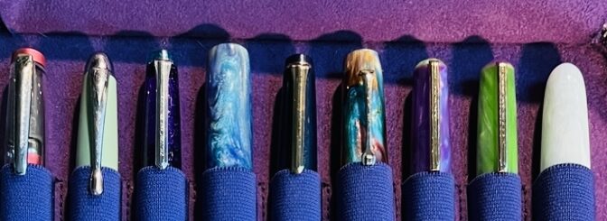
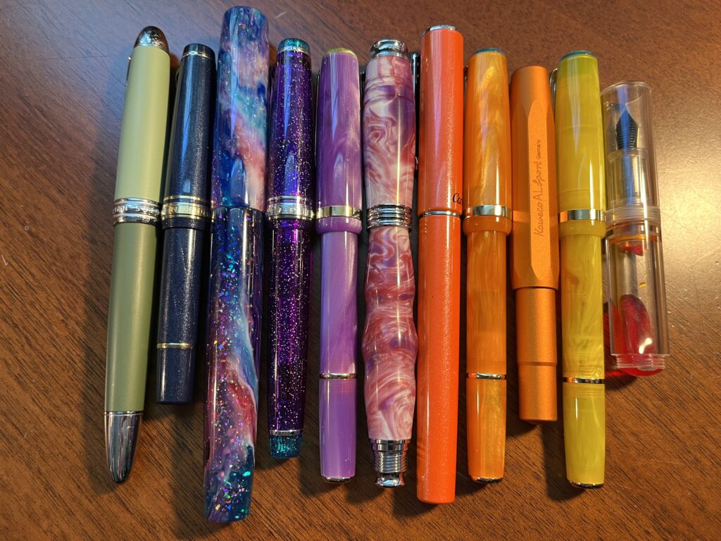
10 pen and ink combos for November. One from each of the previous 10 months in 2022.
I was originally going to theme this months palette “Comfy” but I started thinking about which inks and pens I would deme comfy and then realized I was thinking of pens and inks I had used in palette’s already this year that I enjoyed using. Then it hit me – I was already going to do a sort of review of the Monthly Samples – I could use one combo from every month palette this year! Matchy matchy. Since April I’ve been keeping track of the performance of each combo, so the only ones that would be tricky is Jan – Mar. Those will probably be wild cards. (Oooo except Magic Green from March!)
And it was EASY. Because in each month there is usually a combo that I enjoyed memorably. There were two difficult months, and very little info on how I felt about the pens I used in January thru March, but I ended up with 10 pens I am extremely excited to use. I did end up swapping out the pen paired with three of the inks – I’ll explain in the list. And to determine the best choice for the January and February pens I had to sort of look at how long and how often I would use the pen. There were a couple I remember filling early on and then reluctantly keeping them filled but not wanting to use them… I did that, of course, until I remembered this whole monthly change of pens and inks is supposed to be fun. And if I don’t like a combo nowadays I give it a day or two and then clean it out. Hopefully that won’t be an issue this month?
Tada! The list of inks and pens is below.
Let’s look at our options this month, shall we!
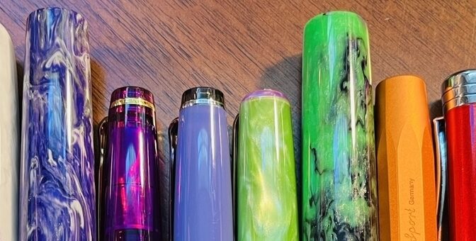
Twsbi Diamond – Prussian Blue (F), Diamine Inkvent 2021 Subzero – this ink was originally in a Twsbi Eco and I decided the Diamond is just a little step up.
Bonecrusher7Studios – Monet (1.1stub), Ferris Wheel Press, April Showers – this ink was originally in my Gravitas, but it was using the custom nib, so I figured I’d just put the nib in one of my favorite pens and go from there!
One of the things I liked about this palette was that I could use the three favorite pens without them just being extra to the palette, they are actually part of it. And I am really looking forward to a nice cozy month with pens I know I like, even when they get a little blocked and won’t write. Because the inks and pens are WORTH it.
Some of my choices were combos that I continued using into the next month. And the palette actually really came together. I was sitting and contemplating it, and Husband looked over my shoulder and was like WHOA That looks incredible! 🙂 Hope it goes as well as it looks!
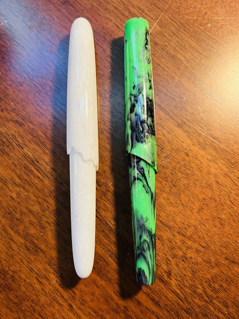
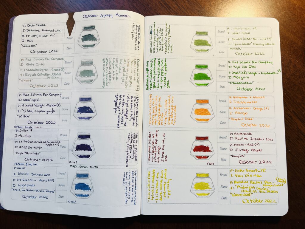
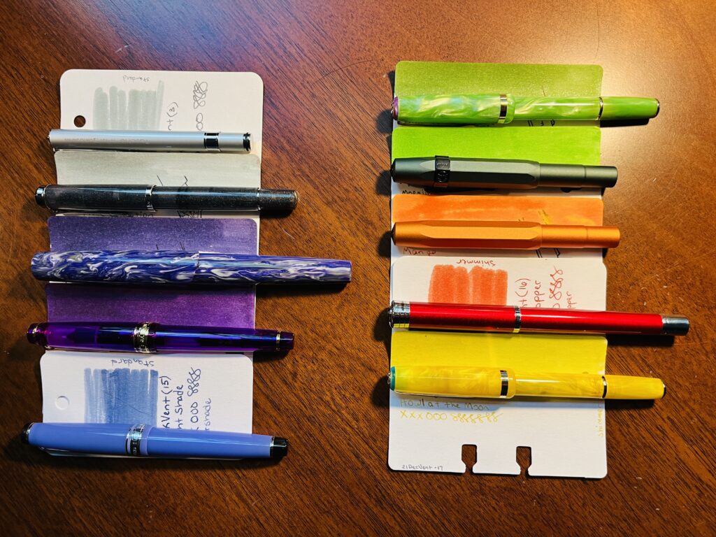
Spoopy Monster Pens! From left to right, Skeleton, Ghost, Witch, Purple People Eater, Frank the Demonic Octopus, zombie, Frankenstein’s Monster, Pumpkin Head, Vampire, Werewolf.
I really like this theme! I did end up swapping out two pens because Mad Science Pen Company made them with the EXACT names of two of my monsters, and I NEEDED them. Ahem. Solid palette this month. I think my favorites are definitely split between the Mad Science Pen Company pens and the Sailor pens. But it’s pretty close.
Yep, had 4 entire Sailor pens in my palette this month.
I really like the MF nibs from Sailor and the shape and balance of the Pro Gear Slims. They feel effortless. Pretty pen colors too. And the inks behaved nicely as well.
Mad Science Pen Company, Hooded Ranger, Proton
Mad Science Pen Company was someone I’d had my eye on from Instagram for a while. What first hooked me was the ”hooded” aspect. I’d never seen something like that before and I ended up really enjoying the aesthetic. And then I missed a pen that had an awesome color – something lime green, if I am remembering correctly. And so it began – I needed one of these pens. And when the Hooded Ranger popped up in that lovely purple, I snatched it up. I really like the balance of these as well, and the decision to pick up the Ghost and Frankenstein was EASY. So Easy. Look at these!
Ghost and Frankenstein, by Mad Science Pen Company.
Now for the rest of these! Check out thoughts below:
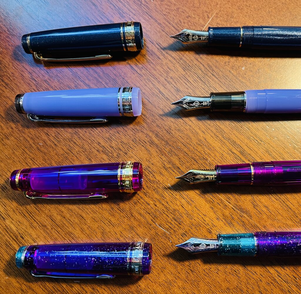
Frank, the Demonic Octopus: Sailor Professional Gear Slim, Manyo – Dianthus (MF) / Diamine Inkvent 2021- Nightshade – Yep, several pens inked that are the same model, BECAUSE I love it. Tada. I love this ink. It is blue, is it purple? Why not both!
Zombie: Esterbrook JR Picket Paradise – Key Lime (F) / Wearingeul Flowing Leaves – Continued from September. Love the pen performance. I did hit a clog or two, rinsed it and realized it had run out of ink the first time haha. Beautiful ink, shimmer comes thru great, fun shade.
Pumpkin Head: Kaweco AL Sport Limited Edition – Orange (F) / Troublemaker – Mango – This nib is still a little wonky, feels like I need to hold it at a low angle to get ink to flow. This ink is super shady – in a good way – and I love it, the dark pops thru in the shade.
Vampire: Monteverde Strata – Red (F) / Diamine 2021 Inkvent Vintage Copper – Sometimes ink does not flow great, but pulled from Sept, writing well enough. I love this ink, the end.
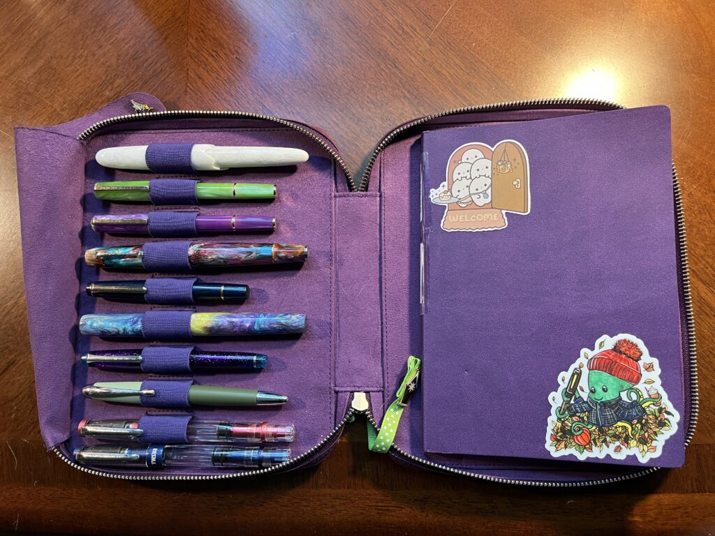
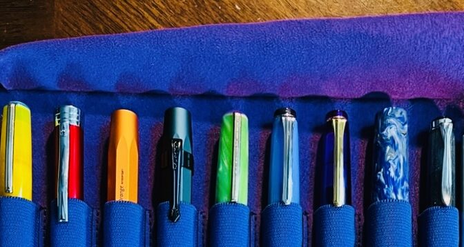
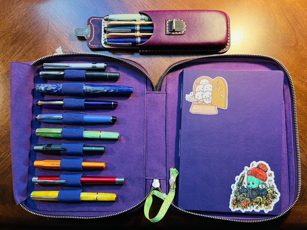
These are the pens and Captain Log I will be using for October!
Yeah, the theme for this month is definitely not hard to puzzle out – Halloween is in October, Monsters and Spoopy things are Halloween related, therefore! Yeah, it’s not hard. I actually ended up picking out the inks themselves and then relating them to “monsters” – although that word was definitely stretched to fit in several cases…
I concentrated on Purple, Greens, and Oranges, specifically in a saturated fashion. After a WHOLE MONTH with only my one usual Forever Purple in September, I was very excited to play with purples again! Which, ahem, has nothing to do with why I picked purples, I mean, purples are totally a Halloween color, right? Right.
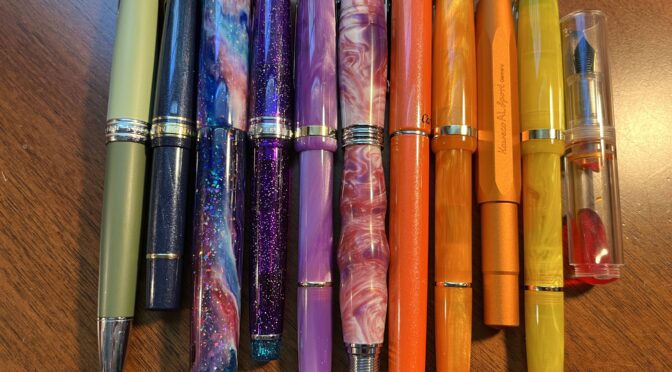
I am using a lot of shimmer, and a lot of inks from my August Daily Samples – Wearingeul – and I am very excited. So, let’s take a look at what “spoopy monsters” I used to justify the colors I picked!
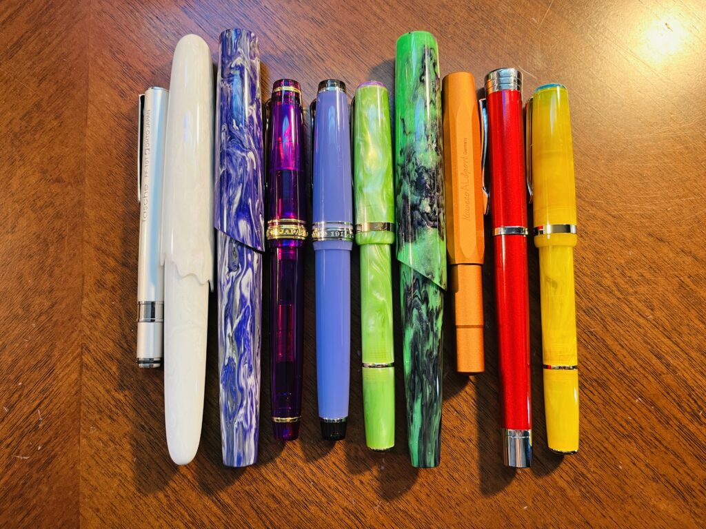
All 10 ink sample cards paired with 10 fountain pens.
(Also the two forever pens and the magic pen – but technically they are not part of this palette, so! I will not be including them in this list.)
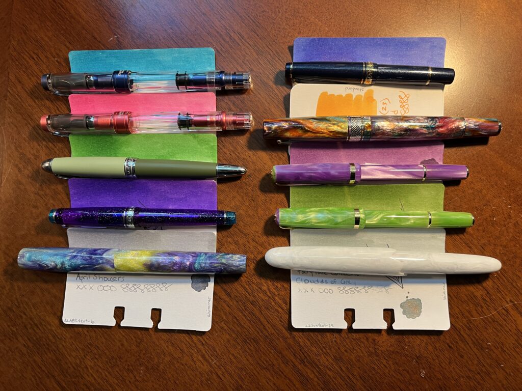
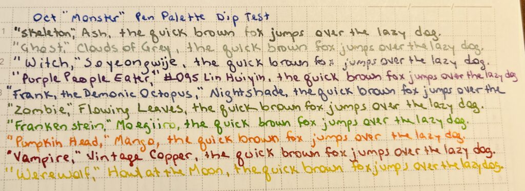
I am very excited about the purple Wearingeul ink and the Vinta. Those look very promising in this dip test:
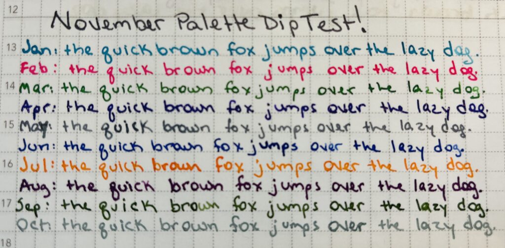
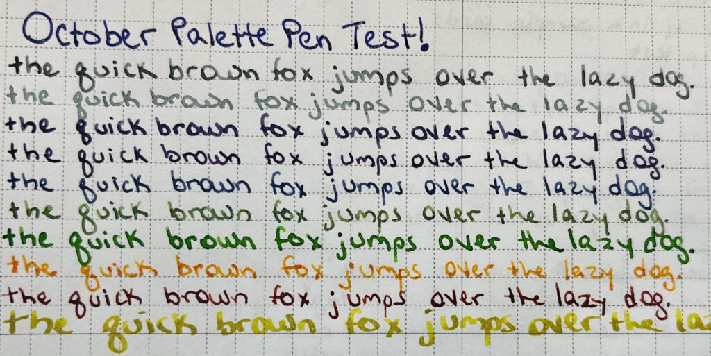
October Monster INK Palette – it should say! Since I used a metal dip pen to sample each one.
Howl at the Moon seemed like an ink that is to pale to use very much when I first sampled it back in December, but now I have started using stub nibs and I want to see how well the ink shows up from a broader nib! And I got the Troublemaker ink in the September Ink Flight and I fell instantly in love, so barely looked at other oranges when I was picking those out haha. Oh! And Frank, the Demonic Octopus is a reference to a creature my Game Master for a game of Dungeons and Dragons introduced, we fought, and my character – an ambulatory wheelchair using Wizard Librarian, who casts spells with a fountain pen and ink – got a bottle of demonic octopus ink. 🙂 Really I am excited about all of these inks, but thought calling out those specifics would be fun.
Twelve pens is a lot of pens but I am happy to report that I really used most of them. There were two with weird nibs, but after I tuned them they were okay. There was a yellow that was mostly too light for me to read, so ended up doing mostly accents with it. My header pen only saw use on headers because I was worried about running out of that ink – didn’t have a lot of them. I will say switching out that one orange ink was a very good idea.
I am now realizing how vague this is going, so let’s just list them all out instead!
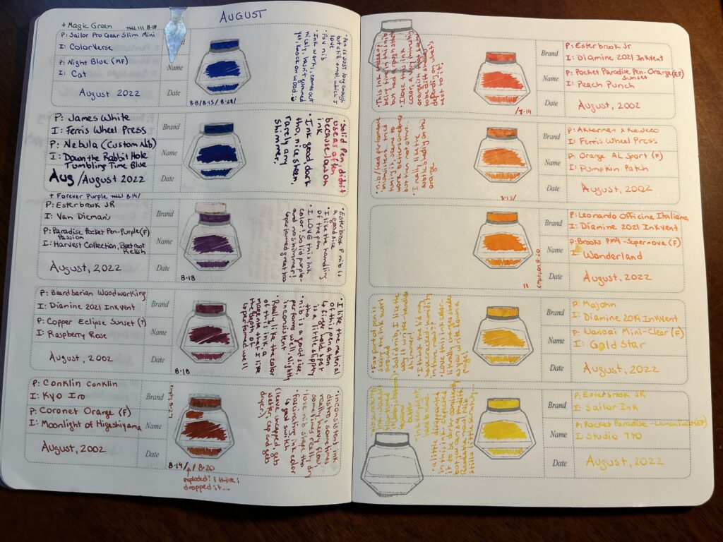
Record of August pens and inks and FEELINGS
1. Hong Dian 5019, Lan Tian – May Flowers (EF) / Ferris Wheel Press Moonlight Jade – Magic Green Pen! I adore it. The end. (Refilled 9 times) 2. Sailor Pro Gear Slim Mini – Night Blue (MF) / ColorVerse Cat – New Forever Pen! Shall dub Forever Blue – pretty much identical experience to the Forever Purple pen, just a different favorite shimmer ink. – “Pen is JUST long enough, but still smol, which I love. Fav nib. Ink works, comes out nicely, hasn’t gummed yet, knock on wood. :)” (Refilled 3 times) 3. James White – Nebula (Custom Nib) / Ferris Wheel Press Tumbling Time Blue – Solid pen, didn’t use it a ton because low on ink. Ink good, dark tho, nice sheen, rarely any shimmer. 4. Sailor Pro Gear Slim – Purple Northern Lights (MF) / ColorVerse 54 Hayabusa Glistening – Forever Purple Pen! Also adore this one. The end. (Refilled 7 times *yay*) 5. Esterbrook JR Paradise Pocket Pen – Purple Passion (F) / Van Dieman Beetroot Relish – “Esterbrook F nib is a good size. I like the handling of the pen. I LOVE this ink color! Solid purple – and no shimmer! Performed great too.” (Refilled 1 time) 6. Bearbarian Woodworking – Copper Eclipse Sunset (F) / Diamine 2021 Inkvent Raspberry Rose – “I like the material of this pen a ton – the finger hold spot is a little slipper tho. Nib is a good size, performs well usually, slightly inconsistent. Really like the color of this ink, a magenta I like the depth of – performed well.” (Refilled 1 time) 7.Conklin – Coronet Orange (F) / Kyo Iro Moonlight of Higashiyama – “Inconsistent ink distro, sometimes really heavy flow, sometimes really dry. Love the nib shape tho. Fascinating ink color – glad I switched it out! (Leave uncapped, gets wetter, caped, gets dryer?)” (Refilled 2 times – exploded a little bit once, maybe because I dropped it) 8. Kaweco AL Sport Limited Edition – Orange (F) / Ferris Wheel Press Pumpkin Patch – “Nib/feed performance inconsistent…tried tuning it, seems to work better sometimes but then not others…I really like the subtle shading on this orange.” (Refilled 1 time) 9. Leonardo Officina Italiana Brooks PM4 Limited Edition – Supernova (F) / Diamine Inkvent 2021 Wonderland – Still love this ink. It ended up not really fitting in the palette – so when it ran out on the 20th, I just didn’t refill it. 10. Esterbook JR Pocket Paradise Pen – Orange (EF) / Diamine 2021 Inkvent Peach Punch – “This ink ended up being fine in this nib, but had a rough start. I love this ink color, a very interesting orangish that seems to be different shades depending on what’s next to it!” (Refilled 1 time) 11. Esterbook JR Pocket Paradise Pocket Pen – Yellow (EF) / Sailor Ink Studio 770 – “Nib scratchy, ink wouldn’t flow, tuned it (baby’s bottom?) and seems better. Ink very light, hard to read. A little disappointed in this ink 0 expected it to be darker consistently but you can see the difference. Readable now! Nib still a little scratchy.” 12. Majohn Wancai Mini Fountain Pen – Transparent Clear (F) / Diamine 2019 Inkvent Golden Star – “Fav part of pen is seeing the ink swirl around. Solid nib, I like the way it writes – can handle shimmer! I think the cap may have cracked – humidity in there now?? Love this ink color – literally changes shades as you write down a page!”
So, if I had to pick a favorite (besides my Forever Pens) it would have to be either the purple Esterbrook with Beetroot Relish in it, or the Majohn with Golden Star in it. For different reasons. Oo! Or the Beardbarian with Raspberry Rose. It was a good month!
My theme for July was “Summer.” picked ink colors that reminded me of a pool, or a beach, or a beach ball. It is a very fun palette. I was able to match pens with inks pretty well, but I also started out with two wooden pens, which did not match (which is fine because they are soooo pretty). Over all I liked how this palette worked, although I did end up switching out one pen after the first week, because the nib needs some tweaking. There are several colors I would like to use again in the future, but first! The palette!
(Originally) Beardbarian Woodworking – Walnut Burl Anniversary (M?) / Robert Oster Envy (swapped this out because the nib was really hard to write with and the line was much thicker AND the ink was really sticky in the syringe I filled the converter with which made me nervous for the pen. So when I got the Esterbrook, I switched it out.)
(If there are no links it is because I could not find it, my apologies!)
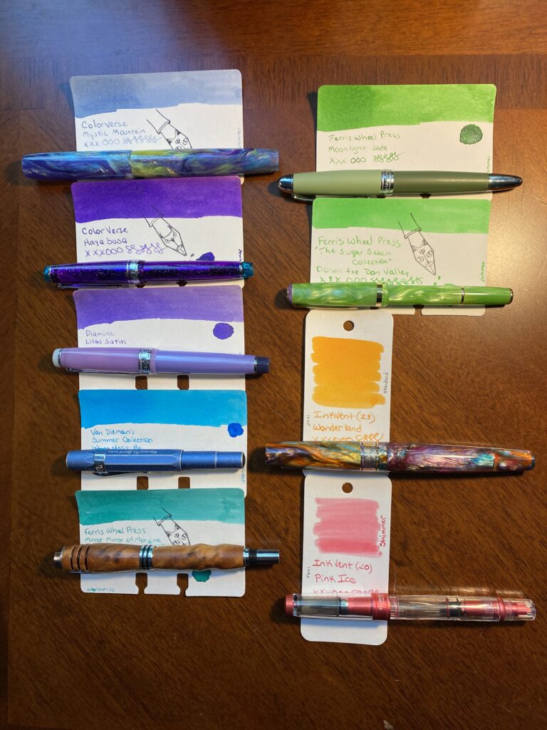
I think my favorite in this set (besides my usual favorites like Forever Purple and Magic Green) were Wonderland in the Leonardo and Down the Down Valley in the Esterbrook. The Esterbrook matched the ink in it PERFECTLY which I was especially pleased by. The Wonderland ink is a very wet ink but it is really pretty, both the shine when it went down on paper and after it dried. Those blues are super pretty but the pens gave me some trouble. I was surprised at the Kaweco not feeding well, and I need to get a new nib for the two Beardbarian pens. Twsbi performed well as usual. And the Salior Pro Gear NOT Slim confirmed for me that I definitely prefer the Slim version haha. But it is pretty and the ink matched it really well. And the James White pen is a mesmerizingly pretty resin, and I really like the Mystic Mountain ink because it is so pretty when you can really get the shimmer out – there are a bunch of different color shimmers in that one ink – which I was able to do with that custom nib.
Overall this was a great palette. I liked all the pens and inks I ended up with by the end of the month. (And the one I had to swap out just needs a new nib, the pen itself is really well balanced and I enjoyed writing with it.) The colors contrasted really well with each other. And I had two of each shade – two purples, two blues, two greens, and I used the orange and pink as a pair which meant I could try out making my work notes more readable by alternating colors on bullet items and between meetings, and use a different pair each day (rainbows on Friday). It meant I got to use more of my pens every day, which I like, and it did make my notes more readable – which is awesome.
A successful palette, my favorite kind! It was the third month this year that was basically a rainbow, since April was a rainbow palette because birthday month, and June was a rainbow because Pride month, and then July which was basically only missing yellow. Which made me pause when I was originally picking my colors. Then I remembered rainbows make me happy and also these are my pens and my inks and my notebooks so all that matters is I am happy. And I was very happy with this palette.
Let’s continue where we left off, shall we? In my last post I showed you how I start to pick inks out for my monthly palette. I go thru all of the inks I have in my sample library and start – you know what? If you want to know more about how I started, go read THIS post.
Today I narrowed down my choices to two different – but similar – palettes. I usually have a rather flamboyant ink in the pen I put my custom nib in. I had two options for August and I ended up picking the one I haven’t used yet, just for fun. It also happens to be a better option for my sunset theme.
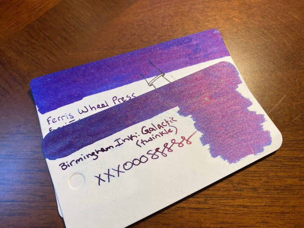
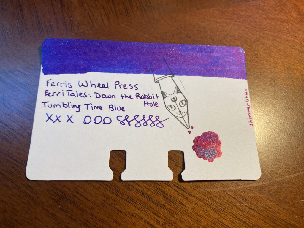
Ferris Wheel Press and Birmingham InkFerris Wheel Press FerriTales: Down the Rabbit Hole Tumbling Time Blue
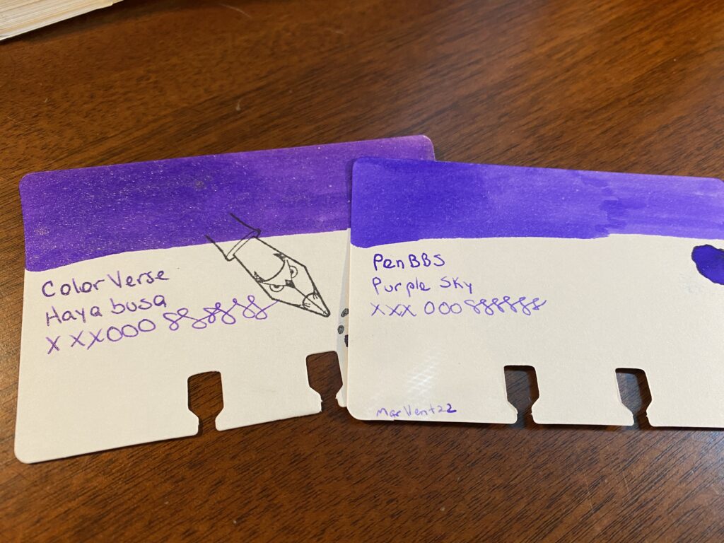
Next, I need to match my new colors to ones I end up keeping. For August I am keeping two inks from my July palette, an orange I am way too in love with and what I am referring as my Forever Purple. (It’s ColorVerse Hayabusa, in a Sailor Pro Gear Slim Northern Lights – it is my favorite.) Because my theme for August is “sunset,” and purple is technically a color that can be found in a sunset, I used that as an excuse to start this whole process. Any excuse to start with purples really. I’ve managed to keep purples relevant to these palettes for months now, haha. So, I took the Hayabusa sample and started by comparing the purples I have to that one.
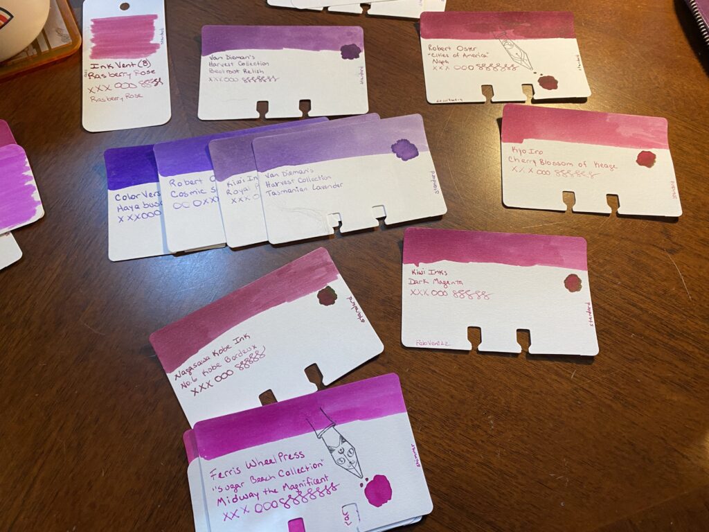
ColorVerse Hayabusa and PenBBS Purple Sky
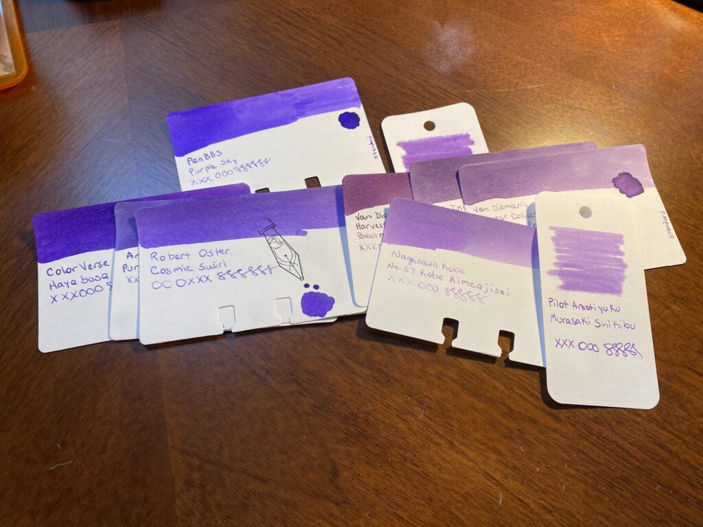
Every purple in the pile gets compared back to the first purple. I am looking for two things primarily this time – a color that is distinct from the Forever Purple, but also goes with it. I discard purples that look too dark or too light or fall outside of the theme. I ended up with a lot of options left over – which is intentional. I don’t want to narrow it down too much at the beginning.
Pile of sample cards of purple inks, ranging from cool purples to warm purples.
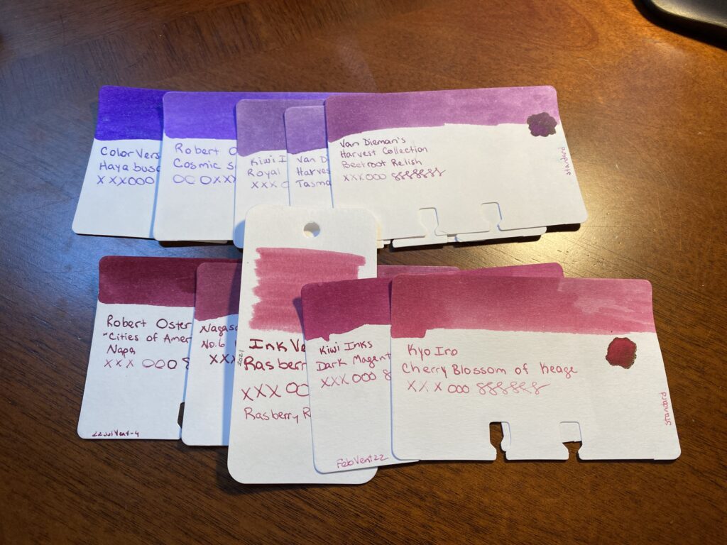
Once I have a more manageable collection of purples, I start adding in the magentas. I’ve already made certain decisions which can roll into the next color – for example, the samples that are too dark or light, those can be discarded quickly. And I can get rid of obviously too bright magentas. I’m again looking for a color that is distinct from the purples I have picked and yet still has a smooth transition which is the effect I am looking for this time. I ended up with a decent set of options.
The magenta sample cards are circling the line or purple sample cards.Two lines of sample cards, purple on top and magenta’s on bottom.
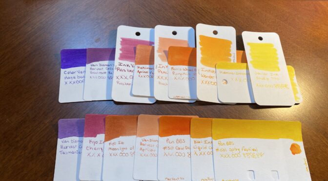
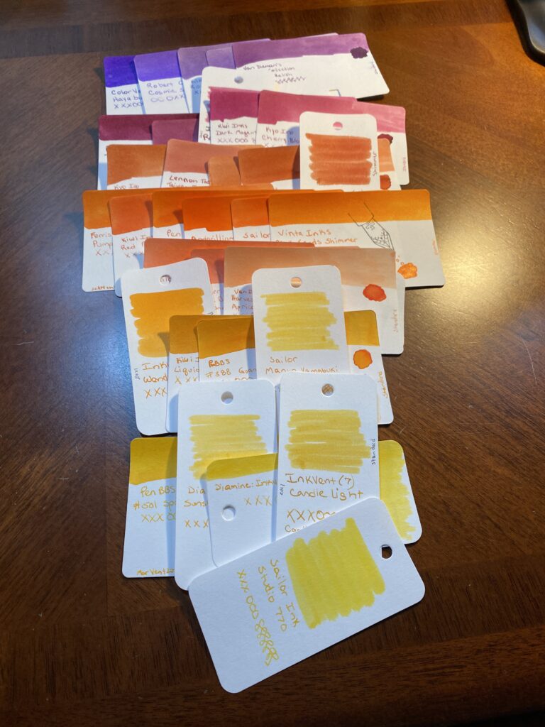
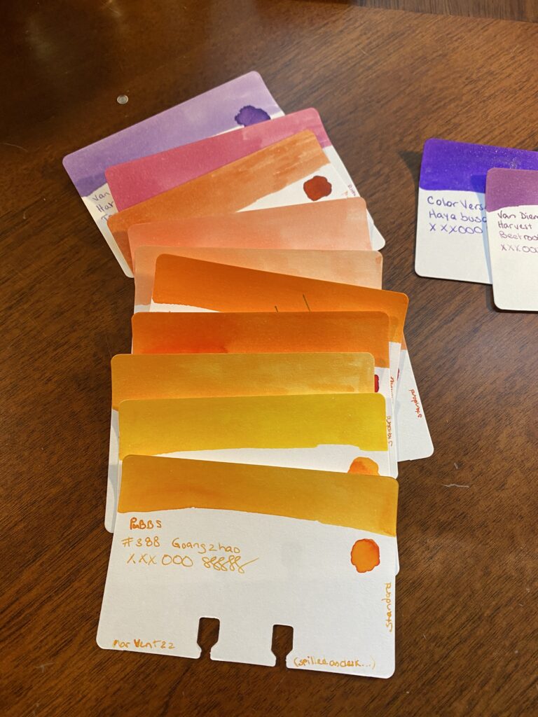
Next up are the oranges. I actually had three fairly distinct oranges – a darker orange, a sort of straight orange which is a bit brighter, and then a kind of peach color. All of these would work well in a sunset theme, but I needed to see what worked with the purples and magentas I pulled. Choices so far continue to help me make some easy choices. I’m always getting rid of colors that are darker or lighter than I want for that month’s palette. Now I remove doubles – colors that are super similar to each other – or practically identical. I ended up not being able to narrow this pile down too far, because I really liked the three distinct oranges I started with. No worries, I still have another color to look at, that should help me decide. To pick the yellows I really have to look at the writing on the card to see how readable it is. Many yellows are too hard to read when written with the nibs I use. And for the palette I’m looking for, I got rid of the darker ones as well. Actually, I use the writing on each card to make my choices. So I’ll line up the cards so the writing is side by side. The swabs are gorgeous and good for picking broad swathes of color. But often the writing turns out very different from the swab. Close enough but when I am getting down to picking a color for sure, I want to look at the writing on the card.
7 lines of sample cards overlapped so the writing on each card is closer to other cards writing.
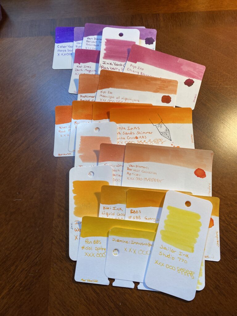
Next I narrow things down, this time I end up with 3-4 options per color. Each color gets compared to the one before it. I want a transition that reminds me of a sunset, so I’m comparing each color to the ones on either side, so I don’t end up just matching everything off the Forever Purple. Frankly, if the palette I end up with doesn’t work well with that purple – it’s fine. I have two colors that have been constant for months now, and they don’t have to go with the palette because I am keeping them for different reasons. I’ll go into that in another post.
Narrowed down choices for each color.
And lastly – my choices, and my secondary choices. This is where I narrow things down to two very similar palette’s. I do this for three reasons. Firstly, I want to be able to walk away and look at something else for a bit before making the final decision. At this point I will have been staring at these colors for at least a half hour. Second, Husband is the color expert in this house. He literally used to do that for a living, making sure colors were accurate. And third is that I like keeping him involved in my silly hobby. This is an easy for us to collaborate. And it’s fun explaining my thought process to him and what I am looking for.
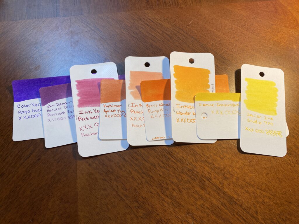
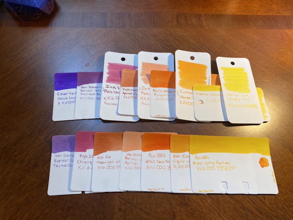
First palette option: ColorVerse, Hayabusa Van Dieman’s Harvest Collection, Beetroot Relish Diamine 2021 Inkvent, Raspberry Rose Kakimori, Apricot Tea Diamine 2021 Inkvent, Peach Punch Ferris Wheel Press, Pumpkin Patch Diamine 2021 Inkvent, Wonderland Diamine 2019 Inkvent, Gold Star Sailor Ink, Studio 770 Second Palette Option: Van Dieman’s Harvest Collection, Tasmanian Lavendar Kyo Iro, Cherry Blossom of Keage Kyo Iro, Moonlight of Higashiyama Van Dieman’s Harvest Collection, Apricot PenBBS, #517 Cold Dews Kiwi Ink, Liquid Gold PenBBS, #501 Spring Festival
And that’s where I’ll leave it today! When I’ve got these two sets of options like this I can start seriously matching pens to the possible ink colors. Often I have some ideas already – for example, I had already pulled all of my orange pens for this palette as soon as I decided on the sunset theme. I also have a new purple and a new tiny clear one I want to try. But I don’t always know which colors I am going to pick until the very end and sometimes I don’t know when a new pen might be coming in, so I keep my options open.
By next weekend – the end of the month – I will have picked both the palette and the pens, because I’ll need to set them up and I’ll reveal that next time! Until then, if you have a favorite color from this post, please share!
First palette option in a row on top, second palette option in a row on the bottom.
An #ActuallyAutistic #ADHD #AmbulatoryWheelchairUser With Opinions