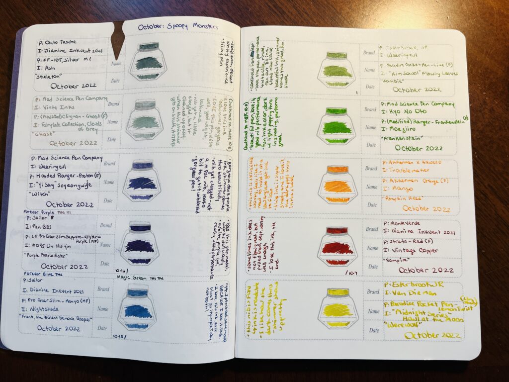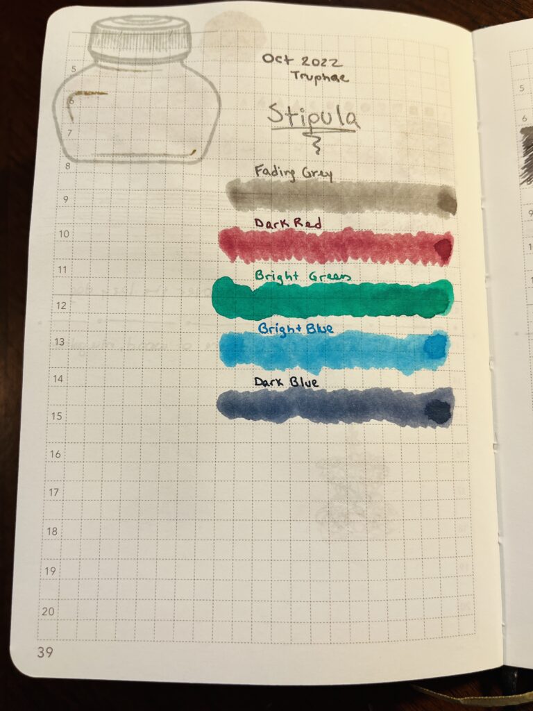
I was originally going to theme this months palette “Comfy” but I started thinking about which inks and pens I would deme comfy and then realized I was thinking of pens and inks I had used in palette’s already this year that I enjoyed using. Then it hit me – I was already going to do a sort of review of the Monthly Samples – I could use one combo from every month palette this year! Matchy matchy. Since April I’ve been keeping track of the performance of each combo, so the only ones that would be tricky is Jan – Mar. Those will probably be wild cards. (Oooo except Magic Green from March!)
And it was EASY. Because in each month there is usually a combo that I enjoyed memorably. There were two difficult months, and very little info on how I felt about the pens I used in January thru March, but I ended up with 10 pens I am extremely excited to use. I did end up swapping out the pen paired with three of the inks – I’ll explain in the list. And to determine the best choice for the January and February pens I had to sort of look at how long and how often I would use the pen. There were a couple I remember filling early on and then reluctantly keeping them filled but not wanting to use them… I did that, of course, until I remembered this whole monthly change of pens and inks is supposed to be fun. And if I don’t like a combo nowadays I give it a day or two and then clean it out. Hopefully that won’t be an issue this month?
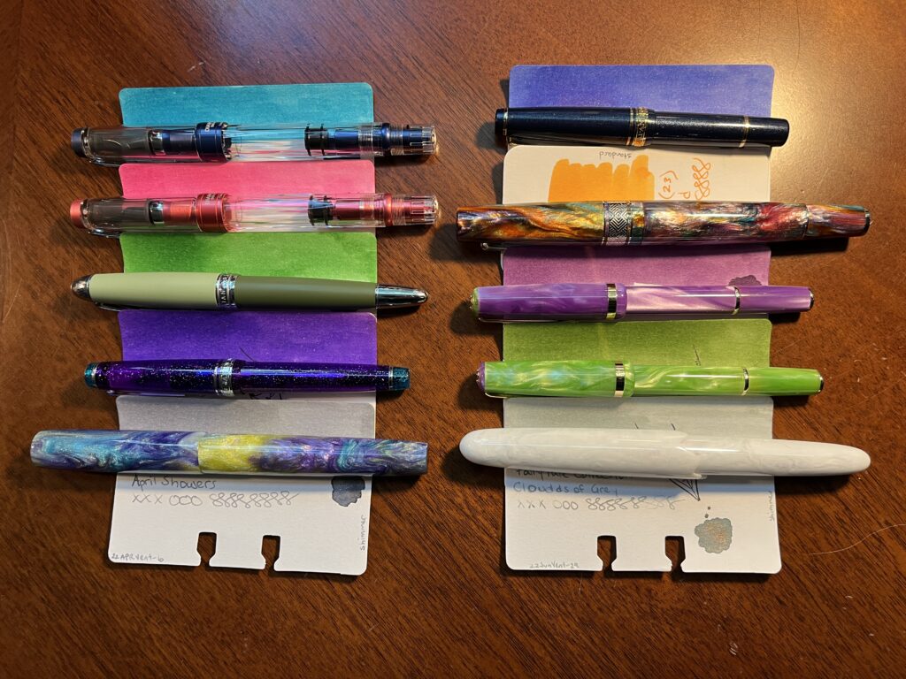
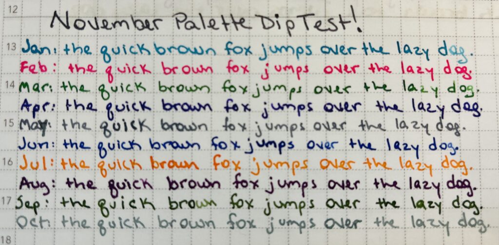
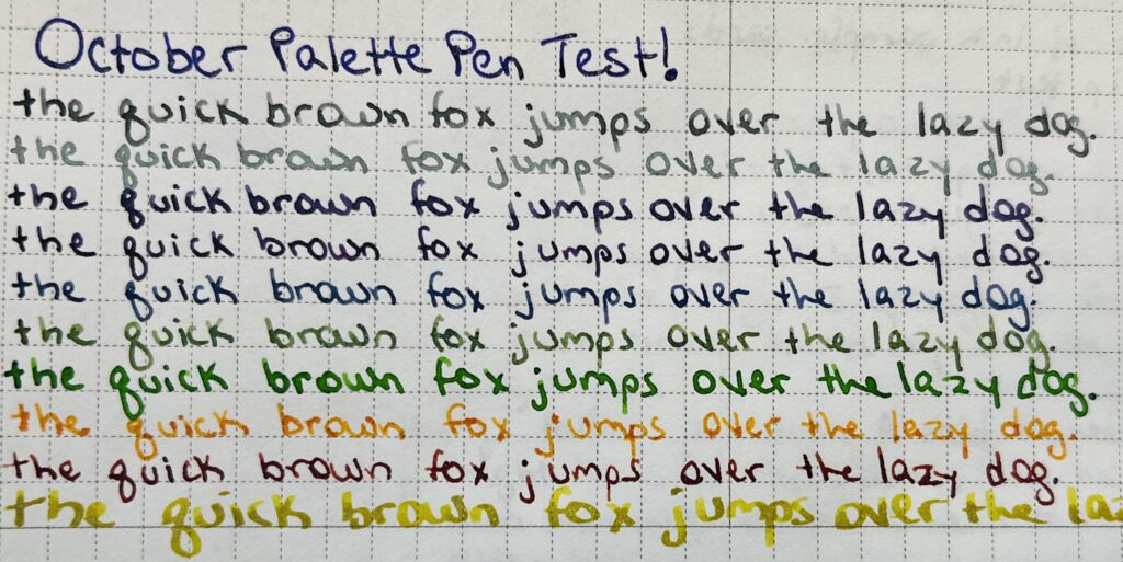
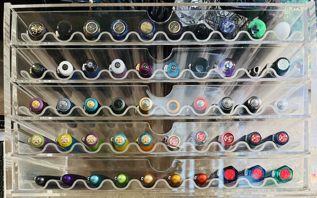
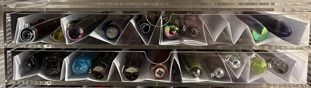
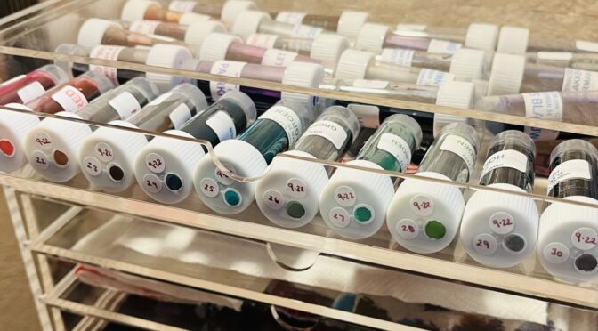
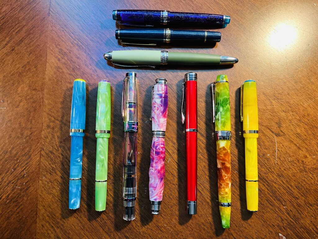
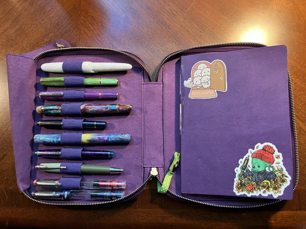
Let’s look at our options this month, shall we!
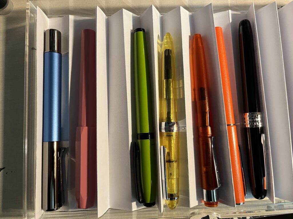
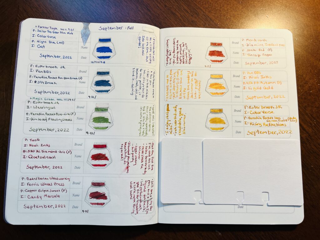
- Twsbi Diamond – Prussian Blue (F), Diamine Inkvent 2021 Subzero
– this ink was originally in a Twsbi Eco and I decided the Diamond is just a little step up. - Twsbi Diamond – Punch Pink (F), Van Dieman – Underwater, Moon Jellyfish
- Hong Dian 5019, Lan Tian – May Flowers (EF) / Ferris Wheel Press Moonlight Jade
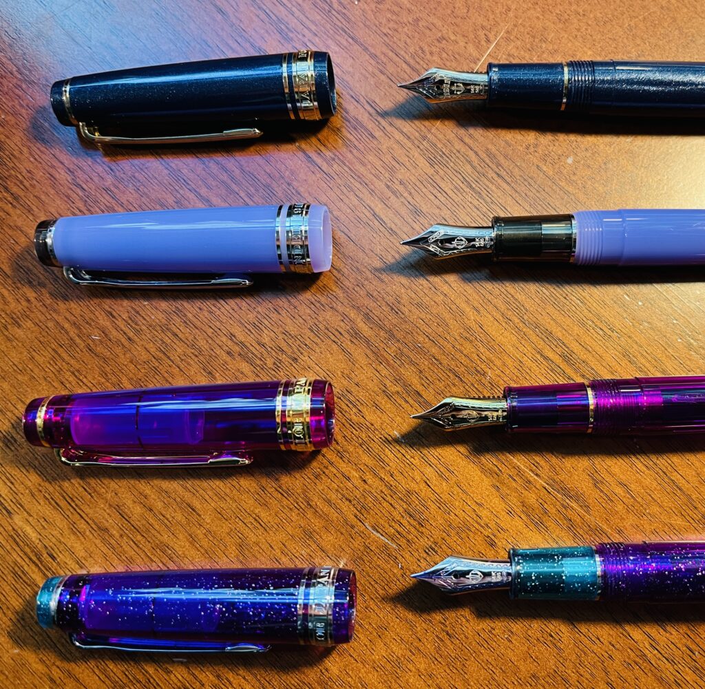
- Sailor Pro Gear Slim – Purple Northern Lights (MF) / ColorVerse 54 Hayabusa Glistening
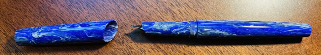
- Bonecrusher7Studios – Monet (1.1stub), Ferris Wheel Press, April Showers
– this ink was originally in my Gravitas, but it was using the custom nib, so I figured I’d just put the nib in one of my favorite pens and go from there! - Sailor Pro Gear Slim Mini – Night Blue (MF) / ColorVerse Cat
– Cat was originally in the Twsbi Diamond Prussian Blue soooooo…leaving it in the Sailor. - Leonardo Supernova (F), Diamine Inkvent 2021 Wonderland
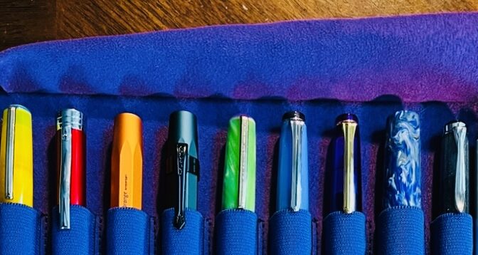
- Esterbrook JR Paradise Pocket Pen – Purple Passion (F), Van Dieman, Harvest Collection, Beetroot Relish
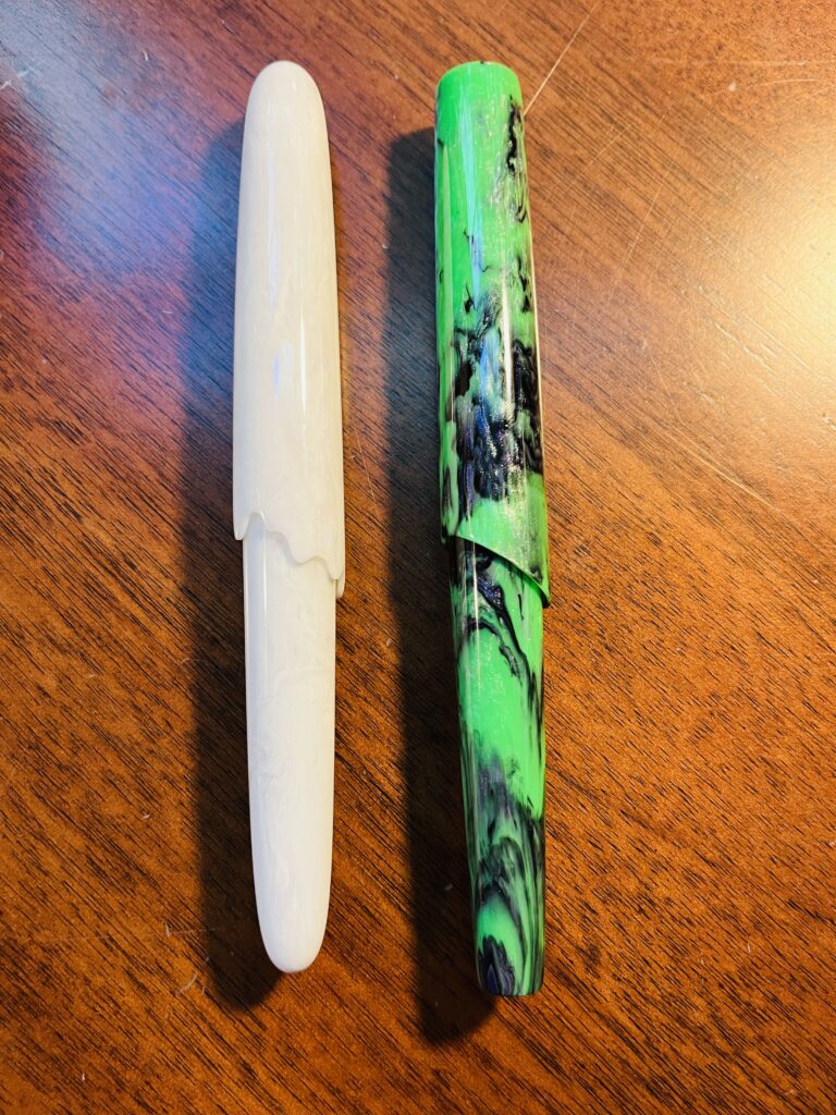
- Esterbrook JR Picket Paradise – Key Lime (F) / Wearingeul Flowing Leaves
- Mad Science Pen Company, Modified Clingman – Ghost (F) / Vinta Inks, Fairytale Collection – Clouds of Grey
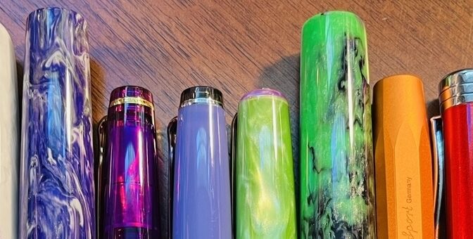
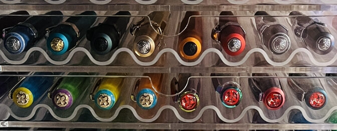
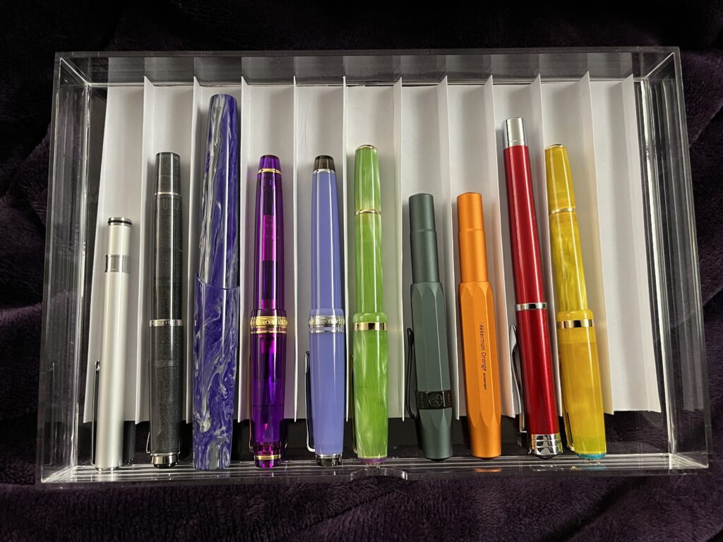
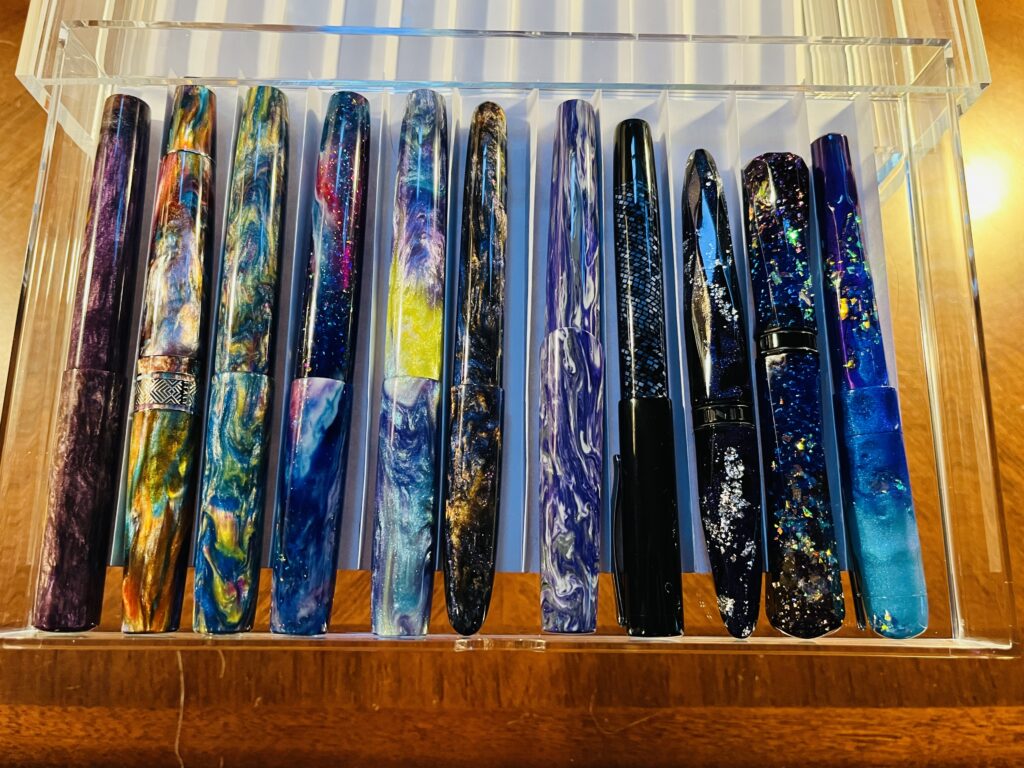
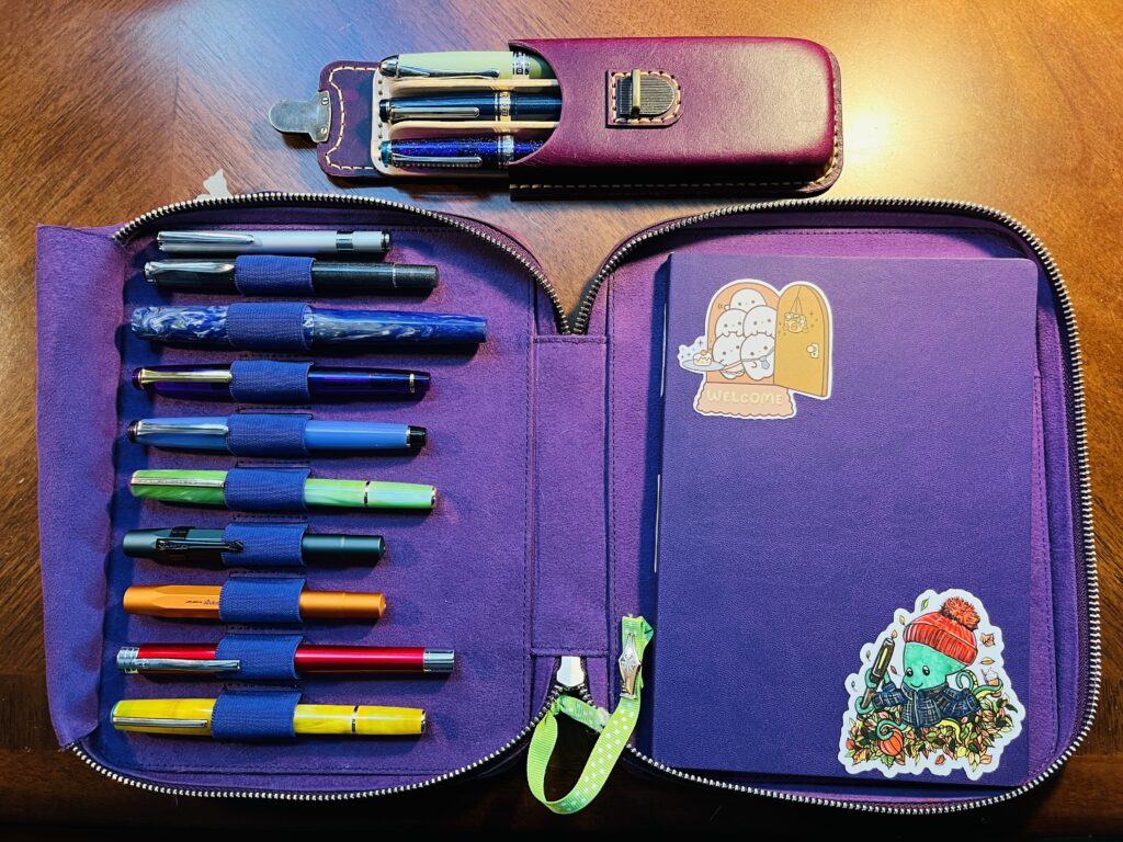
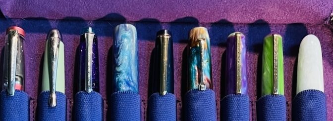
One of the things I liked about this palette was that I could use the three favorite pens without them just being extra to the palette, they are actually part of it. And I am really looking forward to a nice cozy month with pens I know I like, even when they get a little blocked and won’t write. Because the inks and pens are WORTH it.
Some of my choices were combos that I continued using into the next month. And the palette actually really came together. I was sitting and contemplating it, and Husband looked over my shoulder and was like WHOA That looks incredible! 🙂 Hope it goes as well as it looks!