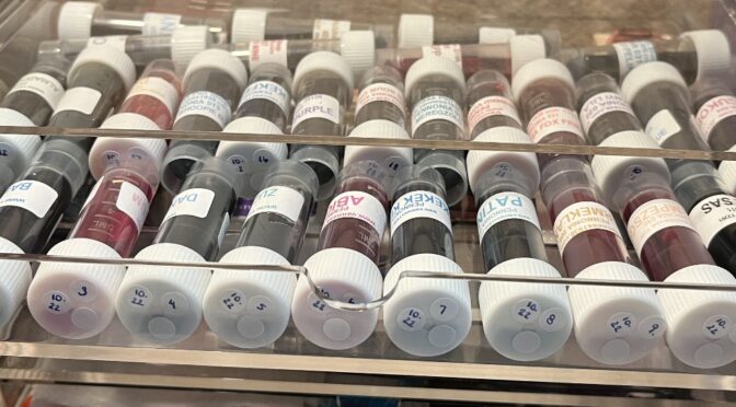
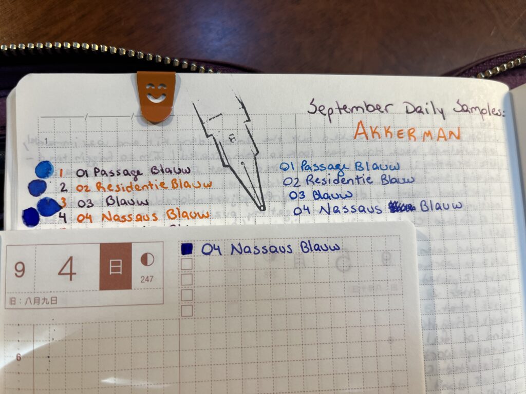
31 Pennonia ink sample vials – October is going to be fun!
Pennonia is another manufacturer that numbers their inks, and it snagged my interest again. The company is based out of Romania, started in 2018, and is owned but what looks like a very passionate fountain pen ink maker! Something he calls out is that from what he knows, he was the first to introduce mixable shimmer powers and mixable liquid shimmer additives to the community. Which I want to look into – immediately! I do love me my shimmer.
I am not sure if any of these have shimmer in them because while I do handle them I specifically try not to really look at what is in the vial. So we shall see! If I had to guess, I am betting there are no shimmer inks, due to the comment about additives! Let’s see if I’m right at the end of the month…
This is the order I will be sampling these in the month of October, and apologies if I got any spellings wrong, I double checked them but my auto correct is aggressive:
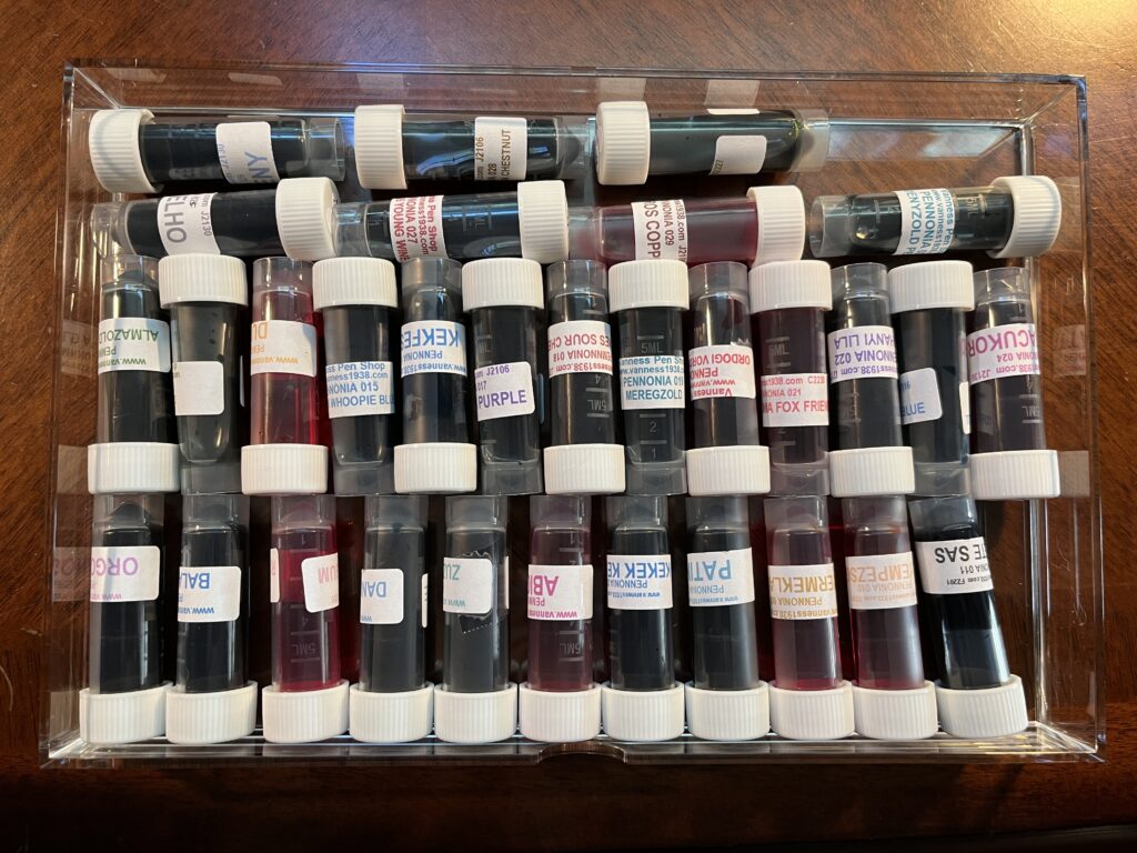
001 Orgona Lilac
002 Balaton Kek
003 Ragu Bubblegum
004 Danuvius Danube
005 Zuzmo Lichen
006 Abigel
007 Kekek Kekje
008 Patina
009 Gyermeklancfu
010 Selyempezsgo
011 Fekete Sas
012 Almazold Apple Green
013 Csillant Nettle
014 Dungo
015 Hupikek Whoopie Blue
016 Kekfesto
017 Lila Arnyek Purple
018 Meggyes Sour Cherry
019 Meregzold
020 Ordogi Volos Devil Red
021 Roka Koma Fox Friend
022 Tihanyi Lila
023 Torokkek Turkish Blue
024 Vattacukor
025 Viharfelho
026 Kekfeny
027 Mustvoros Young Wine
028 Gesztenyebarna Chestnut
029 Rezvoros Copper
030 Zoldike
031 Godenyzold Pelikan
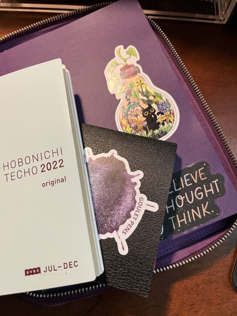
31 Pennonia inks in the awesome vial trays my husband designed and printed for me!
I have added Ink Flight subscriptions to my monthly fun! I had to, there are 7 samples per month, so of course I needed it. I also noticed they have some other fun stuff, like stickers or puzzles, and I thought heck why not. Trying new inks is a greatly pleasing and calming for me.
Anyway!
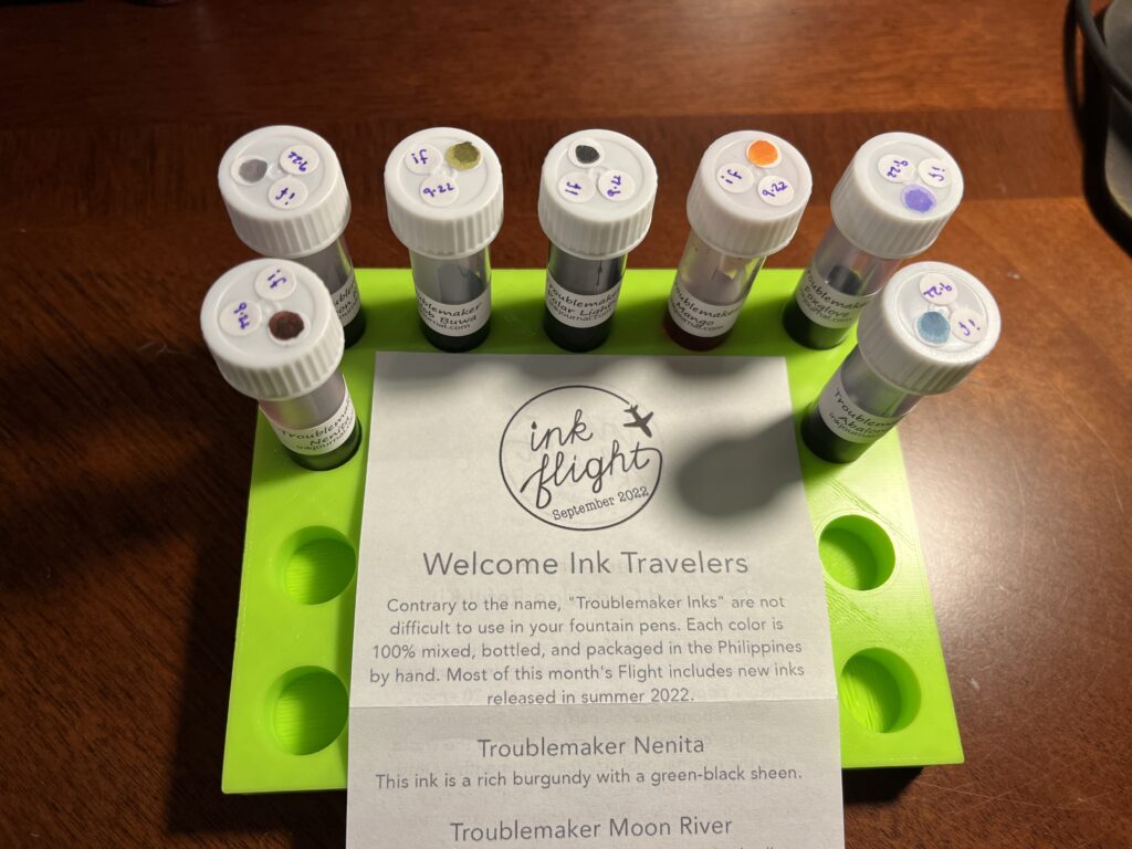
My first Ink Flight! Also, that tray? Husband designed and printed it. He’s pretty cool!
September Ink Flight Sample Subscription was for Troublemaker inks – which I haven’t tried yet, but now I want to get a bunch more! I enjoyed these inks a lot, they stayed on the metal nib, and applied to the paper pleasingly. There are several multi-chromatic inks, which are becoming my favorite thing these days, and the shimmer inks looked well distributed.
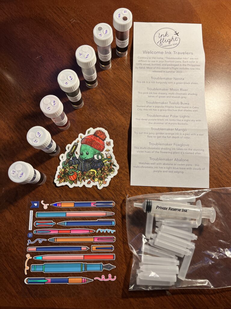
Okay, look at that sticker, how cute is that??? And suspiciously well timed refillable cartridge kit…
There was also an adorable sticker of an octopus wearing flannel and a knit hat, holding a pen and tea – clearly intended for my October Captain’s Log. The cartridge kit is something I am very excited about because I was thinking about getting into refillable cartridges so I can use some tinier pens and here comes this kit! And the pen stickers are shiny, which is delightful. I really enjoy the descriptions Ink Flight sends with the inks because I’ve been learning a lot from how folks with more experience describe inks.
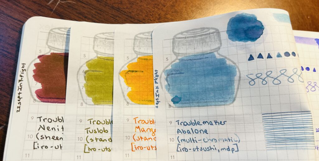
First time I’ve tried Troublemaker inks and it was a lovely experience! Nenite, Tuslob Buwa, Mango, and Abalone.
Now for the inks!
Troublemaker:
Nenita, Ended up sort of a maroon color but the green sheen on top made it more brown than anything else.
Tuslob Buwa, Goose poop. I think I have three different samples in this shade now…ew?
Mango, I really liked the color and the way it shades when written, I’ll be using this one in my October Pen/Ink Palette! (Monster theme, this one is for Pumpkin Head!)
Abalone, This is a really pretty blue, very much in the denim realm, but I would call this one a soft denim, it’s supposed to be multi-chromatic, but I wasn’t getting any of the lavender to come thru – maybe I need a different paper!
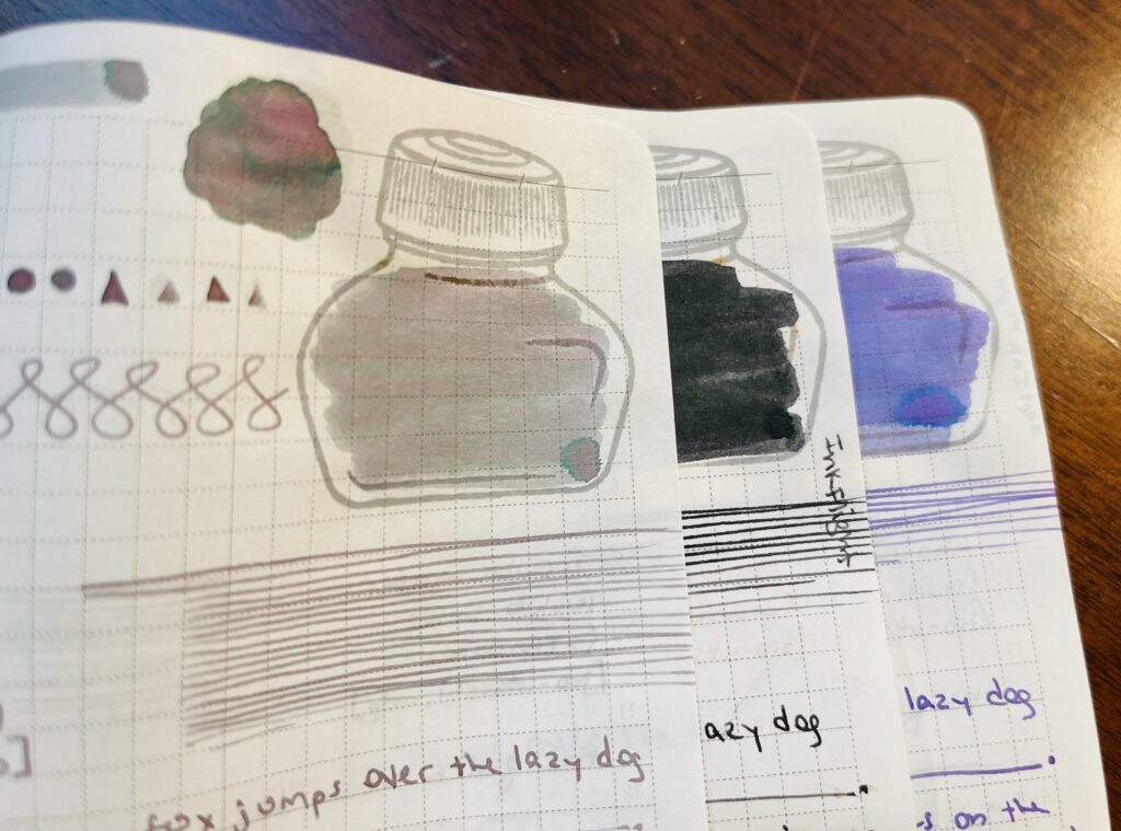
Moon River, Polar Lights, and Foxglove
Moon River, I’d call this one a sort of grey ish lavender, doesn’t come across in the picture very well but it’s a really interesting multi-chromatic shading ink. I do like my weird grey inks.
Polar Lights, Sort of a super dark avocado green, looks black, but has a light blue shimmer that looks really neat in pools. Might be fun in a broader nib. The description says it’s a purple black ink and I super disagree! 😂
Foxglove, Fun shading lavender, light but should be fairly readable. I see pinks and blues in the multi-chromatic bits and these make me want to try a multi-shader palette some month! Maybe February…
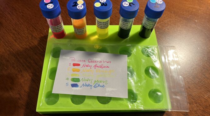
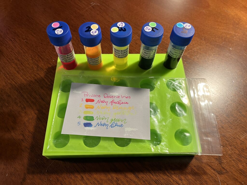
Truphae! Third Private Reserve subscription!
My Truphae Sample Subscription this month was of Private Reserve Neon inks. I think this is the third pack of Private Reserve inks I’ve gotten from Truphae so far. I’ll need to go back and piece things together, but I’ve sampled an Infinity pack and a Silvers pack prior to this, for sure. Anyway! Neons aren’t my usual thing, but I think I would like to try these out on a fountain pen friendly black paper at some point.
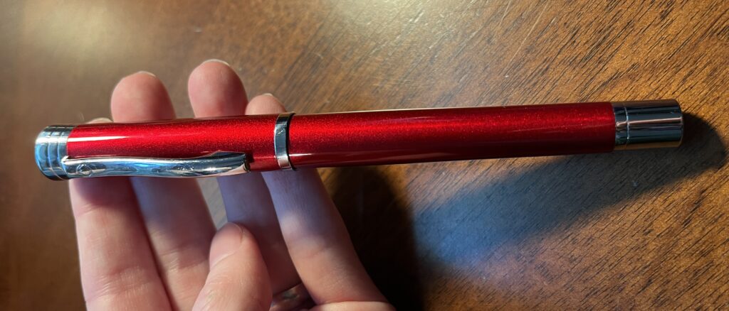
Look at the pretty peeeeeeen!
The subscription I have from Truphae includes a pen, and this month I got a Monteverde Strata, Red with a Fine nib. I got it in time to use for my September Pen/Ink Palette. I will talk more about that combo in the Palette post, but the reason I wanted to use it was the sparkly red finish, the weight felt nice in my hands, and I have had good experiences so far with Monteverde pens. It worked out well, and I’ll be using it in October as well!
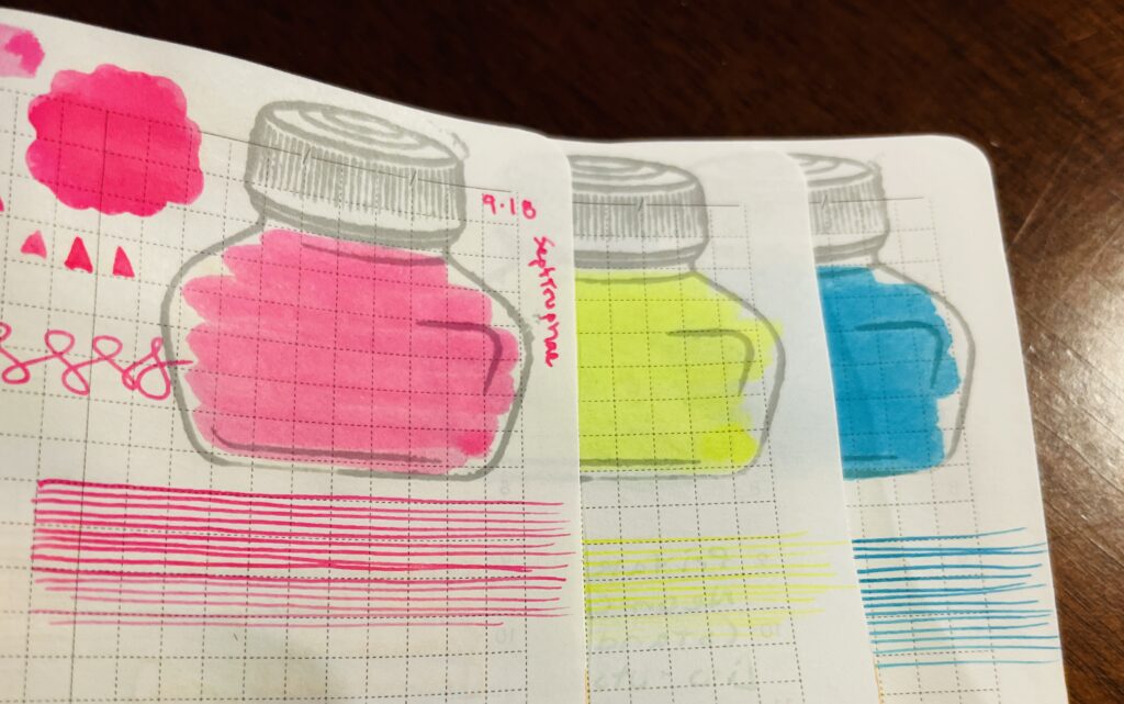
Neon Fuschia, Neon Yellow, Neon Blue.
Now for the inks!
Private Reserve:
Neon Fuschia, this ended up being suuuuper pink, which is not my favorite color haha.
Neon Yellow, so bright, so unreadable! Curious how readable it would be on a black paper…
Neon Blue, as usual, this one was the darkest of the bunch. Not sure I would call it neon per se, but it is on the brighter side.
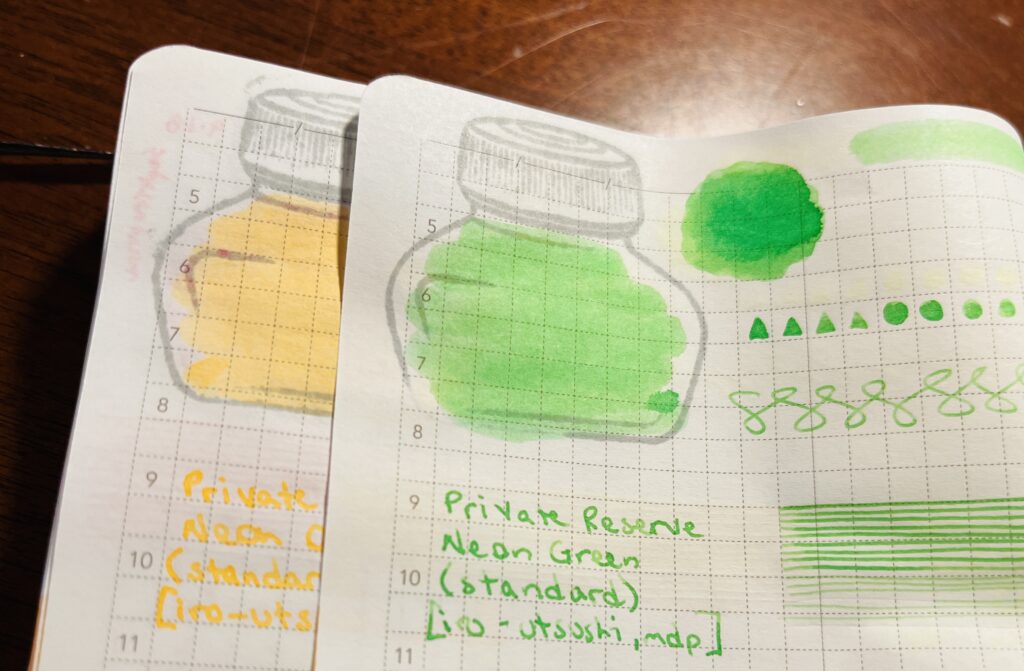
Neon Orange, Neon Green
Neon Orange, very light, almost seems washed out, not as vibrant as the pink or yellow.
Neon Green, Not sure I would call this one neon either, but it is bright.
Over all, not sure I’ll end up using any of these anytime soon, but they will probably end up useful at some point! Now, where can I find nice and fountain pen friendly black paper…hmmm…
Any one wondering why I started sampling a new ink every day? It hit me one day that it was multi dimensional. Originally I thought it was just because of how delighted I was sampling inks when I got the 2021 Inkvent Calendar. It was more than a year into the pandemic – I needed some good distractions. Advent calendars are something you open once a day for 25 days – a small joy, for 25 days in a row. I got about a week into it and I was hooked. I decided to rebuild the 2019 Inkvent calendar, to open in November, then thought in December I could try out some more shimmer inks, then…it continued.
What it turned into was a Routine – with a capitol R. Routines for me are fairly inflexible and are intended to set a tone or a mood. They tend to be coupled with what I’ve been calling Transitions and Sectors (an idea I developed after reading Jamie Knight & Lion’s ideas on tunnels, mine are more about orienting myself in space, to help me navigate). Routines are comforting for me as an Autistic with ADHD, and it’s something that becomes easy to follow, which is helpful when I am low on spoons, or overwhelmed, or exhausted. And Sectors are helpful because I have set up spaces that are intended for a small palette of topics. A lot of people do this actually, not just Autistics or ADHD – someone might have a workshop or a craft room. I do something similar but with a lot of intentionality and practiced focus. Which tends to result in a heightened state of concentration – but only on what is intended in that space – or sector. For example, if I am in my study, which is not a space I use for work, I find it very difficult to concentrate on a work topic. But when I am in my office, which is the Sector I use for work – I find it’s easy to concentrate on work.
What does all of this have to do with pens????? Well. Routines and Transitions and Sectors are how I manage my need for executive functions. It’s basically how I get myself to do stuff haha. And I’ve done a lot of research and thinking about how to get myself to engage with things, when I hit a period of Autistic Burnout in 2021. Actually, I developed this thinking alongside my interest in fountain pens and inks. For several reasons I am continuing to discover and develop, a solid way for me to engage in something is to tie it into fountain pens and inks.
For example. Getting out of bed can be difficult because of the energy it takes to get started when waking up in pain. And getting out of bed will only increase the pain. When you wake up in pain every day, for years, the motivation to get out of bed dwindles. But. You’ve gotta get out of bed. Sounds simple, doesn’t it? Not when you have Chronic Pain and are ADHD. So, I handle this with Routines and Transitions and Sectors. Getting out of bed means I get to go to the desk in my study, which is the Sector that is set up for me to sample inks. The Routine is what I do to get from bed to desk. The Sector is the desk in the study. And the Transition is the time between bed and eating breakfast. Most times, that’s enough. Our morning routine accommodates the time it takes – I do this while Aaron makes breakfast. Once I am at that desk, I am comfortable and I have a a defined task which I don’t even have to think too hard about. I can complete a task that I enjoy, first thing in the morning. The routine is calming, soothing.
Sitting at that desk is comfortable because every thing I need is within reach. There is only the usual expected chaos in the house (dogs going out, getting fed, kitchen noises). I have a pre defined and agreed on amount of time to do something I find extremely comforting, and sets me up to use my systems for the rest of the day. Timing is extremely important, but I’ll get into that later. The routine we have in the morning, when I am in the sector for pens and inks, I am specifically looking for what my range of motion, pain levels, and sensory sensitivities will be like that day. And all of that data helps me be successful with my day.
There are big movements – walking, transferring from one chair to another. I get that data from getting to my desk from the bedroom, getting dressed. There are small movements – opening drawers to get the supplies I use, manipulating those tools to apply the ink to the sample card and my notebooks with a q-tip and a dip pen. There are big sounds – boiling kettle, talking to the dogs, dishes hitting the counter. There are small sounds – drawers opening, tea being poured, pen on paper.
If I have trouble getting from my wheelchair to the desk chair, or reaching out to the drawer, or handling the pen, then I know I need to be very careful with my movements that day. If I’m careful, I can conserve energy, instead of wasting it and finding out the hard way that I should have been careful. If the sounds in the kitchen are overwhelming me then I know I need to be careful with sounds and other sensory input like light or textures or food. If I am careful and wear noise canceling headphones, dim the lights preemptively, don’t eat stressful foods, then I can prevent a melt down. Or at least reduce the likelihood.
Over time this routine solidified into something I need to get myself going in the morning. Some people go for a run, or sit on the porch with a hot cup of coffee, or journal for an hour. I listen to tea being made and sample inks.
Alright, you know those posts I have about the daily samples? Well, let’s get into the technical specifics of how I currently do my daily morning ink and pen routine. I assume someone out there will get something out of it. Here we go!
Step One:
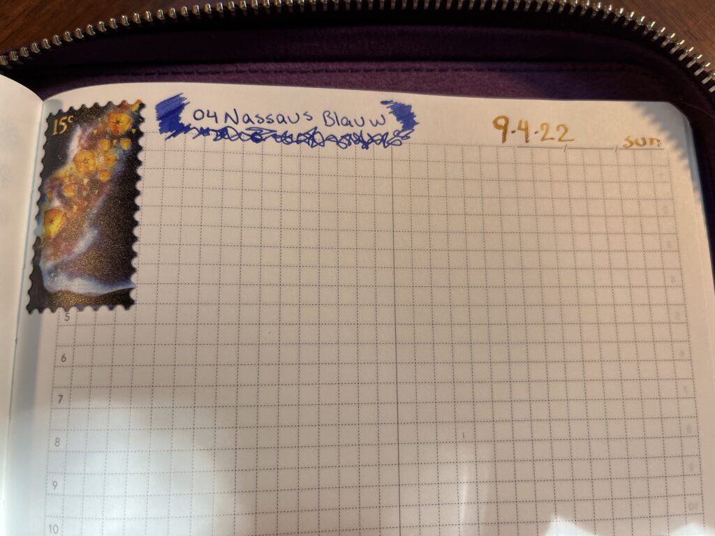
Set up the notebooks. For this I add some stickers to the pages where I start today in my Captain’s Log, and that day’s page in my Nightly Journal. I also pull out my Daily Sample Journal.
Step Two:
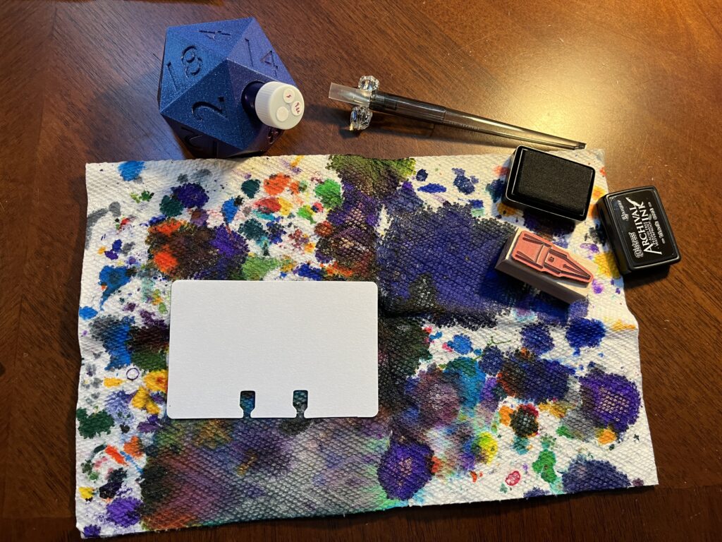
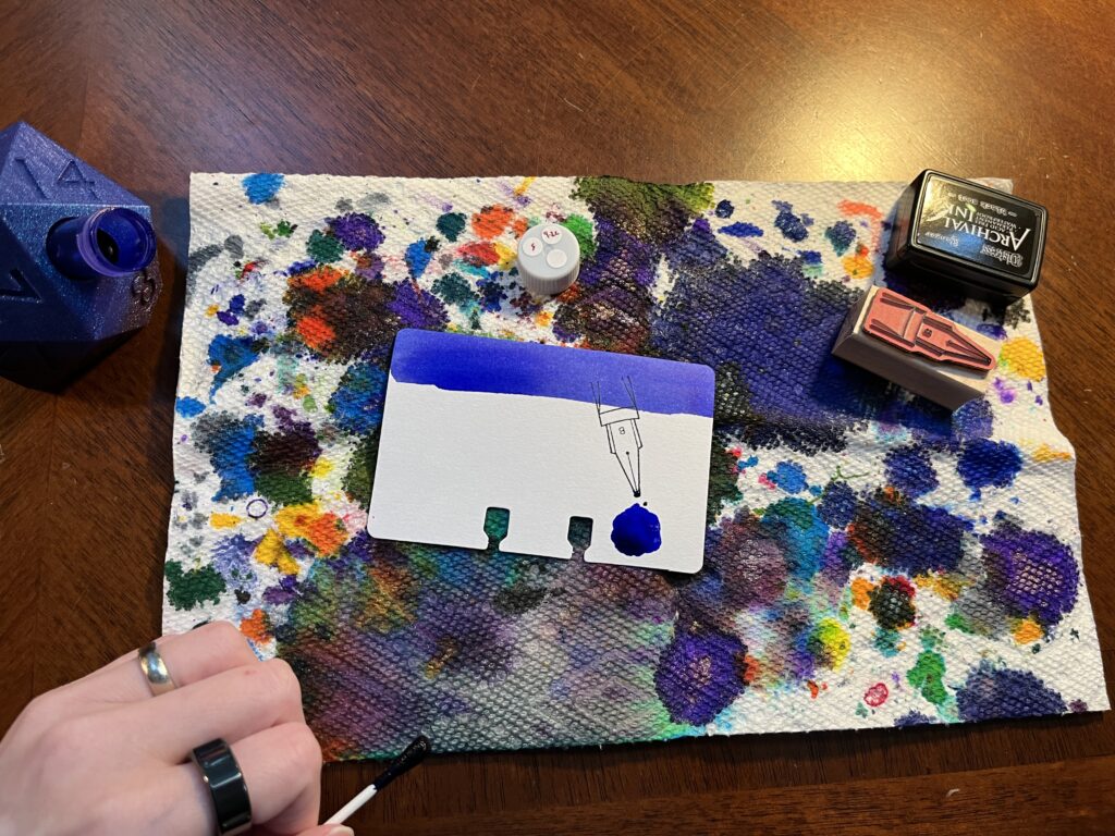
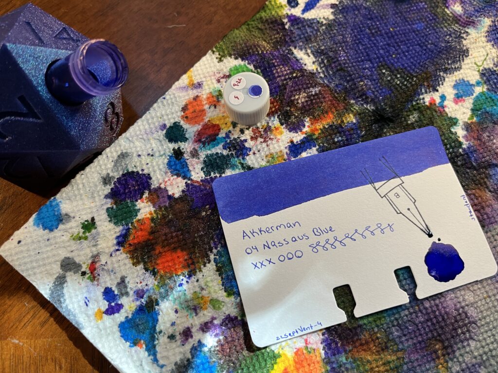
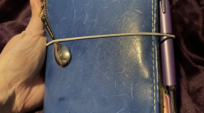
Pull out the sampling supplies. First, the sample vial, which I put in the 3D printed d20 vial holder Aaron made me. Next I pull out the nib stamp I am using that month and the ink pad for it. Then the dip pen I am using – currently an Iro-utsushi, metal nib instead of glass. Last the two paper towels I use – one where I can catch any spills and one where I can rest the q-tip when I am done with it.
Step Three:
This is where I start putting ink down on paper. I use a q-tip to pick up ink from the vial and swab the top of a sample card. Then I’ll stamp the card with that month’s nib stamp. Next I pick up a little more ink and use it to make a puddle of ink on the card, making it look like the ink is dripping off the tip of the stamped ink nib.
Step 4:
I use this q-tip in seven spots, funnily enough. The swab at the top of the card, the ink puddle on the card, an ink puddle on that days journal sample page, a dot on top of the vial lid, a dot next to the name of the ink written out in that month’s list, then I swab in the ink bottle stamp on that days page, then!
Step Five:
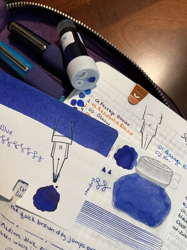
Seventh and finally for the q-tip, a line of ink on the page that lists every day of months in a column. And then I rest it on a paper towel because it pulls the rest of the ink out slowly and sometimes you can see some really interesting color separations. Once the q-tip is done – moving on to using the dip pen. I start with the Captain’s Log and Nightly Journal – I write out the name of the ink on the page I list all of that month’s inks next to itself. Then I write it again at the top of that days Nightly Journal page, and fill in a square – the top of those pages have a very short checklist, so I basically color in the box you’d normally mark when something is done.
Step Seven:
Next is the sample card. I put the ink manufacturer, series if applicable, name, and some test x’s, o’s, and interconnected s’s. I also add which month it is usually by year, month, “vent” and the day – for example, 22SeptVent-4. And last I put the kind of ink it is on the right edge of the card – standard, shimmer, or sheen – those are the three types I’ve sampled so far. Well, ColorVerse calls their shimmers “glistening” and there are some shading inks that go by different shades.
Step Eight:
I write the name of the ink in one last spot in my Captain’s Log – that days first page.
Step Nine:
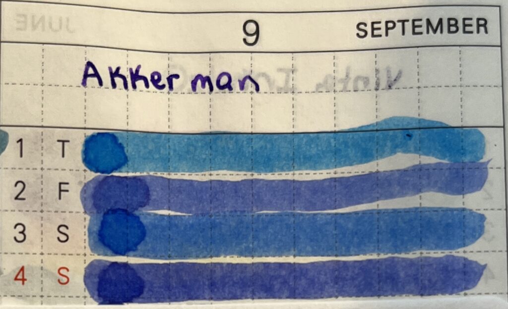
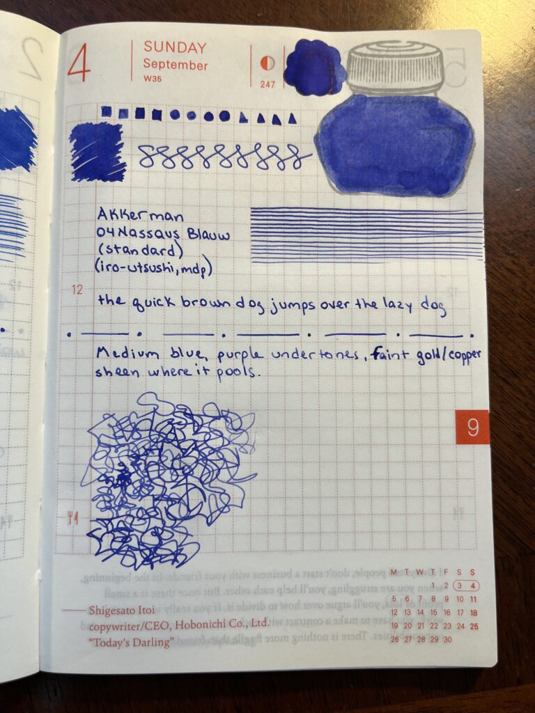
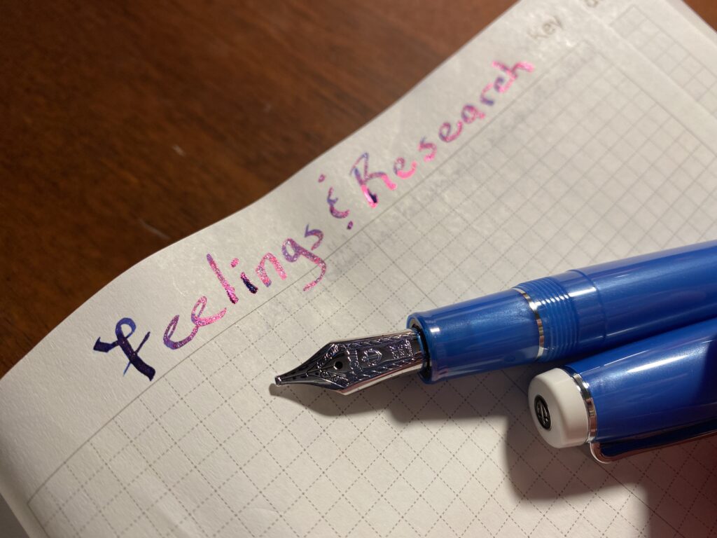
Then I switch over to the Daily Ink Sample Journal. I make 4 squares, 4 circles, and 4 triangles all filled in. Then I scribble a square to be as saturated as I can make it. Then more interconnected squiggles. Below that I put the same info I had on the sample card – manufacturer, series, name and then whether it is a standard ink or not, and finally which dip pen I am using. Beside that I draw straight lines until the ink starts to fade. Below that I write “the quick brown fox jumps over the lazy dog” because that phrase has every single letter of the English alphabet at least one. Then a line of dots and dashes. Then a description and my FEELINGS about the ink. Lastly, after one last dip into the vial, I draw what I call my sharp squiggles – it’s just a mess really, but I find the motions soothing and the visual appealing.
Step Ten:
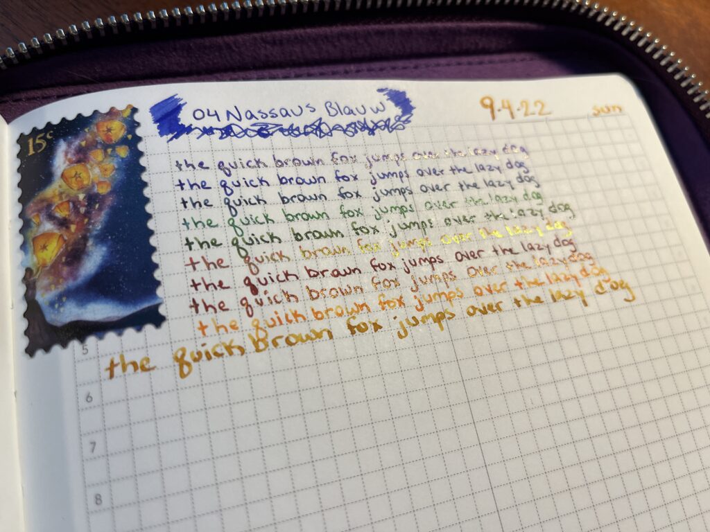
I finish by testing all of the pens I have inked that day. I started doing this when I would find a pen wasn’t working well in the middle of the word day which was so very frustrating! So the pen test gives me an idea of which ones to avoid that day haha. In this photo I just repeat the quick brown fox sentence, but really I’ll just write down my thoughts, changing pen colors on every line.
And that’s it! When I first got started with this I would just ink up the sample card, usually just with a square swab applied by q-tip and the ink manufacturer and name. I added the daily sample journal later. Then I added writing it in my Captain’s Log, then my nightly journal, etc. It has evolved over time. I switched from a glass nib dip pen to a metal nib – recently, actually. I’ve changed up the kind of sample cards I use for samples and I have changed the format I use on the card. Huh…this line of thought could end up being a whole other post. So I will leave it there!
I want to share these kinds of things in case it is helpful to someone. And I love collecting this data and putting it somewhere, so throwing it on this blog seems like a good place for it.
A little over a year ago, I was sitting on a couch, trying to figure out how to get my life organized. Imagine, 2021, a year and more into the pandemic. It was August, and I had made it to the weekend absolutely exhausted. With my chronic pain as bad as it was, that’s what a weeks worth of work would do to me – exhaust me. And then it would take me all weekend of doing nothing to get back into a state where I could just go to work again. My brain fog was at an all time high. Staying organized and being able to emotionally regulate felt impossible. I stopped most of my hobbies and socializing. I woke up, went to work, and then went back to bed until the next day, for months. I didn’t even have the energy to figure out how to fix it. Doesn’t that sound like fun?
First attempt! I wanted to try out something I could hold and use, tried out different kinds of paper and notebooks.
What does this have to do with pens, you may ask? Well. Back to August – I’m procrastinating from doing anything useful by scrolling facebook, when I run across a post from a friend of mine. She posted a photo of one of the art journals she was playing with at the time. I’d seen her posts before, and it clicked. Maybe that’s what I needed to get back to doing – using pen and paper to stay organized.
Back to? Yep. I’ll try and make this next bit short. Let’s back up to 2015. I’m a 20 something adult, a book bag with me everywhere I go – to make sure I had all of the essentials. I leave this bag in a car while I ran in to grab something – I come out and the car has been broken into, bag stolen. What would Spoon consider essential you may ask? Well two things, my favorite pen collection (no fountain pens yet), built up over several years – and a notebook I had in my pocket at all times and had been carrying for years. It had all of the notes for the book I was writing and a dozen other story ideas and journal entries. When it was lost, I was super upset – and decided to go digital. That way everything could be backed up, and retrieved. And I thought I was good – I felt like I’d found a great solution to staying organized. Problem solved. Then, fast forward to August 2021, I realized that this digital thing wasn’t working anymore. I wasn’t using the digital planner, I wasn’t writing in the digital journal, and I was losing track of all kinds of things, important things. I felt like a broken version of myself. Such drama. But in all seriousness, my mental health was in a very dark spot.
Seeing my friends post on facebook sort of clicked something in my brain – maybe I should try pen and paper again? But where to even get started. I asked her what notebook she was using and she told me and then asked what I was interested in using it for? Organizing, planning, writing. Basically, a paper brain. Well – clearly I had asked the right person, because heck did she have a bunch of suggestions! We talked about notebooks, notebook covers, organization systems, pens – really, this is all my friends fault. Ahem.
The first trial of notebook configurations.
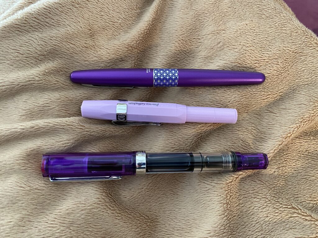
I wanted to start small – practically, and literally, turns out. I picked up a notebook cover, an A6 Hobonichi daily planner, and a blank A6 Wonderland notebook. For work I tried 4 or 5 different planner systems, and finally settled on a Techo Weeks, for scheduling and to dos. And an A5 Hobonichi Daily to keep track of what I’d done during the work day. Oh, and a sample pack of purple pens, which is where I tried out a fountain pen for the first time in recent memory. And then I got curious about fountain pens…I asked Dora – and we went down another delightful rabbit hole together. She showed me pens with different fill systems, told me where I could get ink samples so I could try out different colors, and even recommended what ended up being my first refillable fountain pen – a Twsbi Eco. Purple, of course. Purple is also the color of the first ink sample pack I ever got! All of her advice got me started, and I was able to give myself space to experiment and find something that worked really well for me. From the very start each part of the process kept me engaged and having fun.
The first purple Twsbi Eco at the bottom! Some of my other first trials were a Pilot Metropolitan (also my friends suggestion) and a Kaweco Sport. They all write very differently.
As I tried new things, I got more organized. I was able to self regulate more. I was journaling and waking up and wanting to do things besides sleep and go to work. My mental health was evening out enough that I could start realizing that I needed to make some changes – which we did. I was worried about this whole thing being a passing ADHD interest – but when I hit December and was still using all of the notebooks and pens and my interest kept deepening and expanding – I gave up and embraced the new me haha.
Sailor Cobra Blue, and the opening page for the book where I started doing research into Autistic Burnout.
By the end of 2021 I had started researching (Autistic Burnout, different post), I was consistently using a planner (for some one with ADHD this is impressive), and I was increasing the amount I was journaling every day (this is incredibly useful for someone who has trouble self regulating their emotions, I have found). I was appreciating the joy that sampling inks daily gave me. I was appreciating the joy I could get from a beautiful pen. I was appreciating the joy and peace I was getting from putting those beautiful pens, those gorgeous inks, onto delightful paper. And by the end of the year I had settled on a solid system for myself. I invested in duplicating that system for 2022 – and have continued trying new things! I went thru a lot of iterations between August of 2021 and August of 2022 so I won’t bore you with all of them here. Maybe I should put together a timeline of when I was using each book and pen config?
Now – what am I using these days?
A6 Techo Avec Cousin, which I use for a nightly journal. Just a small space to recap my day and have a moment of transition before bed.
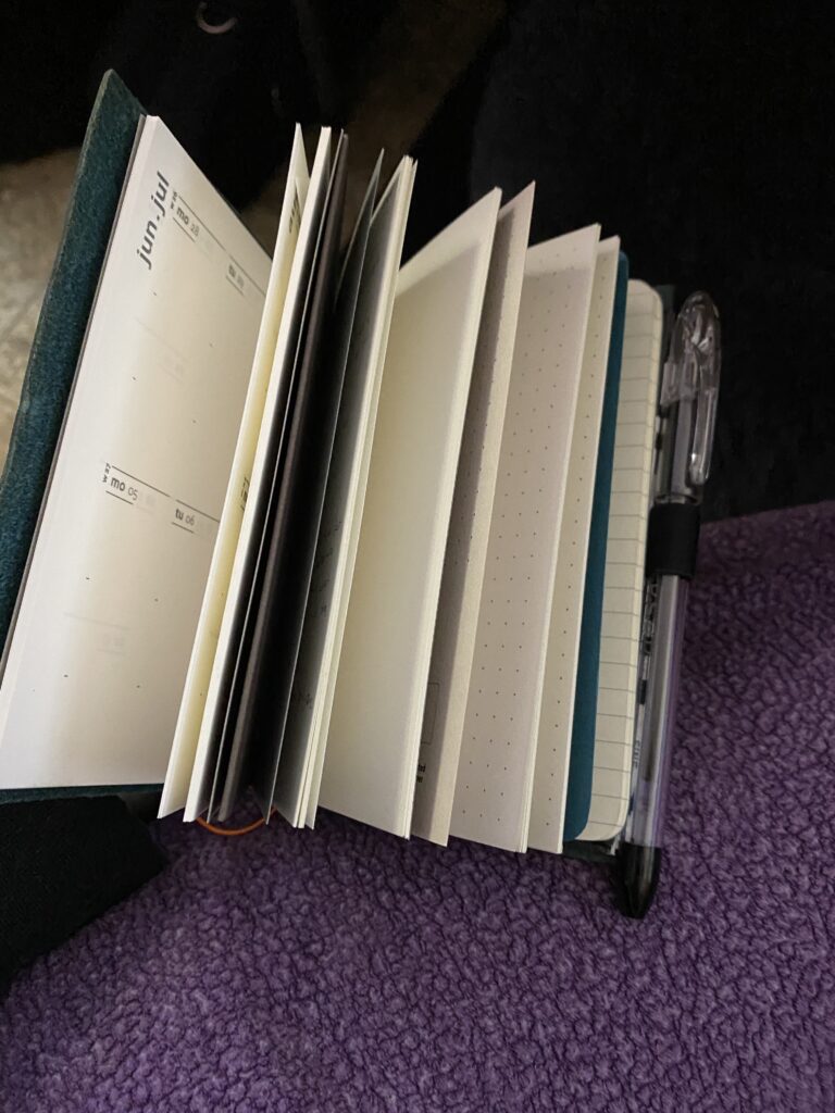
A5 Wonderland, I call it my Captain’s Log – everything goes in here, journaling, workshopping, playing with new inks, more research. Whatever, it’s an undated space where I can write endlessly. (I’m on volume 3!)
Techo Weeks, After my vacation at the end of 2021, in January I actually decided to use this for home scheduling and to-dos instead of for work. We go over this every day after breakfast, and it helps us remember things, sync on stuff, and coordinate what is needed. AND I can keep track of tasks long term. So handy.
For work I settled on a Kokuyo Jibun Techo Days Diary – I just needed more space than the Weeks could give me – and A5 Wonderland notebooks for meeting notes and a workbook. It works incredible well. (I use different colors pen inks for alternating lines or meetings so I can stay ORGANIZED.)
There are a bunch of other notebooks of various sizes I use for my various hobbies, but I’ll go into those in another post.
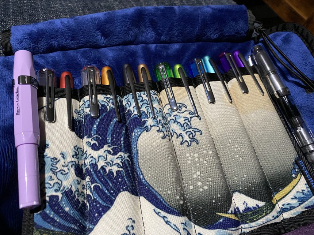
I bought a new pen every time someone made me cry for a while, and ended up with two different rainbows from Twsbi and Pilot.
The pens I am using rotate every month, and each month has a theme – check out my posts on Pen Palettes to learn more. I will have been sampling inks daily for an entire year once we get to October of 2022. And I continue to find fun new things to try with all of it. I think I can safely say this is a solid special interest.
And there’s more! Tangled up in this timeline is how I started using multiple different pens every month, sampling pen inks daily, and setting up transitions and tunnels and stopped masking and – so many things. More future posts!
I wrote this for two reasons. The first is that seeing stories of how – and why – other folks got started really inspired me to try this out. And second, this brings me great happiness and if even a single person reads this and it gives them an idea that makes THEM happy, then I win. I guess a third reason is I am Autistic, this is a special interest, and this blog lets my info dump without irritating anyone.
This is my first post that touches on both my disabilities and my pens! I wouldn’t have gotten started with this when I did if my mental and physical health hadn’t been so awful. So, while I can separate them sometimes, it’s all really tangled up in each other, which is part of what makes me me. Isn’t identity fun? More soon!
“Did you know” is often followed by an Autistic info dumping and the joy and excitement is contagious. I ended up with half a dozen pages of notes and hit 2000 words without getting to the end of the inks and was thinking, oh maybe I should have several posts… Which is when I realized, oh wait I can edit things. 🙂 So I present to you the heavily edited version of the info dump Aaron ended up listening to. I am lucky he finds me adorable.
This was an AWESOME month of samples, I absolutely loved it, because each series gave me a new-to-me author to look into or old classics to check out again. I ended up doing a bunch of research, just for fun! I found out a bunch of stuff and ended up picking up most if not all of these books in book book form, and I’m still reading them, and looking into more things, because one thing leads to another! For me the enjoyment this month was both sampling these neat inks and also the other stuff I found out, so that is what I will be sharing with you today! I can’t WAIT to try out more Wearingeul inks. I’m using one in a pen for September, and it is currently one of my favorites. (It’s Flowing Leaves, for the record.)
Oh, also? FOUR grey shimmer inks. Five if you count Tin Woodman that has a matching vial of shimmer to mix in. (Yes, you heard that correctly – the shimmer is SEPARATE from the ink itself…on purpose…)
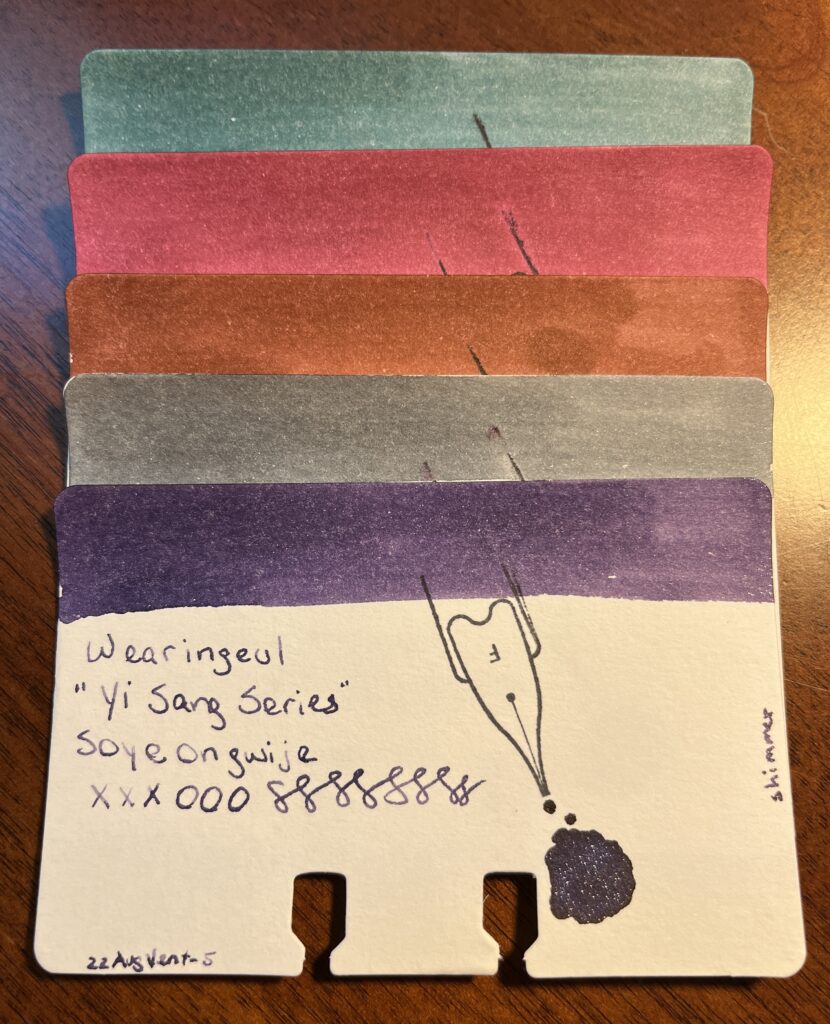
Yi Sand Series, 13 Children, A Taxidermied Genius, Architecture Infinite Cube, Me In The Mirror, Soyeongwije
Did you know…Yi Sang was a Korean poet who died at 27 from tuberculosis and grew up in a Korea occupied by Japan. His work plays with identity, imagery, spacing, pacing, and rhythm. I read a couple of really interesting pieces that seem to be referring to his illness and how it affects his home and family. I empathize with this, being disabled myself. I saw a lot of playfulness tempered by a grief that was multifaceted in nature. ALSO he was one of the first Surrealist poets – which is neat. His poetry is engrossing, for the record, I kept reading the next one and then the next one and then the…
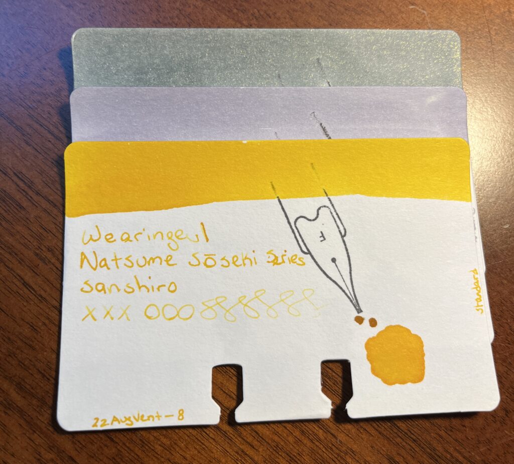
Natsume Soseki Series, I am a Cat, Mind, Sanshiro
Did you know…Natsume Soseki was a Japanese novelist who is well known for writing a book still used in Japanese schools today titled “I am a cat.” It is a satirical novel from the point of view of a cat, and it plays with formal speaking and classism. AND there is a video game called Ace Attorney, the protagonists name is Soseki Natsume – sound familiar? And the character has a cat named “Wagahai” which is the narrator cat’s preferred pronouns from “I am a cat” and is rarely used nowadays except to refer to pompous and anthropomorphic animals.
Oh also, I fell down a ridiculous rabbit hole when I started looking for one of his novels which I thought was called “The Mind” – the name of one of the inks I sampled – but couldn’t see it in the Wikipedia article list of his work. Ready for this?
When I couldn’t find “The Mind” in his book list, I googled what “the mind” was in Japanese – it’s “kokoro.” Neat, so I went back to the list, sure enough, Kokoro is listed as one of his novels. Naturally I look at THAT Wikipedia article, which declared “kokoro” translates literally to “heart.” What? Wait a sec…I double checked my google search – what a scholar am I – and translated “heart” to Japanese – and got “shinzo.” So. Completely different. Let’s try translating “kokoro” to English – got “heart.” Great. That clears up nothing. WELL. Back in the Kokoro Wiki article, it elaborates that the word has shades of meaning and could be translated to “the heart of things” or “feelings.” I know only enough about Japanese to make my “yep, that sounds right,” about how complicated this is face. And moved on. Wait! The ink bottle label has Japanese characters on it – what does that translate too??
See? Rabbit hole. Such fun.
This series had the second grey shimmer. Delightfully distinct, I will say.
Whew, that was a lot. Trust me when I say there was MORE.
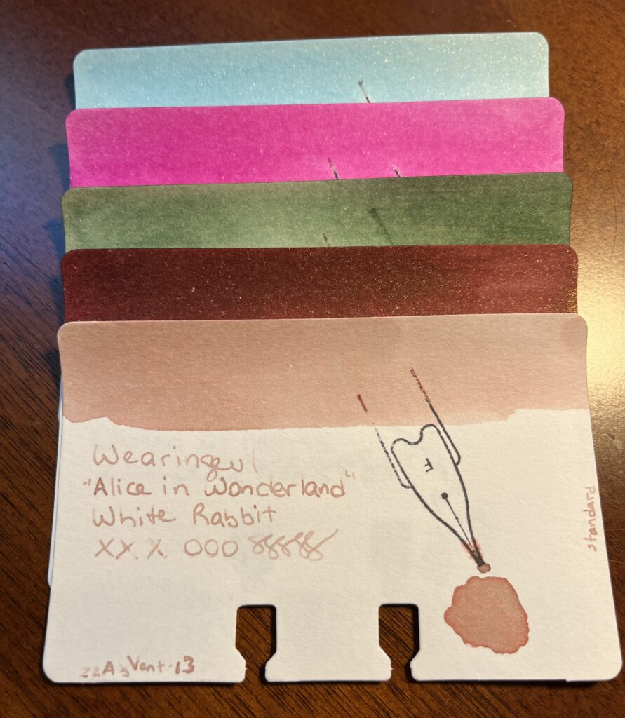
Alice in Wonderland Series, Alice, Cheshire Cat, Mad Hatter, Queen of Hearts, White Rabbit
Speaking of rabbit holes…I was really pleased by how the ink colors matched with the characters – when the ink names don’t match the color it bugs me.
I haven’t ever read the original Alice in Wonderland (Lewis Carroll) – I am looking forward to it, I’ve read that it is WEIRD.
Did you know… Alice in Wonderland is considered “literary nonsense” which is a thing, seriously, I looked. Literary nonsense started being recognized in the 1900’s and is categorized by the conventions of subverting “language conventions or logical reasoning.” This effect of nonsense is usually an excess of logic, rather than the absence of it. Humor comes from it’s nonsensical nature rather than a punchline. Also, L. Frank Baum thought it was incoherent. Fun!
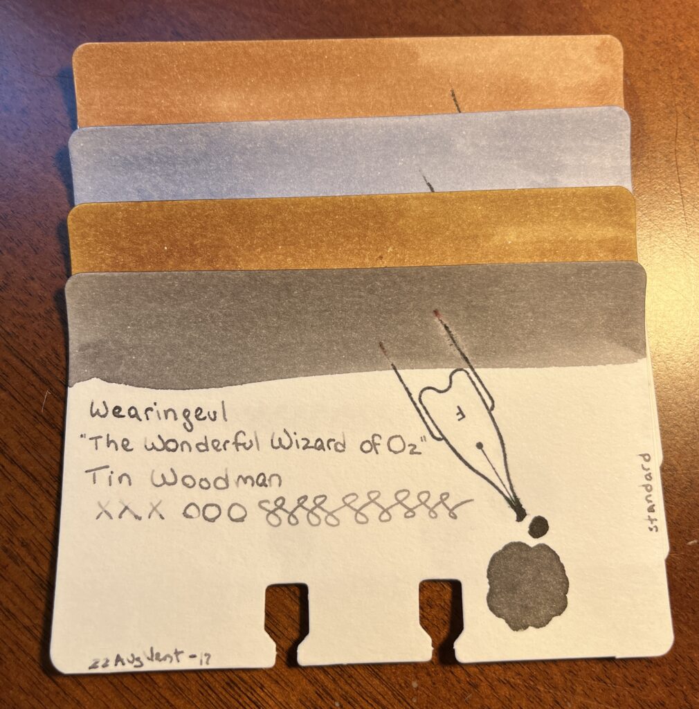
The Wonderful Wizard of Oz, Cowardly Lion, Dorothy, Scarecrow, Tin Woodman
Speaking of L. Frank Baum…
Did you know…The Wonderful Wizard of Oz was in part influenced by Lewis Carroll’s Alice in Wonderland? Yep, despite thinking it was incoherent, both authors believed children’s books should be fun, and not just moral lessons.
These inks were really muted which made me sad and THEN I discovered that there are 5 “glitter potions” which I got all excited about! Brain, Brave, and Heart make sense, because there is a Scarecrow, Cowardly Lion, and Tin Woodman inks, but the other two are Emerald City and Silver Shoes – Didn’t Dorothy wear ruby slippers? Are they different in the book? I have to check out the glitter potions still – could be interesting.
I haven’t read this original either. Yay books!
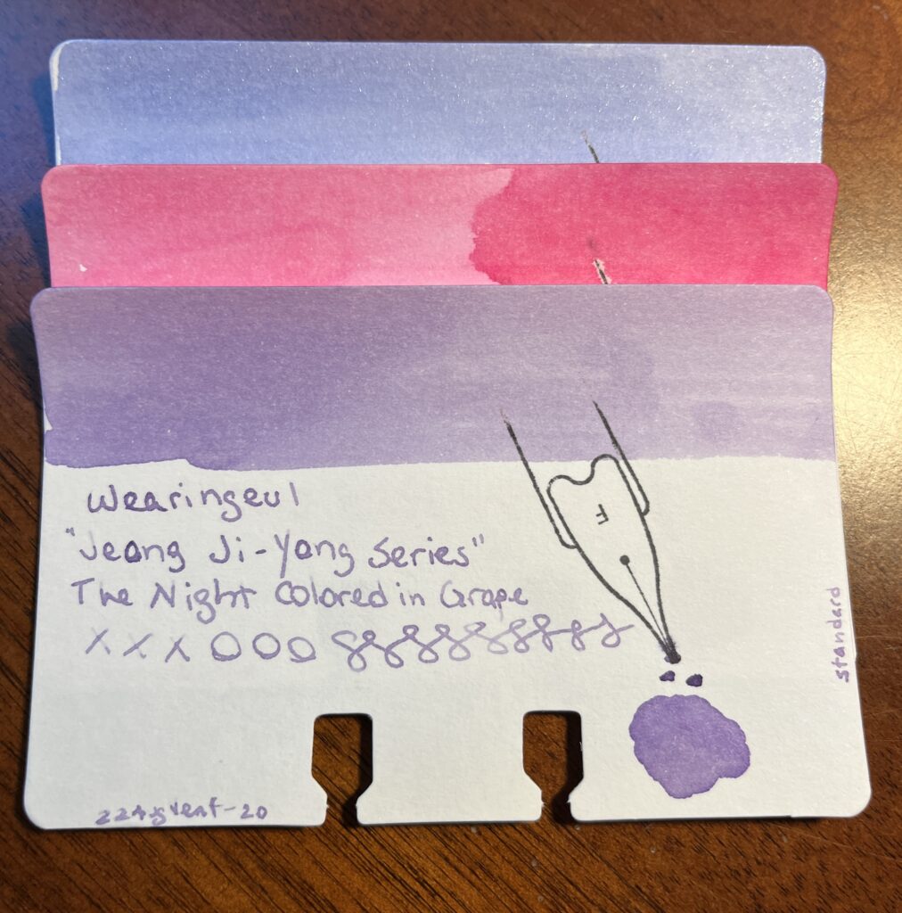
Jeong Ji-yong Series, A Watery Star, Floating Cloud, The Night Colored in Grape
Did you know…that Jeong Ji-yong’s work has three phases, the first of which is a sort of sensual phase, then a religious one, then a more traditional one. These three inks are pulling from three poems from his first phase, which called into imagery of the sea often.
A Watery Star is from “Windowpane” (1929)
Floating Cloud is from “Home” (1927)
The Night Colored in Grape is from “The Dream of Wind and Waves” (1922)
He was also a Korean poet! That’s two at this point.
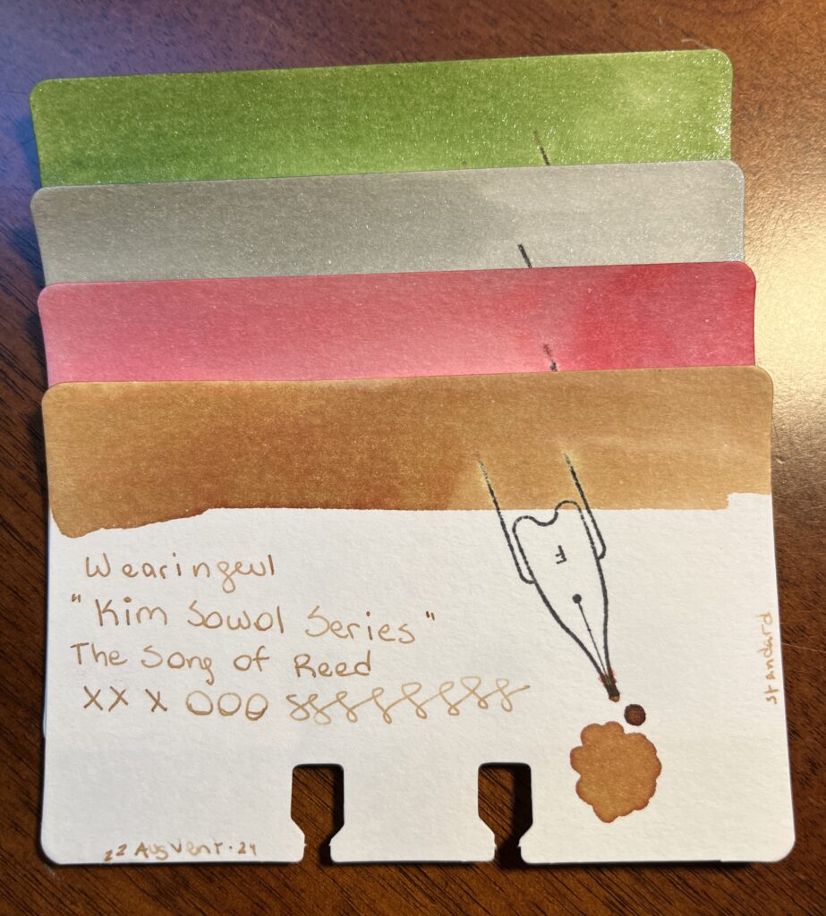
Did you know…Kim Sowol is our third Korean poet? I didn’t find a ton on this one – but I found it interesting that all four of the authors from Korea/Japan at this point were all writing in the same time periods. I couldn’t link the inks with his poems, but I did find a note that his poetry called Korean folk songs to mind, and these titles make sense with that in mind haha.
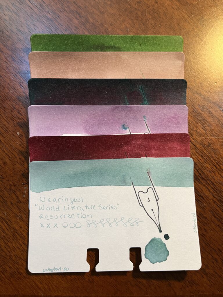
World Literature Series, Beneath the Wheel, Don Quixote, For Whom The Bell Tolls, Jane Eyre, Metamorphosis, Resurrection
Alright this was a series of books by different authors that have nothing to do with each other! They’re all from different countries, come from different time periods, and deal with different topics. Which is probably the point of a World Literature Series… Here is a random fact about each one:
Beneath the Wheel (Hesse, 1906) was reissued in 1957 as The Prodigy.
Don Quixote (de Cervantes, 1605) often labeled as the first modern novel.
For Whom The Bell Tolls (Hemmingway, 1940) title comes from John Donne’s series of meditations and prayers on health, pain, and sickness.
Jane Eyre (Brontë, 1847) revolutionized prose fiction – a Bildungsroman which is a literary genre reflecting “coming of age” themes.
Metamorphosis (Kafka, 1915) this is a super weird book, seriously. Starts with a dude turning into a giant bug. And continues from there.
Resurrection (Tolstoy, 1899) was the last of his major long fiction works published in his life time.
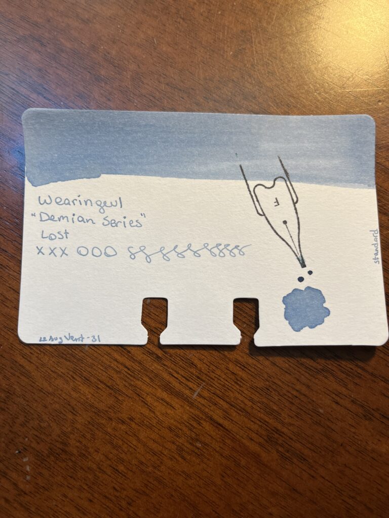
Demian Series, Lost
Dieman? Nope – Demian! I only sampled one of the two inks from this series – saving the second one for Catch All Month in November. So tune in next time. 🙂
Can you tell I had a heck of a lot of fun here? I wonder if I’ll be able to do something similar with the other inks. I know Vinta inks are all linked to stories and fables and stuff – so that could be a fun historical review? That’s a good idea, thanks internet!
Funny story, a friend of mine wrote a book with a character name Caran and I texted her to show her I’d just found this ink and she told me that is where she got the name! Small world, eh? By the way – excellent book, check it out: Resonance, by Dora Raymaker
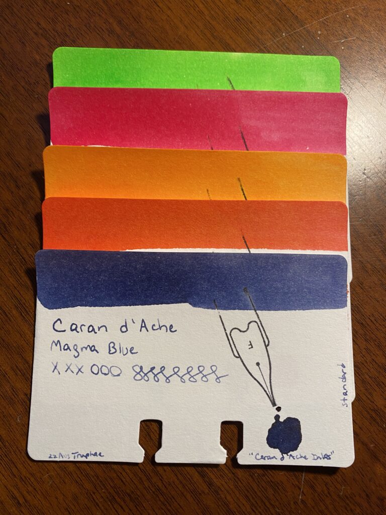
Qtip line swabs of each Truphae Sample
These are really fun colors! Two of them remind me of other inks I already love – Down the Don Valley by Ferris Wheel Press and Wonderland by Diamine. I will definitely use the other three, altho reds are not my favorite so…maybe not that one. It was kind of interesting how 4 of these inks were vibrant and bright and the blue was a lot darker. But the ink wasn’t sticky, it wrote smoothly, it didn’t feel dry, and it does not bleed thru the page. All good things. Overall solid inks!
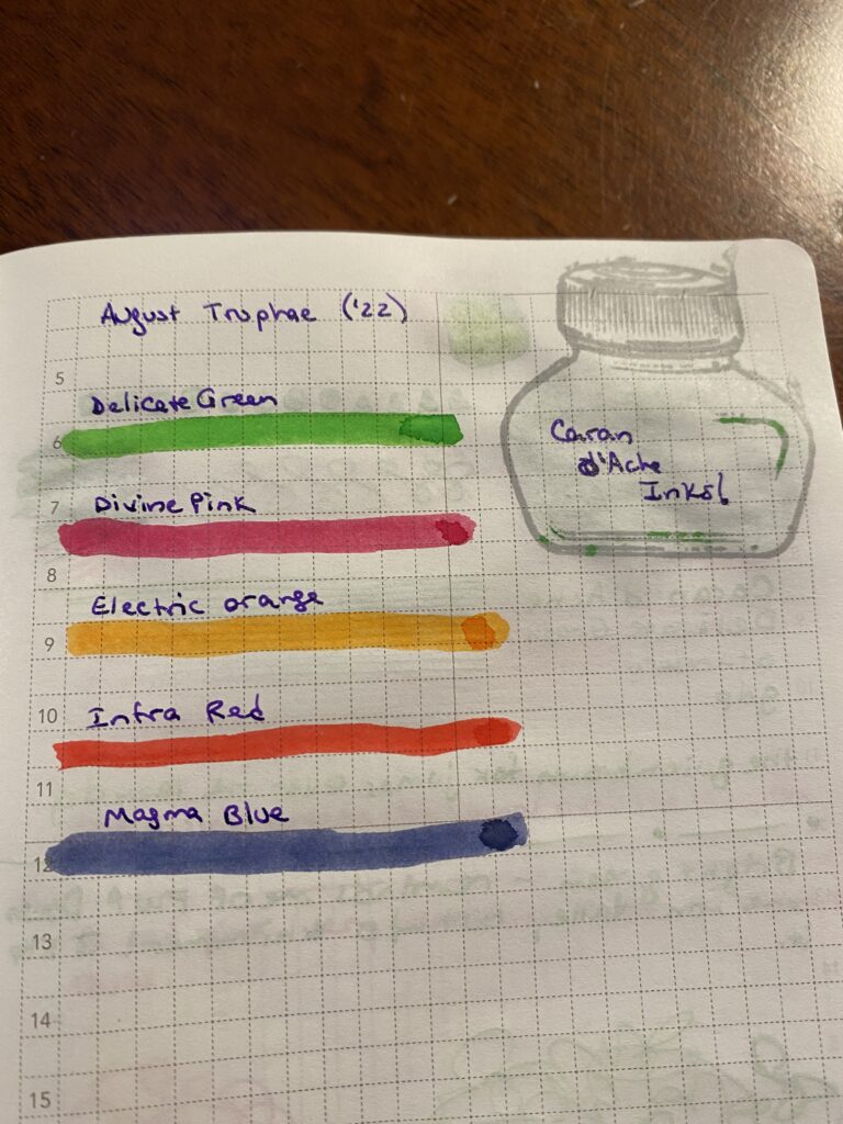
Sample Cards for the Caran d’Ache Truphae inks I sampled in August.
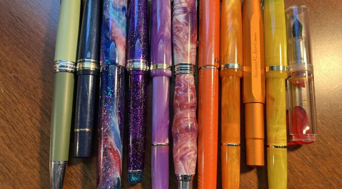
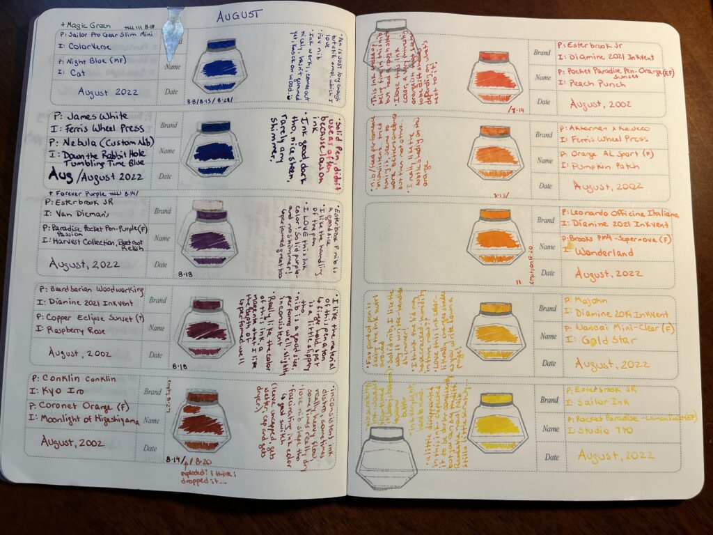
Twelve pens is a lot of pens but I am happy to report that I really used most of them. There were two with weird nibs, but after I tuned them they were okay. There was a yellow that was mostly too light for me to read, so ended up doing mostly accents with it. My header pen only saw use on headers because I was worried about running out of that ink – didn’t have a lot of them. I will say switching out that one orange ink was a very good idea.
I am now realizing how vague this is going, so let’s just list them all out instead!
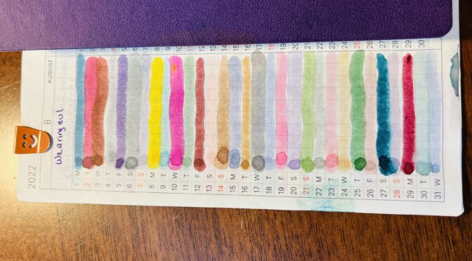
Record of August pens and inks and FEELINGS
1. Hong Dian 5019, Lan Tian – May Flowers (EF) / Ferris Wheel Press Moonlight Jade – Magic Green Pen! I adore it. The end. (Refilled 9 times) 2. Sailor Pro Gear Slim Mini – Night Blue (MF) / ColorVerse Cat – New Forever Pen! Shall dub Forever Blue – pretty much identical experience to the Forever Purple pen, just a different favorite shimmer ink. – “Pen is JUST long enough, but still smol, which I love. Fav nib. Ink works, comes out nicely, hasn’t gummed yet, knock on wood. :)” (Refilled 3 times) 3. James White – Nebula (Custom Nib) / Ferris Wheel Press Tumbling Time Blue – Solid pen, didn’t use it a ton because low on ink. Ink good, dark tho, nice sheen, rarely any shimmer. 4. Sailor Pro Gear Slim – Purple Northern Lights (MF) / ColorVerse 54 Hayabusa Glistening – Forever Purple Pen! Also adore this one. The end. (Refilled 7 times *yay*) 5. Esterbrook JR Paradise Pocket Pen – Purple Passion (F) / Van Dieman Beetroot Relish – “Esterbrook F nib is a good size. I like the handling of the pen. I LOVE this ink color! Solid purple – and no shimmer! Performed great too.” (Refilled 1 time) 6. Bearbarian Woodworking – Copper Eclipse Sunset (F) / Diamine 2021 Inkvent Raspberry Rose – “I like the material of this pen a ton – the finger hold spot is a little slipper tho. Nib is a good size, performs well usually, slightly inconsistent. Really like the color of this ink, a magenta I like the depth of – performed well.” (Refilled 1 time) 7.Conklin – Coronet Orange (F) / Kyo Iro Moonlight of Higashiyama – “Inconsistent ink distro, sometimes really heavy flow, sometimes really dry. Love the nib shape tho. Fascinating ink color – glad I switched it out! (Leave uncapped, gets wetter, caped, gets dryer?)” (Refilled 2 times – exploded a little bit once, maybe because I dropped it) 8. Kaweco AL Sport Limited Edition – Orange (F) / Ferris Wheel Press Pumpkin Patch – “Nib/feed performance inconsistent…tried tuning it, seems to work better sometimes but then not others…I really like the subtle shading on this orange.” (Refilled 1 time) 9. Leonardo Officina Italiana Brooks PM4 Limited Edition – Supernova (F) / Diamine Inkvent 2021 Wonderland – Still love this ink. It ended up not really fitting in the palette – so when it ran out on the 20th, I just didn’t refill it. 10. Esterbook JR Pocket Paradise Pen – Orange (EF) / Diamine 2021 Inkvent Peach Punch – “This ink ended up being fine in this nib, but had a rough start. I love this ink color, a very interesting orangish that seems to be different shades depending on what’s next to it!” (Refilled 1 time) 11. Esterbook JR Pocket Paradise Pocket Pen – Yellow (EF) / Sailor Ink Studio 770 – “Nib scratchy, ink wouldn’t flow, tuned it (baby’s bottom?) and seems better. Ink very light, hard to read. A little disappointed in this ink 0 expected it to be darker consistently but you can see the difference. Readable now! Nib still a little scratchy.” 12. Majohn Wancai Mini Fountain Pen – Transparent Clear (F) / Diamine 2019 Inkvent Golden Star – “Fav part of pen is seeing the ink swirl around. Solid nib, I like the way it writes – can handle shimmer! I think the cap may have cracked – humidity in there now?? Love this ink color – literally changes shades as you write down a page!”
So, if I had to pick a favorite (besides my Forever Pens) it would have to be either the purple Esterbrook with Beetroot Relish in it, or the Majohn with Golden Star in it. For different reasons. Oo! Or the Beardbarian with Raspberry Rose. It was a good month!
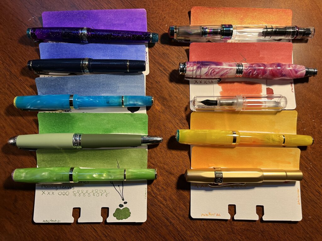
Picking colors for my September pens and inks was a little difficult for me because the theme is “Fall” and fall colors have a lot of red in them and I do not like red. I resorted to google and ended up finding a really nice set of 5 colors – and I have no idea how to describe them professionally, but here we go! Sort of like a teal, evergreen-y type blue, a kind of muted moss green, a rust reddish, an orange that is like a yellow-orange and a yellow that is closer to an orange. Yep. Doing great.
Remember last month when I said I might keep my blue Sailor mini with Cat in it as part of my permanent pens? Well now we have the Forever Purple, Magic Green, and now a Forever Blue. Besides those three, I realized I was looking for colors really similar to my “sunset” theme, but the biggest difference for me was the colors for August were more vibrant and the ones for September are more muted. Insert something clever here about saturation? I am sure Aaron said something about saturation at some point and clearly that did not stay in my head.
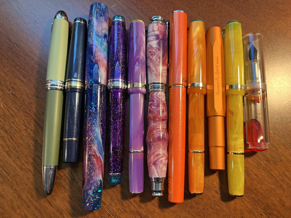
I’ve got 10 pens this month and besides the three forever pens, none of the inks/pens are being carried over from August. That’s not because I didn’t like them, but they just didn’t end up working with the muted theme I was trying. And yes, I ended up with a kind of rainbow again and I refuse to be upset by this. I like rainbows.
10 pens in two columns, one purple, two blues, two greens on the left, 3 red/orange and 2 orange/yellows on the right
I picked up a 1.1m stub nib for one of my Esterbrook pens, and I am interested to see how it handles that shimmer ink. Yellows kind of need a broader application I think…who knows, I usually use fine nibs!
The Vintage Copper is going into one of those clear Majohn mini pens because I anticipate it being gorgeous like the one I was using in August. Twsbi diamond is one I usually enjoy, so looking forward to that, Kaweco is a known great – but a broad nib, so we shall see if I still like it. And I am reusing the Beardbarian pen because it is my favorite right now.
Because I am not wild about all of the colors individually or in pairs, I am going to try using them as a whole palette instead of singly. I have been using a different pair of pens every day of the week, to distinguish the days, to use the pens more regularly, and the pair instead of one so I could have an easier time navigating my notes. This month I will be seeing how annoying it is to switch out every pen for every new line item in my work notebooks instead, in an attempt to not grow to dislike a single color so much I stop using it. Granted, if that does happen – and it might – I can just switch out the ink and/or pen. Still, might be interesting.
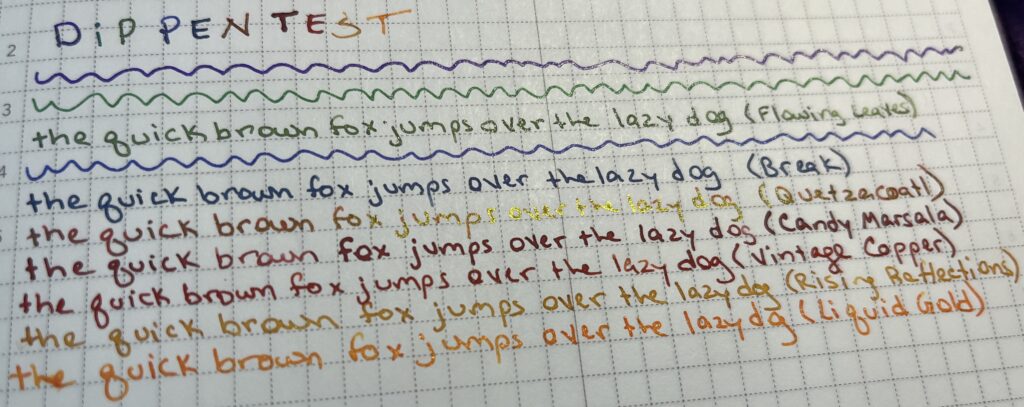
Because of the ink swap last month immediately after putting that one orange in a pen and seeing how mushy it was, I decided this month to try the inks on my usual paper before getting them into pens.
Each line is a different ink color
You may notice the 3 reds in there that look very similar. Because of this, the new rule (for next month) is to dip test the inks before I decide on a palette, instead of just before I put them in a pen.
Wish me luck!
An #ActuallyAutistic #ADHD #AmbulatoryWheelchairUser With Opinions