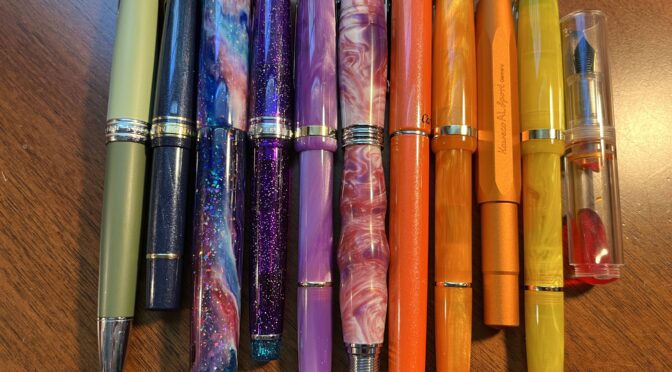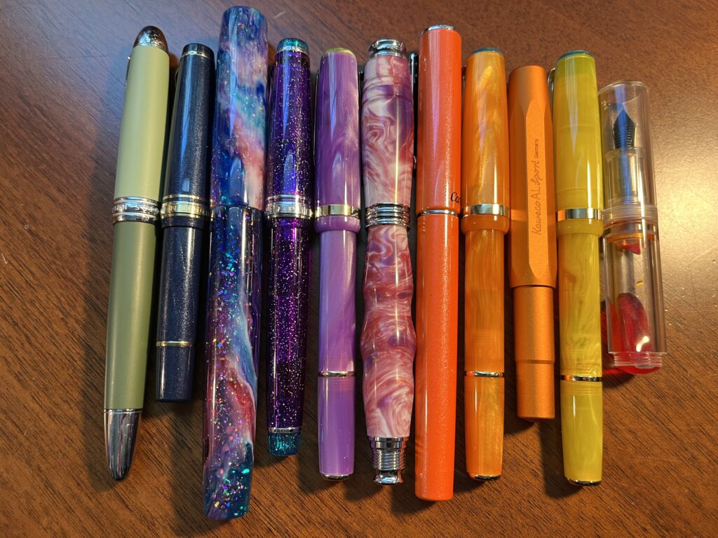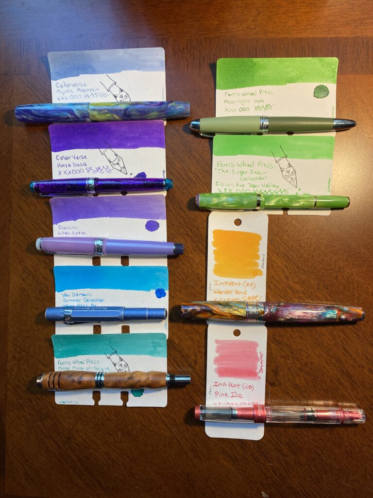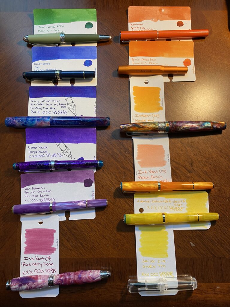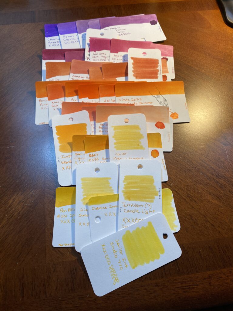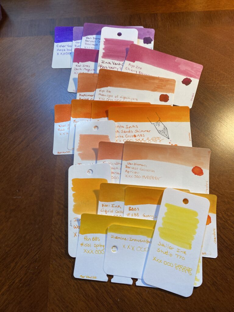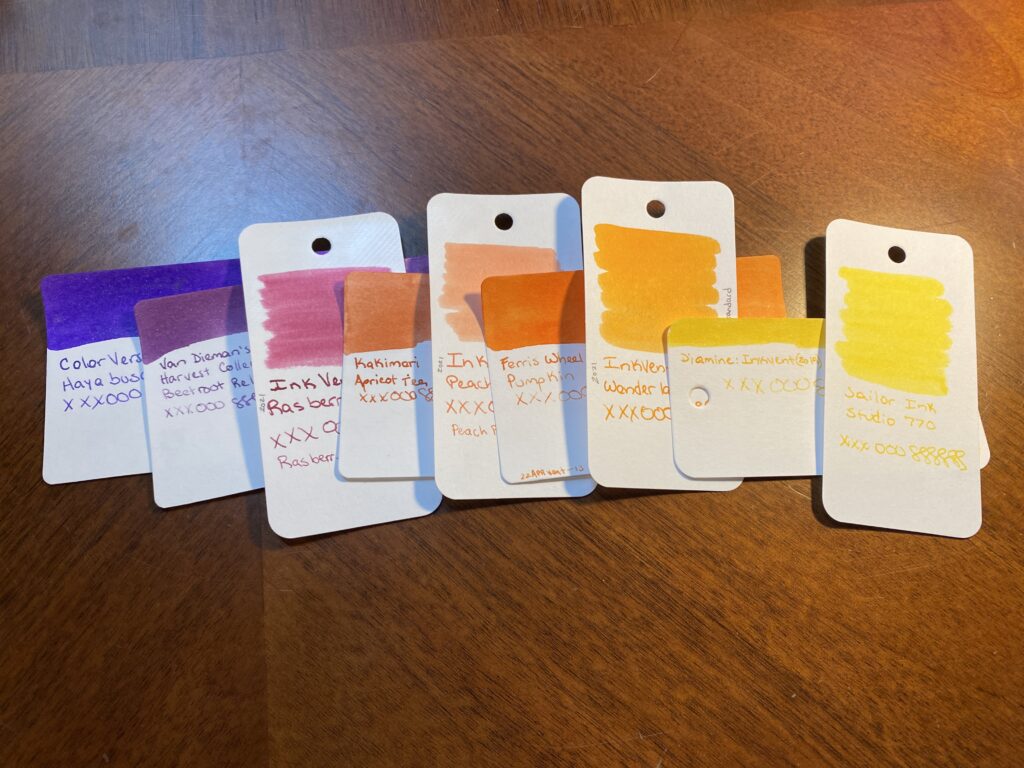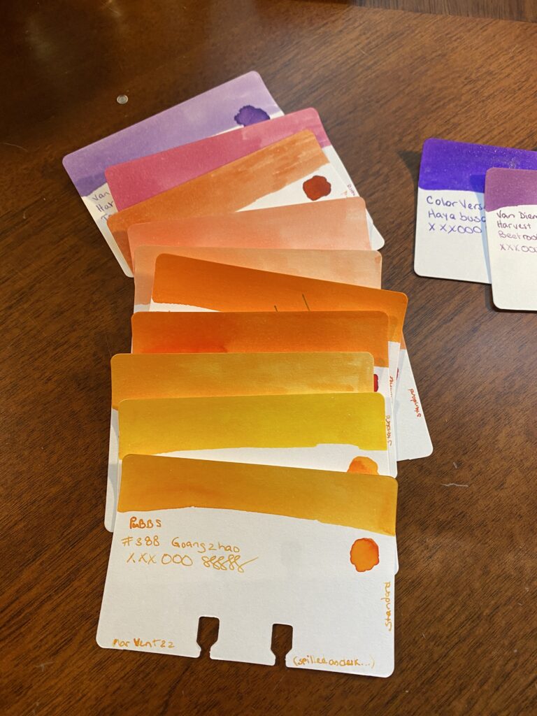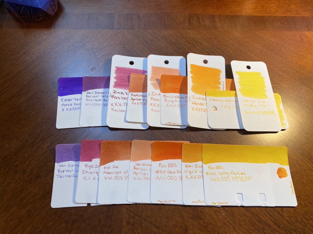
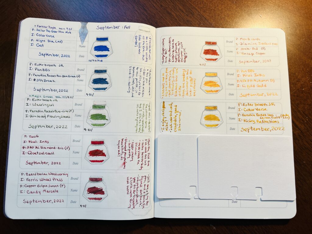
I enjoyed my palette this month. Fall is not my favorite season weather wise but the house I grew up in was always very very decorated for fall. Very decorated. So I guess now as an adult, I find a fall palette pleasing. I spent a lot of my growing up years in Maine, and the fall leaves there are literally a thing people will take a vacation to go see. Worth it.
I used a dusky blue, a darker green and a light green, three different shades of orange and two of an orangish and darkish yellow. I felt that this spread covered what I remember of the woods in the autumn, on long drives in Maine. I googled fall palettes, and found one that looked about right and then winnowed down until I had what I ended up using.
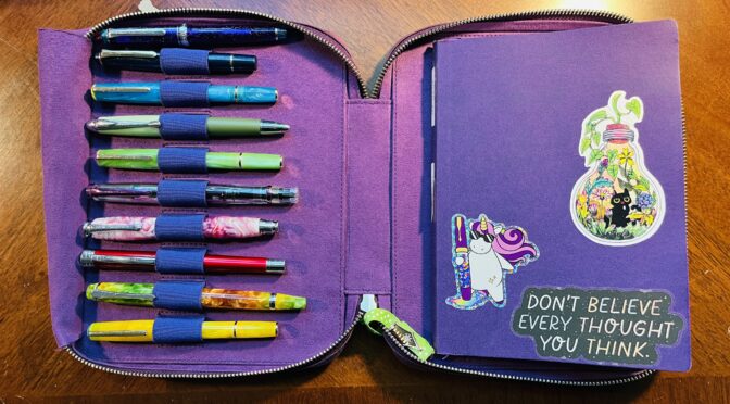
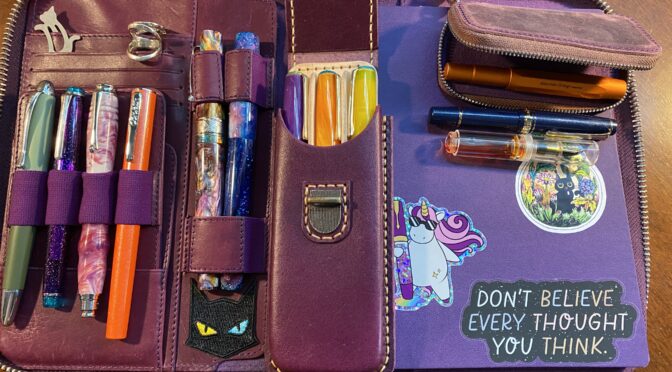
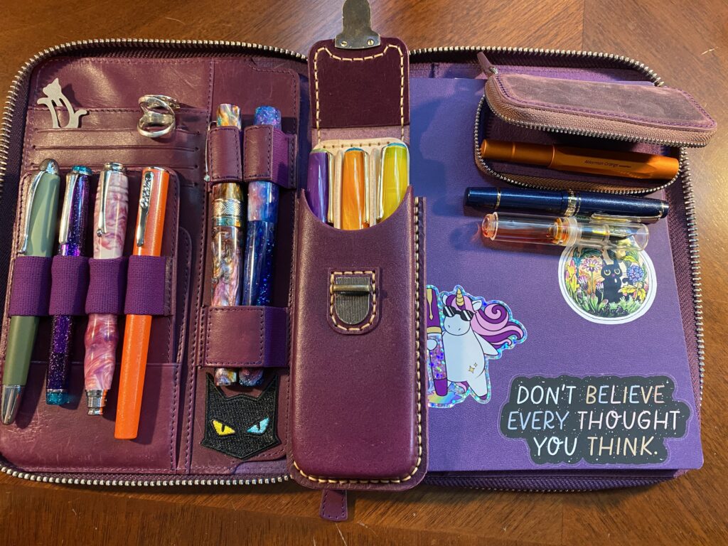
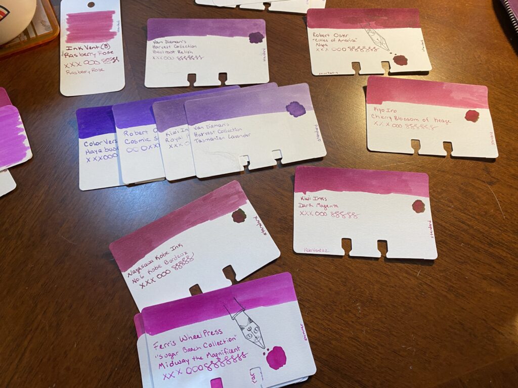
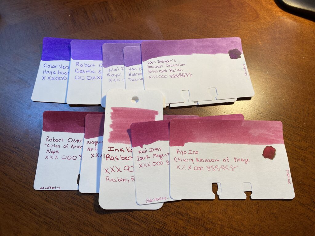
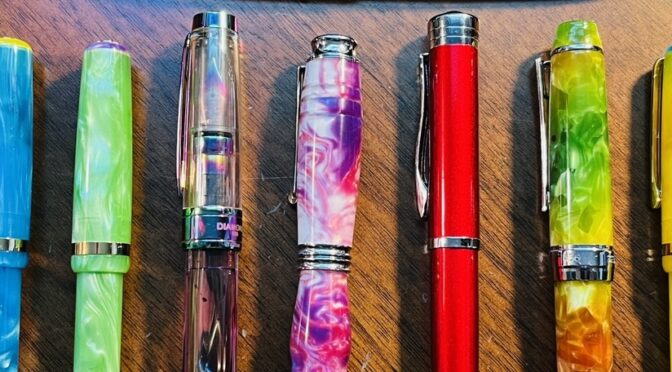
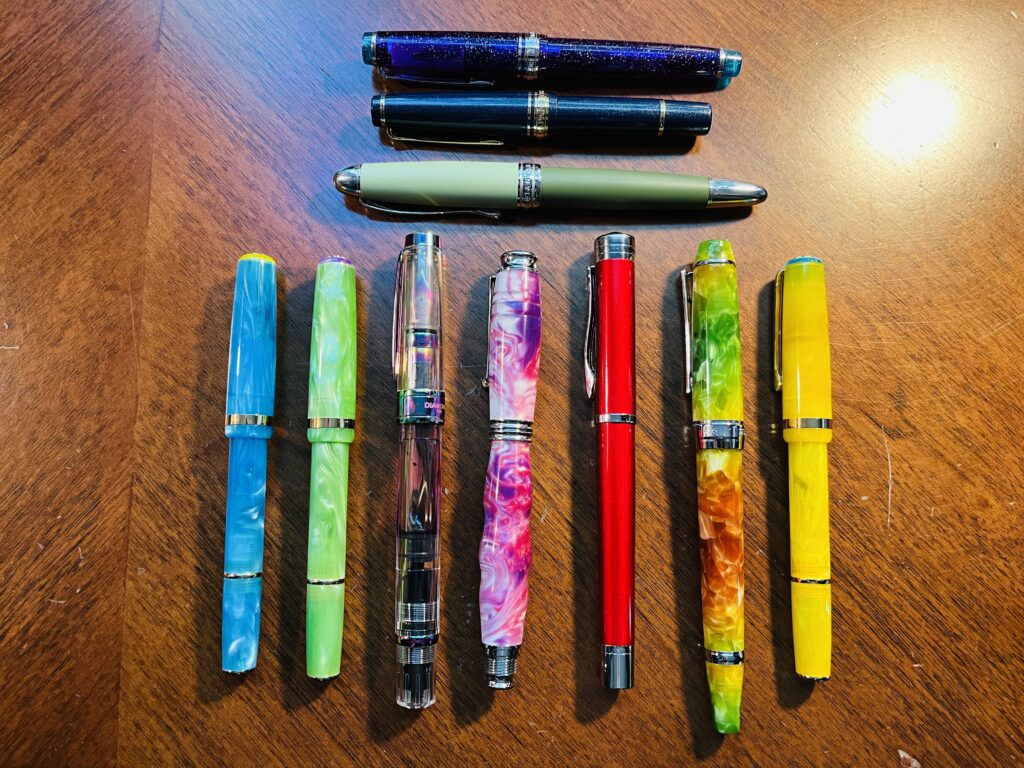
I got to try out a bunch of new inks and a couple of new pens. I made a couple of changes for the pens I started out using:
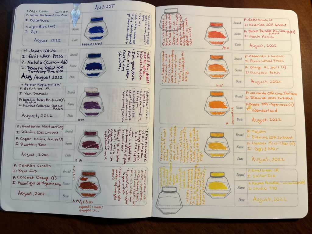
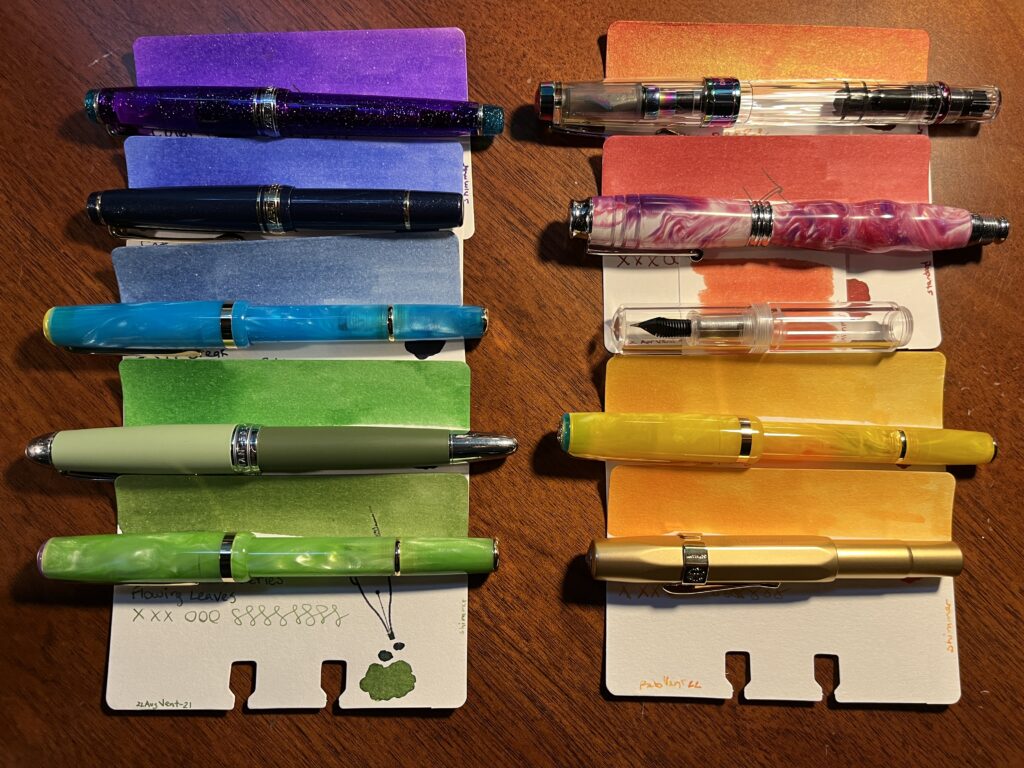
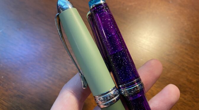
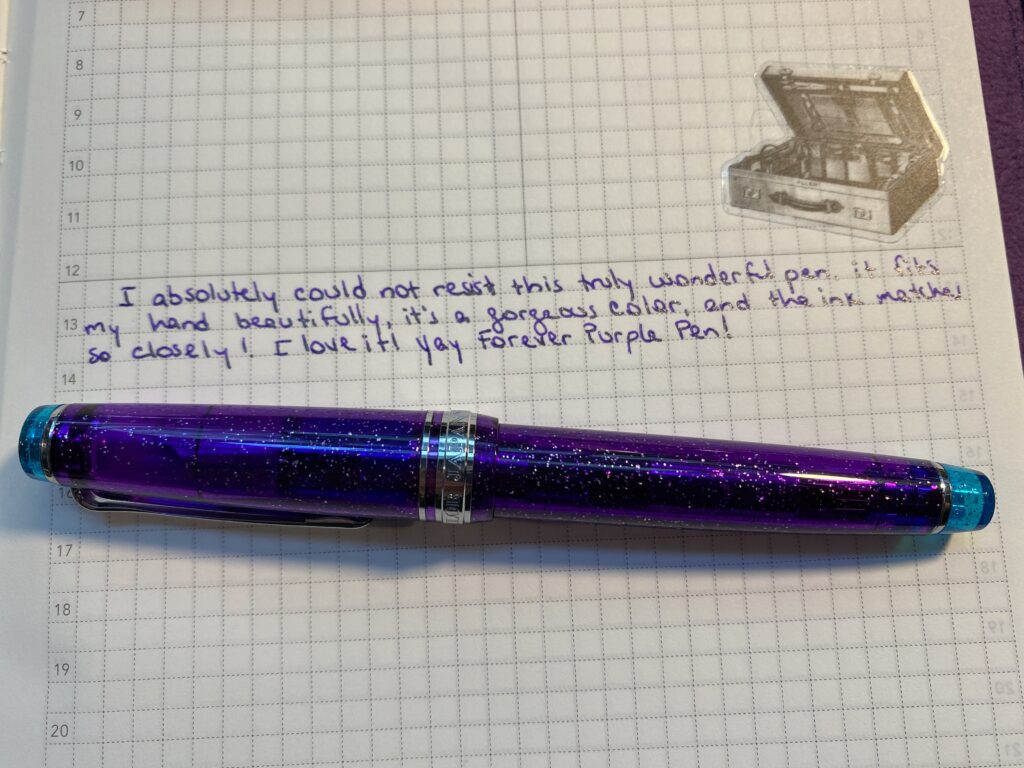
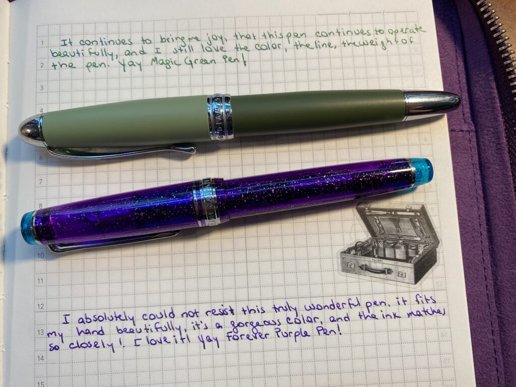
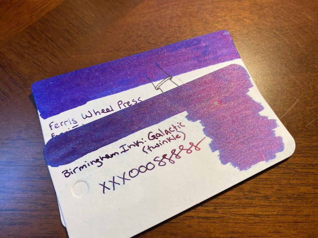
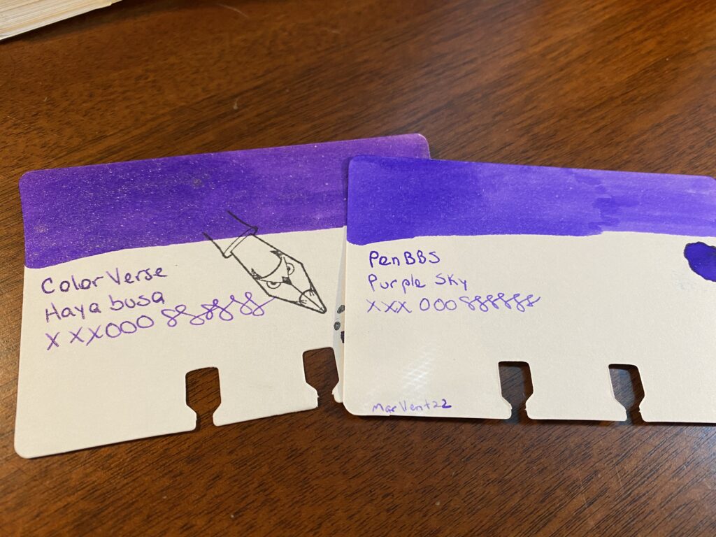
1. Sailor Pro Gear Slim – Purple Northern Lights (MF) / ColorVerse 54 Hayabusa Glistening
– This is my Forever Purple pen, continues to perform admirably!
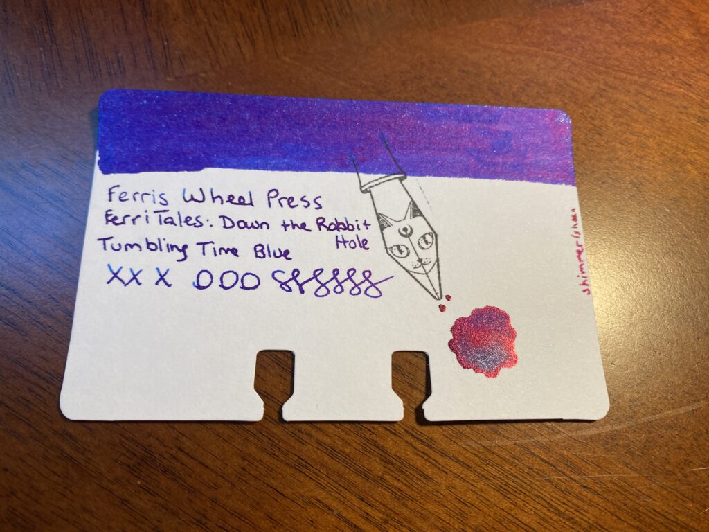
2. Sailor Pro Gear Slim Mini – Night Blue (MF) / ColorVerse Cat
– This is my new Forever Blue pen, had a couple of issues with it sticking a little bit, but that seems to be something I am just going to have to deal with when using ColorVerse Cat. Sad pants.
3. Esterbrook JR Pocket Paradise – Blue Breeze ( F) / PenBBS Break
– This blue ink is really perfect for a fall and I enjoyed writing with it, zero problems. Soothing, really.
4. Hong Dian 5019, Lan Tian – May Flowers (EF) / Ferris Wheel Press Moonlight Jade
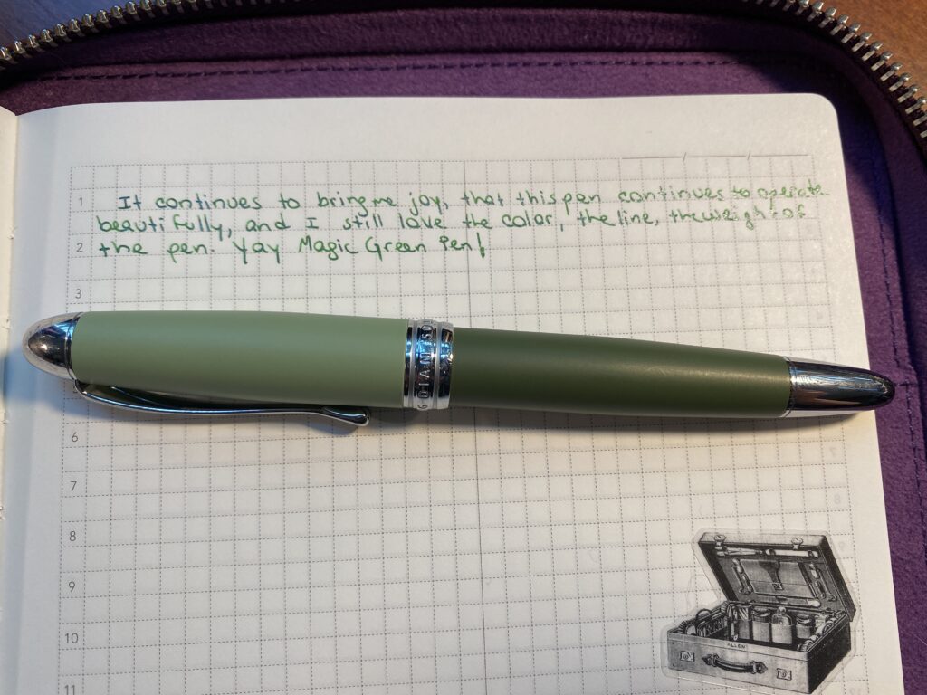
– My Magic Green pen, continues to be magic.
5. Esterbrook JR Picket Paradise – Key Lime (F) / Wearingeul Flowing Leaves
– I already knew I liked this pen but I ended up really adoring this shade of green. And the shimmer behaves beautifully.
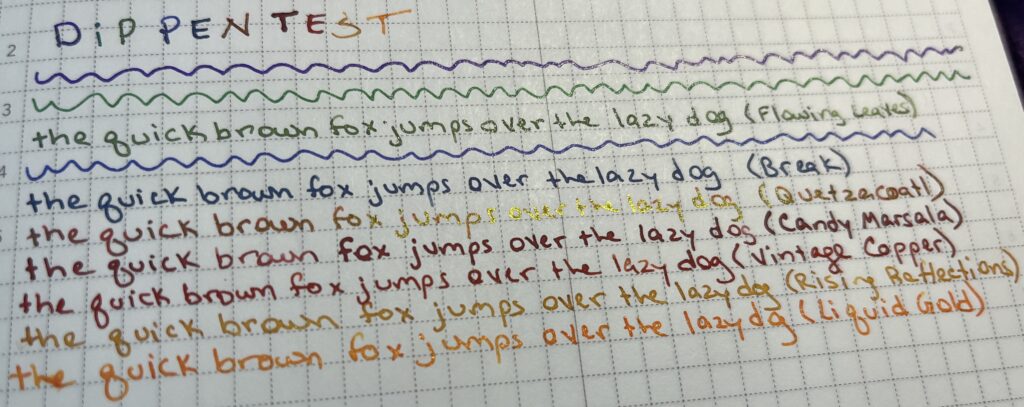
6. TWSBI Diamond 580 – Iris (F) / Kiwi Ink Quetzalcoatl
– I do love my Diamond pens. And I’ve used Quetzalcoatl before and it was as lovely as I remember. Although, it’s supposed to be a sheen AND shimmer ink, but the shimmer never comes through on page. I have two theories – one is that the paper I am using just shows sheen better. The second is that sheen always trumps shimmer. I really need to experiment more with papers…
7. Beardbarian Woodworking – Copper Eclipse Sunset (F) / Ferris Wheel Press Candy Marsala
– I really love this pen. Marsala came through lovely, and only got a little stuck once or twice, but resolved on it’s own.
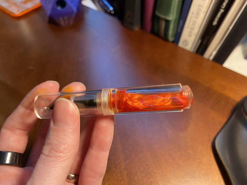
8. Majohn Wancai Mini Fountain Pen – Transparent Clear (F) Monteverde Strata – Red (F) / Diamine 2021 Inkvent Vintage Copper
– I switched pens purely because this Monteverde pen was a sparkly red and came in my monthly Truphae box. It writes okay, gets sticky sometimes. Vintage Copper is one of my very favorite inks, but fun fact – I accidentally put some Raspberry Rose back in here when I was emptying some pens about a year ago. It doesn’t seem to have changed the color of this sample bottle of Vintage Copper, but who knows.
9. Kaweco AL Sport – Gold (B) PenBBS 456 Fountain Pen – Autumn (F) / Kiwi Liquid Gold
– I kept finding ink inside the lid and all over the nib even when the pen hadn’t been dropped, so when my new PenBBS showed up, I switched over. I still haven’t figured out vacuum pens, but that’s on me. I love the way both of my PenBBS pens look, and the writing on this one was mostly fine. The color variations and shimmer came thru nicer with the broad nib, but this wasn’t terrible. I think the times where it felt like the ink wasn’t flowing well was something to do with me not using the vacuum part correctly. I’ll figure it out eventually.
10. Esterbook JR Pocket Paradise Pocket Pen – Yellow (1.1m Stub) / ColorVerse Rising Reflections
– This is the first time I have used a 1.1m Stub nib and I loved it! Shows off the ColorVerse Rising Reflections shimmer beautifully!
I am considering keeping Flowing Leaves and Vintage Copper for my “Monster” palette in October. I like how Flowing Leaves flows and decided it worked well for Zombie – and Vintage Copper looks good for Vampire.
I really want to figure out how vacuum pens work. Must science it. My favorite discovery of my palette this month was the 1.1 Stub nib – it’s so good! I wish I wrote larger when journaling, I only ended up using it for headings. It was odd not using any Kaweco’s. I count this palette as a success!