Let’s continue where we left off, shall we? In my last post I showed you how I start to pick inks out for my monthly palette. I go thru all of the inks I have in my sample library and start – you know what? If you want to know more about how I started, go read THIS post.
Today I narrowed down my choices to two different – but similar – palettes. I usually have a rather flamboyant ink in the pen I put my custom nib in. I had two options for August and I ended up picking the one I haven’t used yet, just for fun. It also happens to be a better option for my sunset theme.
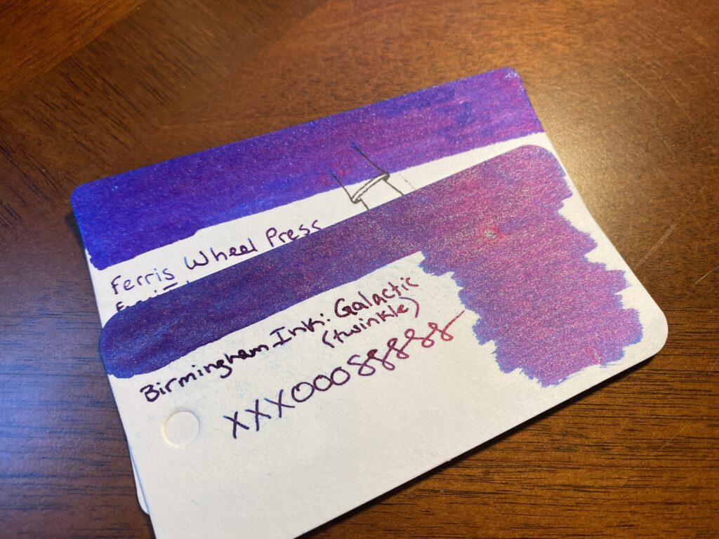
FerriTales: Down the Rabbit Hole
Tumbling Time Blue
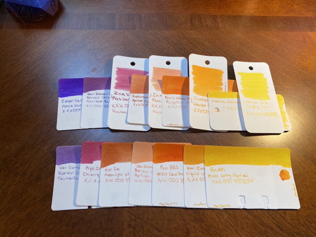
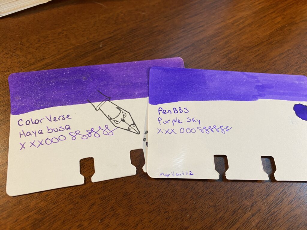
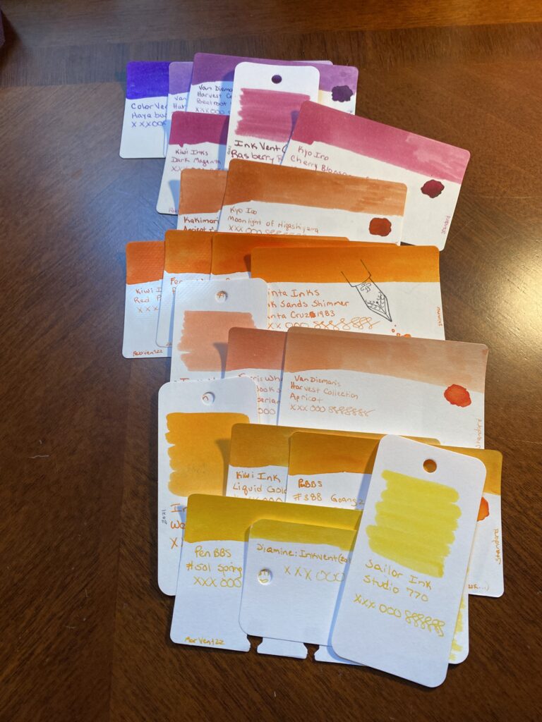
Next, I need to match my new colors to ones I end up keeping. For August I am keeping two inks from my July palette, an orange I am way too in love with and what I am referring as my Forever Purple. (It’s ColorVerse Hayabusa, in a Sailor Pro Gear Slim Northern Lights – it is my favorite.) Because my theme for August is “sunset,” and purple is technically a color that can be found in a sunset, I used that as an excuse to start this whole process. Any excuse to start with purples really. I’ve managed to keep purples relevant to these palettes for months now, haha. So, I took the Hayabusa sample and started by comparing the purples I have to that one.
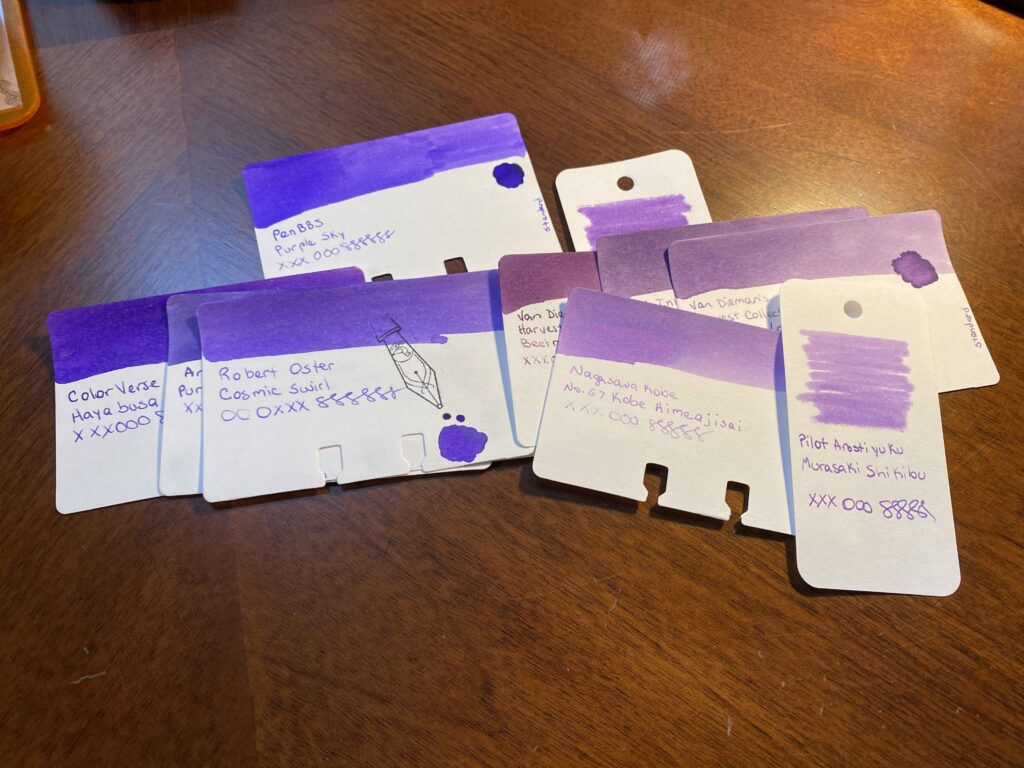
Every purple in the pile gets compared back to the first purple. I am looking for two things primarily this time – a color that is distinct from the Forever Purple, but also goes with it. I discard purples that look too dark or too light or fall outside of the theme. I ended up with a lot of options left over – which is intentional. I don’t want to narrow it down too much at the beginning.
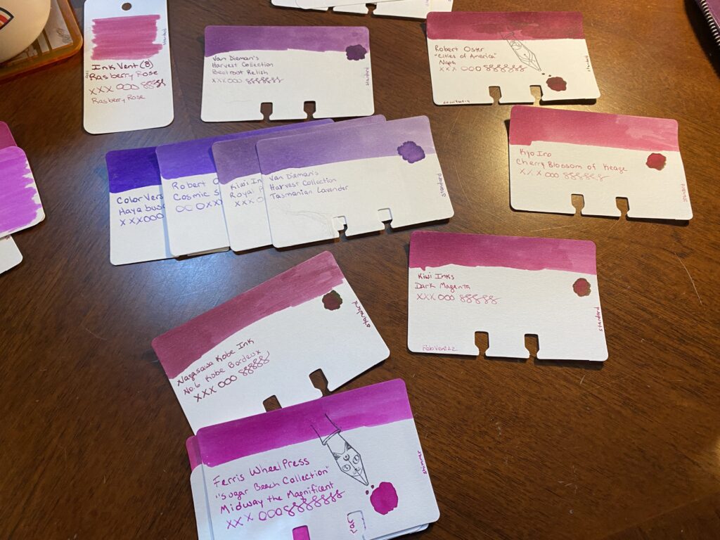
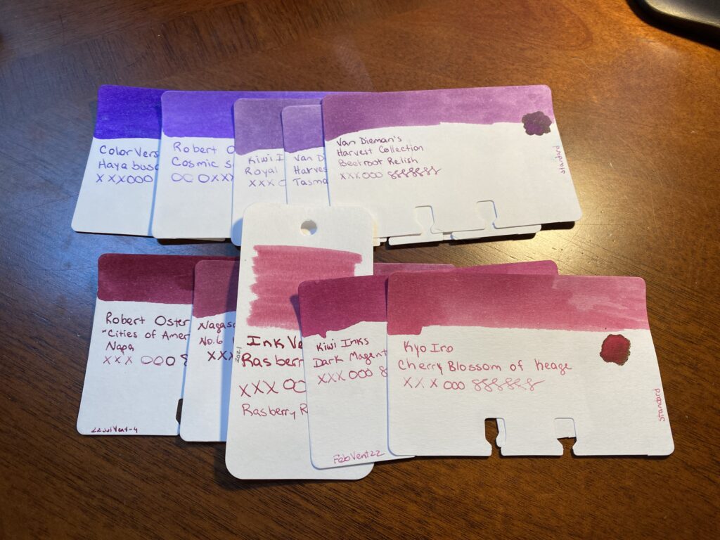
Once I have a more manageable collection of purples, I start adding in the magentas. I’ve already made certain decisions which can roll into the next color – for example, the samples that are too dark or light, those can be discarded quickly. And I can get rid of obviously too bright magentas. I’m again looking for a color that is distinct from the purples I have picked and yet still has a smooth transition which is the effect I am looking for this time. I ended up with a decent set of options.
Next up are the oranges. I actually had three fairly distinct oranges – a darker orange, a sort of straight orange which is a bit brighter, and then a kind of peach color. All of these would work well in a sunset theme, but I needed to see what worked with the purples and magentas I pulled. Choices so far continue to help me make some easy choices. I’m always getting rid of colors that are darker or lighter than I want for that month’s palette. Now I remove doubles – colors that are super similar to each other – or practically identical. I ended up not being able to narrow this pile down too far, because I really liked the three distinct oranges I started with. No worries, I still have another color to look at, that should help me decide.
To pick the yellows I really have to look at the writing on the card to see how readable it is. Many yellows are too hard to read when written with the nibs I use. And for the palette I’m looking for, I got rid of the darker ones as well.
Actually, I use the writing on each card to make my choices. So I’ll line up the cards so the writing is side by side. The swabs are gorgeous and good for picking broad swathes of color. But often the writing turns out very different from the swab. Close enough but when I am getting down to picking a color for sure, I want to look at the writing on the card.
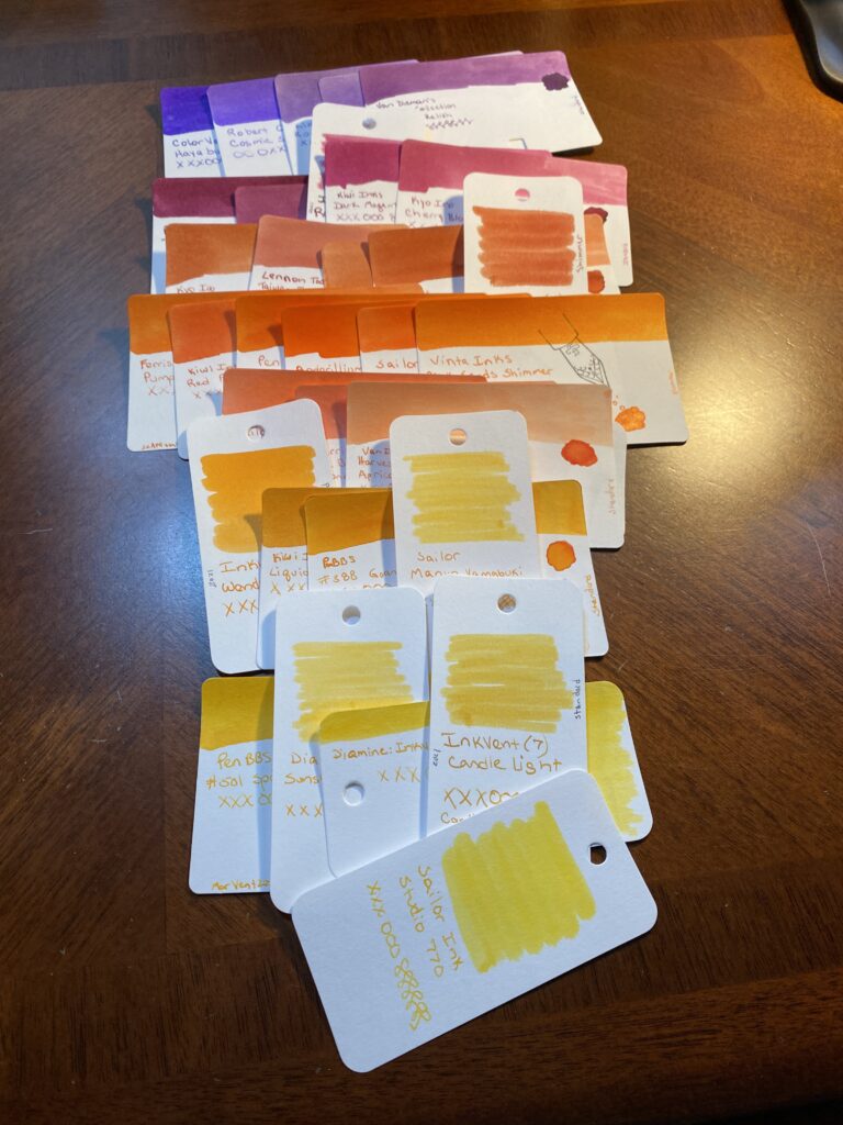
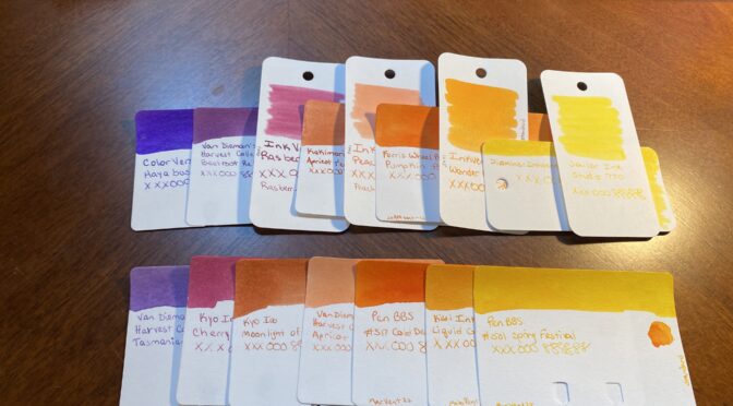
Next I narrow things down, this time I end up with 3-4 options per color. Each color gets compared to the one before it. I want a transition that reminds me of a sunset, so I’m comparing each color to the ones on either side, so I don’t end up just matching everything off the Forever Purple. Frankly, if the palette I end up with doesn’t work well with that purple – it’s fine. I have two colors that have been constant for months now, and they don’t have to go with the palette because I am keeping them for different reasons. I’ll go into that in another post.
And lastly – my choices, and my secondary choices. This is where I narrow things down to two very similar palette’s. I do this for three reasons. Firstly, I want to be able to walk away and look at something else for a bit before making the final decision. At this point I will have been staring at these colors for at least a half hour. Second, Husband is the color expert in this house. He literally used to do that for a living, making sure colors were accurate. And third is that I like keeping him involved in my silly hobby. This is an easy for us to collaborate. And it’s fun explaining my thought process to him and what I am looking for.
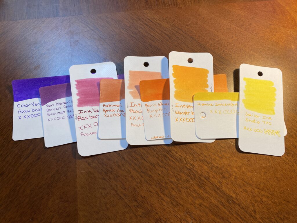
ColorVerse, Hayabusa
Van Dieman’s Harvest Collection, Beetroot Relish
Diamine 2021 Inkvent, Raspberry Rose
Kakimori, Apricot Tea
Diamine 2021 Inkvent, Peach Punch
Ferris Wheel Press, Pumpkin Patch
Diamine 2021 Inkvent, Wonderland
Diamine 2019 Inkvent, Gold Star
Sailor Ink, Studio 770
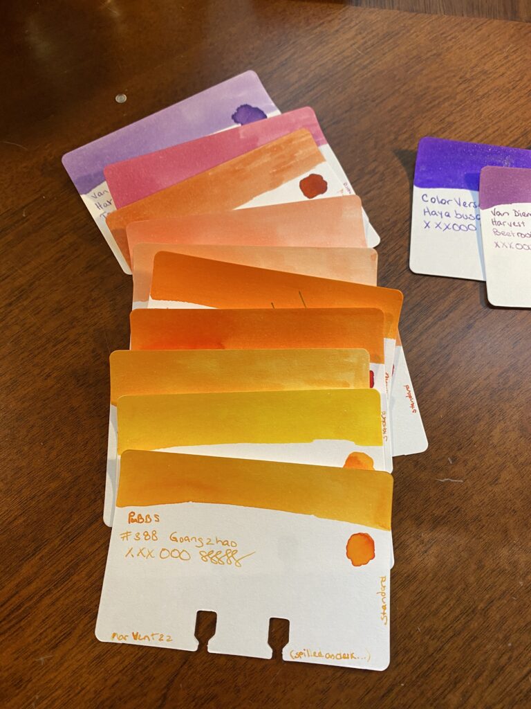
Van Dieman’s Harvest Collection, Tasmanian Lavendar
Kyo Iro, Cherry Blossom of Keage
Kyo Iro, Moonlight of Higashiyama
Van Dieman’s Harvest Collection, Apricot
PenBBS, #517 Cold Dews
Kiwi Ink, Liquid Gold
PenBBS, #501 Spring Festival
And that’s where I’ll leave it today! When I’ve got these two sets of options like this I can start seriously matching pens to the possible ink colors. Often I have some ideas already – for example, I had already pulled all of my orange pens for this palette as soon as I decided on the sunset theme. I also have a new purple and a new tiny clear one I want to try. But I don’t always know which colors I am going to pick until the very end and sometimes I don’t know when a new pen might be coming in, so I keep my options open.
By next weekend – the end of the month – I will have picked both the palette and the pens, because I’ll need to set them up and I’ll reveal that next time! Until then, if you have a favorite color from this post, please share!