Tag Archives: Kakimori

Apricot Tea vs Moonlight

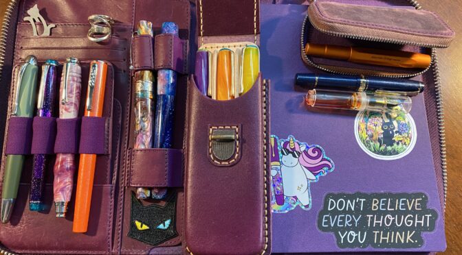
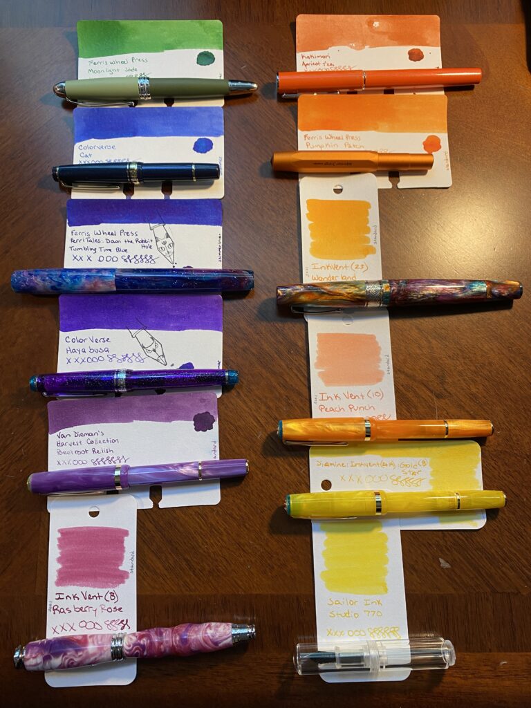
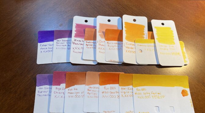
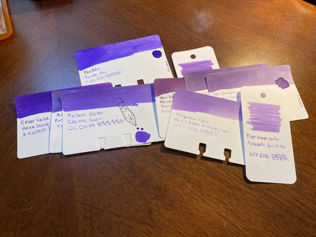
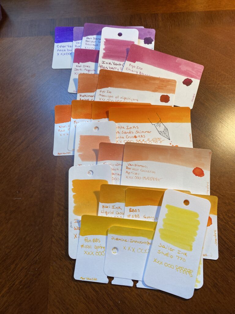
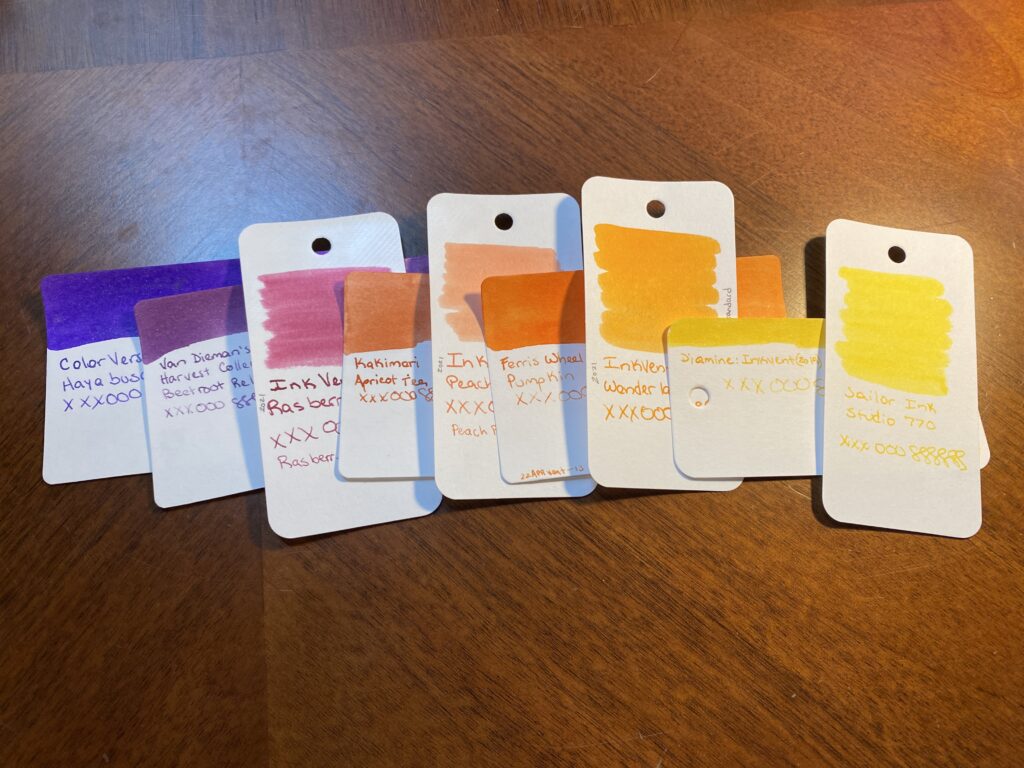
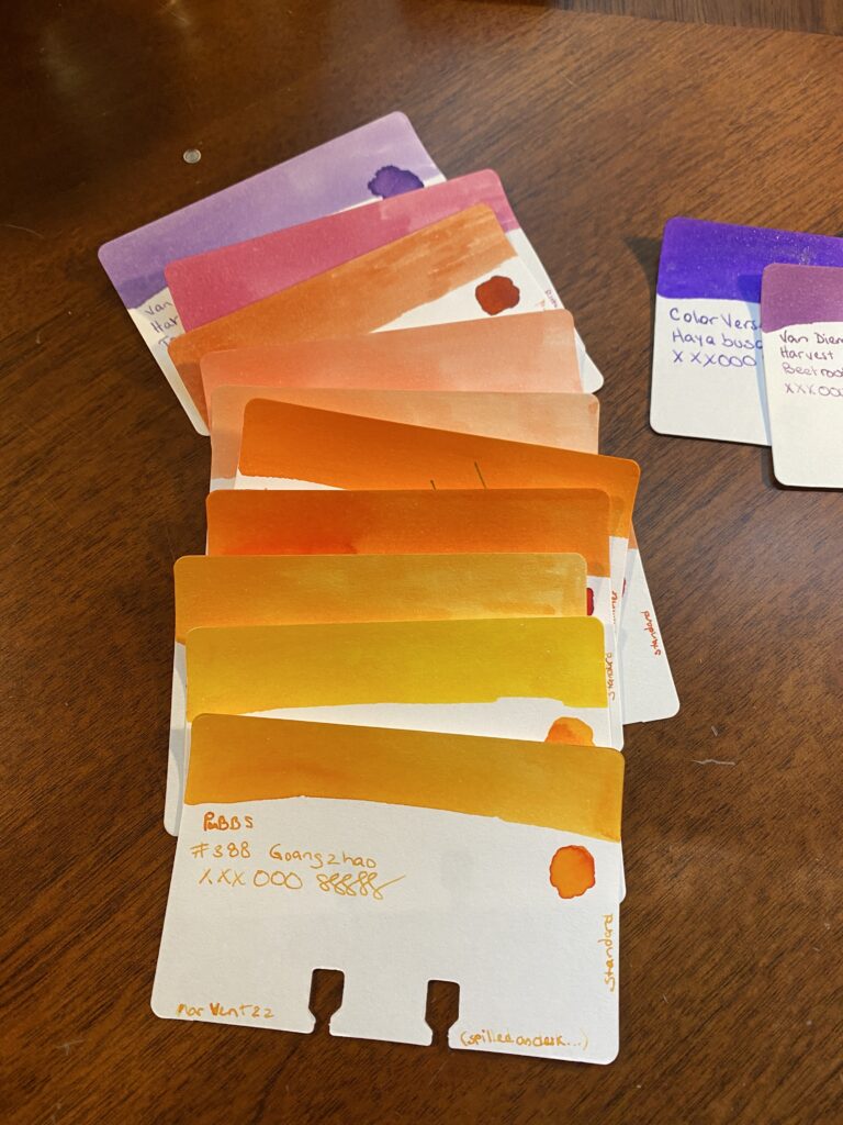
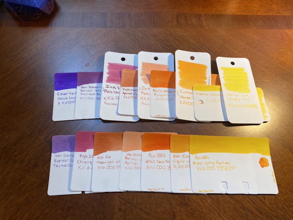
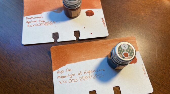
I started the August Pen/Ink Palette with an ink called Apricot Tea from Kakimori in the Conklin pen. I pick my colors using my sample cards and the sample book where I wrote out some stuff on the kind of paper I usually use right now. I currently don’t pull the ink bottles until the day I am going to fill the pen – which might change in the future haha. 

A hand holding a very small clear glass bottle with a silver cap with an opaque orange liquid inside.
Look at this tiny adorable bottle of ink! Also check out the milky texture…

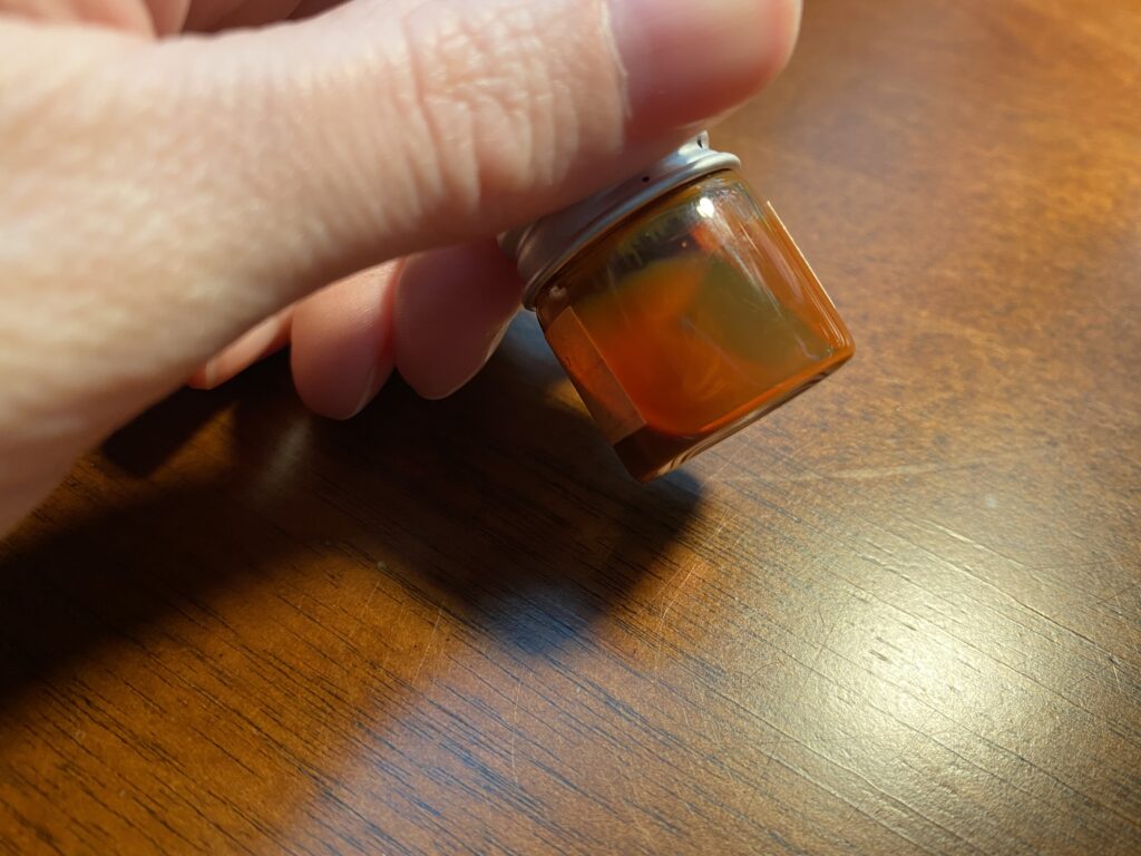
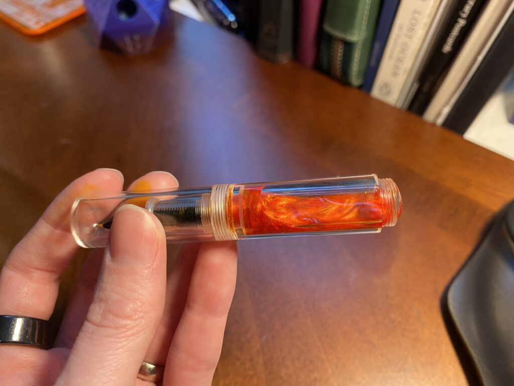
When I pulled this ink out of the drawer to ink my pen I hesitated. The consistency or texture of the ink was more…milky? Viscous. That’s the word I want. Instead of the watery consistency I am used to. It seemed odd. Different from the majority of my other inks. So I rechecked the sample book…seemed fine? And I shrugged and put it in the Conklin Coronet Orange to check it out. 

A notebook page with Kakimori Apricot Tea ink sampled on it in various ways. It is not blurry.
Kakimori Apricot Tea sample page, which is NOT blurry. Rar.
A sample card with an orange ish swap at the top, text reads “Kakimori Apricot Tea xxxooosssssss” and a silver cap is resting on the card, has a sticker with an orange ish dot and a sticker with (23) written on it. The sample card is resting on a notebook page. There is text written on the page, it reads “Why must this be so friggin blurry?? I love this color so much! Oh well.
Kakimori Apricot Tea – so blurry.

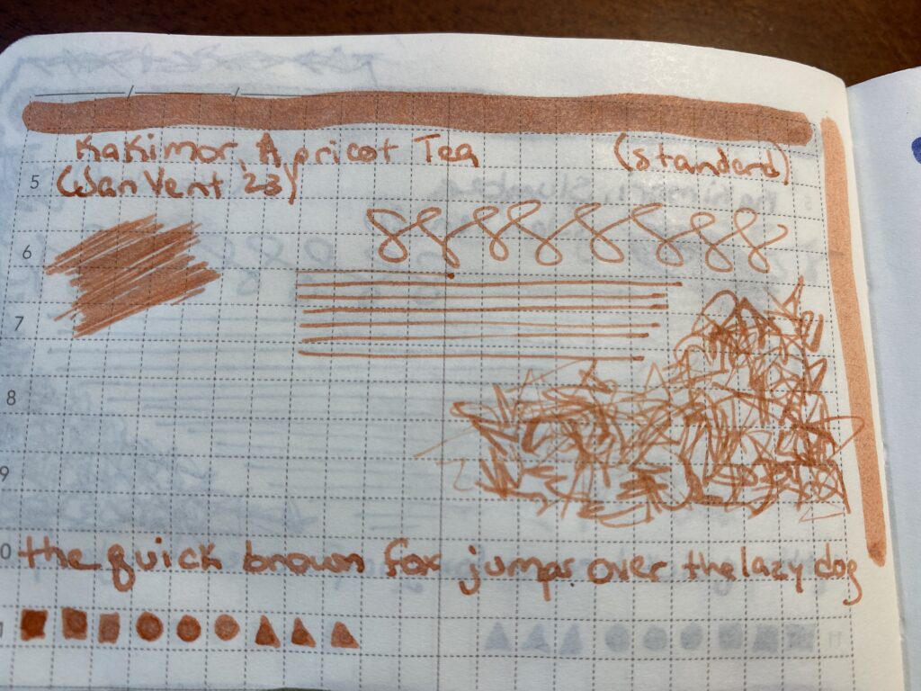
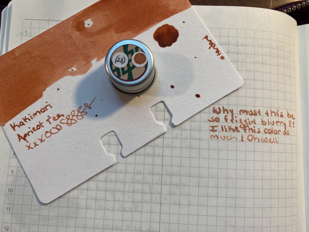
That’s when things started to go wrong. When I wrote with this ink in this pen it was really feathery. What I mean by that is instead of nice, crisp, clean lines, the ink sort of blurs and soaks further into the page, and if you look really closely you can see the ink sort of feathering out and blurring the edges of the line. I am sure there is a cool art application for this, but I am not an artist in the classical sense, so mostly this is just annoying to me. 

Zoomed in on the text “Why must this be so friggin blurry?? I like this color so much! Oh well.”
Look at the feathering! I actually had trouble taking this pick because I couldn’t tell if it was in focus or not!!! Do not like.
The backside of a notebook page where you can clearly see the ink showing thru.
Also look at this bleed thru??? It’s so bad! Moonlight didn’t do this at ALL and neither do my other inks, including the suuuuper dark ones I’m using this month!!

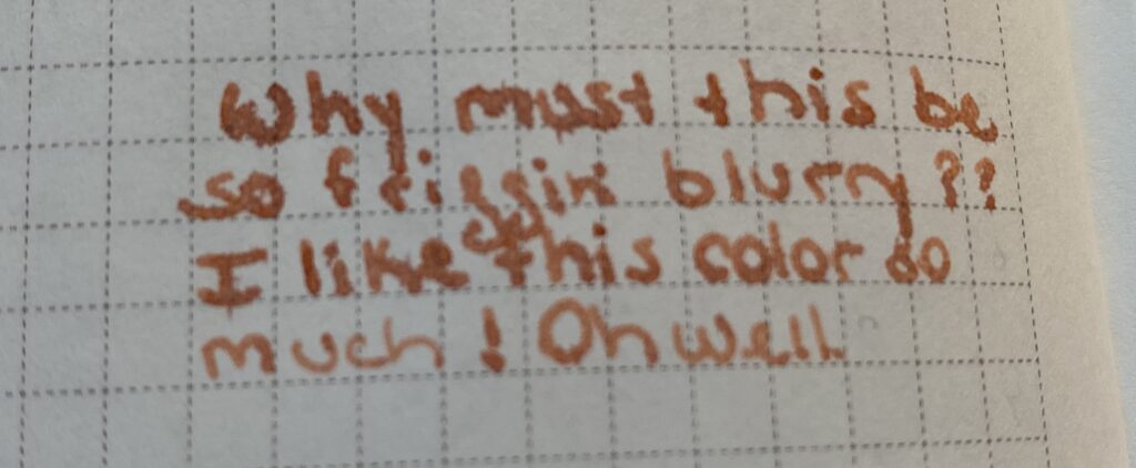
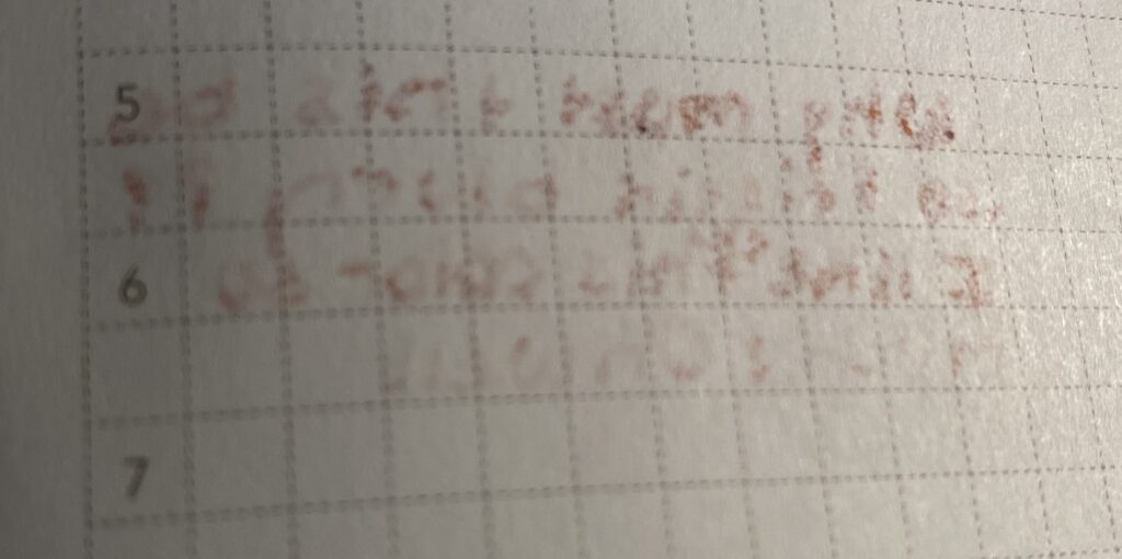
I thought maybe the ink just needed to settle, so I left the pen alone over night but the next day it was still blurry. Which makes me grumpy. So I started investigating what was going on – was it the ink? Was it the pen? Well, I had made the original sample in the sample book with my glass dip pen – which was not blurry, for the record. I figured a good place to start is by replicating that, glass dip pen, dipped into ink bottle, write on paper, see what happens. I was extremely disappointed to see that the ink blurred with the glass dip pen this time. I’m not sure what happened between when I sampled it originally at the beginning of the year, and when I sampled it this month. From what I’ve read it is most likely a difference in the paper between the books. But, it could be the ink deteriorating as well – or even something like temperature maybe? It requires more research yay! I do like research.

I had a bit of a conundrum – do I write with a blurry ink all month and be grumpy every time I do – meaning I prolly wouldn’t use the pen? Or do I swap it out, right now. After consulting with husband who I would need to help me with the psychical side of things (like rinsing out the nibs and converters for me), I decided to swap them. But which ink do I use instead?

Apricot Tea sample card looks more like the Moonlight page sample, and vice versa!

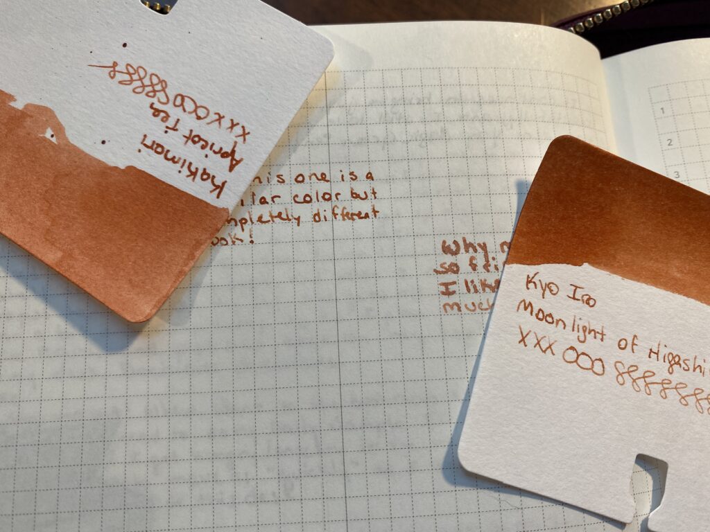
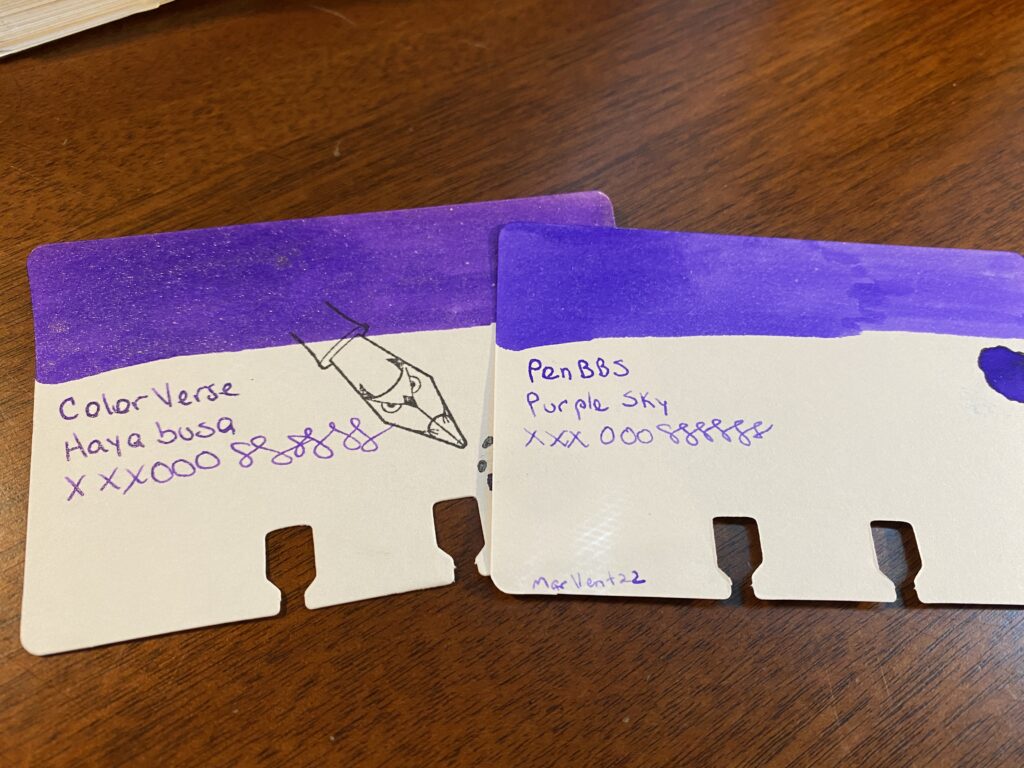
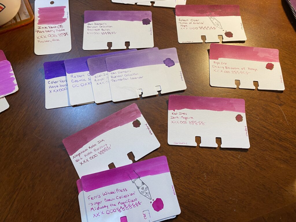
I narrow my inks down for the monthly palette usually into two sets of options. I have so many samples now that I can get some good variety and some subtlety, which means I sometimes end up with colors that are super close to each other in both palettes. For the Apricot Tea, it’s partner in the other palette was Moonlight of Higashiyama from Kyo Iro. They look very similar. This time, before putting it in the pen, I dip sampled it and wrote on the paper I’d be using it on the most. What was funny is the sample card colors are almost the opposite of the sample I wrote out that day.

There is a sample card on the right side of this image with an orange ish swap of color at the top, and the text says “Kyo Iro Moonlight of Higashiyama xxxooosssss” and has a silver cap resting on it. The cap has a sticker dot of the orange ish color on it, and a sticker dot with (6) written on it. To the left of this card on a notebook page is the following text, “So this one is a similar color but completely different look!”
Kyo Iro Moonlight of Higashiyama! And a clear line sample…

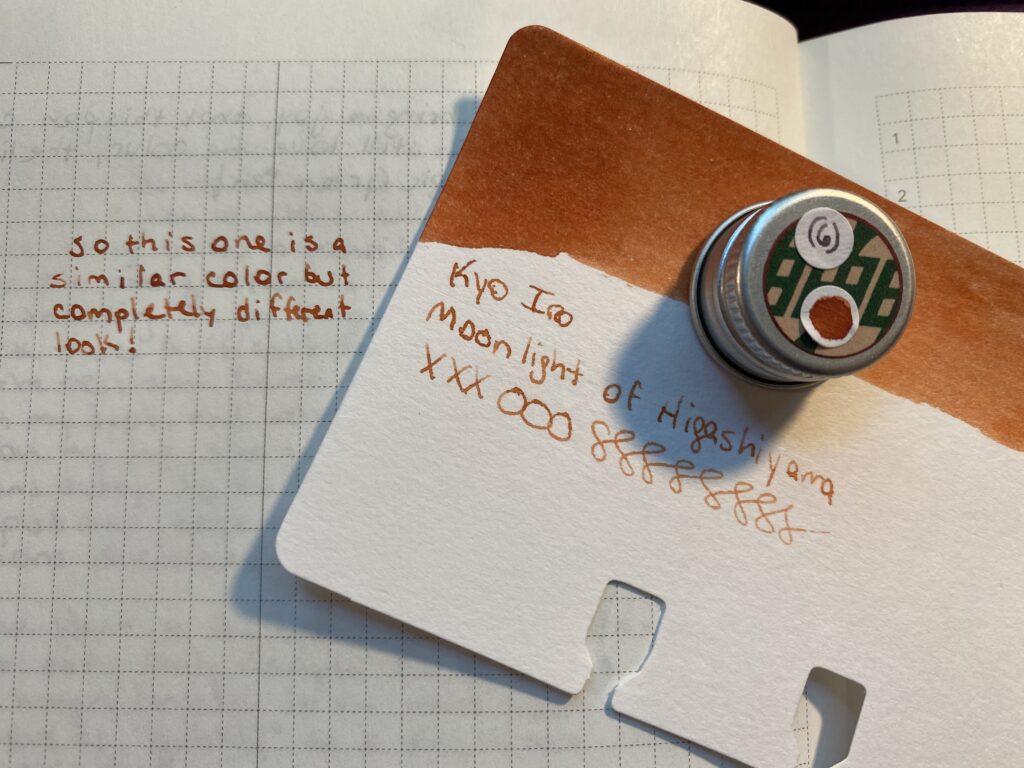
And the results were – Moonlight was not blurry, but was the right kind of color I wanted for that spot in my palette. Looks like we have a winner! I’ve used this one in the pen a couple of times now – just short writing – and it looks good so far. So I’ll use this one for August and report back when I’m done! 

This kind of thing happens often enough that I am trying to think of ways to avoid this. For September I will be dip testing the inks before I decide on the palette finally for sure. The glass dip pen doesn’t always give me a good idea of what it will look like coming out of a pen, so I picked up a new metal tipped dip pen by Pilot – hope it shows up before September! I am hoping this gives me a better idea of what I’ll be seeing from the pen. What I’ll be looking for is how the ink shows up on the page color wise, how thick it runs, or how dry is the ink, how crisp are the edges of the line (although that is often more influenced by the nib you’re using, I’ve noticed), and how long it takes to dry. I might try dipping the actual nibs I am planning on using in the inks I am thinking about…not sure how that would work out…I’ll think about it, maybe give it a try. And let you all know how it goes! 

August Pen/Ink Palette!

Tada! Pens and inks. I usually only ink 7-9 pens but! I am experimenting with a new carry case AND. August is the one year anniversary of me getting into all this. So! I’m going a little extra this time…

My theme is sunset, I was trying to think of good colors for the last month of summer and it made me think of a day ending, as the summer ends, and then I thought of a sunset! The idea of a sunset made me really happy at the wealth of colors I could try out. So that’s what we’re doing!

There are two columns of pens and ink sample cards laid out side by side. The left column starts with a dark green, then a blue, then a darker blue/purple, then purple, then a slightly lighter purple, and last a rose magenta color. The right side colum starts with a darker orange, then a slightly lighter orange, and then another slightly lighter orange, then a peach, then a darker yellow, and last a lighter yellow. The names of the pens and the inks are listed below the photo.
August 2022 Pens and Inks

1. Hong Dian 5019, Lan Tian – May Flowers (EF) / Ferris Wheel Press Moonlight Jade 

2. Sailor Pro Gear Slim Mini – Night Blue (MF) / ColorVerse Cat 

3. James White – Nebula (Custom Nib) / Ferris Wheel Press Tumbling Time Blue

4. Sailor Pro Gear Slim – Purple Northern Lights (MF) / ColorVerse 54 Hayabusa Glistening

5. Esterbrook JR Paradise Pocket Pen – Purple Passion (F) / Van Dieman Beetroot Relish

6. Bearbarian Woodworking – Copper Eclipse Sunset, Diamine 2021 Inkvent Raspberry Rose

7. Conklin – Coronet Orange (F) / Kakimori Apricot Tea (Edit – switched Apricot Tea out for Kyo Iro Moonlight of Higashiyama on 8.1.22)

8. Kaweco AL Sport Limited Edition – Orange (F) / Ferris Wheel Press Pumpkin Patch

9. Leonardo Officina Italiana Brooks PM4 Limited Edition – Supernova (F) / Diamine Inkvent 2021 Wonderland

10. Esterbook JR Pocket Paradise Pen – Orange (EF) / Diamine 2021 Inkvent Peach Punch

11. Esterbook JR Pocket Paradise Pocket Pen – Yellow (EF) / Sailor Ink Studio 770

12. Majohn Wancai Mini Fountain Pen – Transparent Clear (F) / Diamine 2019 Inkvent Golden Star

(You may notice the two yellow inks are in different pens than the picture shows, my mistake! The list is correct, the photo is not. And also – Apologies – I can’t seem to find links for the Diamine Inkvent inks – they originally came out in an advent calendar in 2021 or 2019. The place I grabbed bottles no longer has them – seems to be a very limited run.)

Now, where am I going to put these 12 pens you may be asking! I technically have pen loops for 7 pens across my two main portfolios. I can squeeze in 2 more by putting a smaller pen – like a Kaweco – across the top of my weekly portfolio, and another one clipped into the card slots in my larger portfolio. So that gives me 7 in my main portfolio and 2 in my weekly. See why I usually try to stay under 9 pens? Haha.

A couple of weeks ago I discovered Galen Leather makes tiny little cases for Kaweco pens. I clearly needed one, since I have entirely too many Kawecos. Once I got it I figured out I could fit 3 small pens in it. Tada! Space for 12 pens.

Here’s the thing – If all 3 of my smaller pens are in the extra tiny case, then I don’t technically have a second spot in the weekly portfolio. Oh no…but! I also picked up a full size pen case at the same time as the tiny one – and I happen to be using three Esterbrook pens this month. So! I’ve got 3 Esterbook in a big pen external case, the Sailor Mini, Orange Kaweco, and the clear Majohn in the tiny external case, and the rest of the pens in my large portfolio. Yay! This should be fun.

A purple folio with space on the right for a notebook. The one there is a more blue purple, with three stickers on it. One in the bottom right says “Don’t believe every thought you think.” And to the right is a unicorn with pink hair and sunglasses holding a sparkly fountain pen the same height as the unicorn. And above those is a lightbulb with a black cat and a garden inside.
On the right side of the portfolio is 4 card slots, and 6 pens. The card slots are holding a grey cat paper clip, and two ring splints. 
Set on top of the portfolio in the center is a purple external pen case that has space for 3 pens. And on the top right corner of the notebook is a smaller purple case, one pen rests inside, and 2 pens are set below it.
Purple Portfolio from Galen Leather, all 12 pens, and a fresh purple notebook!

First Impressions!
I got the pens inked this morning and I usually fill them with a syringe, so sometimes I need to do a little bit of manipulation to get them to write. Then of COURSE I have to test them…ahem.
– Magic Green – writes as well as always! (Knock on wood).
– Blue Sailor – gorgeous. I love the mini slim, and I love the MF nib!! And Cat is one of my favorite inks. Gorgeous all around.
– Sparkle Stick – had a little bit of trouble trying to prime the feed on this one, so I rinsed it, and eventually got it to write, and this ink is going to be awesome in this custom nib.
– Forever Purple – also writing wonderfully as usual!
– Esterbrook Purple – very pleased, writes well, solid color. It’s a PURPLE without SHIMMER and I like it. How dare.
– Custom Swirly – yeeees I was worried the nib in this one would be wonky, but no! Writes well out of the gate, and this is a fun ink to play with.
– Conklin Orange – this ink is WEIRD. It had a weird consistency in the first place, and it feathers like bonkers on the page…I’m going to give it a couple of days but I might end up swapping this ink out.
– Kaweco Orange – ink is struggling to flow. I need to check the nib and feed alignment, I’ll keep using it and see if I can’t loosen it up. I think I saw a post about this with like, a nick name, because this happens commonly? Haha. I’ll look for it.
– SuperNova Wonderland – writing beautifully as it did all thru July!
– Esterbook Orange – ugh. Would not write right away – unsure why, although it does have an EF nib – but no shimmer in the ink?? I let it sit for a while and it started to write, but it’s still struggling. I’ll let it sit for a longer time and see what happens.
– Esterbook Yellow – same problem as the orange, so we’ll see how it does tomorrow maybe?
– Clear Shiny Yellow – pen is so wee and tiny and cute!! I hope this nib can handle a shimmer ink… I put a shimmer ink in this because it is truly gorgeous…
Check it out:


Keep in mind, this is all after a single use, testing the pens and inks for the first time. So much can change in a month! I will naturally complain on twitter, ahem, but I will also post a review type thing at the end of the month. It will be less in depth and more…Spoon’s weird opinions! Yay!
Enjoy!

August Palette, Ink Colors Narrowed

Let’s continue where we left off, shall we? In my last post I showed you how I start to pick inks out for my monthly palette. I go thru all of the inks I have in my sample library and start – you know what? If you want to know more about how I started, go read THIS post. 

Today I narrowed down my choices to two different – but similar – palettes. I usually have a rather flamboyant ink in the pen I put my custom nib in. I had two options for August and I ended up picking the one I haven’t used yet, just for fun. It also happens to be a better option for my sunset theme.

2 sample cards laid on top of each other on a wooden desk. The swaps are both blue inks with red sheen and silver sparkle, but each is slightly different. The card on top is Birmingham Ink: Galactic (twinkle) and the one on the bottom is partially covered, but Ferris Wheel Press can be seen.
Ferris Wheel Press and Birmingham Ink
A single sample card on a wooden table of Ferris Wheel Press 
FerriTales: Down the Rabbit Hole
Tumbling Time Blue. There is a stamp on the card that looks like a fountain pen nib with a cats face engraved on it.
Ferris Wheel Press
FerriTales: Down the Rabbit Hole
Tumbling Time Blue

Next, I need to match my new colors to ones I end up keeping. For August I am keeping two inks from my July palette, an orange I am way too in love with and what I am referring as my Forever Purple. (It’s ColorVerse Hayabusa, in a Sailor Pro Gear Slim Northern Lights – it is my favorite.) Because my theme for August is “sunset,” and purple is technically a color that can be found in a sunset, I used that as an excuse to start this whole process. Any excuse to start with purples really. I’ve managed to keep purples relevant to these palettes for months now, haha. So, I took the Hayabusa sample and started by comparing the purples I have to that one. 

Two cards, side by side but overlapping a little in the middle. On the left is ColorVerse Hayabusa and on the right is PenBBS Purple Sky. Hayabusa is a sparkly warm purple, and Purple sky is cooler purple with no sparkle.
ColorVerse Hayabusa and PenBBS Purple Sky

Every purple in the pile gets compared back to the first purple. I am looking for two things primarily this time – a color that is distinct from the Forever Purple, but also goes with it. I discard purples that look too dark or too light or fall outside of the theme. I ended up with a lot of options left over – which is intentional. I don’t want to narrow it down too much at the beginning.

Pile of sample cards of purple inks, ranging from cool purples to warm purples. They are overlapping so the writing on them is close to each other.
Pile of sample cards of purple inks, ranging from cool purples to warm purples.

Once I have a more manageable collection of purples, I start adding in the magentas. I’ve already made certain decisions which can roll into the next color – for example, the samples that are too dark or light, those can be discarded quickly. And I can get rid of obviously too bright magentas. I’m again looking for a color that is distinct from the purples I have picked and yet still has a smooth transition which is the effect I am looking for this time. I ended up with a decent set of options.

Lots of sample cards on a wooden desk. The purples have been narrowed down to 4 options, and there are magenta sample cards placed around it in smaller groupings or singly.
The magenta sample cards are circling the line or purple sample cards.
5 purple sample cards in an overlapping line on top, 5 magenta sample cards on the bottom.
Two lines of sample cards, purple on top and magenta’s on bottom.

Next up are the oranges. I actually had three fairly distinct oranges – a darker orange, a sort of straight orange which is a bit brighter, and then a kind of peach color. All of these would work well in a sunset theme, but I needed to see what worked with the purples and magentas I pulled. Choices so far continue to help me make some easy choices. I’m always getting rid of colors that are darker or lighter than I want for that month’s palette. Now I remove doubles – colors that are super similar to each other – or practically identical. I ended up not being able to narrow this pile down too far, because I really liked the three distinct oranges I started with. No worries, I still have another color to look at, that should help me decide. 
To pick the yellows I really have to look at the writing on the card to see how readable it is. Many yellows are too hard to read when written with the nibs I use. And for the palette I’m looking for, I got rid of the darker ones as well. 
Actually, I use the writing on each card to make my choices. So I’ll line up the cards so the writing is side by side. The swabs are gorgeous and good for picking broad swathes of color. But often the writing turns out very different from the swab. Close enough but when I am getting down to picking a color for sure, I want to look at the writing on the card. 

Line of 5 purple cards, underneath that is 5 magenta cards, below that is 5 darker orange cards, then 6 medium/bright oranges, under those are 3 peach colored oranges, next is 4 orange/yellows, then 5 brighter yellows. These rows are all overlapping the ones above and below and beside each other.
7 lines of sample cards overlapped so the writing on each card is closer to other cards writing.

Next I narrow things down, this time I end up with 3-4 options per color. Each color gets compared to the one before it. I want a transition that reminds me of a sunset, so I’m comparing each color to the ones on either side, so I don’t end up just matching everything off the Forever Purple. Frankly, if the palette I end up with doesn’t work well with that purple – it’s fine. I have two colors that have been constant for months now, and they don’t have to go with the palette because I am keeping them for different reasons. I’ll go into that in another post. 

Sample cards still laid out in rows by color grouping, with new group colors overlapping them from top to bottom. 3 purples, 3 magentas, 2 darker oranges, 4 medium/bright oranges, 3 peach oranges, 3 orange/yellows, 3 yellows.
Narrowed down choices for each color.

And lastly – my choices, and my secondary choices. This is where I narrow things down to two very similar palette’s. I do this for three reasons. Firstly, I want to be able to walk away and look at something else for a bit before making the final decision. At this point I will have been staring at these colors for at least a half hour. Second, Husband is the color expert in this house. He literally used to do that for a living, making sure colors were accurate. And third is that I like keeping him involved in my silly hobby. This is an easy for us to collaborate. And it’s fun explaining my thought process to him and what I am looking for. 

First palette option:
ColorVerse, Hayabusa
Van Dieman’s Harvest Collection, Beetroot Relish
Diamine 2021 Inkvent, Raspberry Rose
Kakimori, Apricot Tea
Diamine 2021 Inkvent, Peach Punch
Ferris Wheel Press, Pumpkin Patch
Diamine 2021 Inkvent, Wonderland
Diamine 2019 Inkvent, Gold Star
Sailor Ink, Studio 770
Second Palette Option:
Van Dieman’s Harvest Collection, Tasmanian Lavendar
Kyo Iro, Cherry Blossom of Keage
Kyo Iro, Moonlight of Higashiyama
Van Dieman’s Harvest Collection, Apricot
PenBBS, #517 Cold Dews
Kiwi Ink, Liquid Gold
PenBBS, #501 Spring Festival

And that’s where I’ll leave it today! When I’ve got these two sets of options like this I can start seriously matching pens to the possible ink colors. Often I have some ideas already – for example, I had already pulled all of my orange pens for this palette as soon as I decided on the sunset theme. I also have a new purple and a new tiny clear one I want to try. But I don’t always know which colors I am going to pick until the very end and sometimes I don’t know when a new pen might be coming in, so I keep my options open.

By next weekend – the end of the month – I will have picked both the palette and the pens, because I’ll need to set them up and I’ll reveal that next time! Until then, if you have a favorite color from this post, please share!

First palette option in a row on top, second palette option in a row on the bottom.