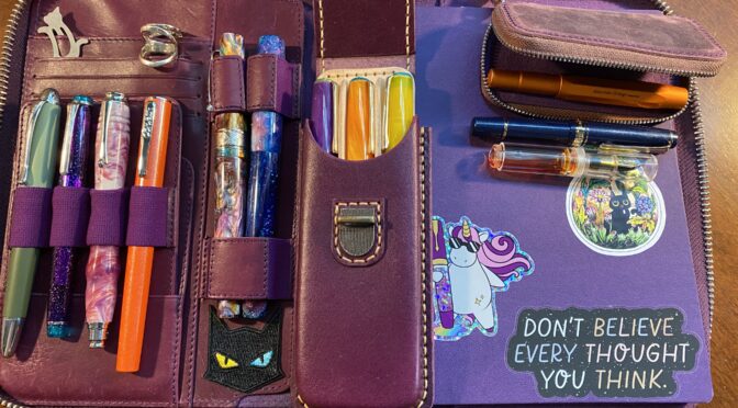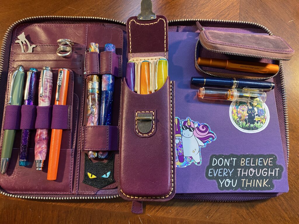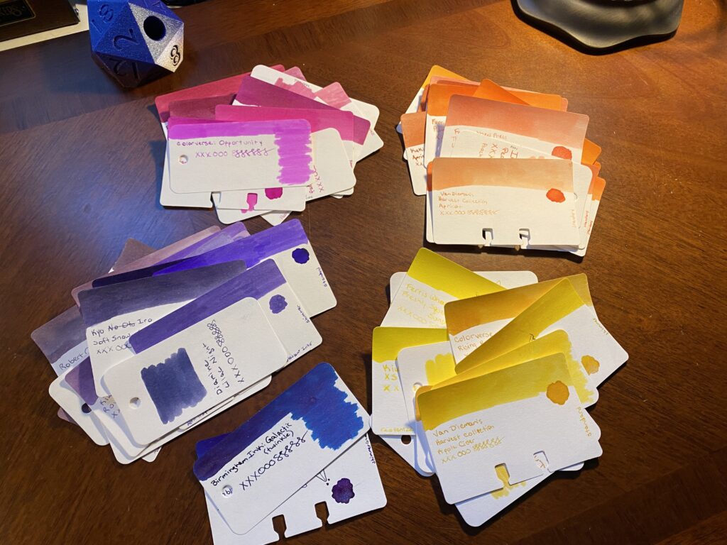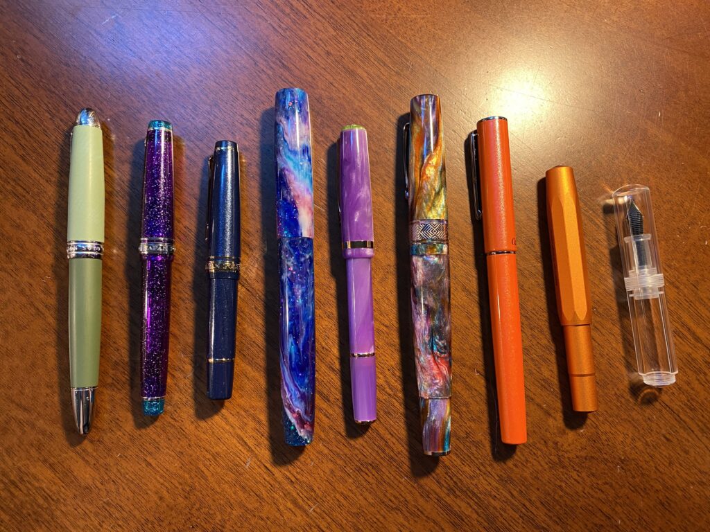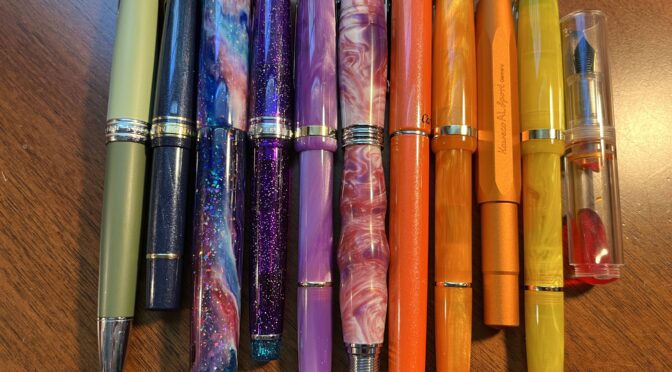
Twelve pens is a lot of pens but I am happy to report that I really used most of them. There were two with weird nibs, but after I tuned them they were okay. There was a yellow that was mostly too light for me to read, so ended up doing mostly accents with it. My header pen only saw use on headers because I was worried about running out of that ink – didn’t have a lot of them. I will say switching out that one orange ink was a very good idea.
I am now realizing how vague this is going, so let’s just list them all out instead!
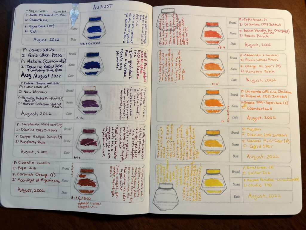
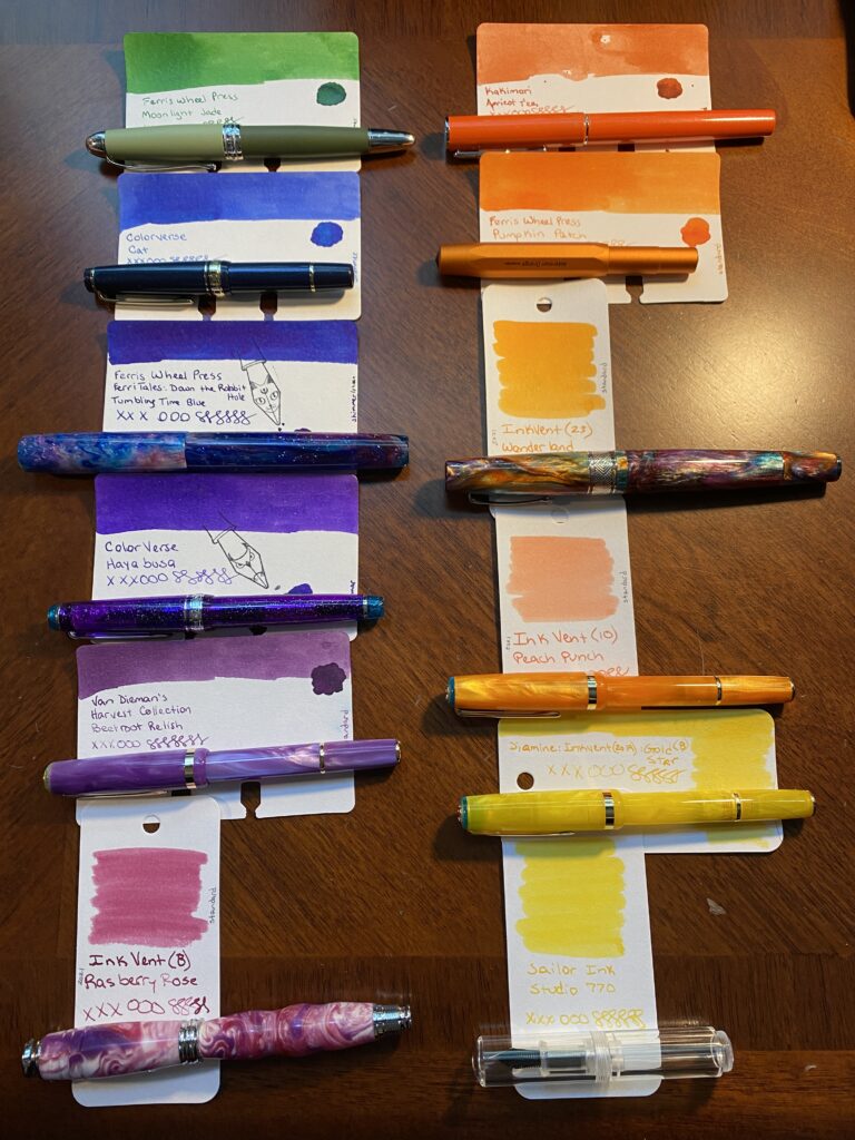
1. Hong Dian 5019, Lan Tian – May Flowers (EF) / Ferris Wheel Press Moonlight Jade
– Magic Green Pen! I adore it. The end. (Refilled 9 times)
2. Sailor Pro Gear Slim Mini – Night Blue (MF) / ColorVerse Cat
– New Forever Pen! Shall dub Forever Blue – pretty much identical experience to the Forever Purple pen, just a different favorite shimmer ink.
– “Pen is JUST long enough, but still smol, which I love. Fav nib. Ink works, comes out nicely, hasn’t gummed yet, knock on wood. :)” (Refilled 3 times)
3. James White – Nebula (Custom Nib) / Ferris Wheel Press Tumbling Time Blue
– Solid pen, didn’t use it a ton because low on ink. Ink good, dark tho, nice sheen, rarely any shimmer.
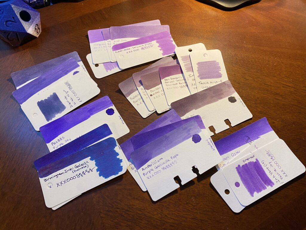
4. Sailor Pro Gear Slim – Purple Northern Lights (MF) / ColorVerse 54 Hayabusa Glistening
– Forever Purple Pen! Also adore this one. The end. (Refilled 7 times *yay*)
5. Esterbrook JR Paradise Pocket Pen – Purple Passion (F) / Van Dieman Beetroot Relish
– “Esterbrook F nib is a good size. I like the handling of the pen. I LOVE this ink color! Solid purple – and no shimmer! Performed great too.” (Refilled 1 time)
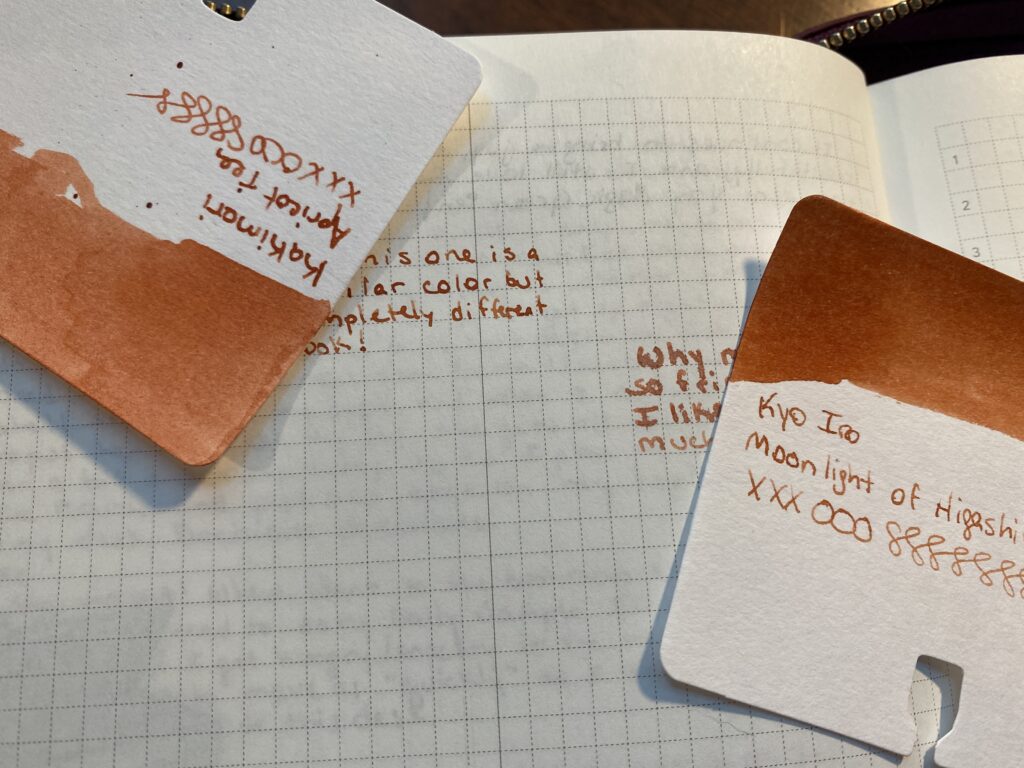
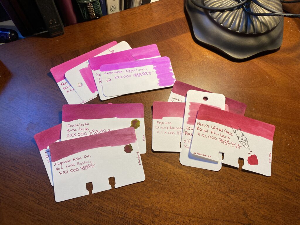
6. Bearbarian Woodworking – Copper Eclipse Sunset (F) / Diamine 2021 Inkvent Raspberry Rose
– “I like the material of this pen a ton – the finger hold spot is a little slipper tho. Nib is a good size, performs well usually, slightly inconsistent. Really like the color of this ink, a magenta I like the depth of – performed well.” (Refilled 1 time)
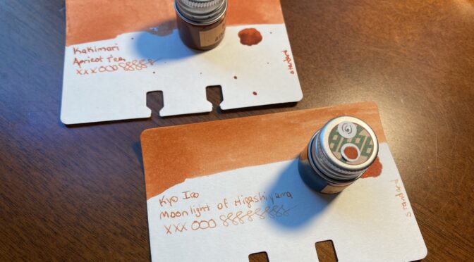
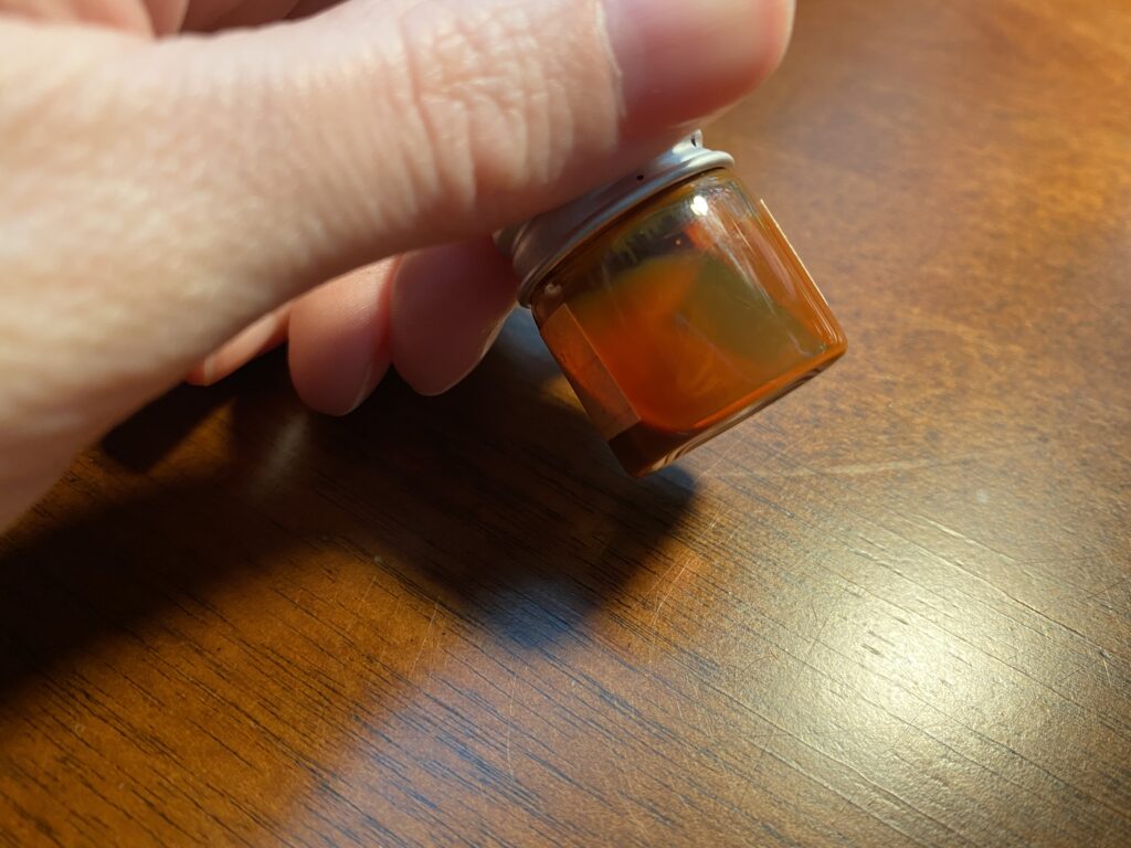
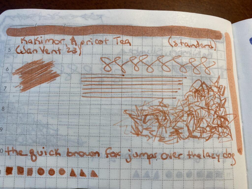
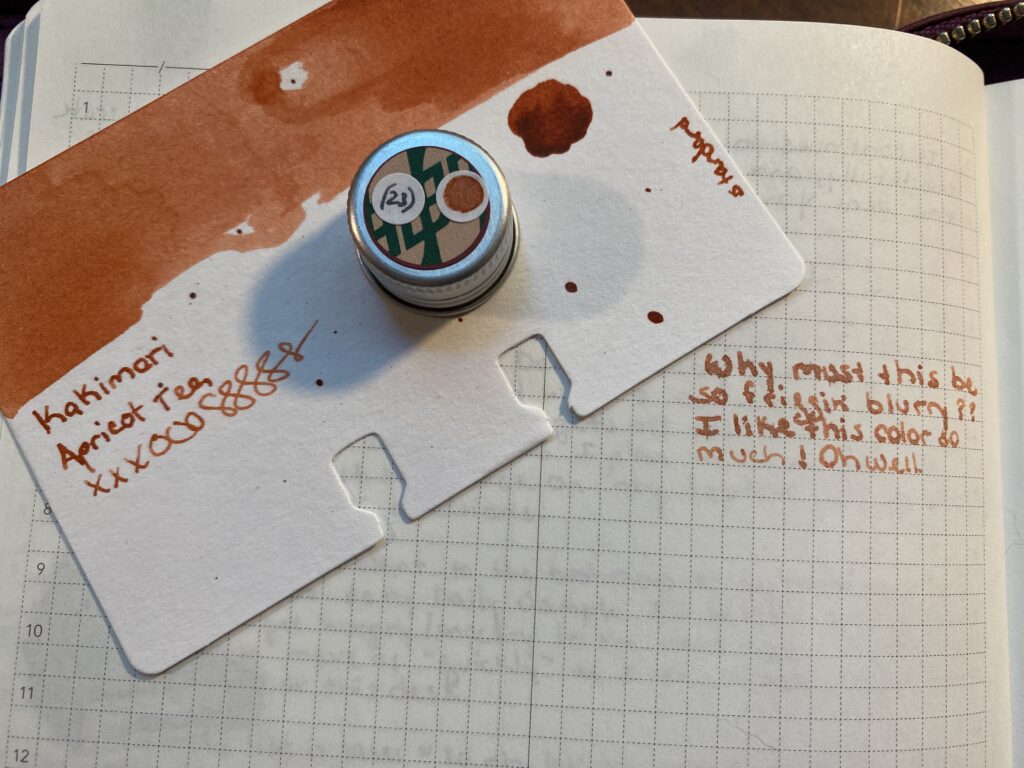
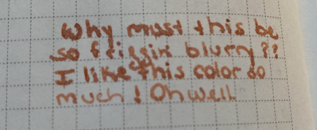
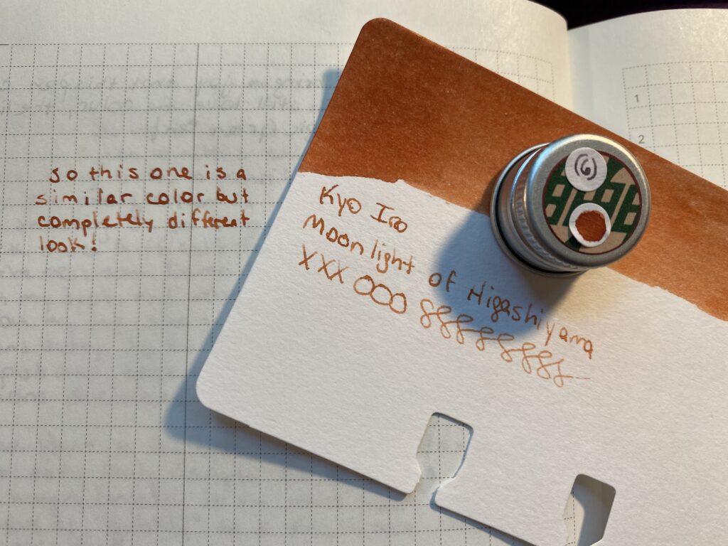
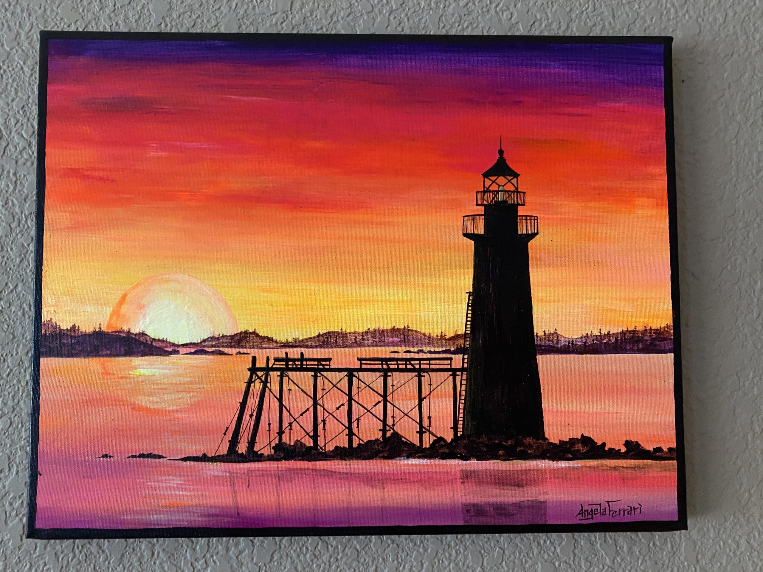
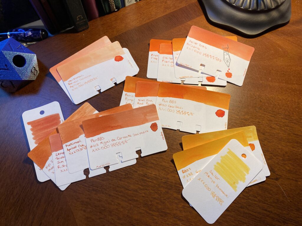
7. Conklin – Coronet Orange (F) / Kyo Iro Moonlight of Higashiyama
– “Inconsistent ink distro, sometimes really heavy flow, sometimes really dry. Love the nib shape tho. Fascinating ink color – glad I switched it out! (Leave uncapped, gets wetter, caped, gets dryer?)” (Refilled 2 times – exploded a little bit once, maybe because I dropped it)
8. Kaweco AL Sport Limited Edition – Orange (F) / Ferris Wheel Press Pumpkin Patch
– “Nib/feed performance inconsistent…tried tuning it, seems to work better sometimes but then not others…I really like the subtle shading on this orange.” (Refilled 1 time)
9. Leonardo Officina Italiana Brooks PM4 Limited Edition – Supernova (F) / Diamine Inkvent 2021 Wonderland
– Still love this ink. It ended up not really fitting in the palette – so when it ran out on the 20th, I just didn’t refill it.
10. Esterbook JR Pocket Paradise Pen – Orange (EF) / Diamine 2021 Inkvent Peach Punch
– “This ink ended up being fine in this nib, but had a rough start. I love this ink color, a very interesting orangish that seems to be different shades depending on what’s next to it!” (Refilled 1 time)
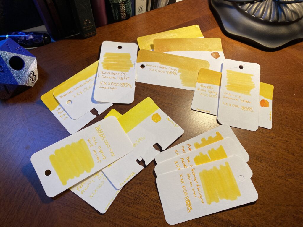
11. Esterbook JR Pocket Paradise Pocket Pen – Yellow (EF) / Sailor Ink Studio 770
– “Nib scratchy, ink wouldn’t flow, tuned it (baby’s bottom?) and seems better. Ink very light, hard to read. A little disappointed in this ink 0 expected it to be darker consistently but you can see the difference. Readable now! Nib still a little scratchy.”
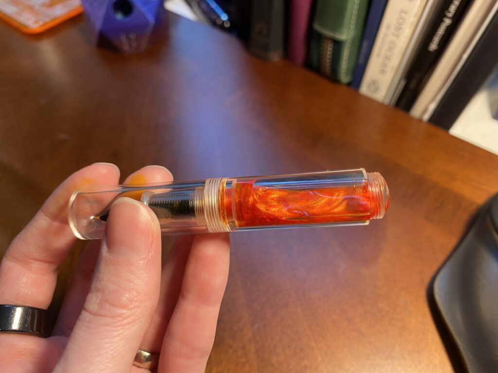
12. Majohn Wancai Mini Fountain Pen – Transparent Clear (F) / Diamine 2019 Inkvent Golden Star
– “Fav part of pen is seeing the ink swirl around. Solid nib, I like the way it writes – can handle shimmer! I think the cap may have cracked – humidity in there now?? Love this ink color – literally changes shades as you write down a page!”
So, if I had to pick a favorite (besides my Forever Pens) it would have to be either the purple Esterbrook with Beetroot Relish in it, or the Majohn with Golden Star in it. For different reasons. Oo! Or the Beardbarian with Raspberry Rose. It was a good month!