
Oh look, the internet! Clearly this place wants to hear about the fountain pen stuff I’m all excited about. Right? Definitely. Here we go!
So I got into fountain pens last October (2021). Since then I have been keeping a set of pens inked, sampling new inks, and trying new pens. I’ll get into all that as I back track in future posts. Today I am going to wax eloquent about my current stage of fun.
I forget when I started this but I decided to stop carrying around 20 inked pens at a time, and started trying to keep to 7 at a time. Ish. This was after reading a post on the practicality of it and realizing that more than about 7 meant I just didn’t use all of the pens. Since pens can’t stay infinitely inked and still work well, it ended up being kind of a waste. Then I decided to swap them out monthly. THEN I started to pick themes for both the inks I used that month and the pens I put them in.
Which brings us to August. About half way thru the month before – so in this instance, right now, middle of July – I start looking at which inks and pens I’m going to use for the following month. I usually think of a theme a couple months before – for August I was planning on using a sunset palette. Fortunately I’ve been picking up orange pens lately – convenient eh?
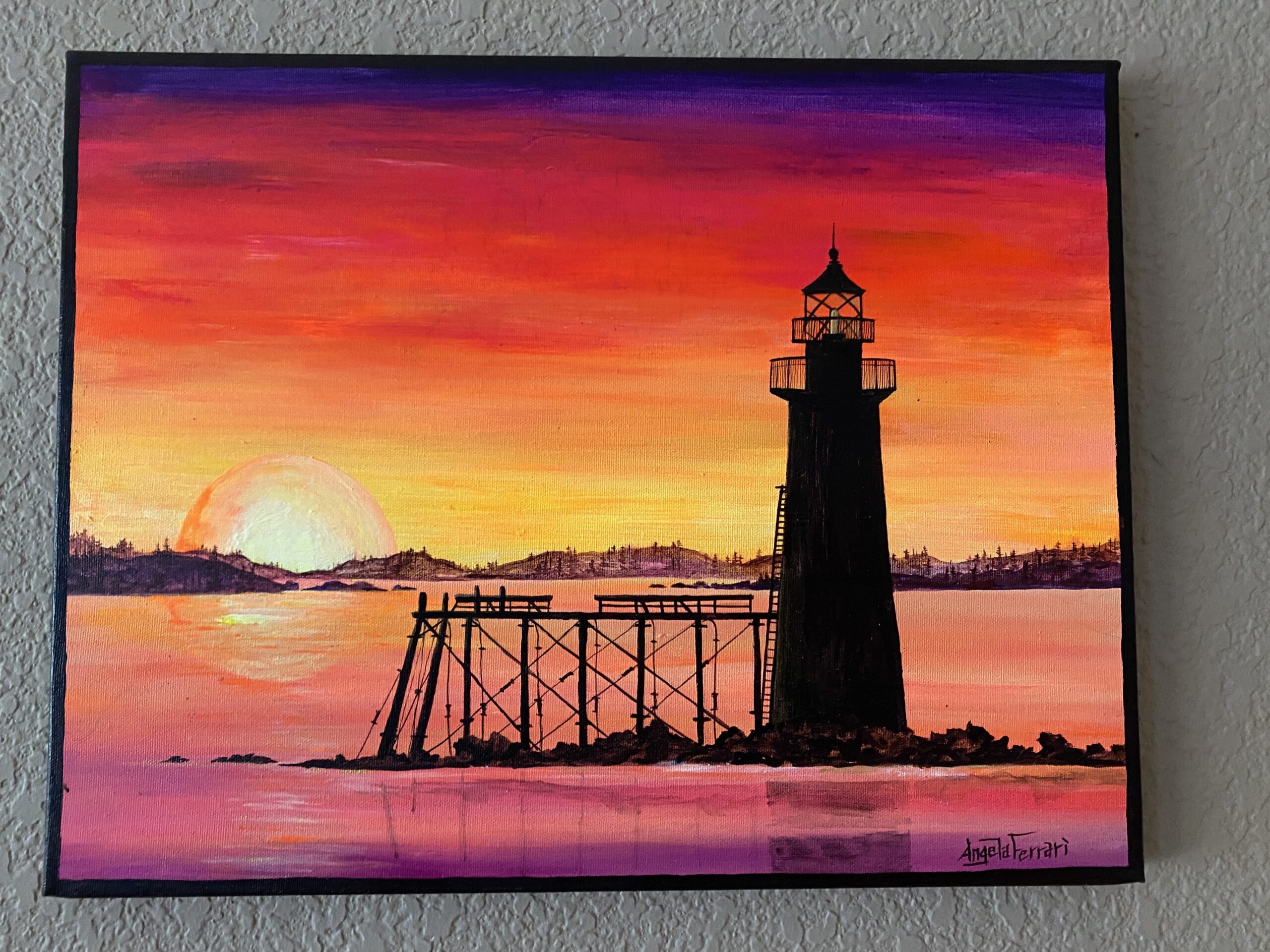
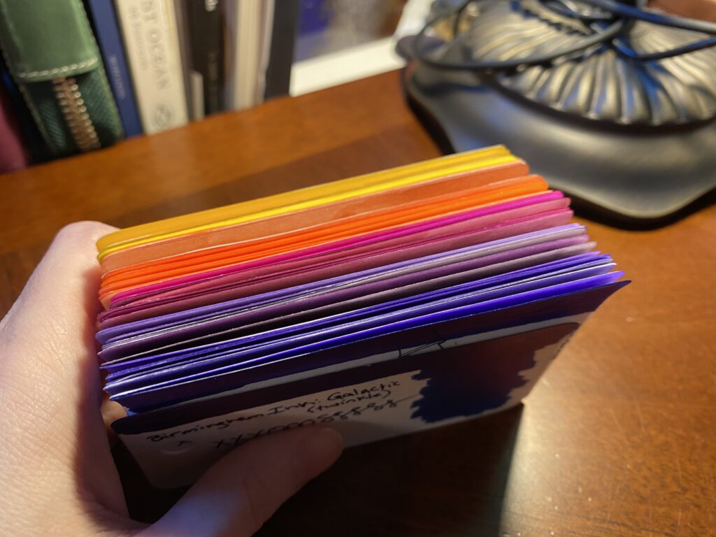
I create a new sample card every time I pick up a new ink. Since I have been sampling a new ink daily for a couple of months, I have a decent library at this point. What I like to do when I am picking out my inks is I literally walk thru every single card for whatever colors I am looking for on the next palette. In this case I was looking for purples, magentas (I do NOT like pinks usually), oranges, and yellows. I pulled from this painting my husband and I have from one of our anniversaries:

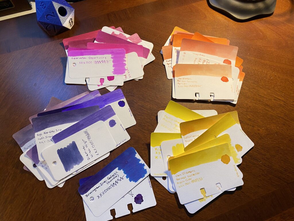
And yes, I pulled all of those colors – ALL of them. Every single purple, magenta, orange, and yellow I had in my sample card library. Wheeeee.
When I am first pulling these colors, I do it very loosely. Is it purple? Yep. Goes in the pile. Is it green? Yep. Put it back. I look for nuance after I’ve pulled all of my main colors. Like, a purple that is so dark it’s closer to a black. Or a yellow that is too faint to read easily. I put all of those back and then I do the next thing.
Next I start to group them by color feel – there is more than one kind of purple for example. Some are more blue, some are more red. You get the idea. I like to do this because the same ink colors can show up across different manufacturer’s. Often you can get very similar colors but also they can end up having really subtle differences which is super fun! This is what I got from that step:
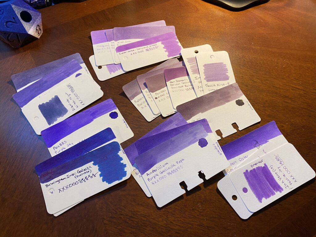
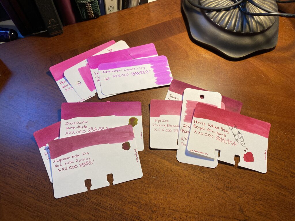
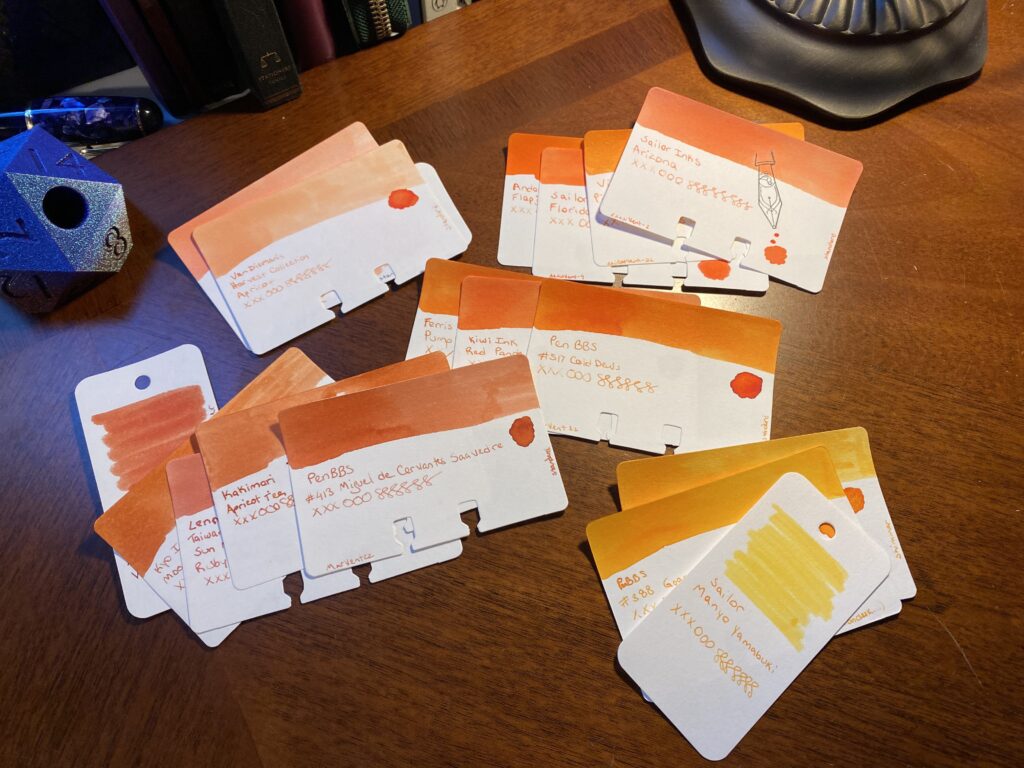
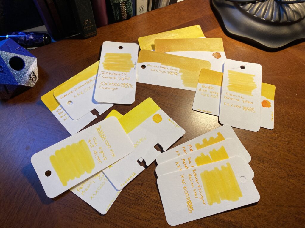
You should be able to see how similar the cards that are grouped together are, usually by tone or temperature or color or whatever you want to call it. They look similar. Moving on.
I REALLY like what I have come up with so far. But I need to keep narrowing it down, obviously. But rather than do that today, I’m actually going to sit with this stack for a bit. It’s got the range I think I like, it’s narrowed down to some good options – too many good options. And while I could make final decisions today, I don’t have to. Having this stack set aside, colors I can look through whenever I want to check something, colors I can visualize in my brain, I find this a very enjoyable experience. It’s part of the whole thing for me, being able to get to this step, and just think about it.
I don’t know if you’ve noticed, but the things going on in the world right now are kind of the worst. So I like to put good things in my brain, so I can concentrate on that for a nice break.
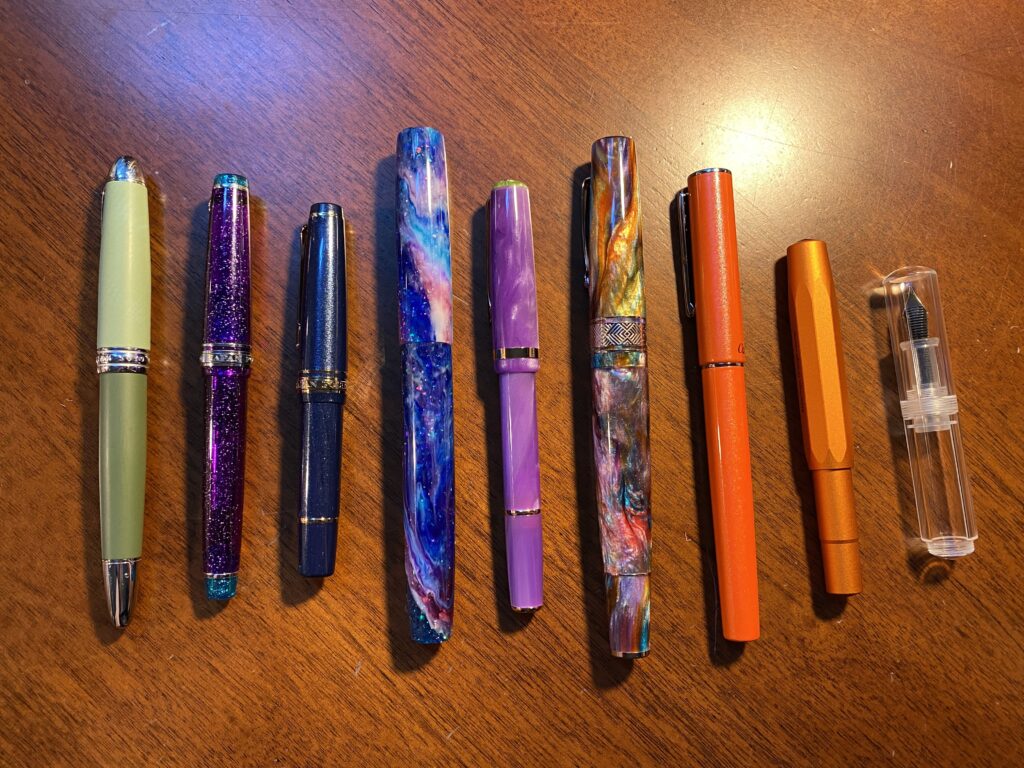
I have also picked out the pens, or at least most of them. This can change depending on which ink colors I end up picking, or a new pen might come in that I want to try. Or a new ink comes in last minute. It can change a lot of things. These are the pens I picked out:
I typically keep 9 pens inked. I’ve been pretty consistent about that since I started using the 2 portfolios I keep my main notebooks in. There is intended space for 7 pens but I can get creative and fit in 2 more. This month I want to try using a tiny pen case for Kaweco pens – but I’ll only be putting 1 Kaweco in it, with 2 other tiny pens. Which means. Technically. Ahem. I could carry…12 inked pens. Just saying.
I have some favorite pen makers these days, although I am always keen to try new ones. And I very much love tiny pens. Husband and I both super like Kaweco AL Sport, for example. We have entirely too many of them, haha. Sailor has turned out to be another favorite – the MF nib is my favorite! I tend to like finer nibs, so I’ve stuck mostly to those so far. I do have a custom nib that does a very broad line but I can also write “upside down” with it and get a finer line – closer to a medium nib I think. I use that one for Headers when I am writing dates and notes. I have also used Twsbi a great deal – they were some of my first pens, and I continue to enjoy them. I try to experiment with new kinds of pens when I can, but I definitely have favorites. For example, I have been using the two tone green pen and the sparkly purple pen on the left side of the photo above for several months in a row!
In fact, this month I am trying out two pens that are fairly new to me. I did use an Esterbook for the first time in July, and I’ll be using a second one in August. The other new one I got on Amazon haha – a friend found it, it’s adorable and tiny, and completely clear. And it doesn’t take a converter or a cartridge – it’s called an eye drop pen. You fill it with a syringe, which I’ve started using lately. Looks like fun! Depending on how many pens I do end up inking, I may end up changing my line up, but this is what I am planning on so far.
And that’s it! I do this every month. There are many steps to this…process? Project? I don’t even know what to call this – it’s woven thru my day, become critical to my sense of calm, and something I continue to find solid joy in. Whatever it’s called – there are things I do a certain way, and I plan on talking about them here. So, if you’re into fountain pens and what not, enjoy!
There are entirely too many inks to list for this post, but I will list the ones I end up choosing in another post. Here is a list of the pens in that photo:
- Hong Dian 5019, Lan Tian – May Flowers (EF)
- Sailor Pro Gear Slim – Purple Northern Lights (MF)
- Sailor Pro Gear Slim Mini – Night Blue (MF)
- James White – Nebula (F)
- Esterbrook JR Paradise Pocket Pen – Purple Passion (F)
- Leonardo Officina Italiana Brooks PM4 – Supernova (F)
- Conklin – Coronet Orange (F)
- Kaweco AL Sport – Limited Edition Orange (F)
- Majohn Wancai Mini – Transparent Clear (F)