Hullo folks, this one is being posted suuuuper late because February was a ROUGH month in our house. Lotsa meltdowns, broke my favorite fountain pen (Magic Green), lotsa possible exposure to covid, all kinds of fun stressful things. But never mind! Let’s talk pens. And inks. Fun stuff for real real.
Pen/Ink Palette: My theme for February was our wedding colors, purple and green because I do not like reds and pinks so when I think of love, I think of those colors! I did include one pink but it was more of a peach so, cheated a little bit.
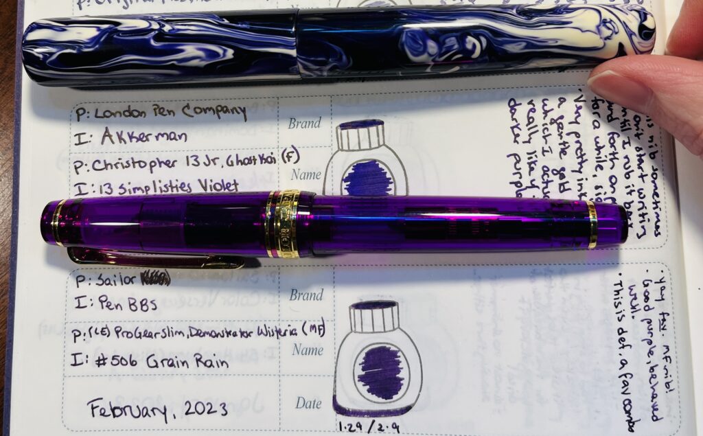
Sailor Pro Gear Slim and a London Pen Co. Christopher 13 Jr., loved for different reasons haha.
Favorite: I had a tie in favorites this month. Both of these pens worked so well with the inks in them – and NEITHER ink was a shimmer! Yeah, surprised me too. I had Akkerman 13 Simplisties in the London Pen Co. pen, and PenBBS #506 Grain Rain in the Sailor. They were very soothing to write with which I definitely needed the latter half of the month. Very reluctant to put these away when the ink ran out!
Least Favorite: I am going to write about the Magic Green drama in another post, so I’ll put a different pen in this spot. There were actually a couple of pen combos I was having trouble with this month, I really need to stop buying vacuum pens for example. But the least favorite I settled on was a Mad Science Pen Company pen with a 1.1 stub nib and Diamine Inkvent 2022 Alpine. Pen worked great, fine performance flow wise. But the ink was basically black on most of the papers I used it with. Very very faint green in the right light. Silver sheen was pretty visible, but I found the whole thing kind of unappealing. So I think I found one of the few shimmers that looks WORSE in a broad nib! I will do a comparison. Some day.
Learned: Uhm. I think the biggest thing I learned was really WHY the Magic Green pen was magic for me. Oh and that I really do not like vacuum pens. I have 3. I think I am done at this point haha. Oh and the Osprey nib was annoying – I don’t think flexible nibs are for me. Two years in a row I had a very disappointing February pen/ink experience. Ah well. Third years the charm right?
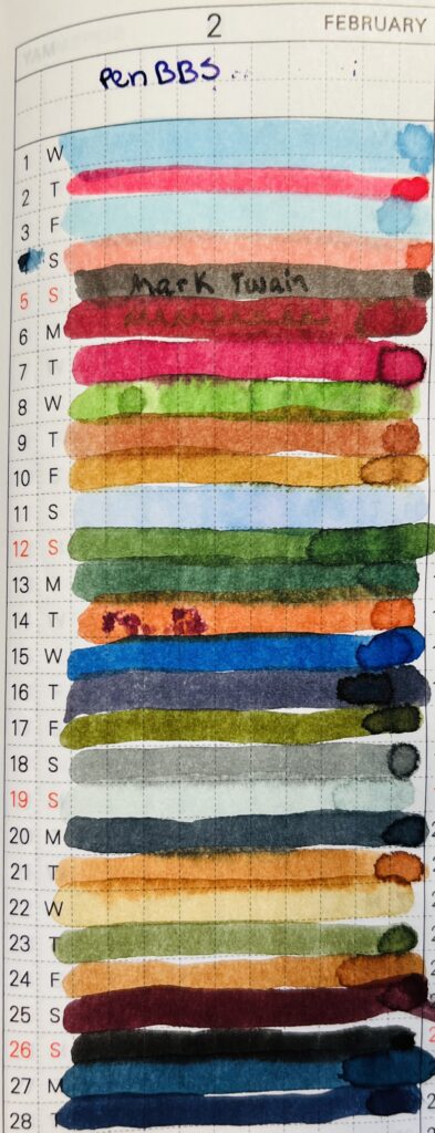
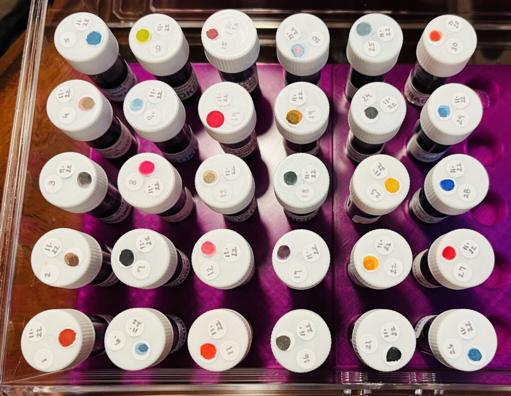
Daily Samples: I forget exactly why I picked up so many PenBBS samples but. I did. So another month of PenBBS samples! I do like how these inks behave overall, so this was a nice, chill, reliable start to my day!
I have started using this part of the notebook to find colors I want to use for my palette – and it is brilliant.
Favorite: Honestly, I was mostly just enjoying how the ink performed. But wasn’t too excited about the colors this month. I did enjoy the weird of #408 Xiamen on the 11th. You can kind of see it in the photo how the ink sort of shades, it’s mostly a pastel blue but there are brief and very faint hints of pink. It’s too light to write with but I bet the chromatography of it is going to be SUPER fun. Whenever I get into that.
Least Favorite: No real strong feelings for the daily samples this month so I guess I’ll go with #387 Mark Twain because it ended up being a pretty basic black. I don’t think I have ever used a black ink. Nor will I!
Learned: I should probably stop just buying sets of ink to get all of the numbers. Maybe. But it is easier. I am not sure how much longer I’ll end up doing daily samples, which I realized this month. I still find it soothing, and I still appreciate including it in my daily routine. And I DID just start a year long planner for this haha. I probably won’t abandon this until I find something else to replace it, but I will be building some fairly odd palettes in future, often augmented by the Subscriptions samples.
Subscription Samples: Nope! I got Truphae and Ink Flight but I did NOT sample them in February because for my March Daily Samples, I only had 20 inks. And 12 samples fills in the last 11 needed nicely.
So that’s it. I was incredibly focused on March starting for a couple of reasons – I am trying out planner specific stickers in March from HubmanChubgirl for one, which could be fun – and for another thing, it would be a brand new month to hopefully not go horribly. Also, one month closer to my birthday, yay! Thank you for your patience my delightful readers!
Okay, let’s take a look at what I played with in January. Second January I have been doing all of this by the way! I remember being super frustrated with shimmer inks January of 2022. But I have learned a lot since then – still more to learn tho, haha. Keeps things interesting.
Pen/Ink Palette: I went with “Ice” as a theme, and picked out some really pale and icy blues, purples, and teals. I actually enjoyed every single pen/ink combo. It was tough to pick a favorite. One thing that ended up being a little annoying was having my Magic Green and Favorite Purple pen still being inked but I didn’t use them very much. Considering putting one or both of them away.
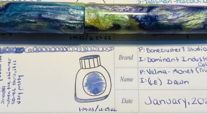
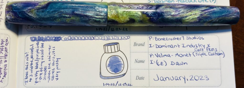
I use a notebook from Ink Flight to record the palette’s I use every month. Here you can see my comments on this combo: “I love this nib! 3 widths, so useful. Pretty blue/purple ink, one of my usual favorite shades. When the shimmer comes thru it is very pretty.” And on the right I list the pen and ink details.
Favorite: While it was tough to choose, the one that ended up being my favorite combo was a Bonecrusher7 Studios pen, using a custom three-grind pen from Jose Munera, and filled with a limited edition ink, Dawn, from a Dominant Industry and Cult Pens collaboration. The ink really worked well both from the 1.1m stub grind, and the MF grind side. I’ve played with different custom nibs before and often the ink only looks right from one side or the other, so I was happy to find a combo that worked well with all of the grinds on this nib.
Least Favorite: This may have been my own fault, but my least favorite combo was an Iron Feather Creative pen, filled with A Watery Star, from Wearingeul. I don’t think it was the pen or the inks fault, but it ended up writing a much different blue than I expected, way darker, and bled thru the paper! Completely wrong from an ink I sampled as a shading medium blue with shimmer! But after a couple of days I got to thinking…I had put Thunderbolt from Diamine in this pen the month before, which looks exactly like the dark ink coming out right now…so maybe the nib wasn’t cleaned out enough? Something to keep in mind when I am cleaning it this time! I am going to use the cleaner liquid this time instead of just water.
Learned: I’m betting the things I learn every month will end up being from whatever my least favorite pen/ink combo was. Like, in this case, I learned that even if you THINK the nib is clean, it might not be. And I need to look into some more ways to make SURE they are clean when I am done cleaning them!
Daily Samples: Okay, I ran into a conundrum. Last year, when I had decided to go back thru every ink brand I had sampled in 2022 and pick up the last couple of each that I hadn’t sampled yet, I ended up with…a lot of inks. More than I could sample one a day in November. I decided not to worry about it at the time haha, and so January 2023 was arriving…I discovered I had enough PenBBS samples for another whole month…which is what I am doing in December. Then the hodge podge that was left meant I needed 10 more samples for the month of January, and since I get 11 with the Ink Subscriptions I get monthly I thought, you know what! And just added them to the Daily Samples for January to fill that out. And I got super lucky! I had only previously sampled one of the inks from the Ink Flight subscription. Hooray!
Therefore! This section will be just touching on the samples that I did not get in one of my subscriptions.
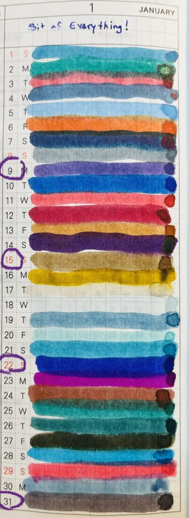
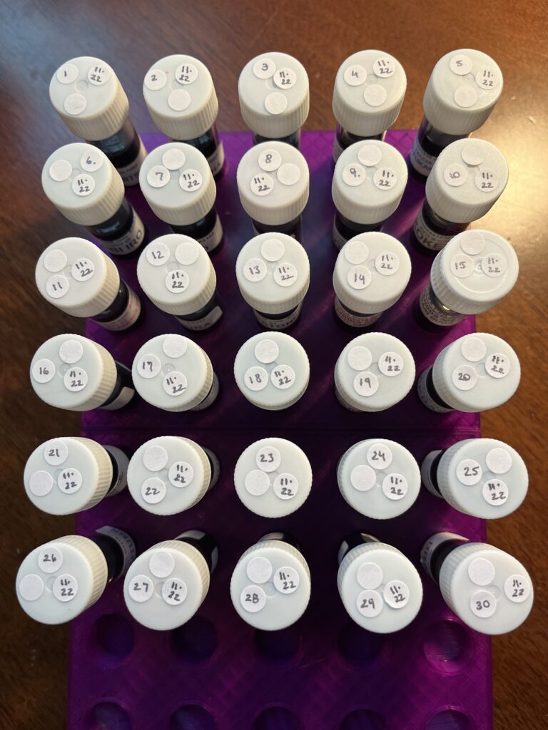
So many colors! I circled the dates for the inks I will reference below, 9, 15, 22, and 31.
Favorite: A purple, so surprised. Taccia Naka Murasaki (January 9), a solid cool purple, and has that “dusty” feel that I like. I think this will go quite nicely in any of my purple palettes, and it is on the darker side, so easy to read. Probably going to be a little tough to tell it is a purple in darker lights tho.
Least Favorite: Another surprise, my least favorite was a brown. (Being sarcastic by the way haha). Kyo No Oto, #10 Ochiguriiro (January 15). It’s a softer brown, which shares a little to a darker brown, has sort of deep yellow tones, and…I just don’t like browns. If you like browns, this is probably a good one tho, it behaved really well on my dip pen.
Learned: I don’t think I can completely guarantee that I have no brown ink samples in any of my reviews, but I can certainly try! This is definitely confirming for me that random ink samples are fun but only in small amounts, like the ink subscriptions. I have March figured out but I am going to have to do a think about what I am going to do in April.
Ink Subscription Samples: As I said, I actually sampled these in my Daily set, but I still! Gets it’s own section. And I got to play with Lamy inks from Truphae – which I have never tried before – and Anderillium from Ink Flight – which I have tried before, but out of the 7 I had only sampled one before. Also, I keep getting Monteverde pens in my Trupha subscription box haha, and the one from this month has not been tried yet! Next time I need a red pen I guess.
Favorite: The Lamy inks were all vaguely sheen-y inks, seemed to be a jewel themed pack. I ended up liking their Azurite (January 22) out of all 11 the best. It’s a very blue purple with a light green subtle sheen. I am guessing the sheen will only present itself in finer nibs by taking one thousand years to dry but otherwise I’ll need a broader nib to get it to show up visibly.
Least Favorite: For variety, let’s say the black ink, instead of the brown, was my least favorite…Anderillium, Common Loon Black (January 31). Nothing against the ink really, I just…think black inks are boring. Now! I could be wrong. But currently I have only seen one black ink I really enjoyed, and this was not it. Happy to be wrong some day tho.
Learned: Well…I guess I confirmed that I am still sus of sheen inks, and I still don’t like brown/black inks no matter what. But maybe I was not paying enough attention…
Whew, let’s see what we’ve got next month, shall we?
Trying something different! Instead of multiple posts, I’m going to just share a couple things from each.
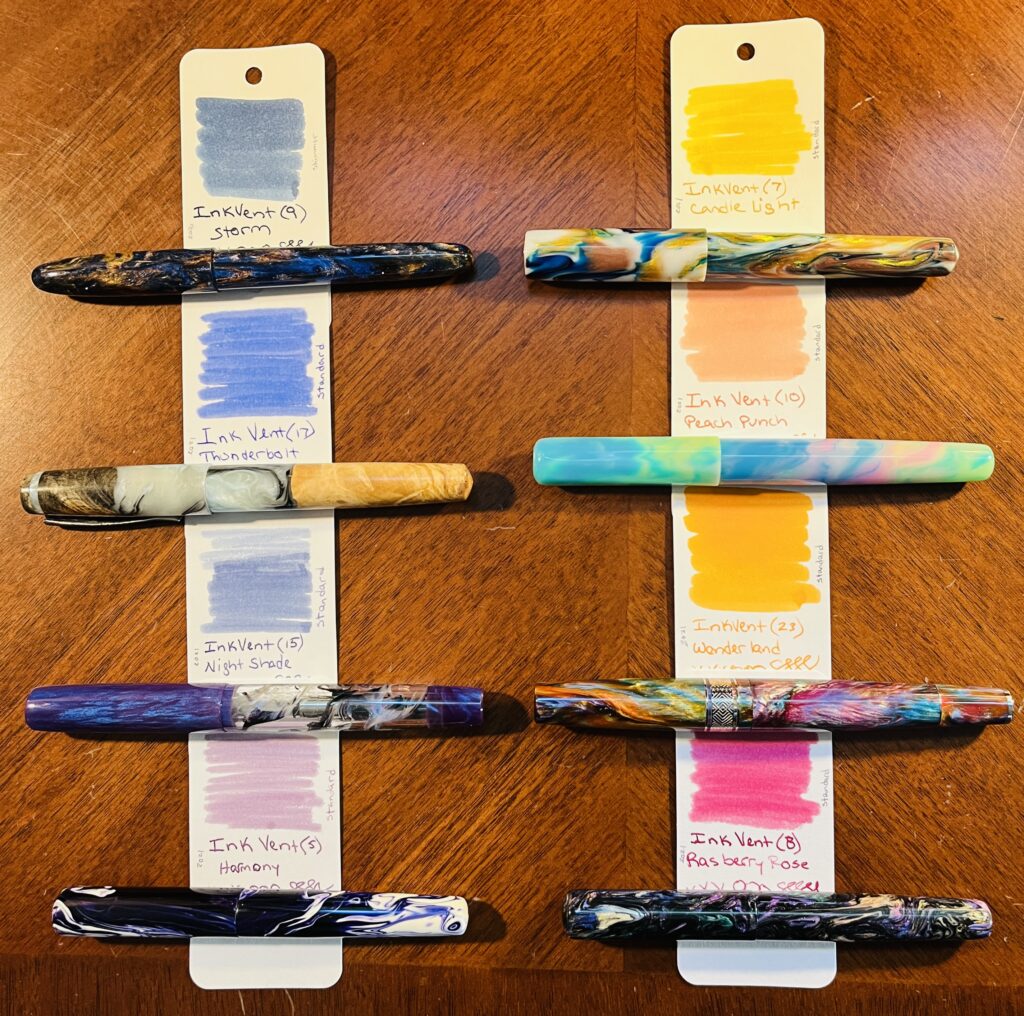
Let’s start with the Pen/Ink Palette. December’s pen/ink palette theme was more of an intention to use only inks from Diamine Inkvent 2021 than a proper theme. My favorite over all ended up being one I added from the 2022 Inkvent however haha – so the favorite here will be my second favorite. I really liked this palette, I found it very comfortable over all.
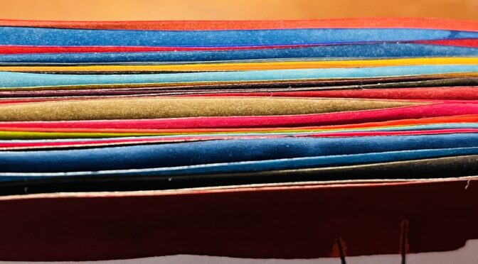
One of my sample cards from the beginning times! I do them very differently these days. And the ink ends up looking more purple in the notebooks I am using, hard to catch in a photo.
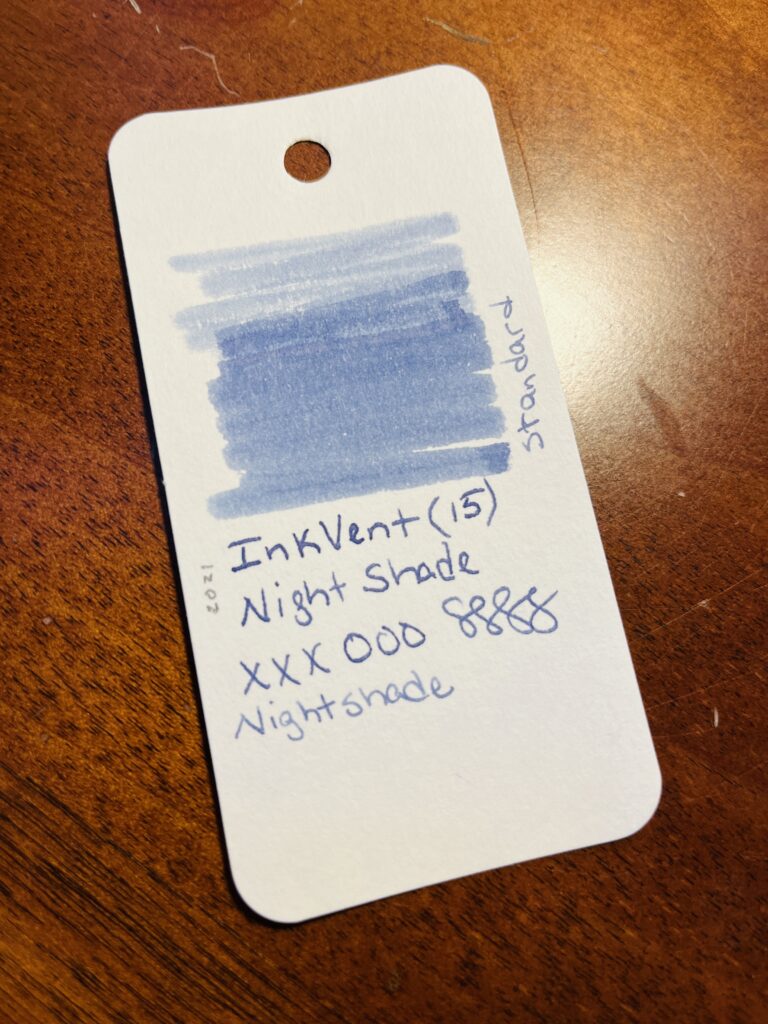
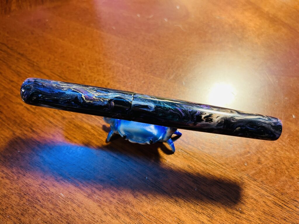
Favorite: (second favorite…) Diamine Inkvent 2021, Nightshade and the London Pen Company Christopher 13 Jr. pens. This ink was not in this pen this month – but they were my favorites respectively. I have actually used this ink in a couple of palette’s this year, but! The thing that makes it my favorite is that it’s one of those blue-purples. It operates really well, no skipping, good level of wetness, doesn’t smudge.
My crab stand is adorable, ahem. But this pen! Look at this gorgeous pen! It’s the perfect size and weight for me. And those colors!
I really enjoyed the shape and weight of this pen model. And the two I have are gorgeous colors.
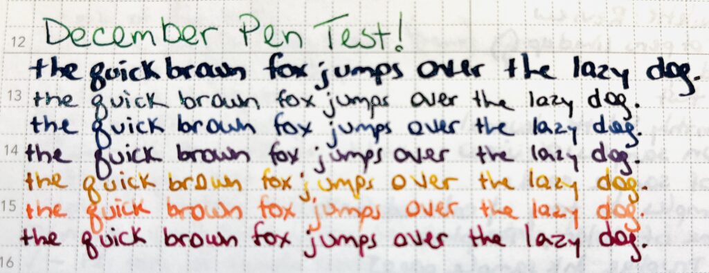
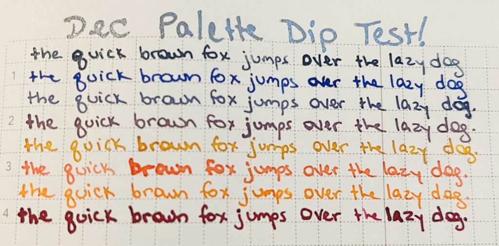
Candlelight is the fifth pangram line down, it is mostly a golden yellow, there is significant shading from an almost unreadable pale yellow to a darker golden brown color. (Nightshade is the third pangram line down for the record.)
Least Favorite: Diamine Inkvent 2021, Candlelight There is nothing really wrong with this ink, but I found it a little annoying to read as I was writing it and after it dried. It shades pretty significantly, I am hoping that is visible in that picture of my writing sample.
Learned: A balanced palette is really important for my mental health. This is more of a year long thing I learned, but it really solidified for me this month. So if there is a pen and ink combo I don’t like, as soon as I’ve realized that, swapping it is a good idea.
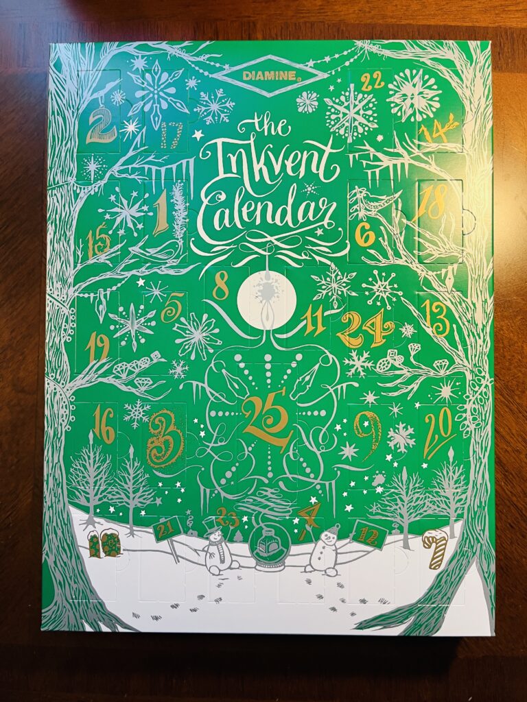
Now, Daily Samples! This month I went through Diamine Inkvent 2022 Advent Calendar. A complete mystery set of samples is a double edged sword. There were more browns than I like, but at least there was a healthy dose of shimmer inks!
Look at that pretty color! You can see the dark warm purple color with several different light colors of shimmer.
Favorite: Diamine Inkvent 2022, Solar Storm Hands down my favorite. I liked it so much and so instantly that I added it into my palette right away. After using it all month I have decided it is a little dark for my tastes over all, and more of a warm purple, when I prefer cool purples. But the shimmer, is so fantastic. So really my favorite thing is the way the shimmer works in this ink!
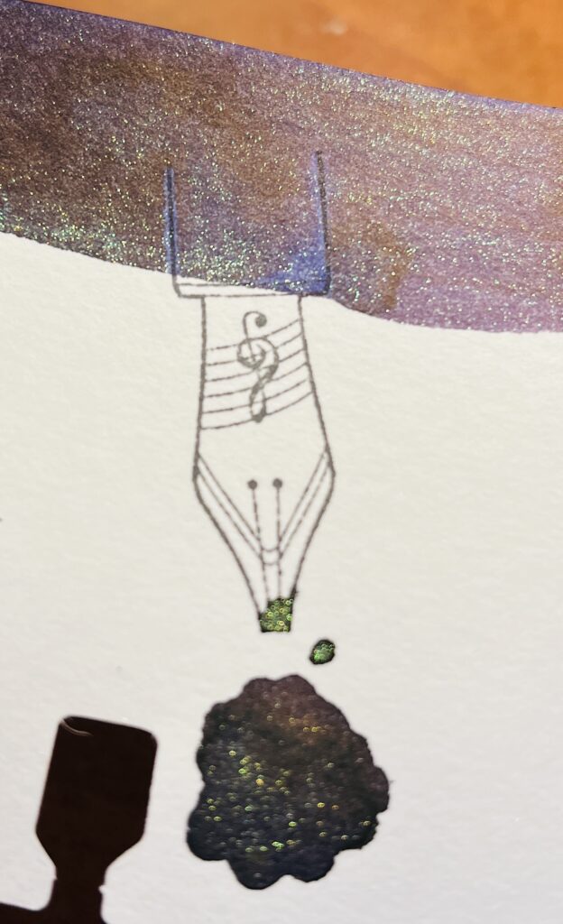
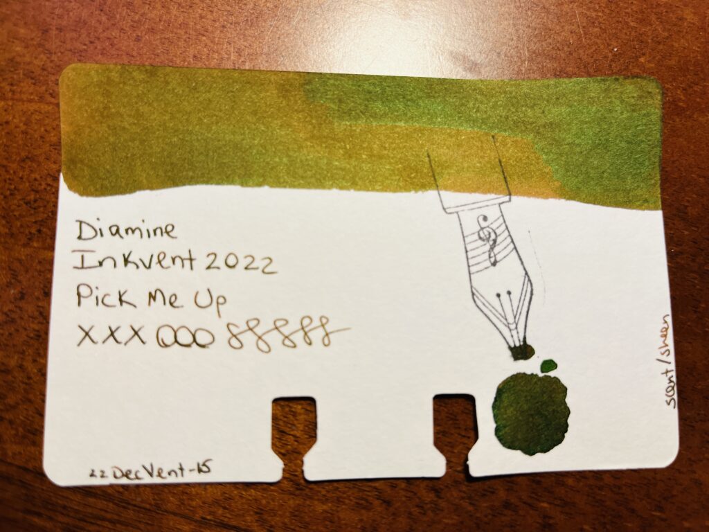
Icky green/brown color. Where it looks sort of golden in this photo is actually a lot browner.
Least Favorite: Diamine Inkvent 2022, Pick Me Up I do NOT like scented inks. And heck this one was scented. AND it’s brown, my least favorite ink color. And to top it all off, the scent was one of those things that I recognized but couldn’t place, and I still haven’t figured it out so it continues to bug me. Triple threat. There were other scented inks, and since they were behind sealed Advent Calendar style doors, they were always unexpected. I hated it. Fortunately a friend of mine opened her calendar ahead of time and was able to give me warnings for the days they would show up. Very helpful! I’m not sure I would have been able to finish the set of samples otherwise.
Learned: There were a couple of inks in this set that look a lot like inks from the 2021 Inkvent. I saw some folks be upset about this on Instagram. But it made me think, what if they look really similar, but they are different somehow? How are they different? Why would they release the same shade of ink with a different name (beyond the obvious consumer marketing nonsense)? I want to look into this some more.
Last but not least – the Subscription Samples. This month I received Kaweco Inks from Truphae (and a Lamy pen? Seems off that is isn’t a Kaweco pen??) and I received Ferris Wheel Press inks from Ink Flight. Unfortunately I got a lot of duplicates from Ferris Wheel Press, since I sampled all of the inks they had at the time in April for that months Daily Sample set. Also unfortunately overall, none of the inks really stood out either way.
I REALLY like these cards but I’m not sure what I should use them for…
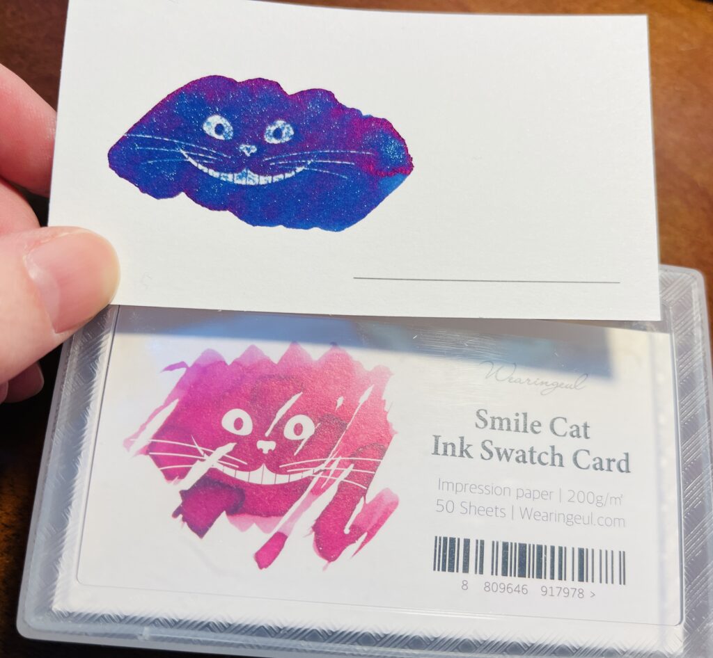
Favorite: So instead of a favorite ink sample, my favorite thing from these subscriptions this month were the Wearingeul Sample Cards. They have a kind of hydrophobic impression in the shape of the Cheshire Cat smile from Alice in Wonderland and when ink is applied over it, over about a minute the ink will move off of the hydrophobic spots and reveal the smile. It is SUPER cool looking. I took a video, I’ll try to put it on my twitter when this post goes up.
I was able to sample 2 of them, and at least one of those was shimmer, so yay.
Least Favorite: Again, none of the inks stood out as my least favorite since none of them stood out in any way really. Maybe I am just indecisive this month. And while the Lamy pen I got from Truphae is purple…Lamy’s are not my favorite pens. I do really like the tear-off notepad from Endless. So! I guess my least favorite thing from the Subscription Samples was the duplicate inks I got.
Learned: My reaction to the duplicates was a high level of disappointment. This was not Ink Flight’s fault, for the record – I really enjoy the subscription boxes both companies send out. I just have a ton of ink samples at this point, so it’s my own fault! But the thing I learned is that I really need to figure out how to handle this better so I am not so disappointed.
Overall I most enjoyed the Palette I used this month. The Daily Samples and the Subscription Samples ended up being a little frustrating. Fortunately nothing super terrible and some new favorites mixed in, which I really appreciate.
Next month (next YEAR) I’ll be using a mix of brands for the Daily Samples, a bunch of Kaweco pens and shimmer inks in my Pen/Ink Palette (theme: Ice), and looking forward to whatever I get in my subscriptions! I expect to run into the usual problems with shimmer inks and fine nibbed pens – sigh – and I am guessing the mix of sample inks is going to be frustrating somehow due to the random grab bag effect. But, as usual, looking forward to finding some joy in all of this!
Whew, using the word review twice in one title is super annoying. I’ll have to think of something better the next time I do this. Anyway – this month’s daily samples are using 8 different ink brands.
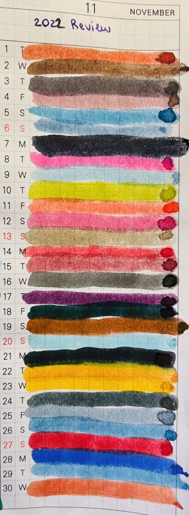
I pulled each sample randomly from a pile that gives me enough samples for November and January. Then I grouped the inks by brand, so I’ll be showing them grouped like that here. However! I wasn’t thinking and did not take the opportunity to order them by number – if they had one – or by series – if they had one. So, in January, I have to remember that! But, let’s look at the November daily samples:
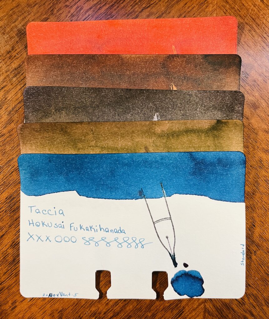
Taccia: Hokusai Benitsuchi: rusty brown, dark red with orange hints. Sharaku Kurocha: Brown. Very straightforward brown. Utamaro Usuzumi: Black, slight sheen. Utamaro Ume Murasaki: A brownish pink. Hokusai Kukakihanada: Ocean/whale blue – maybe not literally, but that is what it makes me think of?
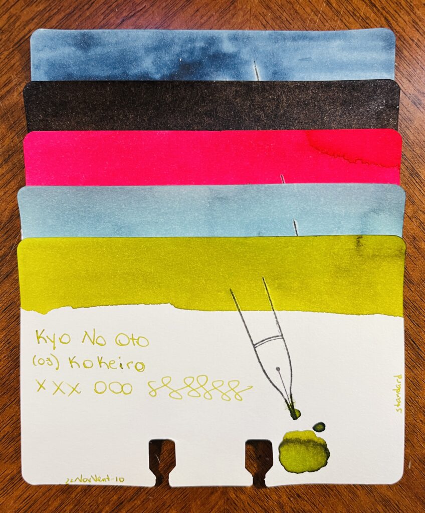
Kyo No Oto: Aonibi Iro, Nurebairo, Iamyou Iro, Hisoku, Kokeiro
Kyo No Oto: 05 Aonibi Iro: Mushy denim blue. 01 Nurebairo: I can’t tell if this is sheen or not? I feel like it is. Super darkest blue with just like…a wet colored sheen honestly? 02 Iamyou Iro: Bright pink, red tones. 07 Hisoku: Light to medium blue, readable, might be chromatic… 03 Kokeiro: Writes out like pea soup, dries to a goose poop greeny brown.
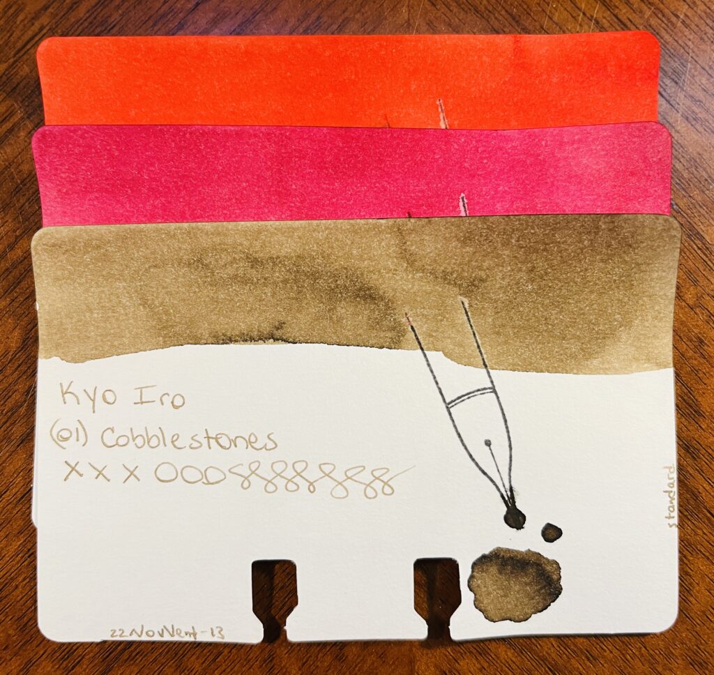
Kyo Iro: 03 Fushimi’s Flaming Red: Bright red, leaning towards a dark pink. 05 Keage Sakura: Nice cherry blossom pink. 01 Cobblestones: A really soft brown, or a brown tuned grey? Perfect for cobblestones.
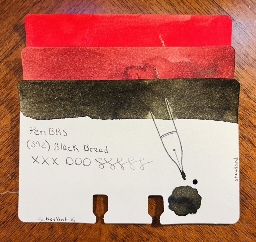
PenBBS: (520) Light Snow, (508) Grain Buds, (392) Black Bread
PenBBS: 520 Light Snow: Fall red, orange tones when it’s written lighter. 508 Grain Buds: Makes me think of coffee, both to drink when it’s dark and to stain. 329 Black Bread: Black! A very dark grey is what it dries to.
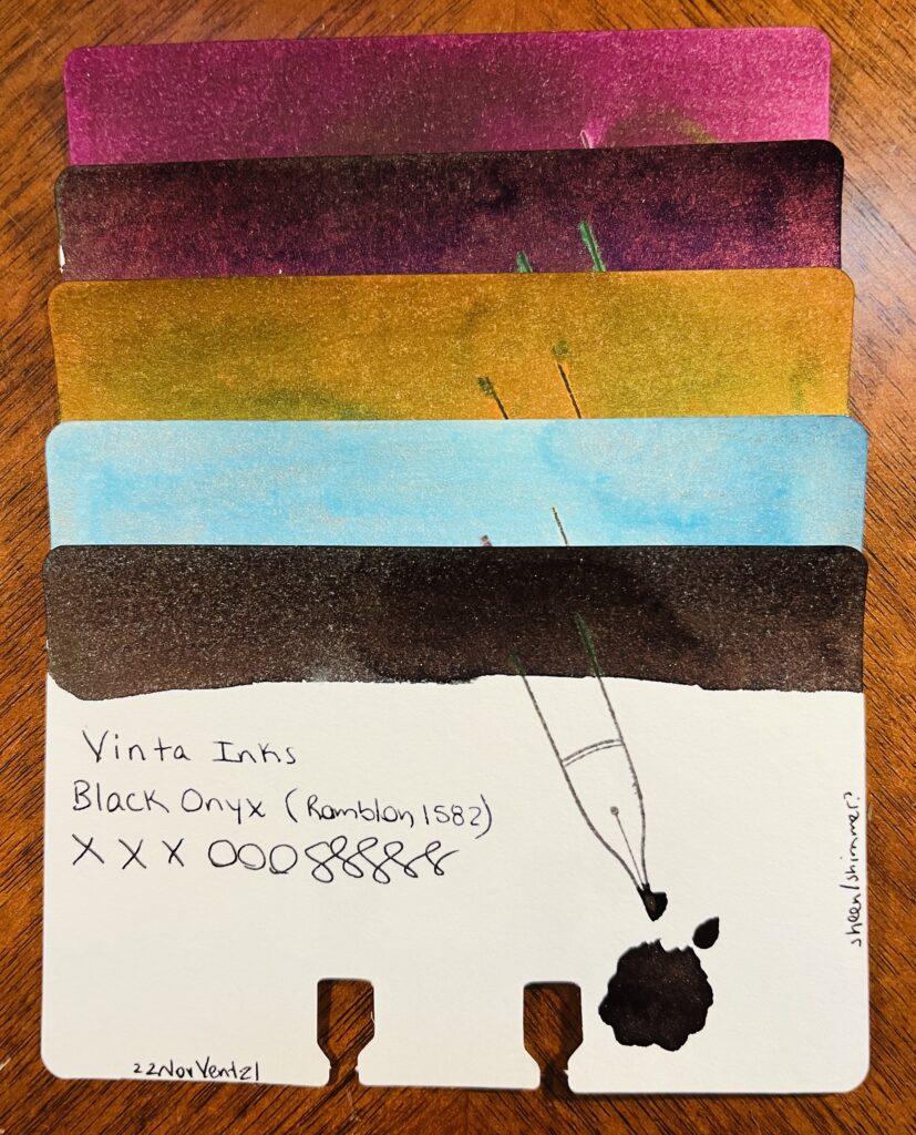
Vinta: Ubi, Andrada, Pamana, Lakbay, Romblon
Vinta: Mulberry Ubi 1663: Mulberry purple, dark, only noticeably purple in the light. Teal Andrata 1898: Dark teal hidden under a purple sheen – or at least it looks like an almost black purple, I suppose it could be read mixing with the teal? Heritage Brown Pamana 2018: Orangey brown with a green sheen. Sea & Sky Lakbay 1861: Pretty, light blue, pink shimmer, not sure how much the shimmer comes thru, but when it does, pretty! Kind of dirty looking in the swatch tho. Black Onyx Romblon 1582: Black/green undertones to the ink, faint dark purple sheen, and a very faint shimmer? Can’t see it in the vial, just the swatches. In writing it’s hard to see because of the sheen so…secret shimmer? I like it tho. For a black ink, nice subtle colors if you look at it right.
Wearingeul: Kyonghui, A Star Spattered Hill, Shooting at the Moon, Mature, Stars in Autumn, Human Problem
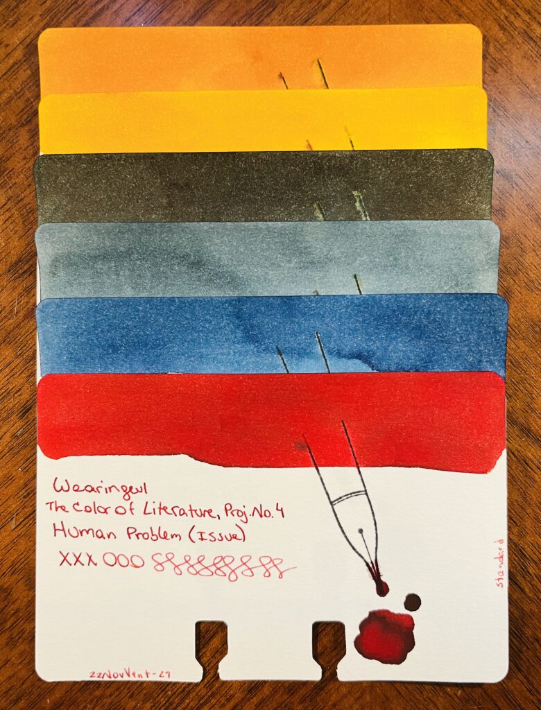
Wearingeul: Color of Literature, Project 4, Kyonghui: A sort of tan gold…reminds me of the color you’d see on plastics from the 80’s. Color of Literature, Project 1, A Star Spattered Hill: A buttery yellow, warm brown tone, gold shimmer. Pretty! Color of Literature, Project 1, Shooting at the Moon: Dark ink with a faint sheen. The color reminds me of a night sky and that hazy halo that you can see sometimes around the moon. Demian Literature, Mature: Medium denim blue, grey tones as it dries. Color of Literature, Project 1, Stars in Autumn: Medium to dark blue with blue shimmer. I feel like I really like this one, the swatch came out really pretty. Color of Literature, Project 4, Human Problem (Issue): Interesting that an ink called ‘Human Problem’ is the color of blood?
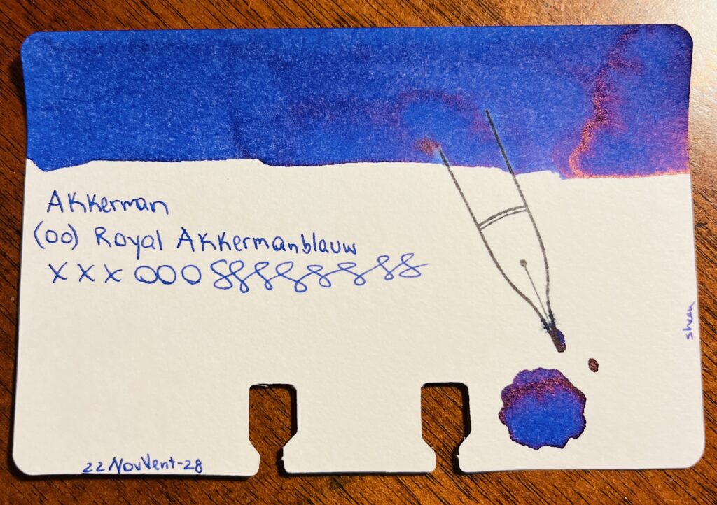
Akkerman: (00) Royal Akkermanblauw
Akkerman: 00 Royal Akkermanblauw: Medium dark blue, reddish sheen, looks purple. Subtle.
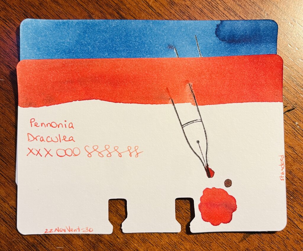
Pennonia: (032) Csontvarys Blue, Draculea
Pennonia: 032 Csontvarys Blue: A sort of sky blue with denim darker blue tones. Draculea: An orangeish red? Or a reddish orange? Sort of a fall color.
It was nice revisiting these brands. I am looking forward to finishing out these in January!
Month of iiiiinks! Look at all of those pretty vials of ink!
I am so excited for this – this Inkvent calendar is what got me into a daily sample last year, when I realized the ritual brought me calm and quiet joy. I was so excited when I got the 2021 box that I started it in October! And then quickly learned the community does NOT appreciate spoilers, ahem. So this year when it arrived I quickly “hid” it from myself in the closet haha.
I loved this box so much I tried to find samples for the very first box in 2019 – I believe it is referred to as the Red box, 2021 is the Blue box, and 2022 is the Green box. I didn’t find all of the inks from 2019 in sample form, unfortunately, but I made what I could find plus some random ones I filled in the gaps with work for November 2021 Daily Samples anyway!
Anyway enough about older Inkvents – although I can unfortunately say nothing about this years Inkvent, as I don’t want to spoil it for myself – or the community! So there is no list of the inks I’ll be sampling this month. We’ll see if I have enough energy to insta my samples every day or whether you will all have to wait until I post the review in January! And if you are also doing the 2022 Diamine Inkvent calendar, hooray! I hope you enjoy it.
For December I decided to only use inks from last year’s Diamine Inkvent. The pens are just shiny and I like them. I also kept the Magic Green pen and the Forever Purple pen. I want to try to keep the green pen filled for a full year, so need to keep it going until March 2023. And I don’t think I could exist without a really solid purple ink, so had to keep that one! The rest of the palette inks are a mix of Inkvent ones I have used before and some I’ve always wanted to try but I couldn’t fit them into other palette’s this year.
December Pen/Ink Palette combos!
And just to list all of those out, if you’re curious! I couldn’t find links for any of the inks, my apologies, but if you google the names you can read a lot of different reviews. Or wait for mine in January! And the links for the pens are mostly going to be to the creator themselves or the model of pen from that creator. Most of these pens use resin blanks from various other creators, and aren’t available all of the time, but I wanted you all to be able to find the creators at least!
I am very excited to try these pens – picked up a couple of new brands. And I really like the ink palette, it feels nice, the colors are pretty. Wish me luck that they all work well!
Alright, to review, this whole palette started with the idea of a “comfy” theme, and when I started thinking about comfy pen/ink combos I started thinking about combos I had used before that worked well. Which led me to the idea of picking a combo from each month between January and October of 2021 and using that as my palette.
So I did. I went back through all of my palettes. Although the palettes from before April were definitely not documented in my Monthly Palette Journal where I recorded what I ended up using – which made things a bit tricky. But, I picked pairs out and started using them – but I ended up making some changes, which I’ll explain later:
This combo clogged as well, and was equally frustrating! These two inks really did reflect my experience in January and February of 2022 with my palettes.
I immediately had trouble with the January and February pens. Looking back more closely at my notes I realize I had always had trouble with them. So I thought, welp maybe I’ll try a different pair – and when I looked more closely at both of those months it became clear those two palettes were kind of the worst.
The thing is, I discovered shimmer inks later in 2021, and my Daily Samples for December were all Van Dieman shimmer inks, so by January and February of 2022 I was very hooked on shimmer inks. And I struggled to use them in my pens which I found incredibly frustrating! Which is why when the Ferris Wheel Press Moonlight Jade worked without a single issue in my Hong Dian pen in March I was so absolutely thrilled!
As I was looking into this and trying to decide if I wanted to keep struggling with those two pens, I ran across and instagram post from @claire_scribbles (check) about the #30Inks30Days challenge for November being about sampling old favorites. Which is similar to what I was doing for my November palette…except the favorites part. That got me thinking, maybe I’ll look back thru all of the palettes and see if I had any other favorites – and turns out – I did! So I threw the whole “one combo from each month” out the window, and went back looking for any combos that worked and were loved. I looked thru the Monthly Palette Journal, where I make notes about the combo performance, and for anything prior to April I went looking in my Captain’s Logs for those times and looked for any complaining or performance issues. And came up with more than 20 options. Since I try to only carry around 10 pens at a time in my palette, I needed to narrow it down.
I started by keeping the 8 pens I had picked out already and were behaving. And mostly looked for combos that helped me round out the ink palette color range wise. But what was interesting to me were the combos that stood out – like Bloom in the Peach Punch Twsbi Diamond – it was the first pink I used and liked, in my April palette. I’d used a bunch of pinks in February and it made me so grumpy that they both didn’t work and the colors were irritating that I switched to the March palette early. And in April I found a pink I liked AND it performed well. So I kept using it in May! Or Kon-Peki, which was a blue I used really early on, first time in September of 2021. I’d gotten into all of this pen stuff in late August 2021, and I got a sample pack of blue inks and Kon-Peki was in it, and I liked it, and I put it in a pen when I built my first rainbow palette. I put it in my Twsbi Diamond Mini. And I loved it. Used it into October 2021 before I switched it out. I wasn’t using month palettes at that point. But it came back in my May 2022 palette in a Kaweco, and continued into June just in another pen. One of the reasons this one stands out is it is not a shimmer ink and yet, I still adore it. And there were other examples like that, combos I liked enough to pull into the next month’s palette, and inks I liked enough I swapped them into different pens to keep using them.
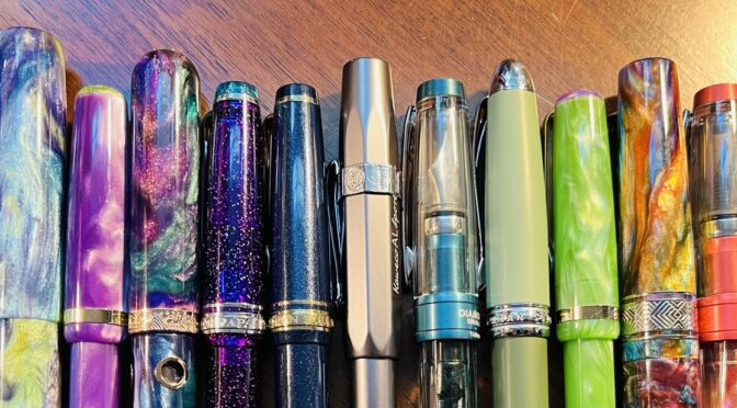
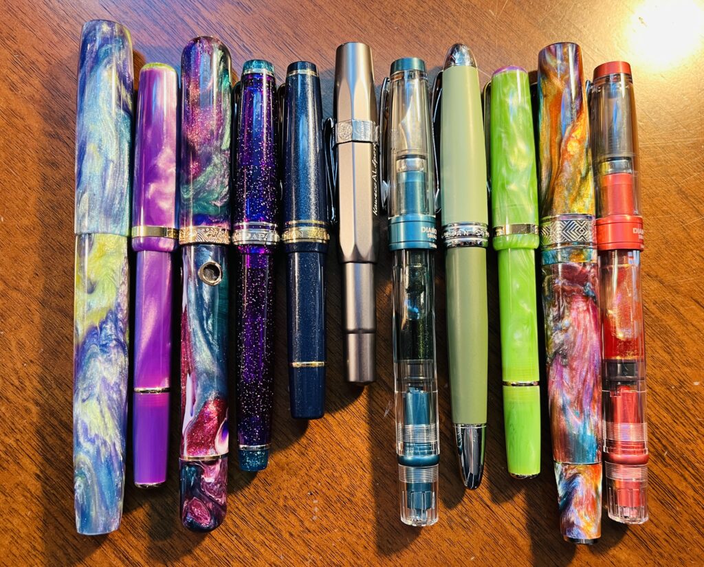
My 2022 November Ink/Pen Palette!
I ended up with 12 pens – rather fitting, considering it’s a year review, although I did stick to combos from 2022. When I started listing out which combos were from which months, I realized some combos could be from multiple months! Actually, only 2 of the 12 are combos I only used once, but I distinctly remember wanting to use them more than once. In case anyone is interested: 1 of them is a pen I inked in late April but ended up using through May. 2 of the inks I put in a pen and never took out. 2 inks I used in multiple months but not back to back and in different pens. 3 more are pens I used across 2 months. And there are 2 from October I am using in November, so I guess technically one of those joins the “used across 2 months” club, and the other counts towards the group that I used in multiple months but different pens!
So this ended up being a proper review, because each of those categories hits a 2022 trend for my palettes. Even washing out 2 pens almost immediately fits a decision I made pretty early on to not persist for too long with a pen that bugged me. Made that decision after the February palette. I remember being SO GRUMPY which utterly defeated the entire purpose of using these pens in the first place. The Narwhal pen with Sosdajgh in it – pen arrived IN November, so never used it before, but that’s something I did often, adding a pen completely unrelated to the palette purely because I wanted to use it IMMEDIATELY. Usually I decreed it an accent color. Actually, Bloom was my accent color for May, since that theme was all Blues. So even that one fits!
I will list the pens I did end up using – and why! I find this rather fascinating. I really enjoyed the things I discovered and learned and developed. Like how I don’t reeeeally need a whole rainbow. (Even tho rainbows are absolutely delightful and satisfying and completely legitimate.) I figured out what was satisfying for a palette and worked out good themes along those lines. I learned how many pens I could actually use in month. I worked out how to deal with shimmer pens when they clog. I started filling the removable converters with a syringe. I settled on a good way to use the different colors for work. I discovered new pen makers and new inks. I even did art. Yay art.
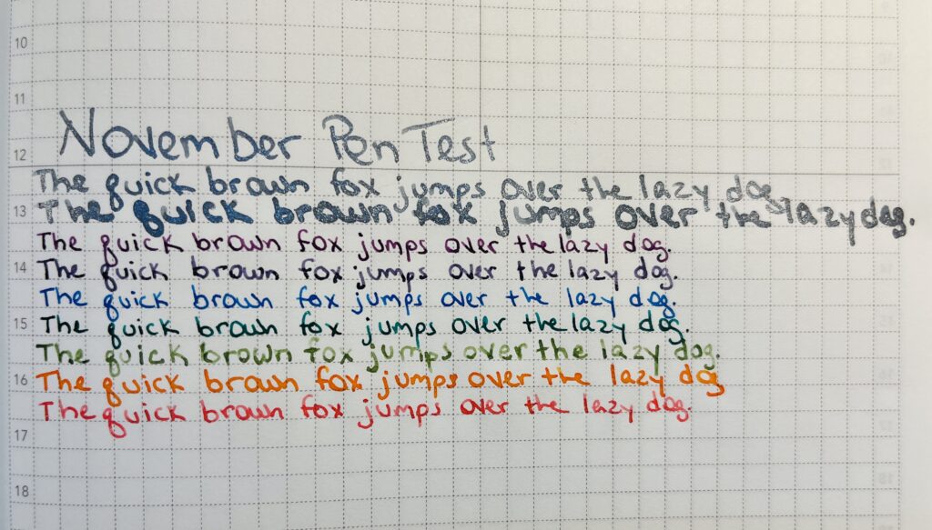
November Pen Test, sans the Ghost pen which had to be cleaned out early when it ran out of ink, and the Forever pens because I use those all the time anyway!
January: NOPE. Could not find a pen combo from January I wanted to use.
I tried Subzero in the Twsbi Diamond, altho originally this ink was in a Twsbi Eco. It didn’t perform well in either of them so after trying to make it work with my new found skill set at handling shimmer inks and having that fail, I decided to put this one away. February’s palette made me so very very grumpy this year that I decided moving forward to just clean out a pen if it was bugging me too much.
February: NOPE. This was a very frustrating month for me. The pens either didn’t work or the ink were colors I really didn’t like. I actually ended up emptying almost all of these pens about half way through the month!
I really like shimmer inks, but at this point nothing was working well and it made me want to throw things because Van Dieman shimmer inks are so gorgeous. The one I felt truly betrayed by in January was another Van Dieman: Twilight Mist, but! I kept trying. I had a theory with that brand that I just needed to find a good pen and the shimmer inks would behave. (The secret usually is having a wide nib, for the record.)
And lo and behold – a pen and shimmer ink that WORKED. I swore I would never put it down. Never. We shall see how long that is true. But please know – I was so incredibly delighted. (AND this is an EF nib! Why does it work?? No one knows.)
This was another satisfying combo – both of the TWSBI Diamond pens I tried to use in the beginning with different inks ended up with shimmer inks from brands I had looked in to after Van Dieman frustrated me so badly. I was chasing a theory that each brand handle shimmer differently, largely stemming from how Diamine shimmer inks and Van Dieman shimmer inks performed so differently between November and December of my 2021 samples. The only reason Zoanthid didn’t go from my 2022 March palette it into my 2022 April palette was I had chosen bright rainbow colors for April, and a teal didn’t really work.
Pink? Seriously? Pink. I needed a red for my 2022 April rainbow and I loathe red inks more than I dislike pinks, so I picked a pink for my April Rainbow Palette. And I liked it so much I justified using it in my 2022 May palette because I was going to use all blues and I needed an accent color. And it remains one of the only pink inks I actually enjoy using.
It’s the right color purple – a cool purple, that is desaturated enough to LOOK purple, and has shimmer that showed nicely. In this pen it mostly behaves. And the pen is sparkly. So I decided to also never put this combo away. I’ve only had to empty it once completely so far and that is because I made an absolute mess filling the converter with a syringe the first time I tried it. Which made me nervous the next time I went to fill it so! The entire pen top to bottom got beautifully cleaned sometime in August 2022 and otherwise I just keep refilling it.
I actually started using this ink in April 2022, late April, the day the custom architect nib I had ordered arrived. This ink was originally in my Gravitas pen, with this same nib. I put it in a different pen for my 2022 November palette because I really love this resin. I love being able to use both top and bottom of the nib to get those different line widths and I think this was the nib that I decided to use for headers in my notebooks.
Okay this one is fun! It was one of the original inks I used in the first set of pens I ever kept inked. I put it in the Twsbi Diamond mini first in September of 2021, then used it into October 2021, but switched it out sometime in that month. It re emerged in May of 2022, with a Kaweco pen. Then I swapped it into another pen in June, a Cult Pens x Kaweco collaboration. And now it’s back in the first Kaweco pen I had it in! This ink is delightful and NOT a shimmer ink and yet I still adore it. May 2022 was when I started to accept that if I wanted a pen that worked well without having to fuss with it every time I used it, I might need to find non shimmer inks I enjoyed using. Sigh. For the record, there is like, a thousand blue inks that fit this category. But not many purples.
This was another fun one – I fell in love with this ink fast, because it is a blue, but also can shade purple, and has rose-gold shimmer. I adore it. And finding a pen that would write consistently was difficult. It wasn’t until August that I actually found a Sailor pen with a MF nib to put it in and be able to trust it worked consistently. But since June was another month with a disappointing palette, I fudged which pen I put this ink in a tiny bit. I first used this ink in November of 2021 in a Twsbi Eco. Kept using it in December and then January of 2022. In February I moved it into the Twsbi Navy Blue Diamond, where it lived until April. I put it back in the Twsbi Diamond for May and June, cleaned it out in July, and it joined my palette again in August in the Sailor. So technically an ink I used in June, just not the pen. The ink works pretty consistently in this Sailor pen, but to be honest it isn’t perfect. I was originally thinking that this would be my third forever pen alongside the Purple and Green I am using, but alas. Still too frustrating to be kept inked forever.
I desperately wanted this pen – it has a fidget built into the clip on the cap. It’s not intended as a fidget but it is one and I needed it. The one I got has a lot of orange in it, so! For my July palette theme of Summer, I needed a really good orange. Enter Wonderland! Loved it so much I managed to justify using it into August, for my Sunset theme. It performs so beautifully. I was super excited to have it back in my November palette. And it worked beautifully as usual!
A non shimmer purple that I like! What! So excited. SO EXCITED. I loved how this pair worked. I didn’t use it in the September palette, because it didn’t fit into the Fall theme, so enthusiastically added it back in for the review theme in November!
Wearingeul inks sampled in August brought me Flowing Leaves which is a truly delicious green – and distinct enough from Moonlight Jade that I was able to justify keeping them both in my palette. I had started insisting inks of the same color had to be distinct shades, because sometime in June or July I think I started using two different color inks in one day for my work notes, alternating per line item so I could read my notes easier. In August I switched to just using the entire palette, mostly because I couldn’t find 2 ink shades for the whole palette that I liked enough. But, I ended up liking this ink so much I used it in my October palette for my Zombie Spoopy Monster. Yet another ink brand with excellent shimmers! I am going to have a very hard time putting this ink away.
Another Wearingeul shimmer ink – one of 3 in the October palette actually, all 3 of which are still being used in November. This was originally in a different pen, but I actually can’t remember which one? I HAD to put it in the Mad Science Pen Company “Ghost” pen the instant it arrived. The INSTANT. And it has performed beautifully, and I love continuing to use it. I ended up having some trouble with the ink dribbling out into the nib when it was resting capped so I ended up having to clean this one out early, mostly because I completely ran out of the ink sample. I spilled this vial, if I recall correctly, when I was first sampling it. And of COURSE it is out of stock everywhere. Sigh.
This entire year I tried very hard to create palettes I would find engaging and delightful. Occasionally a pen or ink arrives after the theme is put together and I just HAVE to use it. And that is how I justified using this pen in this palette! I put together a palette to review pen and ink combos that worked well, one from every month between January and October of 2021. But THIS pen arrived in November – and I was having an extremely bad day when it showed up and Aaron encouraged me to put an ink in it I love just for the night. And now I refuse to put it away muahahah because I love it. So, technically, it fits in this year’s review! 🙂
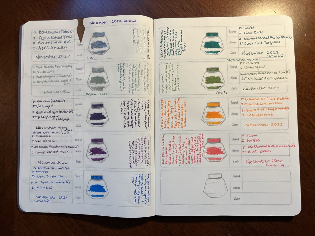
November Monthly Palette Journal
I think it’ll be interesting to see what ends up happening around this time next year. Will I have even MORE options to choose from because I get amazing at combining pens and inks and they all work beautifully? Or will I take more risks because I’ve gotten better and now I think I can do ANYTHING. Hmmm…I do want to try some more custom nibs. I want to keep trying new brands of inks, and paper types, and experimenting. So who knows? I guess we’ll just have to find out.
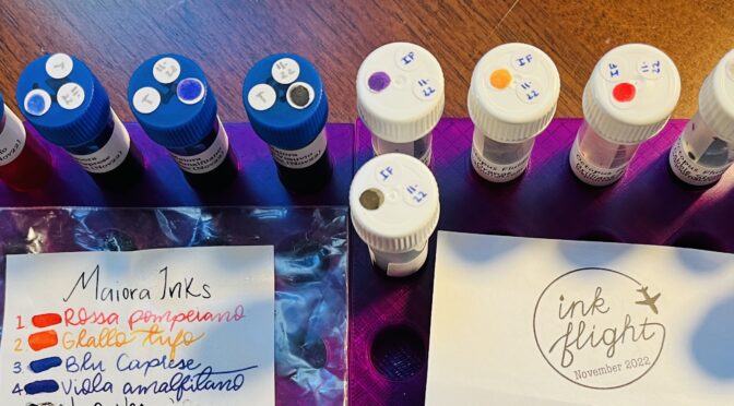
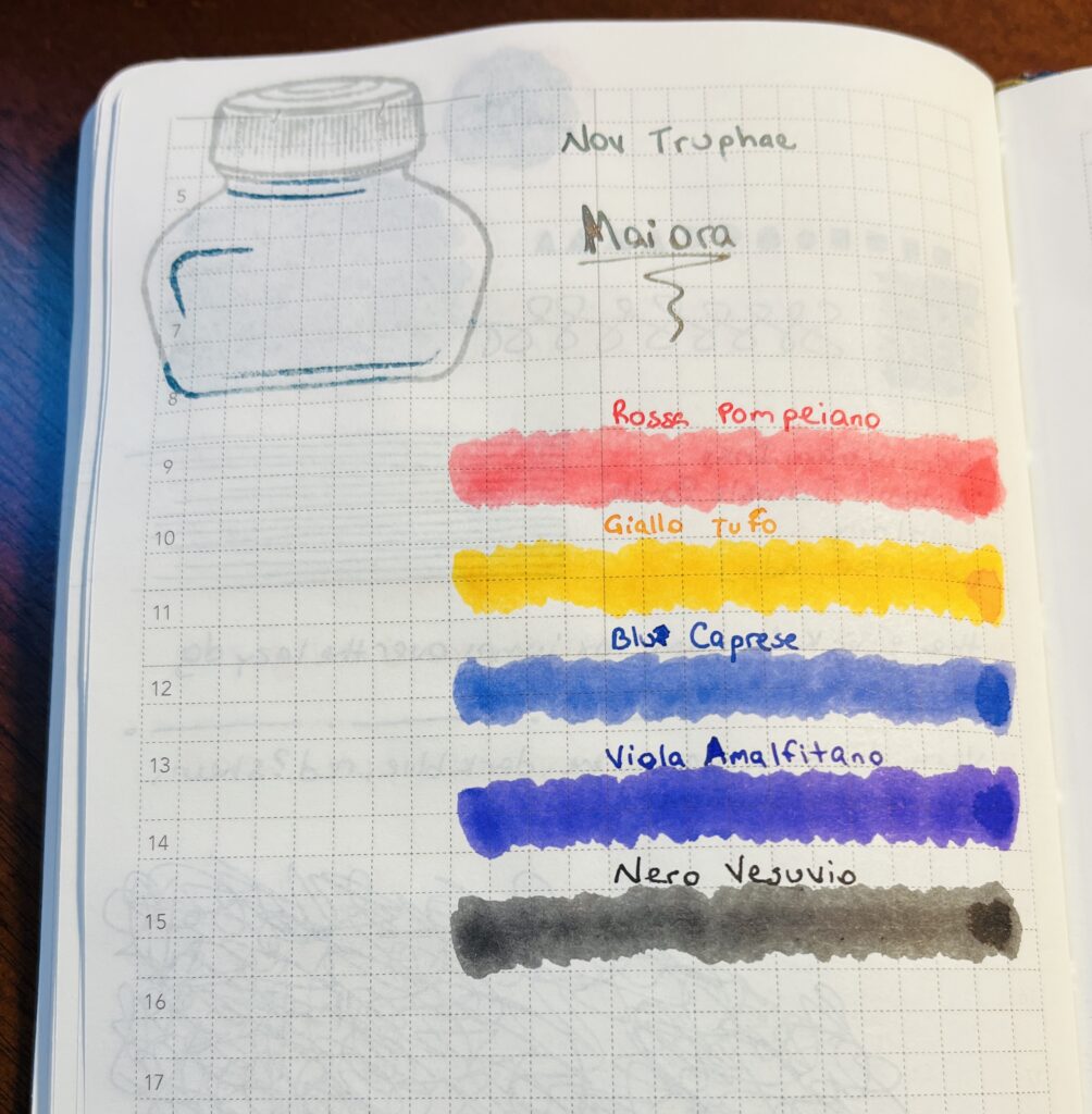
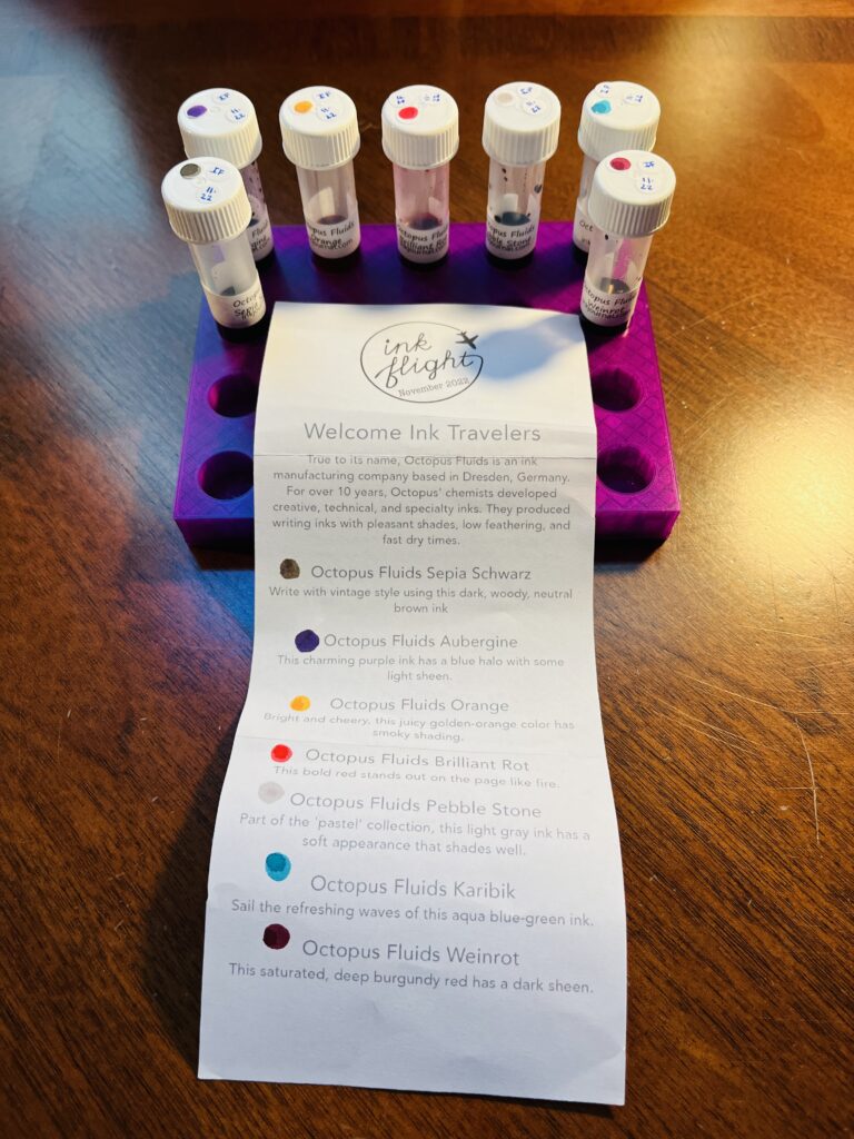
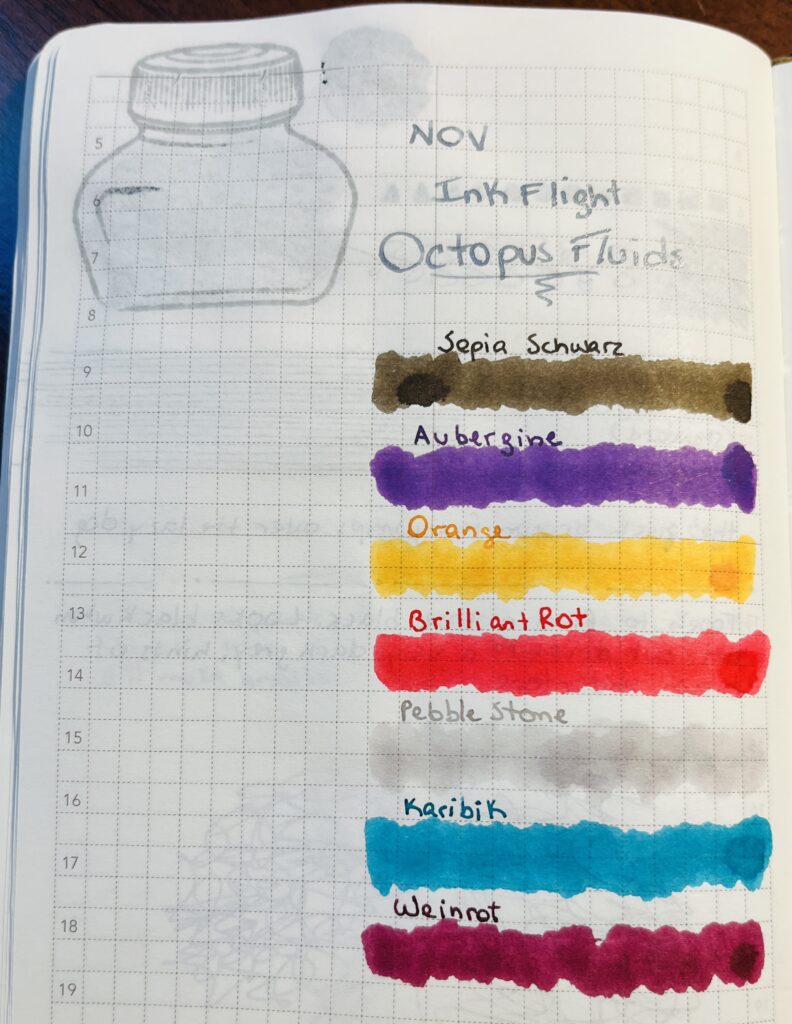
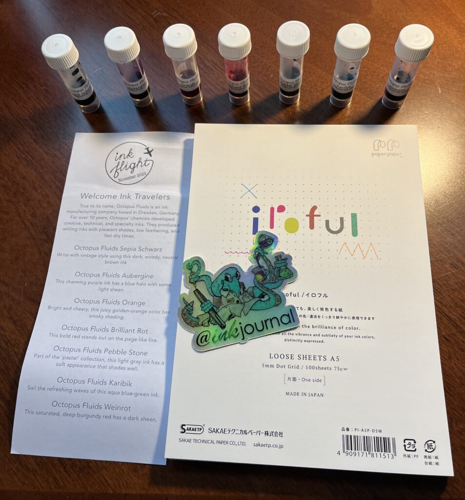
November begins! This month I got Maiora inks from Truphae and Octopus Fluids from Ink Flight! Interestingly named inks, I must say.
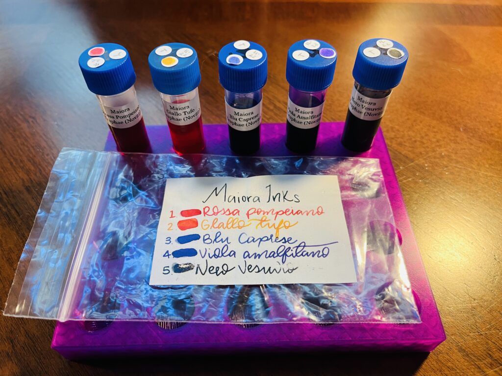
Maiora Inks
Maiora inks are made in Italy and are most often described as vibrant when googled. I have been super tired lately so I didn’t get to look into this brand as much as I’d like. I know I’ve seen other reviews of it and they have a good reputation.
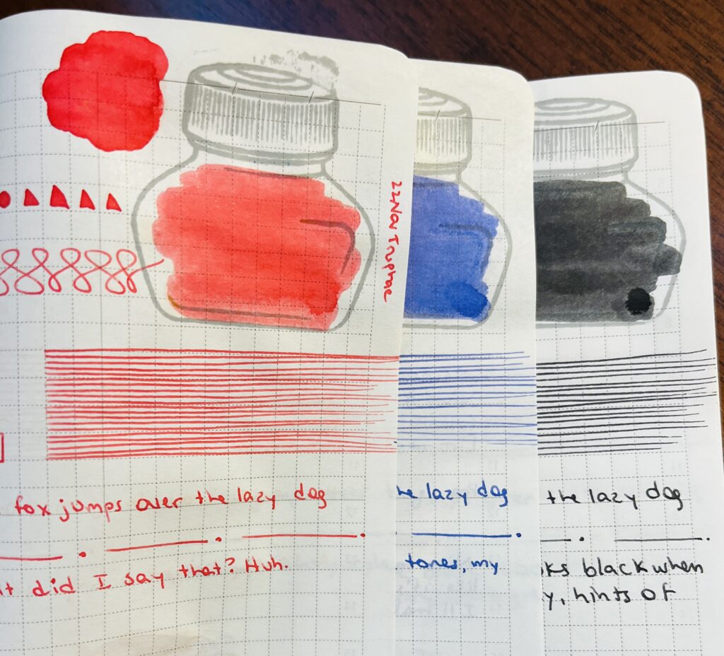
Rossa Pompeiano, looks red in the photo but in person it looks like a nice pink to me.
Blu Caprese, a purply blue, or a blue with faint purple tones, my favorite!
Nero Vesuvio, tough to find a true black ink. Looks black when wet, but dries to a very dark grey, hints of brown undertone.
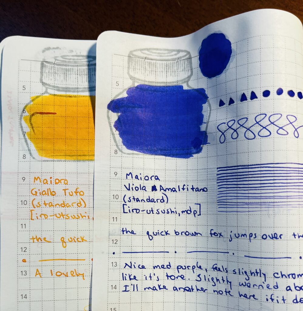
Maiora: Giallo Tufo, Viola Amalfitano
Giallo Tufo, a lovely bright orange, yum!
Viola Amalfitano, nice medium purple, feels slightly multi chromatic, I really like it’s tone. Slightly worried about staining my metal nib – but ended up fine.
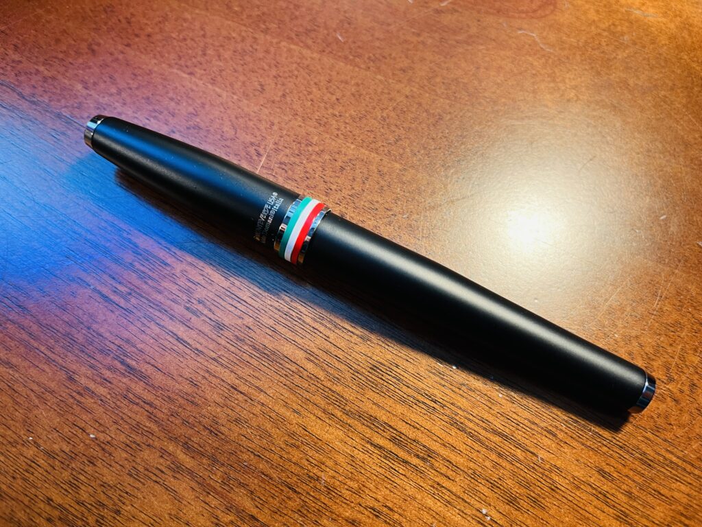
I haven’t tried this pen yet, and I’m not sure when I will. The Monteverde pens I have tried I liked, but the coloring of this one isn’t something I usually use.
Octopus Fluids – these inks are pigmented, water proof and smudge proof – I think. Because of that I was super careful with them when I did the samples, and I expected to have some trouble keeping my metal nib clean. I only had an issue with one ink which I’ll describe below. I will include the text on the piece of paper that describes the inks below my own thoughts and in quotations.
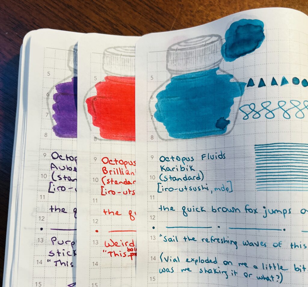
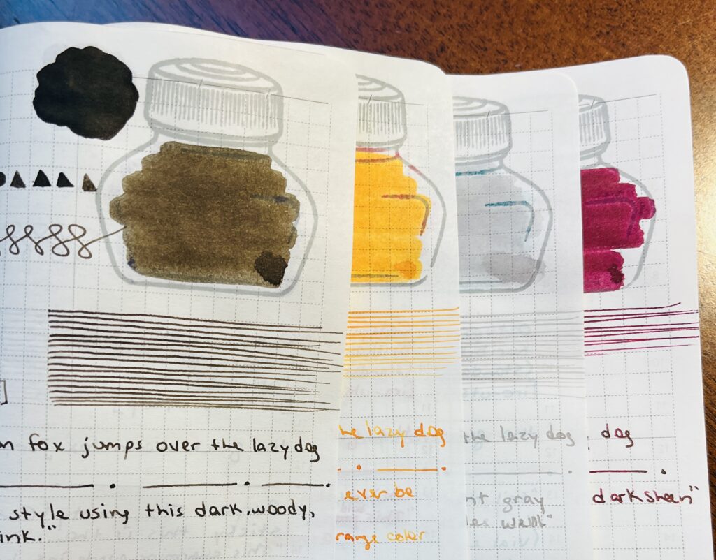
Octopus Fluids: Aubergine, Brilliant Rot, Karibik
Aubergine, purple! It’s pretty! Concerned about how sticky it is though. I had some trouble getting it cleaned off the holder for my metal nib. And I did not see the halo or the sheen, but that might be the paper I am using. “This charming purple ink has a blue halo with some light sheen.”
Brilliant Rot, weird name but okay! Very bright red. “This bold red stands out on the page like fire.”
Karibik, nice turquoise, although I did get it all over me! I shake the vials gently before sampling and when I opened the lid it burst out all over me and my desk! I think it was me though and not due to the ink haha. ”Sail the refreshing waves of this aqua blue-green ink.”
Sepia Schwarz, kind of a smoky brown. I drew a tree. Which I will not be showing the internet haha. “Write with vintage style using this dark, woody, neutral brown ink.”
Orange, pretty orange! Bright, yellow tones. Did not see any shading but again, could be my paper. “Bright and cheery, this juicy golden-orange color has smoky shading.”
Pebble Stone, very light grey, and I thought I saw some purple hints in it. “Part of the ‘pastel,’ this light grey ink has a soft appearance that shades well.”
Weinrot, dark maroon or burgundy I think, with very faint sheen. “This saturated, deep burgundy red has a dark sheen.”
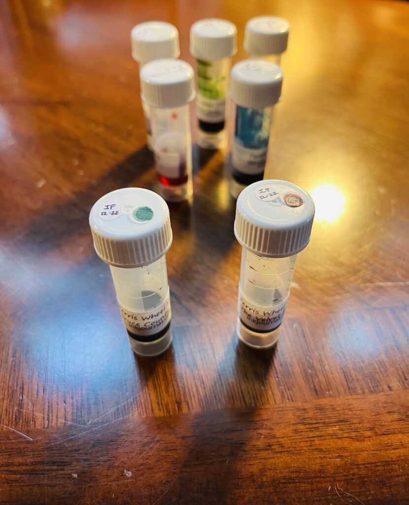
22 November Ink Flight: Octopus Fluids, Sepia Schwarz, Aubergine, Orange, Brilliant Rot, Pebble Stone, Karibik, WeinrotOctopus Fluids Ink Flight, 100 sheets of loose leaf A5 paper from Iroful, and a shiny Science Octopus sticker!
The inks turned out really cool, I liked all of the colors. I worry about pigmented inks in my pens and have even had warnings accompany some of them about not using them in that particular pen. Here is where I show my inexperience! Actually, the entire pack highlighted how much I still have to learn. For example, I thought this paper would be awesome to use, it’s a fancier grade and everything. But some of my pens end up sort of going dry and skipping when I write on it. Not sure why. Discovered a hard surface under the page instead of another page or a softer surface does help, but! Must still investigate. And I continue to love these stickers.
I enjoy how these subscriptions keep exposing me to new inks, pens, and accessories. I don’t know how long I’ll keep doing them but as of next month I’ll have been subscribed to Truphae for an entire year! They are certainly still fun.
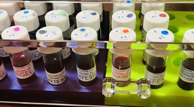
Pennonia Inks! I found this page on how to pronounce the inks names and I was incredibly entertained. 😂 This brand has raaaange heck.
Heckin messed up the
11th haha look at that mess! At least it was with two pretty colors.
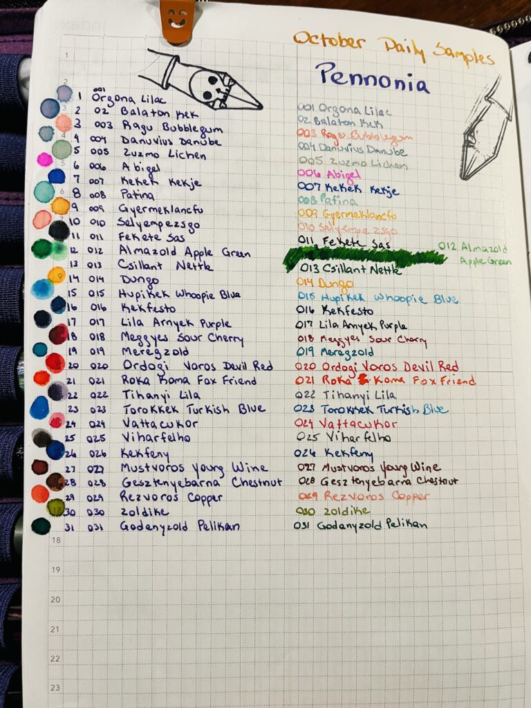
Now, I couldn’t figure out a way to really group these, so we’re just going to look at 10ish at a time. There are darks, lights, saturated, chromatic, pretty much everything but shimmer. And! This was one of those inks with a small enough library (at the time I was looking) that I could finish out almost the entire thing in one month! I have one more which I’ll try in my November set of Daily Samples. Let’s take a look! It was a little strange having so many pastel type shades at the beginning of a spoop month haha.
Pennonia 001 – 010!
001 Orgona Lilac – Another blue lilac, multi chromatic, but on the light side. Reminds me of fairy wings.
002 Balaton Kek – Multi-chromatic blues, faintest hint of lavender.
003 Ragu Bubblegum – Very light peach, soft and pretty.
004 Danuvius Danube – Light blue, with some pink shading, another multi-chromatic!
005 Zuzmo Lichen – Soft green, fresh looking, orange shadinf which doesn’t muddy it – unusual! And the last of the multi-chromatics for a while.
006 Abigel – Oh heck a hot pink! And readable!
007 Kekek Kekje – I like this blue, medium dark, jewel tone, performs really well.
008 Patina – Light teal, fairly readable, reminds me of a copper patina. Without the copper.
009 Gyermeklancfu – Burnt orange yellow.
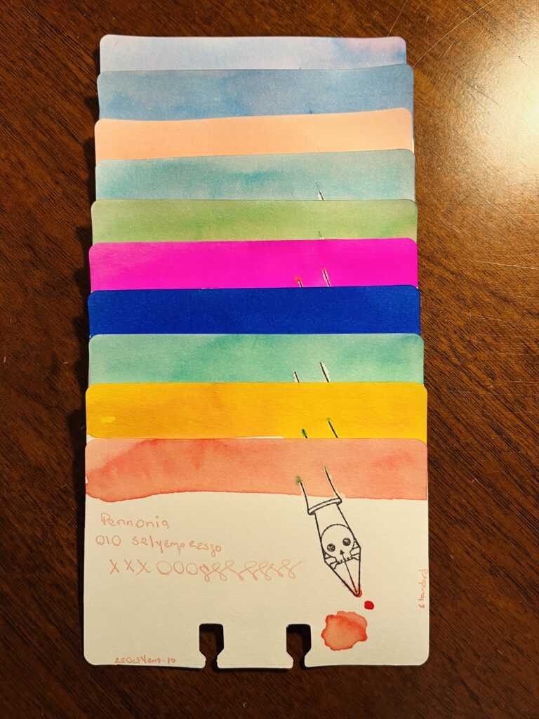
010 Selyempezsgo – Pale peach, reminds me of tea! I like tea.
Pennonia 011 – 020!
011 Fekete Sas – Blue black, fun to write with, not a fun color tho.
012 Almazold Apple Green – Nice dark green, darker medium green.
013 Csillant Nettle – Reminds me of that first Granny’s Apple green apple of the summer – did that make sense? It makes sense. Ahem.
014 Dungo – Butter yellow, no! Egg yolk yellow.
015 Hupikek Whoopie Blue – Brigth blue, pool/beach blue.
016 Kekfesto – Nice standard dark blue, light blue is nice too.
017 Lila Arnyek Purple – Not one bit of purple in this ink, disappointed. However this dark blue ink is fun to write with, very well behaved and controlled. (But no purple, grumble grumble grumble.)
018 Meggyes Sour Cherry – Reminds me of cherry juice, not maraschino, like the bourbon soaked cherries we get sometimes.
019 Meregzold – Teal! Good teal.
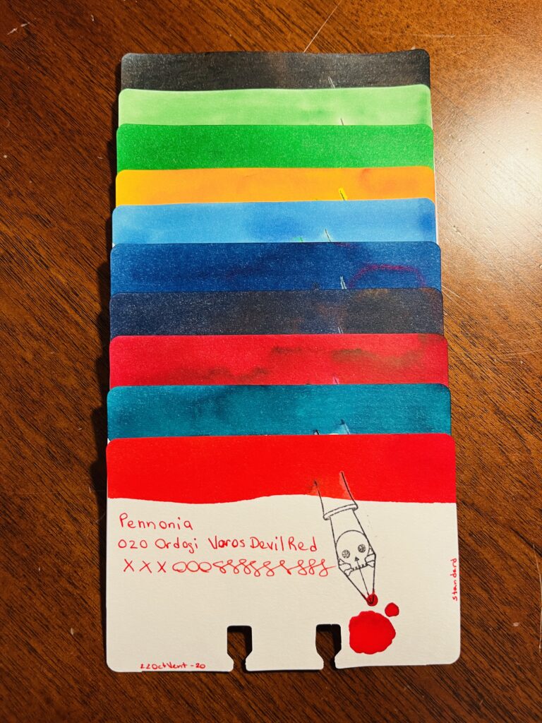
020 Ordogi Volos Devil Red – Bright lipstick red. More pink than devil red.
Pennonia 021 – 031!
021 Roka Koma Fox Friend – Bright orange, with a red base that grounds it nicely.
022 Tihanyi Lila – Reminds me of the ink I have called Nightshade but a touch more purple. Shading inks are really interesting.
023 Torokkek Turkish Blue – Sheeny blue, purple sheen, dense lighter blue, with some aquamarine. Complicated ink!
024 Vattacukor – Dark pink. Rose pink, has a flower petal softness to it.
025 Viharfelho – Dark grey when wet, fades to a medium grey when dry.
026 Kekfeny – Medium blue, red sheen = purple! Yay purple.
027 Mustvoros Young Wine – Reddish orangeish/brownish tones?
028 Gesztenyebarna Chestnut – Maybe not a chestnut brown, exactly, but definitely brown.
029 Rezvoros Copper – Pastel, peach color – might be chromatic?
030 Zoldike – Grass green, yellow/tan undertones.
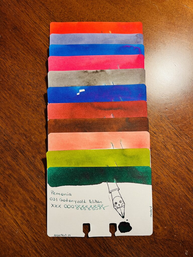
031 Godenyzold Pelikan – ooo caught the sheen! Dark green/teal, hint of reddish sheen.
Whew! Quite the month. I do miss shimmers tho!
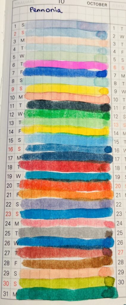
All of my Pennonia colors!
I’ve got another set of solid standard inks in my collection. Two months in a row of no shimmer is tough tho, so looking forward to next month’s samples! Altho those chromatics were fun. These were nice and low maintenance. Which I hilariously appreciate.
Instead of a new ink – despite having like dozens I wanted to try – I decided to look back and pull inks from the brands I had tried this year. The idea came to me when I was looking at the Pennonia inks to follow the Akkerman inks. There were only a couple more than 30 in both brands (- at least when I was looking at them). And that completion rule I have kept bugging me, and I was trying to think of a way to use the extra ones. Maybe I could build a collection that finishes out each brand? I started looking at all of the other brands, and then the part of my brain that thinks it’s an archivist immediately started doing research into my own past. (It was super fun. Like, for real real.) I looked through notebooks, and looked up specific samples, and ended up realizing that there were some brands that would definitely not fit into a single month. Here’s the list of the ink brands I tried since January of 2022, and then the inks I am planning to sample this month:
So many potentially pretty inks!
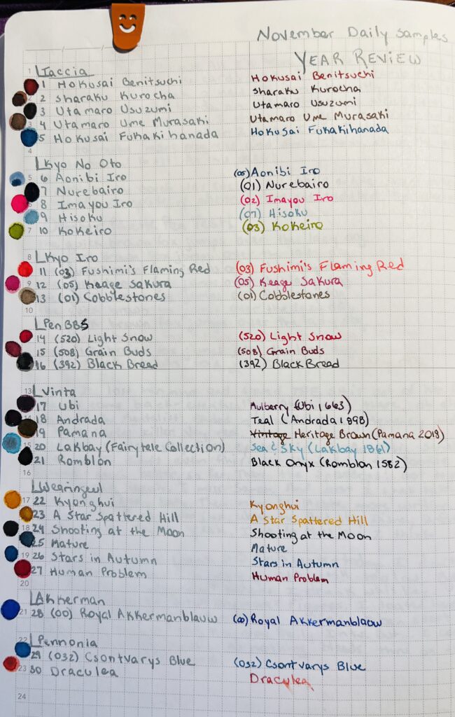
January: I hadn’t quite figured everything out in January, so I didn’t focus on just one brand this month, instead it was tiny little glass bottles from Yoseko Stationary that I focused on, because they are adorable. Also I am still figuring out Brand vs. Line of ink. So! Much confusion, and this may not be correct, but I’m trying! Taccia: 1. Hokusai Benitsuchi 2. Sharaku Kurocha 3. Utamaro Usuzumi 4. Utamaro Ume Murasaki 5. Hokusai Fukakihanada
February: Robert Oster – so many inks! So none for the Daily Samples in November.
March: Kiwi Inks – finished everything they had at the time, I believe, but will definitely be checking back, because these are fun! Their multi-chromatic shading inks are awesome.
April: Ferris Wheel Press – I had tried a couple of samples based on a friend who recommended them. So, when I saw they had these ”collections” of every ink sample, and that there were enough to fill a months worth of daily samples, I was very excited. This is probably what gave me the idea to deliberately try to find brands with smaller libraries of inks to fit it into a month, after the second month in a row of that working out well.
May: PenBBS – these are always named so interestingly, and weirdly accurately. And numbering them just makes me want to GET THEM ALL. Some day. 14. (520) Light Snow 15. (508) Grain Buds 16. (392) Black Bread
June: Sailor Inks + Robert Oster – these both have super big libraries, as previously mentioned for RO, and this set was themed ”America.” I think there are more being added to the Sailor set, because I had to add Robert Oster ”Cities of America” inks to have enough samples for every day and obviously there are more than 30 states anyway. Maybe next time!
July: Vinta – I was SO EXCITED about these inks when I first heard about them (I still am for the record) because they came with stories attached! I enjoyed it thoroughly. Looking forward to more of these! Also the name on the sample vial is not the full name of the ink AND I KNOW IT. I will add them in the review. The full names are what points at the stories involves, so, that is important context. 17. Ubi 18. Andrada 19. Pamana 20. Lakbay (Fairytale Collection) 21. Romblon
August: Wearingeul – I enjoyed the Vinta inks so much that I looked for something like it – something that gave me an excuse to DO RESEARCH. Serious fun. Oh – these vials were ALSO missing very relevant information which I will add in the review… Because it is the stuff that points back to the literature influence, which means I have just…a whole bunch of new books to read. Which is an EXCELLENT outcome. I get to sample pretty inks, learn about authors that are new to me, and read books that are new to me? So excited. 22. Kyonghui 23. A Star Spattered Hill 24. Shooting at the Moon 25. Mature 26. Stars in Autumn 27. Human Problem
September: Akkerman – only ONE LEFT. (I think?) 28. (00) Royal Akkermanblauw
October: Pennonia – This is the one that really triggered my decision to do this theme for November’s Daily Samples! Because there were only two left, and after Akkerman, I thought, you know what… 29. (032) Csontvarys Blue 30. Draculea
Which brings us to November!
When I was putting this together I quickly realized that if I tried to finish the inks with every one of these brand, I actually have about 2 months worth of Daily Samples…so. I’ll do half in November and half in January. Tada! 🙂 I picked the ones I will be using in November randomly, so this should be interesting. If I get all reds and browns I will be SO SAD. So sad.
Since I enjoyed every brand I’ve tried this year, I am looking forward to this! I especially want to play with the Vinta and Wearingeul inks again. They both have story elements to them, and I love that. Mmmm…research.
An #ActuallyAutistic #ADHD #AmbulatoryWheelchairUser With Opinions