Tag Archives: Robert Oster

November Daily Samples, 2022 Review, Pt.1

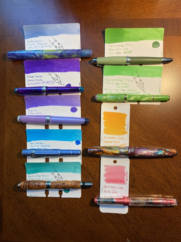
Instead of a new ink – despite having like dozens I wanted to try – I decided to look back and pull inks from the brands I had tried this year. The idea came to me when I was looking at the Pennonia inks to follow the Akkerman inks. There were only a couple more than 30 in both brands (- at least when I was looking at them). And that completion rule I have kept bugging me, and I was trying to think of a way to use the extra ones. Maybe I could build a collection that finishes out each brand? I started looking at all of the other brands, and then the part of my brain that thinks it’s an archivist immediately started doing research into my own past. (It was super fun. Like, for real real.) I looked through notebooks, and looked up specific samples, and ended up realizing that there were some brands that would definitely not fit into a single month. Here’s the list of the ink brands I tried since January of 2022, and then the inks I am planning to sample this month:

30 ink vials from top down, the caps are all white, and they have round white stickers with the date.
So many potentially pretty inks!

January: I hadn’t quite figured everything out in January, so I didn’t focus on just one brand this month, instead it was tiny little glass bottles from Yoseko Stationary that I focused on, because they are adorable. Also I am still figuring out Brand vs. Line of ink. So! Much confusion, and this may not be correct, but I’m trying!
Taccia:
1. Hokusai Benitsuchi
2. Sharaku Kurocha
3. Utamaro Usuzumi
4. Utamaro Ume Murasaki
5. Hokusai Fukakihanada

Kyo No Oto:
6. Aonibi Iro
7. Nurebairo
8. Imayou Iro
9. Hisoku
10. Kokeiro

Kyo Iro
11. (02) Fushimi’s Flaming Red
12. (05) Keage Sakura
13. (01) Cobblestones

February: Robert Oster – so many inks! So none for the Daily Samples in November.

March: Kiwi Inks – finished everything they had at the time, I believe, but will definitely be checking back, because these are fun! Their multi-chromatic shading inks are awesome.

April: Ferris Wheel Press – I had tried a couple of samples based on a friend who recommended them. So, when I saw they had these ”collections” of every ink sample, and that there were enough to fill a months worth of daily samples, I was very excited. This is probably what gave me the idea to deliberately try to find brands with smaller libraries of inks to fit it into a month, after the second month in a row of that working out well.

May: PenBBS – these are always named so interestingly, and weirdly accurately. And numbering them just makes me want to GET THEM ALL. Some day.
14. (520) Light Snow
15. (508) Grain Buds
16. (392) Black Bread

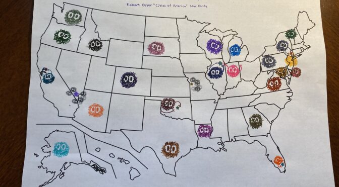
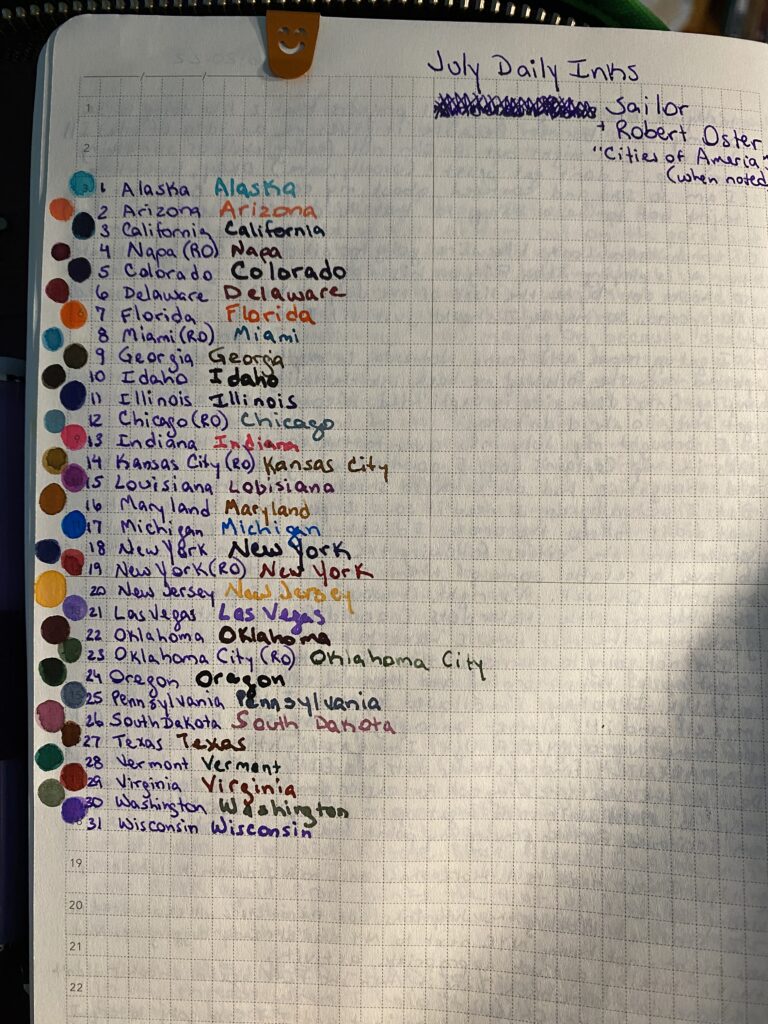
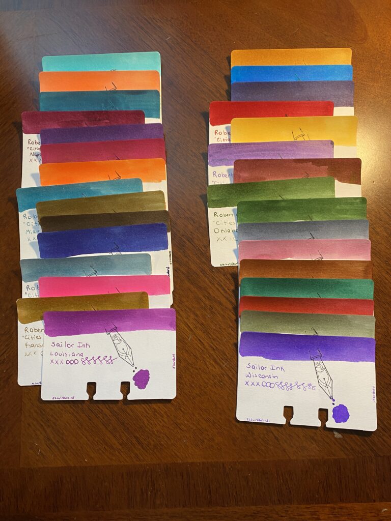
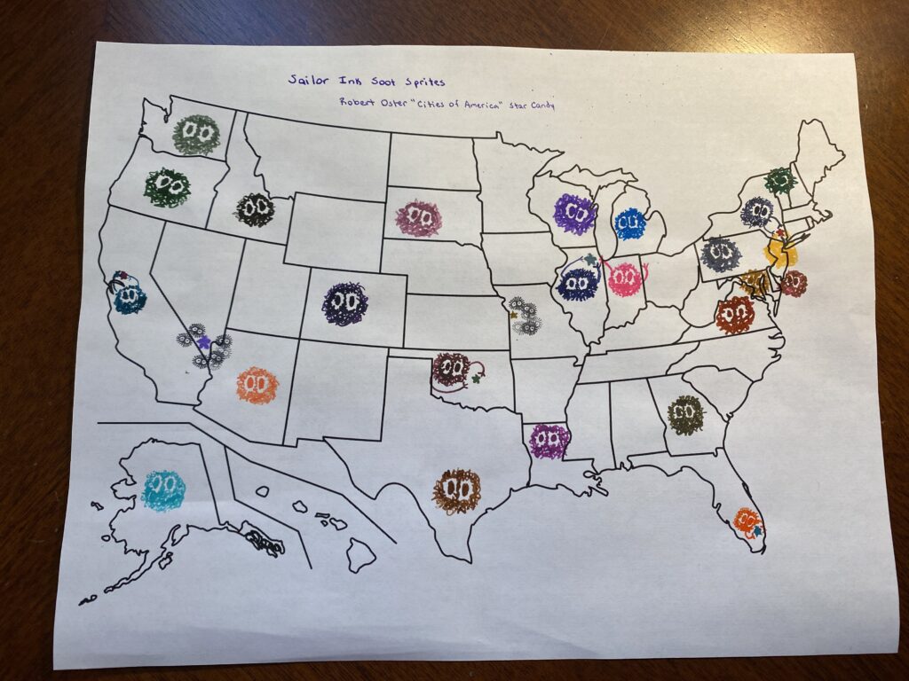
June: Sailor Inks + Robert Oster – these both have super big libraries, as previously mentioned for RO, and this set was themed ”America.” I think there are more being added to the Sailor set, because I had to add Robert Oster ”Cities of America” inks to have enough samples for every day and obviously there are more than 30 states anyway. Maybe next time!

July: Vinta – I was SO EXCITED about these inks when I first heard about them (I still am for the record) because they came with stories attached! I enjoyed it thoroughly. Looking forward to more of these! Also the name on the sample vial is not the full name of the ink AND I KNOW IT. I will add them in the review. The full names are what points at the stories involves, so, that is important context.
17. Ubi
18. Andrada
19. Pamana
20. Lakbay (Fairytale Collection)
21. Romblon

August: Wearingeul – I enjoyed the Vinta inks so much that I looked for something like it – something that gave me an excuse to DO RESEARCH. Serious fun. Oh – these vials were ALSO missing very relevant information which I will add in the review… Because it is the stuff that points back to the literature influence, which means I have just…a whole bunch of new books to read. Which is an EXCELLENT outcome. I get to sample pretty inks, learn about authors that are new to me, and read books that are new to me? So excited.
22. Kyonghui
23. A Star Spattered Hill
24. Shooting at the Moon
25. Mature
26. Stars in Autumn
27. Human Problem

September: Akkerman – only ONE LEFT. (I think?)
28. (00) Royal Akkermanblauw

October: Pennonia – This is the one that really triggered my decision to do this theme for November’s Daily Samples! Because there were only two left, and after Akkerman, I thought, you know what…
29. (032) Csontvarys Blue
30. Draculea

Which brings us to November!

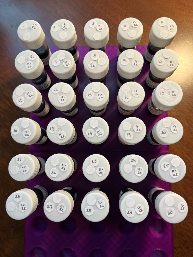
When I was putting this together I quickly realized that if I tried to finish the inks with every one of these brand, I actually have about 2 months worth of Daily Samples…so. I’ll do half in November and half in January. Tada! 🙂 I picked the ones I will be using in November randomly, so this should be interesting. If I get all reds and browns I will be SO SAD. So sad.

Since I enjoyed every brand I’ve tried this year, I am looking forward to this! I especially want to play with the Vinta and Wearingeul inks again. They both have story elements to them, and I love that. Mmmm…research.

July Daily Inks, Sailor + Robert Oster

For July I went with a theme for my Daily Ink Samples for the first time. I saw a post about an ink that was named after a state and I was like, hmmmm. July 4th, could do USA themed. Now I will say this – I am NOT thrilled with the USA in general right now. But, if I could find 31 inks that were state related, then. Thought it might be interesting. 

I could only find 24 inks from Sailor that had state names, so I filled in with another 7 from a Robert Oster series “Cities of America.” And I ordered the states alphabetically and put in the cities with the state if there was one, or where a state would be if it was missing. 

Sailor Ink has never given me any trouble, and this set of samples followed suit. Robert Oster was a manufacturer I did samples from earlier in the year, so it was nice to have some more from them. There was only one shimmer ink in this pack – and it was from Robert Oster – which made me realize I don’t know if Sailor even makes shimmer inks! So I will be going to look into that at some point! 

There were a lot of browns. I do not like the color brown. These were…nice browns. For that color. I suppose. But when the Georgia ink is brown instead of a peach for like Georgia peach, I got grumpy. Which is not the inks fault, but still!

A page from a notebook with a grey grid. At the top it is labeled “July Daily Inks, Sailor + Robert Oster “Cities of America” (when noted). The ink names are listed in a numbered column, and on each line is a dot of that ink. The inks are listed below the photo.
The tracking page I use to list all of the ink names and a dot of that inks color next to the name.

Sailor:

  • Alaska
  • Arizona
  • California
  • (Robert Oster) Napa
  • Colorado 
  • Delaware
  • Florida
  • (Robert Oster) Miami
  • Georgia 
  • Idaho
  • Illinois
  • (Robert Oster) Chicago
  • Indiana
  • (Robert Oster) Kansas City
  • Louisiana
  • Maryland 
  • Michigan
  • New York
  • (Robert Oster) New York City
  • New Jersey
  • (Robert Oster) Las Vegas
  • Oklahoma
  • (Robert Oster) Oklahoma City
  • Oregon
  • Pennsylvania
  • South Dakota
  • Texas
  • Vermont
  • Virginia
  • Washington
  • Wisconsin
31 Ink Sample Cards in two columns. There are a variety of colors. Each sample card has a swatch of color at the top, a stamp of a fountain pen nib, a puddle of ink, the name of the ink manufacturer, the name of the ink, and “xxxooossssssssss.” There is a label on the bottom left, 22JulVent-#, and on the side it is labeled Standard.
31 Ink Sample Cards, in two columns.

Then things got weird! I decided to put all of the inks on a US Map – but the paper was regular printer paper, and the inks did not go down great. A lot of the inks bleed and made the soot sprites or candy stars look kind of creepy. But Aaron’s whole face lit up when he saw this – worth it.

A plain and unlabeled US map printed in black on white paper. There are soot sprites in all of the different ink colors from Sailor. And there are candy stars of the different Robert Oster inks. The soot sprites are adorable.
US map populated by different color soot sprites and candy stars.

Not sure I am going to theme my Daily Ink Samples again…I might just stick to a single manufacturer per month -for as long as I can. We shall see!

July Pen/Ink Palette, Review!

My theme for July was “Summer.” picked ink colors that reminded me of a pool, or a beach, or a beach ball. It is a very fun palette. I was able to match pens with inks pretty well, but I also started out with two wooden pens, which did not match (which is fine because they are soooo pretty). Over all I liked how this palette worked, although I did end up switching out one pen after the first week, because the nib needs some tweaking. There are several colors I would like to use again in the future, but first! The palette!

There are nine pens and ink sample cards laid out on a wooden table in two rows. The first row starts with a dark purple, then a lighter purple, then a bright blue, then a teal. The second row starts with a dark green, then a lighter green, then an orange and lastly a pink.The names of the pens and inks are listed below the photo.
July 2022 Pens and Inks
  1. James White – Monet (Custom Nib) / ColorVerse Mystic Mountain
  2. (Forever Purple) Sailor Pro Gear Slim – Northern Lights (MF) / ColorVerse Hayabusa
  3. Sailor Pro Gear – Gin Cocktail, Purple Fizz (MF) / Diamine Lilac Satin
  4. Kaweco AL Sport – Stonewashed (F) / Van Dieman’s Summer Collection Wineglass Bay
  5. Beardbarian Woodworking – Thuya Burl Birthday (F) / Ferris Wheel Press Mirror Mirror of Moraine
  6. (Magic Green) Hong Dian 5019 – May Flowers (EF) / Ferris Wheel Press Moonlit Jade
  7. (Originally) Beardbarian Woodworking – Walnut Burl Anniversary (M?) / Robert Oster Envy (swapped this out because the nib was really hard to write with and the line was much thicker AND the ink was really sticky in the syringe I filled the converter with which made me nervous for the pen. So when I got the Esterbrook, I switched it out.)
  8. (New) Esterbrook JR Paradise Pocket Pen – Key Lime (F) / Ferris Wheel Press Down the Don Valley
  9. Leonardo Officiana Italiana – Supernova (F) / Diamine Inkvent 2021 Wonderland
  10. Twsbi 580 Diamond ALR – Punch Pink (F) / Diamine Inkvent 2021 Pink Ice

(If there are no links it is because I could not find it, my apologies!)

I think my favorite in this set (besides my usual favorites like Forever Purple and Magic Green) were Wonderland in the Leonardo and Down the Down Valley in the Esterbrook. The Esterbrook matched the ink in it PERFECTLY which I was especially pleased by. The Wonderland ink is a very wet ink but it is really pretty, both the shine when it went down on paper and after it dried. Those blues are super pretty but the pens gave me some trouble. I was surprised at the Kaweco not feeding well, and I need to get a new nib for the two Beardbarian pens. Twsbi performed well as usual. And the Salior Pro Gear NOT Slim confirmed for me that I definitely prefer the Slim version haha. But it is pretty and the ink matched it really well. And the James White pen is a mesmerizingly pretty resin, and I really like the Mystic Mountain ink because it is so pretty when you can really get the shimmer out – there are a bunch of different color shimmers in that one ink – which I was able to do with that custom nib.

Overall this was a great palette. I liked all the pens and inks I ended up with by the end of the month. (And the one I had to swap out just needs a new nib, the pen itself is really well balanced and I enjoyed writing with it.) The colors contrasted really well with each other. And I had two of each shade – two purples, two blues, two greens, and I used the orange and pink as a pair which meant I could try out making my work notes more readable by alternating colors on bullet items and between meetings, and use a different pair each day (rainbows on Friday). It meant I got to use more of my pens every day, which I like, and it did make my notes more readable – which is awesome. 

A successful palette, my favorite kind! It was the third month this year that was basically a rainbow, since April was a rainbow palette because birthday month, and June was a rainbow because Pride month, and then July which was basically only missing yellow. Which made me pause when I was originally picking my colors. Then I remembered rainbows make me happy and also these are my pens and my inks and my notebooks so all that matters is I am happy. And I was very happy with this palette.