I made a note of where I first saw an Akkerman ink referenced, and have lost it somehow. Sigh. I keep starting new notebooks so I can find things easier but I REFUSE to pull my ink stuff out of my Captain’s Log. Refuse.
Besides, it was probably on the Pen Addict blog, let’s be honest. I am read that blog all the time. I have learned a thousand things from it. Highly recommend. Actually, I love it so much, I am working my way backwards, as I keep up to date with the latest. It is a little weird seeing posts from near the beginning of the pandemic – I think I’m back in early 2020 at this point.
What decided me on this one for this month was the numbered aspect actually. Numbered inks are both satisfying and have the potential to make me go a little out of control – if for example, I only need 30 or 31 of them but there are 70 in total… And if any of these names are misspelled, I am sorry, I may have lost one or two battles with the auto correct.
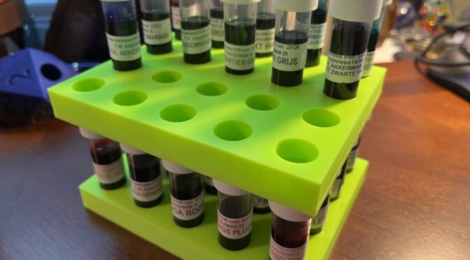
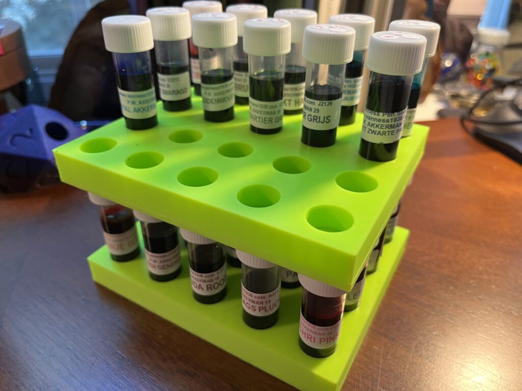
Akkerman Ink Samples
01 Passage Blauw
02 Redidentie Blauw
03 Blauw
04 Nassaus Blauw
05 Shocking Blue
06 Binnenhof Blues
07 Koninginne Nach-Blauw
08 DiepDuin Water Blauw
09 Laan van Niew Oost-Indigo
10 Ijzer-galnoten Blauw-Zwart
11 Treves Turquois
12 Mauritshuis Magenta
13 Simplisties Violet
14 Parkpop Purpur
15 Voorhout Violet
16 Oranje Boven
17 Staten-Generaal Rood
18 Garuda Rood
19 Rood Haags Pluche
20 Pulchri Pink
21 ChinaTown Red
22 Hopjesbruin
23 Bekakt Haags
24 Zuiderpark Blue-Green
25 Denneweg Groen
26 Goenmarkt Smaragd
27 Bezuidenwoud Groen
28 Hofkwartier Groen
29 Hofvijer Grijs
30 Het Zwarte Pad
I am pretending I can understand what some of those mean, like Groen – green, clearly. Rood – red. Blauw – blue. We’ll certainly find out once I break into these!
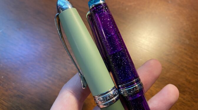
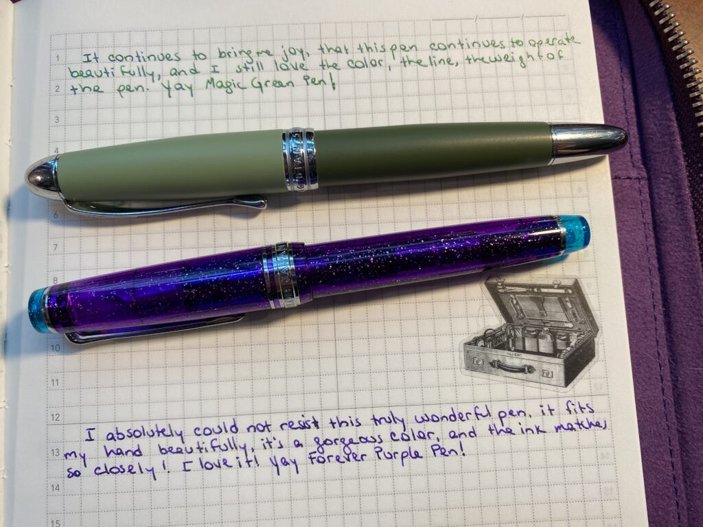
I have referred to my Magic Green pen and my Forever Purple pen a couple of times, so I figured I should explain what that is all about. So first, the pens and inks in question are actually:
Little bit of history to set context. I’ve only been playing with fountain pens and inks for about a year now, and when I first got started, believe it or not, I did not know shimmer inks existed. And when I realized they did, I went a little out of control on sampling as many as I could get my hands on. In December I sampled Van Dieman inks, mostly shimmer if I recall correctly, and I put Twilight Mist (?? Check) in a pen (???) and – it wouldn’t write. Like. At all. Not right after I inked it. Not after I tried my tricks to make it work. Nothing.
This was the first time I had run into this, so I started to do some research. I figured it had something to do with the shimmer particles gumming up the feed and I was right according to my research. Which…sucks. Sigh. I love shimmer inks AND fine nibs and they do NOT mix well sometimes…slash always. Always meaning I can usually get the pen to write, but it’ll get stuck some times. And I have a couple of ways to un stick them and I’m slowly figuring out which techniques work best with different pens. But still.
I picked up a Hongdian from a Truphae box in February (I think? That’s when this got inked for the first time at least, so pretty safe bet at the time). I wasn’t sure what to put in it. But shortly after that I picked up the Ferris Wheel Press Jade collection (of 2 inks) after a friend suggested it I check them out. I’d been trying out different shimmer ink manufacturer’s to try and find one that did not clog pens! I thought the pen looked a little odd with the two tone muted greens, but I liked the heft and the balance and I thought, hey green pen, green ink, let’s try it. I super expected it to clog immediately, due to it having an Extra Fine nib.
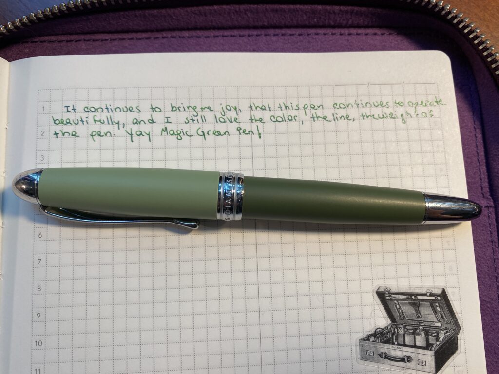
Magic Green pen with writing sample!
So imagine my surprise when my Hongdian pen wrote beautifully with a shimmer ink in it – out of an EXTRA fine nib! Yay! Then, like weeks later, when it wouldn’t write anymore, I rolled my eyes and assumed the feed was clogged, and started trying all my techniques to unclog it and none of them worked and I was so grumpy! I open it up to try to clean the bits more thoroughly and realize – it wasn’t clogged. It was out of ink! At this point, a pen NOT clogging on a shimmer ink at least a LITTLE bit was unheard of, in my experience to date. I immediately refilled it – and it wrote – and it continued to write without clogging. Then I needed to refill it a second time – so I did – still no clogging. Definitely not my normal at that point. (Still, really, not my normal out of a nib that fine.) And so, I decided – to do Science.
I ended up deciding to carry the pen over from using it in March into my rainbow palette for April. I started doing palette’s in January and the idea was I would switch out ALL of the pens every month. This was the first time I carried a pen over. I felt guilty about it – I had other pens to try – but. I wanted to see how far it would go. For Science. Then I made it thru April with no issues, and decided to carry it over into May…then June…
Basically I decided to keep refilling it until it clogged. And I am still waiting, 6 months later (knock on wood). I have refilled it a total of 8 times to date, all with the same ink. I dip filled it (dib the entire nib into the ink and suck it up with the converter) 6 times, and the 7th and 8th I used a syringe to pick up the ink and put it into the converter before plugging it into the nib. And still no issues.
Truly. A magic pen. Let’s see how long this goes! For Science indeed!
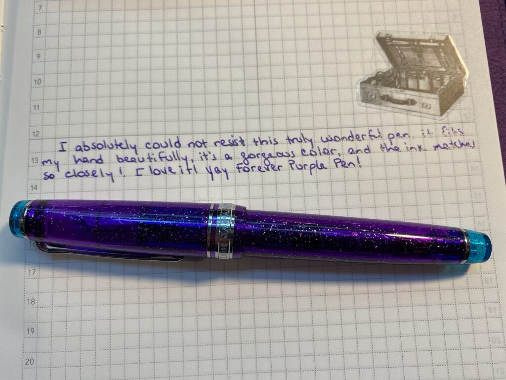
Forever Purple pen and writing sample!
Which brings us to Forever Purple, the Sailor Pro Gear Slim. I forget which site sent me the email about the pretty purple Sailor pen but I made squealy noises when I saw it for the first time because it was the perfect purple and it had silver sparkles and I NEEDED it. It’s a fairly expensive pen, but it was around my birthday…so I decided it was okay to get it for myself for my birthday! (Husband helped haha). It was ONLY available at that point with the MF nib, which I had not tried yet, so figured I’d give it a go. I also had no idea what “slim” meant at that point, so when it arrived and I realized “slim” meant “smol” I was ecstatic. It’s a good bit shorter than regular pens (that’s a technical term “good bit” trust me look it up cough) and it has a slightly narrower (or slimmer!) barrel but not too narrow and it was light weight which is good for my hands. I was so very, very happy. And I had the perfect ink to put in it! Hayabusa was made for this pen. Not really, but LOOK at it. They match so well!
I started writing with it, wrote well right off the bat, and the line this nib creates is so gorgeous. It’s such a clean line, not rounded, not to thick, not too spidery thin. Perfect. My new favorite thing. And I instantly decided to never put it down again haha. So I’ve been using it since April – and it does clog a little, like all of a sudden the ink I am putting down is ALL shimmer and then starts getting thinner and harder to get out of the nib. I usually just – gently – press down a little more than usual for some straight down lines and that solves the problem. I think I tried rinsing it once, but I am pretty sure that was another time I was all eye rolly about a shimmer ink not writing well and it was just out of ink, not clogged. I’ve been using it for about 5 months – and refilled it 9 times, ahem. I clearly use this pen more than the others by a good deal – even my Magic Green! The first seven refills were by dipping into the ink. The last two were with a syringe.
These are my two favorite pens at the moment, and I do not foresee a time that I will retire them from my palette. I’ve come up with a lot of excuses to keep them in my rotation. For May I had a blue palette and decided the green and purple were helpful as accent inks. In July I had a summer theme – bright, vibrant colors – and I decided the green and purple were good grounding colors, because they are a little on the darker side. See? I can logic anything.
And that’s it! Good story, eh? Thought so. I am sure I will add more to my Forever collection moving forward – for example I just inked up a Sailor Pro Gear Mini Slim MF that is blue with silver sparkles and put ColorVerse Cat in it. Which is a strong contender for possible future foreverness. I assume I will build a rainbow at some point, of forever pens. This sort of defeats the purpose of trying out new pens every month but I also think finding the perfect set of forever pens will take me a while, so I’ll allow it.
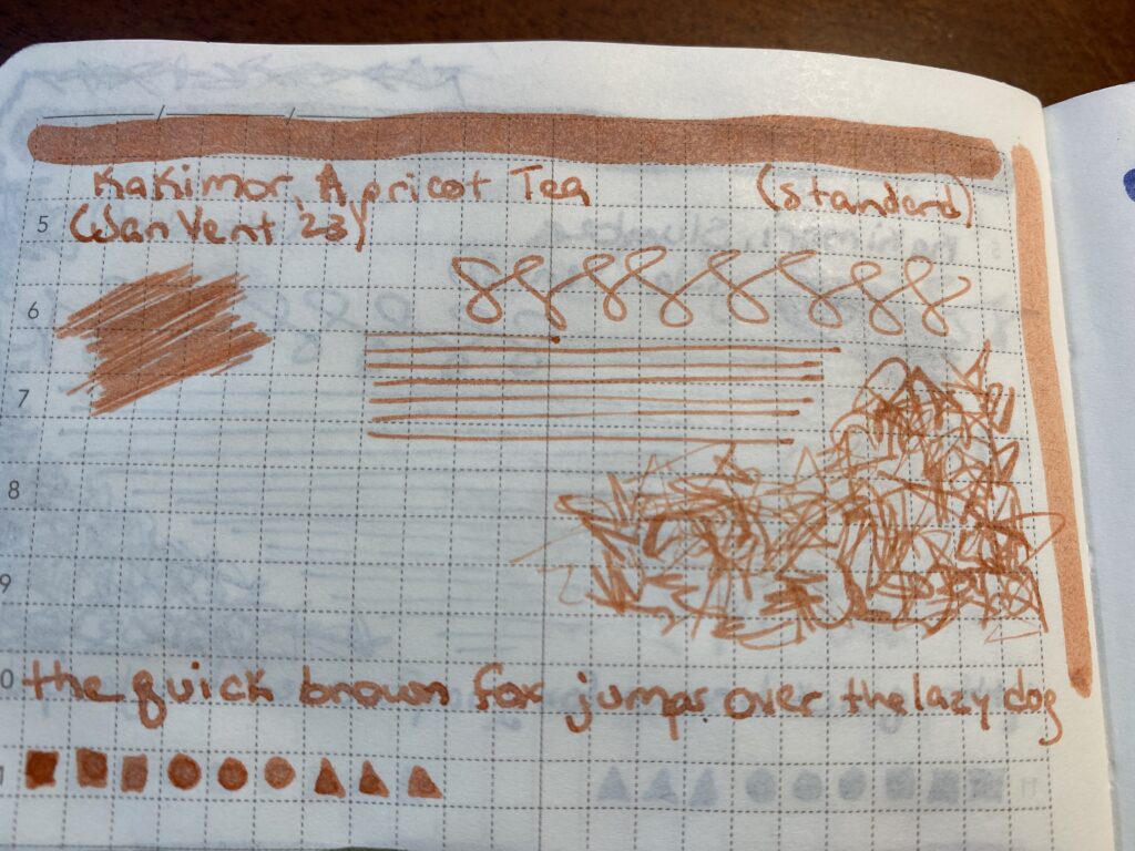
I started the August Pen/Ink Palette with an ink called Apricot Tea from Kakimori in the Conklin pen. I pick my colors using my sample cards and the sample book where I wrote out some stuff on the kind of paper I usually use right now. I currently don’t pull the ink bottles until the day I am going to fill the pen – which might change in the future haha.
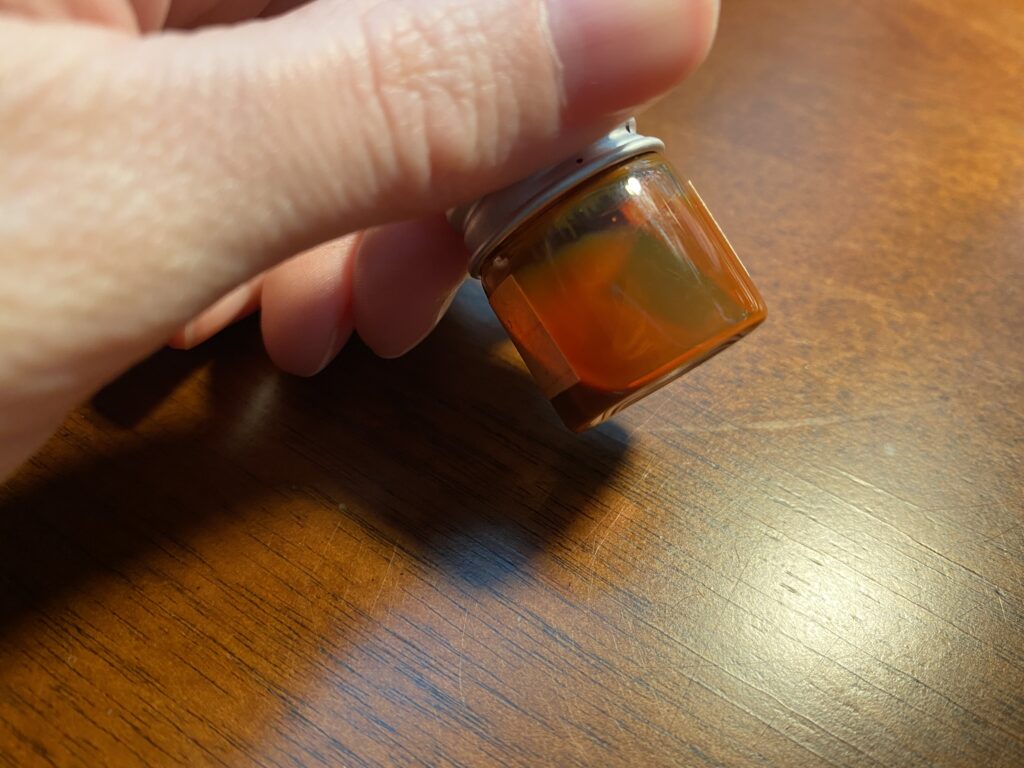
Look at this tiny adorable bottle of ink! Also check out the milky texture…
When I pulled this ink out of the drawer to ink my pen I hesitated. The consistency or texture of the ink was more…milky? Viscous. That’s the word I want. Instead of the watery consistency I am used to. It seemed odd. Different from the majority of my other inks. So I rechecked the sample book…seemed fine? And I shrugged and put it in the Conklin Coronet Orange to check it out.
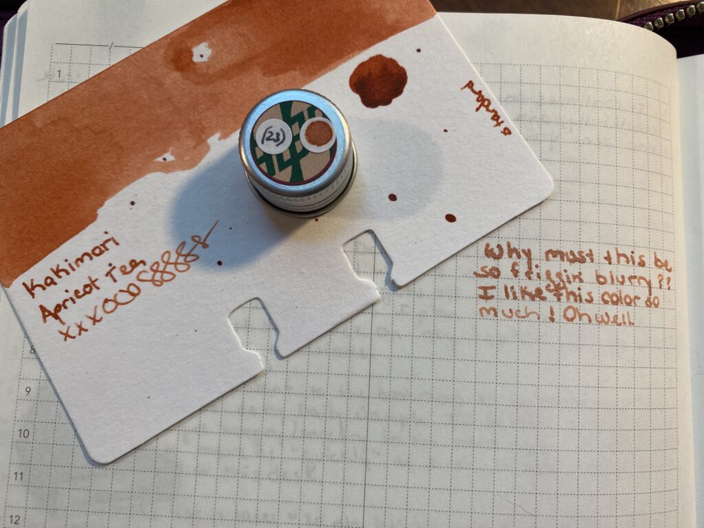
Kakimori Apricot Tea sample page, which is NOT blurry. Rar. Kakimori Apricot Tea – so blurry.
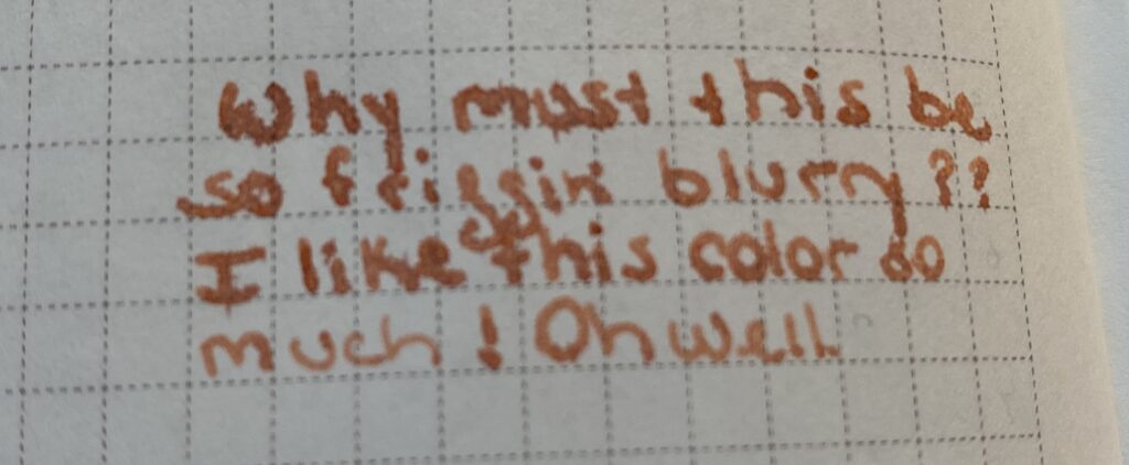
That’s when things started to go wrong. When I wrote with this ink in this pen it was really feathery. What I mean by that is instead of nice, crisp, clean lines, the ink sort of blurs and soaks further into the page, and if you look really closely you can see the ink sort of feathering out and blurring the edges of the line. I am sure there is a cool art application for this, but I am not an artist in the classical sense, so mostly this is just annoying to me.
Look at the feathering! I actually had trouble taking this pick because I couldn’t tell if it was in focus or not!!! Do not like. Also look at this bleed thru??? It’s so bad! Moonlight didn’t do this at ALL and neither do my other inks, including the suuuuper dark ones I’m using this month!!
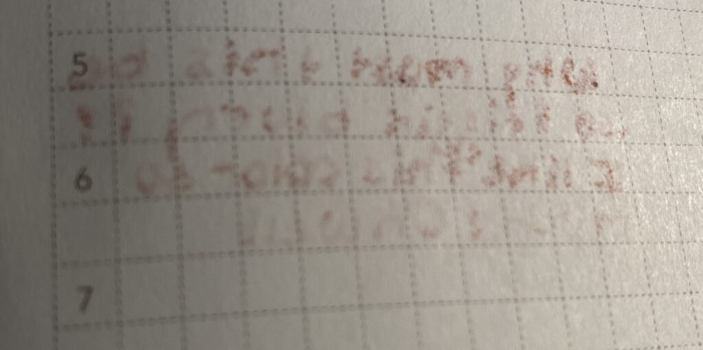
I thought maybe the ink just needed to settle, so I left the pen alone over night but the next day it was still blurry. Which makes me grumpy. So I started investigating what was going on – was it the ink? Was it the pen? Well, I had made the original sample in the sample book with my glass dip pen – which was not blurry, for the record. I figured a good place to start is by replicating that, glass dip pen, dipped into ink bottle, write on paper, see what happens. I was extremely disappointed to see that the ink blurred with the glass dip pen this time. I’m not sure what happened between when I sampled it originally at the beginning of the year, and when I sampled it this month. From what I’ve read it is most likely a difference in the paper between the books. But, it could be the ink deteriorating as well – or even something like temperature maybe? It requires more research yay! I do like research.
I had a bit of a conundrum – do I write with a blurry ink all month and be grumpy every time I do – meaning I prolly wouldn’t use the pen? Or do I swap it out, right now. After consulting with husband who I would need to help me with the psychical side of things (like rinsing out the nibs and converters for me), I decided to swap them. But which ink do I use instead?
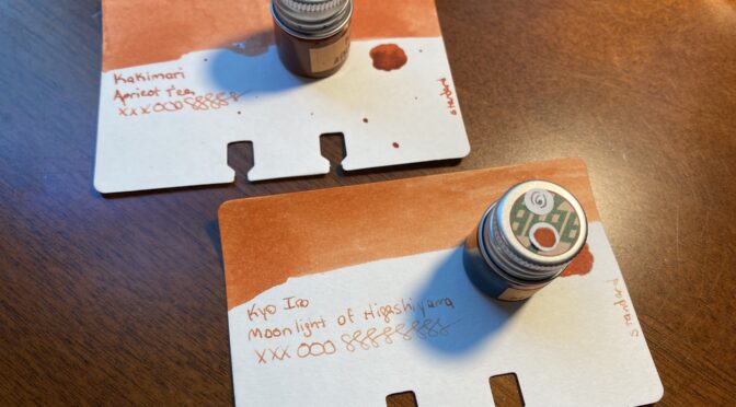
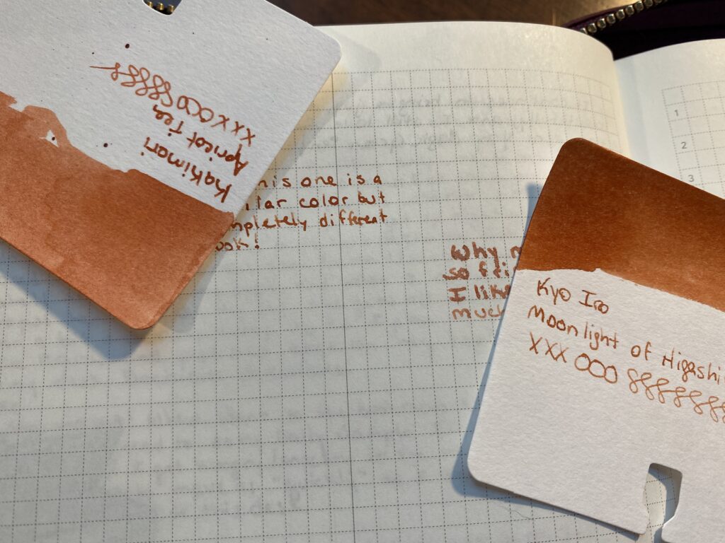
Apricot Tea sample card looks more like the Moonlight page sample, and vice versa!
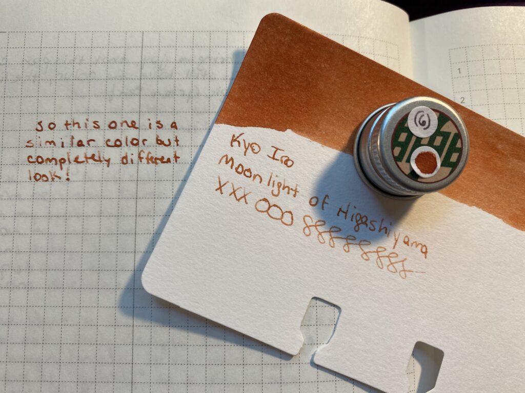
I narrow my inks down for the monthly palette usually into two sets of options. I have so many samples now that I can get some good variety and some subtlety, which means I sometimes end up with colors that are super close to each other in both palettes. For the Apricot Tea, it’s partner in the other palette was Moonlight of Higashiyama from Kyo Iro. They look very similar. This time, before putting it in the pen, I dip sampled it and wrote on the paper I’d be using it on the most. What was funny is the sample card colors are almost the opposite of the sample I wrote out that day.
Kyo Iro Moonlight of Higashiyama! And a clear line sample…
And the results were – Moonlight was not blurry, but was the right kind of color I wanted for that spot in my palette. Looks like we have a winner! I’ve used this one in the pen a couple of times now – just short writing – and it looks good so far. So I’ll use this one for August and report back when I’m done!
This kind of thing happens often enough that I am trying to think of ways to avoid this. For September I will be dip testing the inks before I decide on the palette finally for sure. The glass dip pen doesn’t always give me a good idea of what it will look like coming out of a pen, so I picked up a new metal tipped dip pen by Pilot – hope it shows up before September! I am hoping this gives me a better idea of what I’ll be seeing from the pen. What I’ll be looking for is how the ink shows up on the page color wise, how thick it runs, or how dry is the ink, how crisp are the edges of the line (although that is often more influenced by the nib you’re using, I’ve noticed), and how long it takes to dry. I might try dipping the actual nibs I am planning on using in the inks I am thinking about…not sure how that would work out…I’ll think about it, maybe give it a try. And let you all know how it goes!
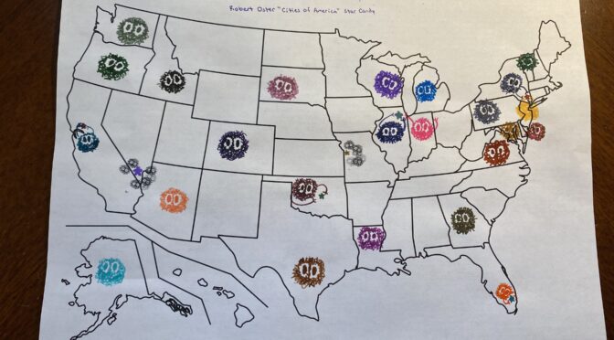
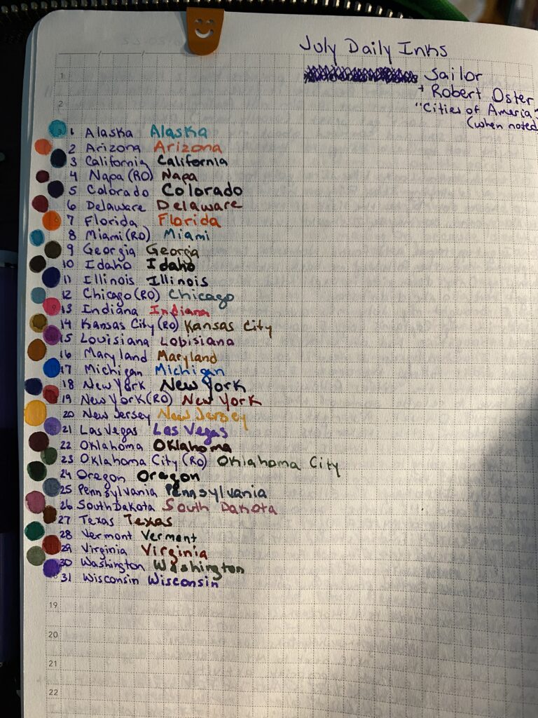
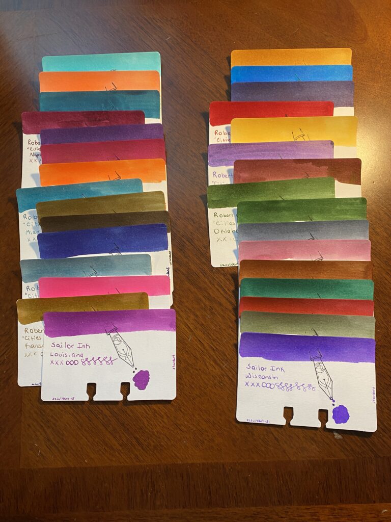
For July I went with a theme for my Daily Ink Samples for the first time. I saw a post about an ink that was named after a state and I was like, hmmmm. July 4th, could do USA themed. Now I will say this – I am NOT thrilled with the USA in general right now. But, if I could find 31 inks that were state related, then. Thought it might be interesting.
I could only find 24 inks from Sailor that had state names, so I filled in with another 7 from a Robert Oster series “Cities of America.” And I ordered the states alphabetically and put in the cities with the state if there was one, or where a state would be if it was missing.
Sailor Ink has never given me any trouble, and this set of samples followed suit. Robert Oster was a manufacturer I did samples from earlier in the year, so it was nice to have some more from them. There was only one shimmer ink in this pack – and it was from Robert Oster – which made me realize I don’t know if Sailor even makes shimmer inks! So I will be going to look into that at some point!
There were a lot of browns. I do not like the color brown. These were…nice browns. For that color. I suppose. But when the Georgia ink is brown instead of a peach for like Georgia peach, I got grumpy. Which is not the inks fault, but still!
The tracking page I use to list all of the ink names and a dot of that inks color next to the name.
Sailor:
Alaska
Arizona
California
(Robert Oster) Napa
Colorado
Delaware
Florida
(Robert Oster) Miami
Georgia
Idaho
Illinois
(Robert Oster) Chicago
Indiana
(Robert Oster) Kansas City
Louisiana
Maryland
Michigan
New York
(Robert Oster) New York City
New Jersey
(Robert Oster) Las Vegas
Oklahoma
(Robert Oster) Oklahoma City
Oregon
Pennsylvania
South Dakota
Texas
Vermont
Virginia
Washington
Wisconsin
31 Ink Sample Cards, in two columns.
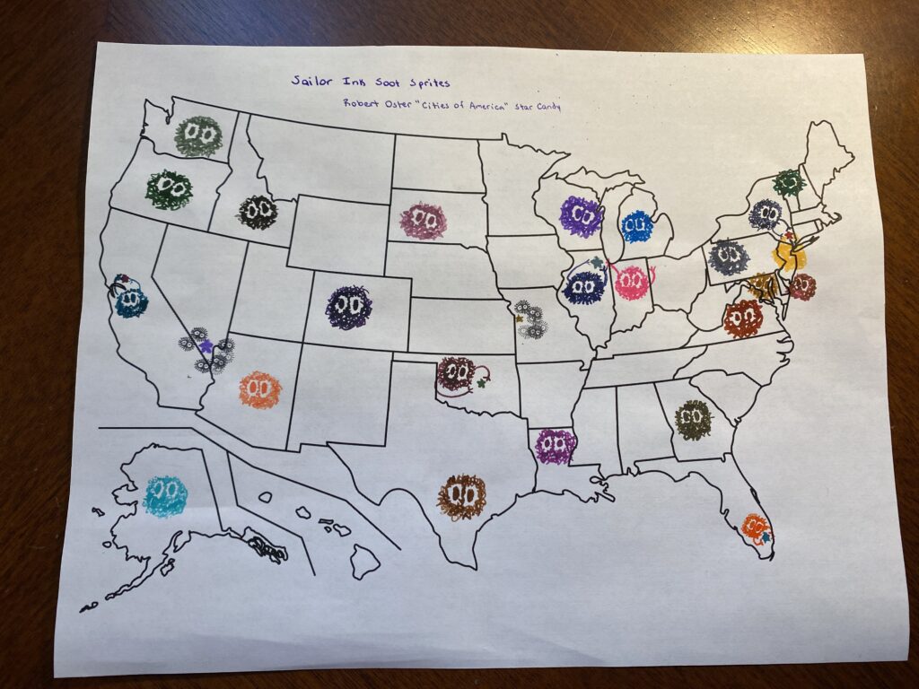
Then things got weird! I decided to put all of the inks on a US Map – but the paper was regular printer paper, and the inks did not go down great. A lot of the inks bleed and made the soot sprites or candy stars look kind of creepy. But Aaron’s whole face lit up when he saw this – worth it.
US map populated by different color soot sprites and candy stars.
Not sure I am going to theme my Daily Ink Samples again…I might just stick to a single manufacturer per month -for as long as I can. We shall see!
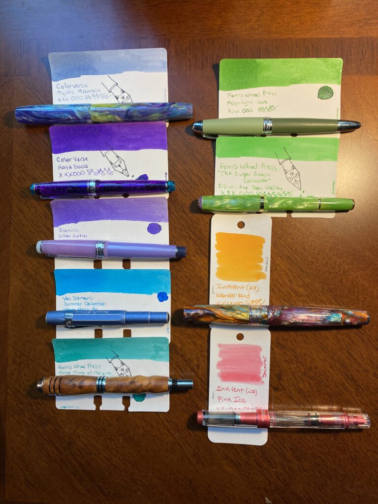
My theme for July was “Summer.” picked ink colors that reminded me of a pool, or a beach, or a beach ball. It is a very fun palette. I was able to match pens with inks pretty well, but I also started out with two wooden pens, which did not match (which is fine because they are soooo pretty). Over all I liked how this palette worked, although I did end up switching out one pen after the first week, because the nib needs some tweaking. There are several colors I would like to use again in the future, but first! The palette!
(Originally) Beardbarian Woodworking – Walnut Burl Anniversary (M?) / Robert Oster Envy (swapped this out because the nib was really hard to write with and the line was much thicker AND the ink was really sticky in the syringe I filled the converter with which made me nervous for the pen. So when I got the Esterbrook, I switched it out.)
(If there are no links it is because I could not find it, my apologies!)
I think my favorite in this set (besides my usual favorites like Forever Purple and Magic Green) were Wonderland in the Leonardo and Down the Down Valley in the Esterbrook. The Esterbrook matched the ink in it PERFECTLY which I was especially pleased by. The Wonderland ink is a very wet ink but it is really pretty, both the shine when it went down on paper and after it dried. Those blues are super pretty but the pens gave me some trouble. I was surprised at the Kaweco not feeding well, and I need to get a new nib for the two Beardbarian pens. Twsbi performed well as usual. And the Salior Pro Gear NOT Slim confirmed for me that I definitely prefer the Slim version haha. But it is pretty and the ink matched it really well. And the James White pen is a mesmerizingly pretty resin, and I really like the Mystic Mountain ink because it is so pretty when you can really get the shimmer out – there are a bunch of different color shimmers in that one ink – which I was able to do with that custom nib.
Overall this was a great palette. I liked all the pens and inks I ended up with by the end of the month. (And the one I had to swap out just needs a new nib, the pen itself is really well balanced and I enjoyed writing with it.) The colors contrasted really well with each other. And I had two of each shade – two purples, two blues, two greens, and I used the orange and pink as a pair which meant I could try out making my work notes more readable by alternating colors on bullet items and between meetings, and use a different pair each day (rainbows on Friday). It meant I got to use more of my pens every day, which I like, and it did make my notes more readable – which is awesome.
A successful palette, my favorite kind! It was the third month this year that was basically a rainbow, since April was a rainbow palette because birthday month, and June was a rainbow because Pride month, and then July which was basically only missing yellow. Which made me pause when I was originally picking my colors. Then I remembered rainbows make me happy and also these are my pens and my inks and my notebooks so all that matters is I am happy. And I was very happy with this palette.
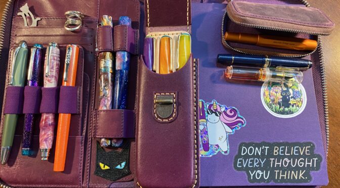
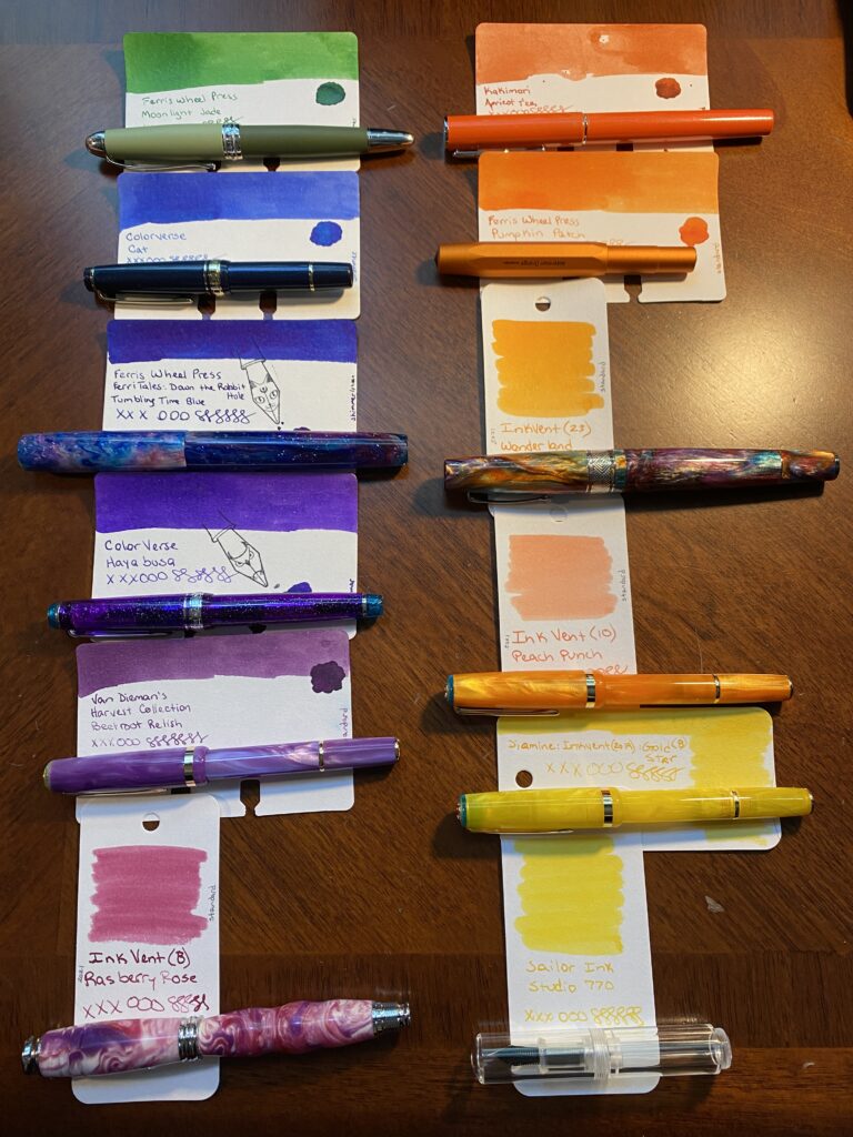
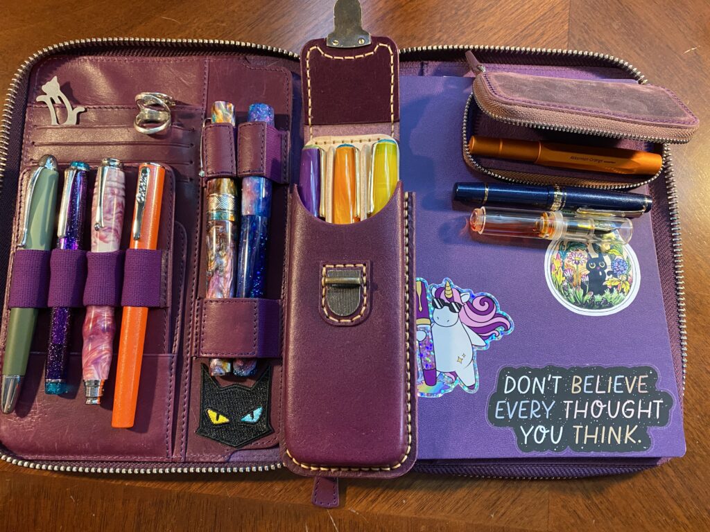
Tada! Pens and inks. I usually only ink 7-9 pens but! I am experimenting with a new carry case AND. August is the one year anniversary of me getting into all this. So! I’m going a little extra this time…
My theme is sunset, I was trying to think of good colors for the last month of summer and it made me think of a day ending, as the summer ends, and then I thought of a sunset! The idea of a sunset made me really happy at the wealth of colors I could try out. So that’s what we’re doing!
(You may notice the two yellow inks are in different pens than the picture shows, my mistake! The list is correct, the photo is not. And also – Apologies – I can’t seem to find links for the Diamine Inkvent inks – they originally came out in an advent calendar in 2021 or 2019. The place I grabbed bottles no longer has them – seems to be a very limited run.)
Now, where am I going to put these 12 pens you may be asking! I technically have pen loops for 7 pens across my two main portfolios. I can squeeze in 2 more by putting a smaller pen – like a Kaweco – across the top of my weekly portfolio, and another one clipped into the card slots in my larger portfolio. So that gives me 7 in my main portfolio and 2 in my weekly. See why I usually try to stay under 9 pens? Haha.
A couple of weeks ago I discovered Galen Leather makes tiny little cases for Kaweco pens. I clearly needed one, since I have entirely too many Kawecos. Once I got it I figured out I could fit 3 small pens in it. Tada! Space for 12 pens.
Here’s the thing – If all 3 of my smaller pens are in the extra tiny case, then I don’t technically have a second spot in the weekly portfolio. Oh no…but! I also picked up a full size pen case at the same time as the tiny one – and I happen to be using three Esterbrook pens this month. So! I’ve got 3 Esterbook in a big pen external case, the Sailor Mini, Orange Kaweco, and the clear Majohn in the tiny external case, and the rest of the pens in my large portfolio. Yay! This should be fun.
Purple Portfolio from Galen Leather, all 12 pens, and a fresh purple notebook!
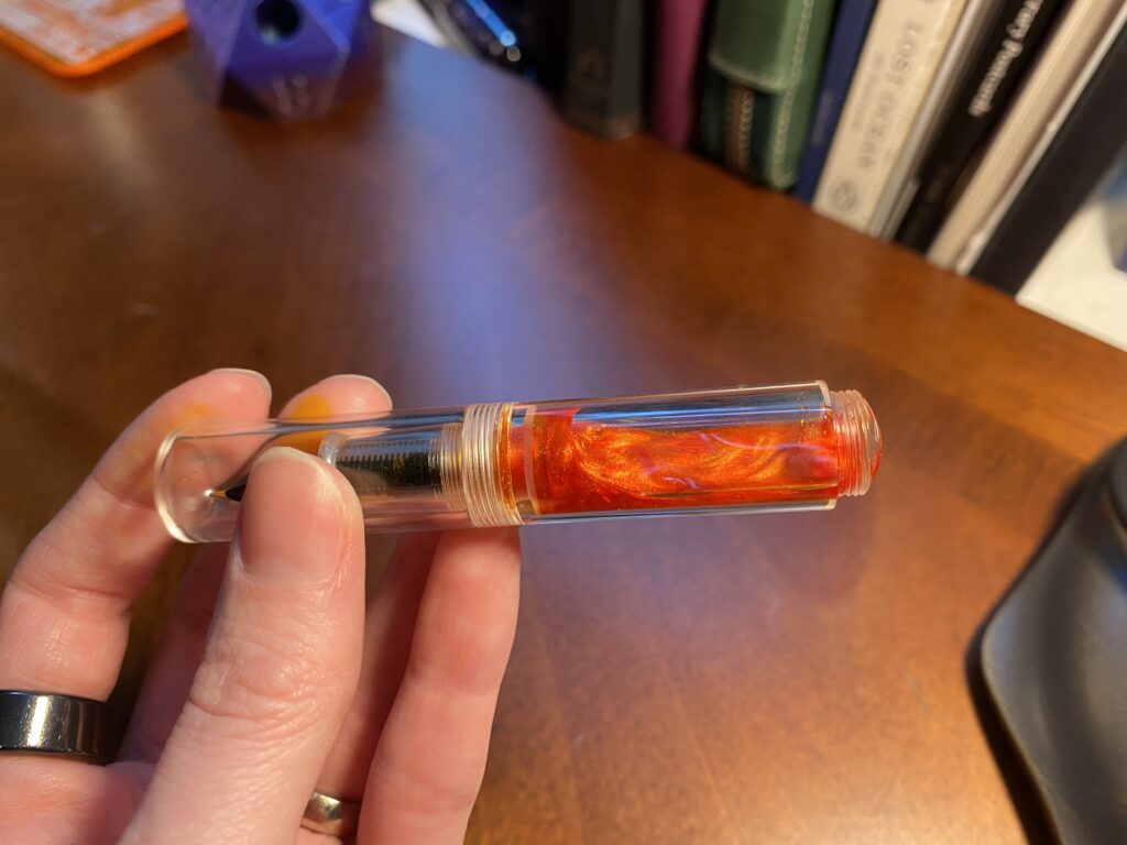
First Impressions! I got the pens inked this morning and I usually fill them with a syringe, so sometimes I need to do a little bit of manipulation to get them to write. Then of COURSE I have to test them…ahem. – Magic Green – writes as well as always! (Knock on wood). – Blue Sailor – gorgeous. I love the mini slim, and I love the MF nib!! And Cat is one of my favorite inks. Gorgeous all around. – Sparkle Stick – had a little bit of trouble trying to prime the feed on this one, so I rinsed it, and eventually got it to write, and this ink is going to be awesome in this custom nib. – Forever Purple – also writing wonderfully as usual! – Esterbrook Purple – very pleased, writes well, solid color. It’s a PURPLE without SHIMMER and I like it. How dare. – Custom Swirly – yeeees I was worried the nib in this one would be wonky, but no! Writes well out of the gate, and this is a fun ink to play with. – Conklin Orange – this ink is WEIRD. It had a weird consistency in the first place, and it feathers like bonkers on the page…I’m going to give it a couple of days but I might end up swapping this ink out. – Kaweco Orange – ink is struggling to flow. I need to check the nib and feed alignment, I’ll keep using it and see if I can’t loosen it up. I think I saw a post about this with like, a nick name, because this happens commonly? Haha. I’ll look for it. – SuperNova Wonderland – writing beautifully as it did all thru July! – Esterbook Orange – ugh. Would not write right away – unsure why, although it does have an EF nib – but no shimmer in the ink?? I let it sit for a while and it started to write, but it’s still struggling. I’ll let it sit for a longer time and see what happens. – Esterbook Yellow – same problem as the orange, so we’ll see how it does tomorrow maybe? – Clear Shiny Yellow – pen is so wee and tiny and cute!! I hope this nib can handle a shimmer ink… I put a shimmer ink in this because it is truly gorgeous… Check it out:
Keep in mind, this is all after a single use, testing the pens and inks for the first time. So much can change in a month! I will naturally complain on twitter, ahem, but I will also post a review type thing at the end of the month. It will be less in depth and more…Spoon’s weird opinions! Yay! Enjoy!
An #ActuallyAutistic #ADHD #AmbulatoryWheelchairUser With Opinions