To be honest, I often pick which samples I am going to try out by what is actively available AS a sample because some things – like ColorVerse – seem to be almost impossible to find. Maybe I need to look around some more…
Which brings me to Wearingeul. I’d seen posts on Instagram of inks with some intriguing names linked back to this manufacturer, and I found a place that does samples last month. Hooray! The ink name that first intrigued me was “A Watery Star” which brought such an interesting image into my mind. I think the next one I saw was “A Taxidermied Genius” and I thought, okay where can I find more of this awesomeness.
When I start looking for ink samples these days I just google the manufacturer + sample and see what pops up. Often I get vanness1938.com as a first result, which was where I did get these this time. But I also look for a site that will tell me anything about the inks. Which brought me to the Hamilton Pen Company. They have all of the series sorted out with a nice tool in the side bar, so I could easily see which inks belonged to which series.
What further intrigued me about these inks is that the series are all associated with literature. One of them is even called “World Literature Series.” Ink colors associated with books? Yes please. I am a book lover, and the idea of inks associated with literature sounded awesome. I have also discovered that if an ink is named something and then the color of that ink does not match the name – let’s say the ink is named “Verdant Grass” but the color is like. Orange. Then it makes me super grumpy.
So a series of inks that are “re-interpreted novels”? I am expecting the ink colors to make SENSE. For example, one of the series is “Alice in Wonderland” and one of those inks is Alice, and the Alice ink is a light blue with light gold glitter. In my head, that matches what I think of when I think of the character from Alice in Wonderland. She’s blonde and wears a blue dress – matchy matchy.
What will be trickier is some of the inks that come from an author I am unfamiliar with. But that also means I have some fun opportunities for research and also finding out about some new books to read.
That was my thought process when looking at these – and the next thing I had to figure out was how to get exactly 31 of them. That was fun. I basically wrote down every single series and figured out which ones to Tetris together to equal 31. Then when I went to pick up the samples, an ink in one series was unavailable. Sigh. So I picked up a 2 ink series and have an extra yay.
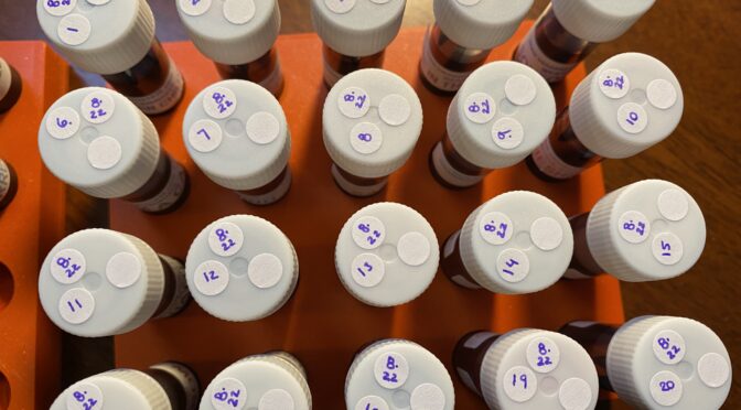
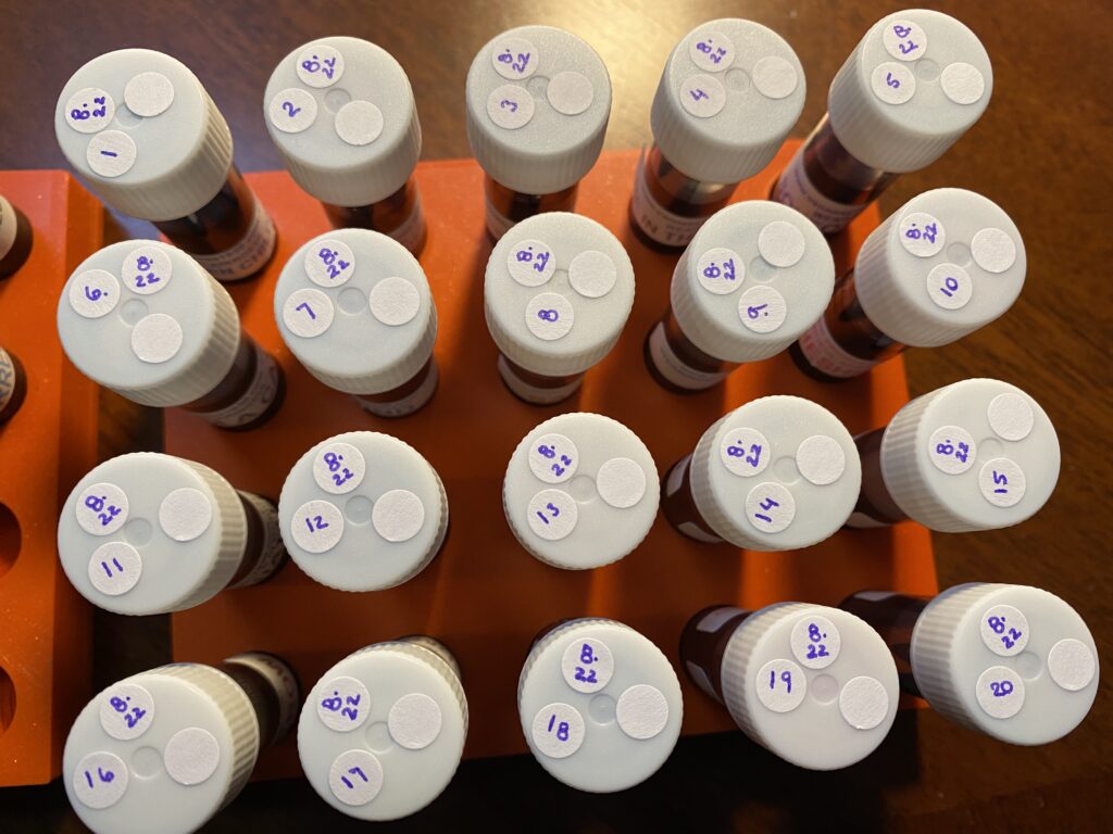
And here are the inks I picked up to sample this month:
Sample Vials from above.
Yi Sang Series
13 Children
A Taxidermied Genius
Architecture Infinite Cube
Me In The Mirror
Soyeongwije
Natsume Soseki Series
I am a cat
Mind
San shirt
Alice in Wonderland
Alice
Cheshire Cat
Mad Hatter
Queen of Hearts
White Rabbit
The Wonderful Wizard of Oz
Cowardly Lion
Dorothy
Scarecrow
Tin Woodman
Jeong Ji-yong Series
A Watery Star
Floating Clouds
The Night Colored in Grape
Kim Sowol Series
Flowing Leaves
Half Moon with Dimmed Light
The Flowers on the Way
The Song of Reed
World Literature Series
Beneath the Wheel
Don Quixote
For Whom The Bell Tolls
Jane Eyre
Metamorphosis
Resurrection
Demian Series
Lost
Mature (this one is extra)
Now all we have to do is sample each ink, one at a time, and see how these turn out. I’ll be reading up on some of these authors I am unfamiliar with so I’ll report back if I find anything interesting!
Let’s continue where we left off, shall we? In my last post I showed you how I start to pick inks out for my monthly palette. I go thru all of the inks I have in my sample library and start – you know what? If you want to know more about how I started, go read THIS post.
Today I narrowed down my choices to two different – but similar – palettes. I usually have a rather flamboyant ink in the pen I put my custom nib in. I had two options for August and I ended up picking the one I haven’t used yet, just for fun. It also happens to be a better option for my sunset theme.
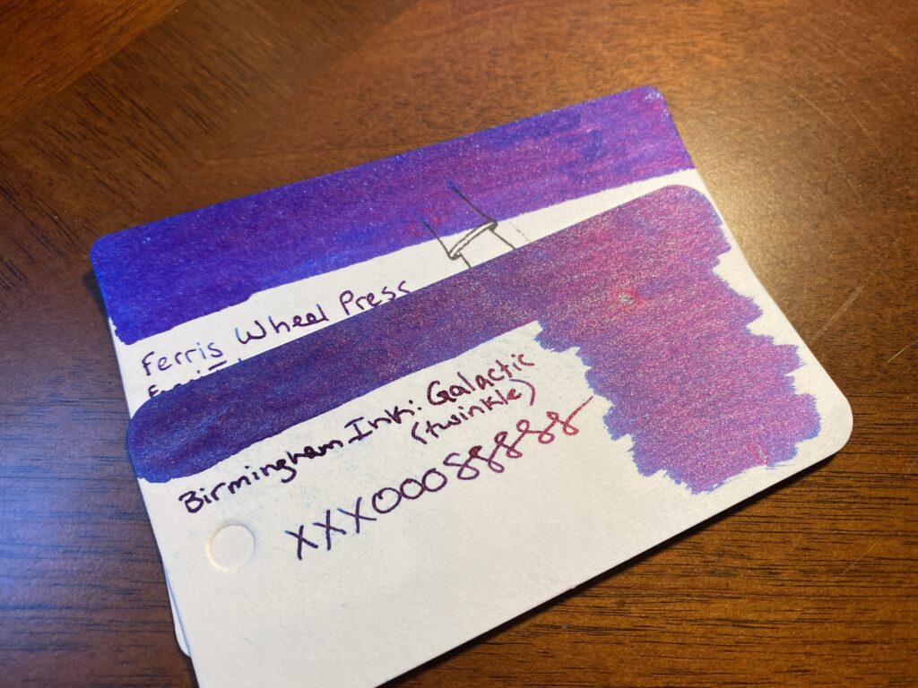
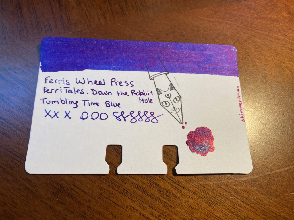
Ferris Wheel Press and Birmingham InkFerris Wheel Press FerriTales: Down the Rabbit Hole Tumbling Time Blue
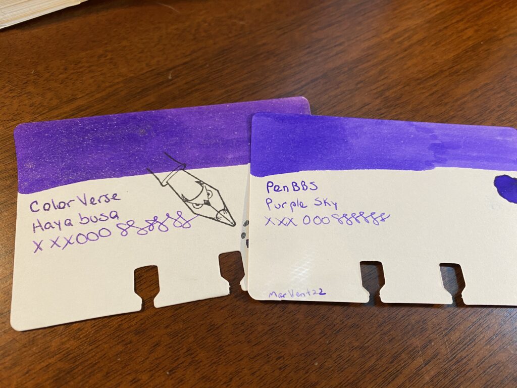
Next, I need to match my new colors to ones I end up keeping. For August I am keeping two inks from my July palette, an orange I am way too in love with and what I am referring as my Forever Purple. (It’s ColorVerse Hayabusa, in a Sailor Pro Gear Slim Northern Lights – it is my favorite.) Because my theme for August is “sunset,” and purple is technically a color that can be found in a sunset, I used that as an excuse to start this whole process. Any excuse to start with purples really. I’ve managed to keep purples relevant to these palettes for months now, haha. So, I took the Hayabusa sample and started by comparing the purples I have to that one.
ColorVerse Hayabusa and PenBBS Purple Sky
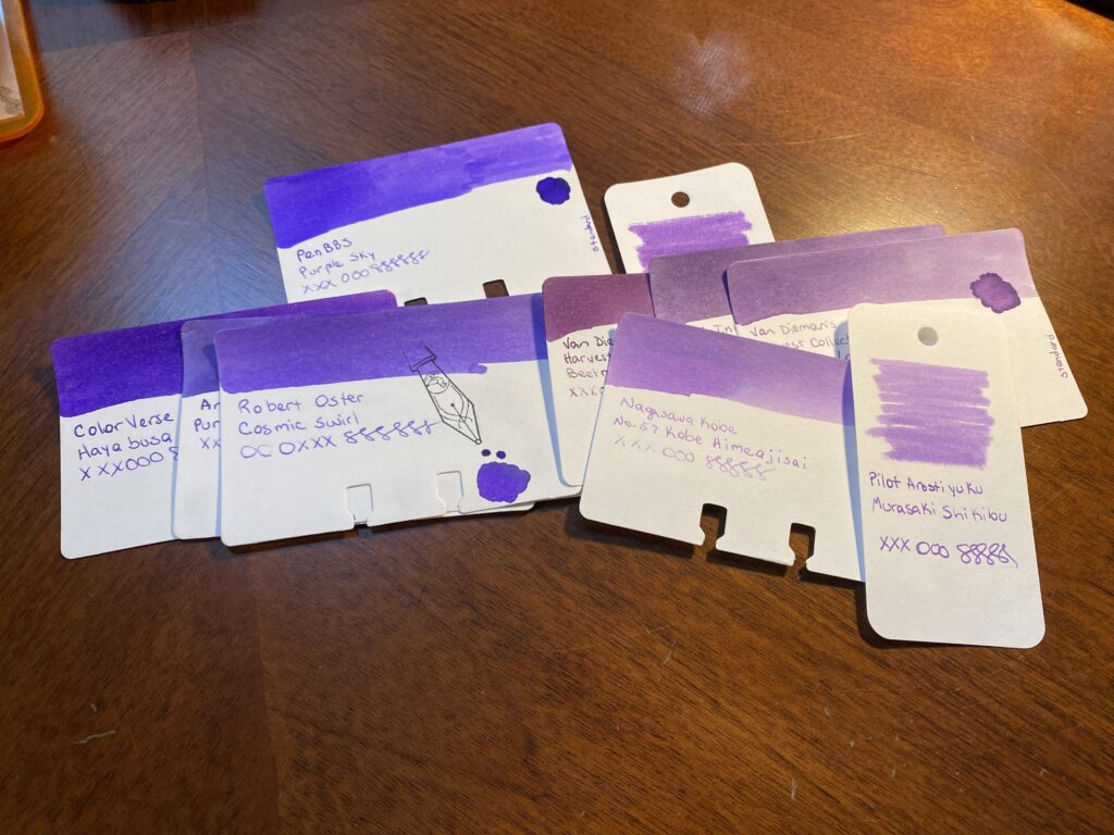
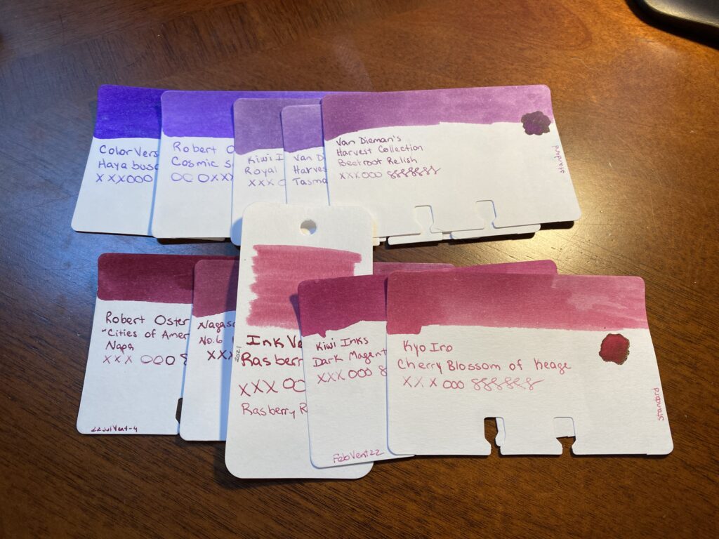
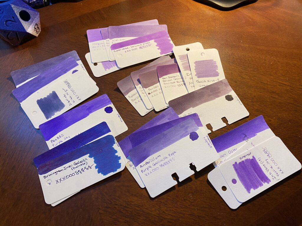
Every purple in the pile gets compared back to the first purple. I am looking for two things primarily this time – a color that is distinct from the Forever Purple, but also goes with it. I discard purples that look too dark or too light or fall outside of the theme. I ended up with a lot of options left over – which is intentional. I don’t want to narrow it down too much at the beginning.
Pile of sample cards of purple inks, ranging from cool purples to warm purples.
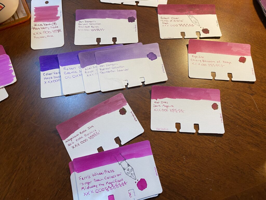
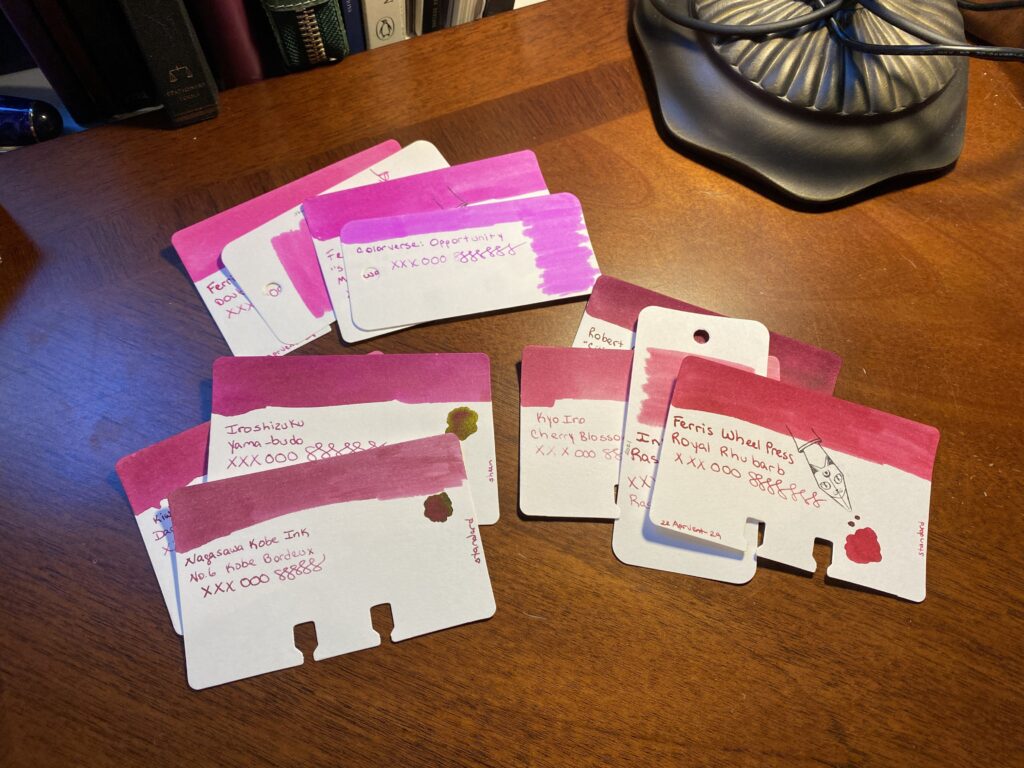
Once I have a more manageable collection of purples, I start adding in the magentas. I’ve already made certain decisions which can roll into the next color – for example, the samples that are too dark or light, those can be discarded quickly. And I can get rid of obviously too bright magentas. I’m again looking for a color that is distinct from the purples I have picked and yet still has a smooth transition which is the effect I am looking for this time. I ended up with a decent set of options.
The magenta sample cards are circling the line or purple sample cards.Two lines of sample cards, purple on top and magenta’s on bottom.
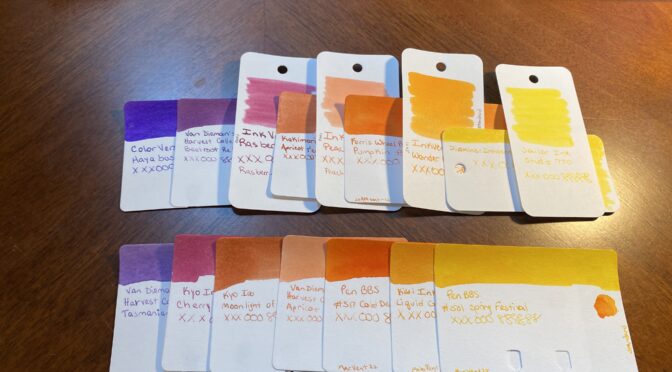
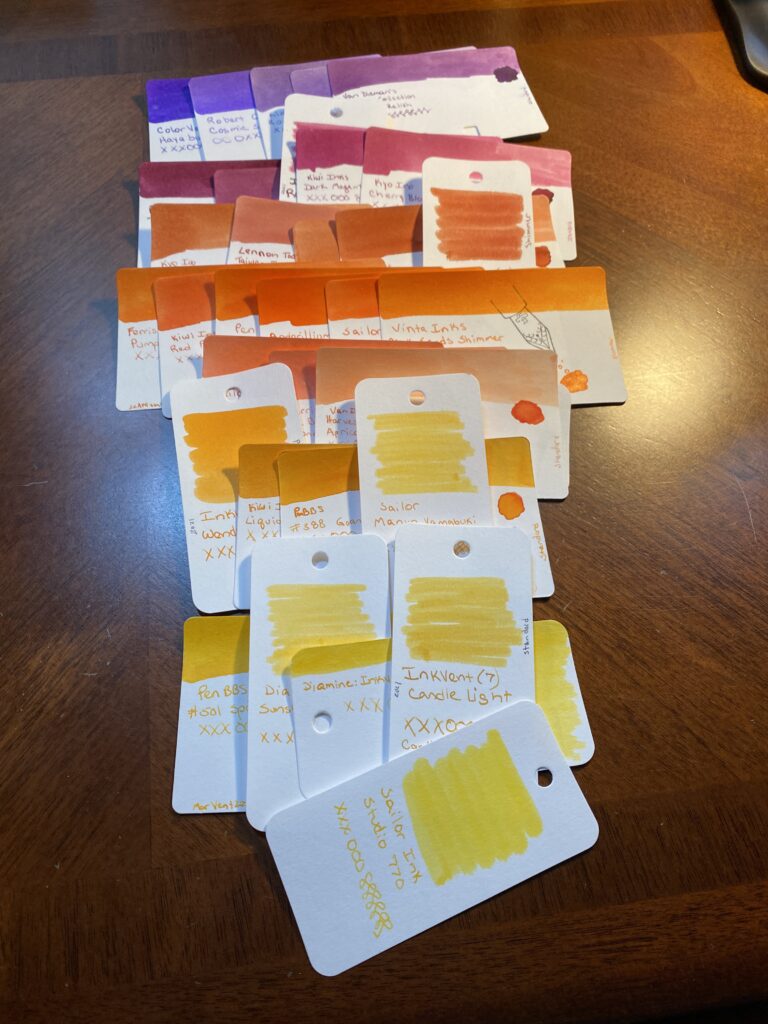
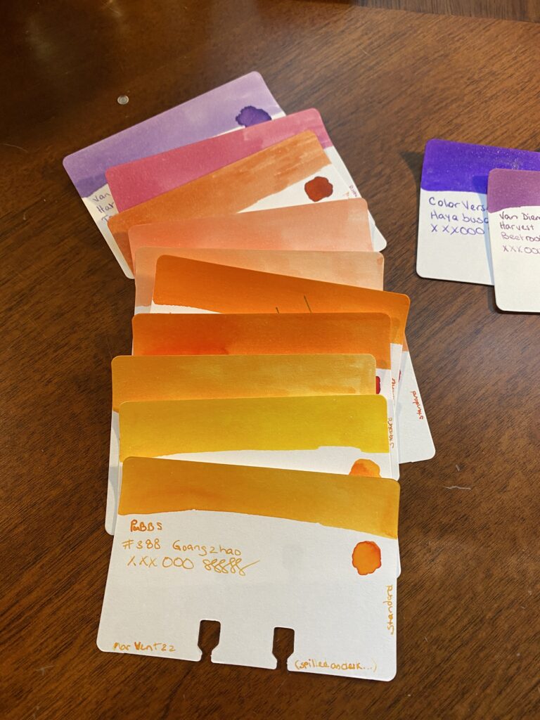
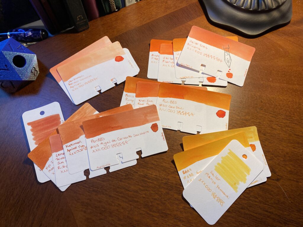
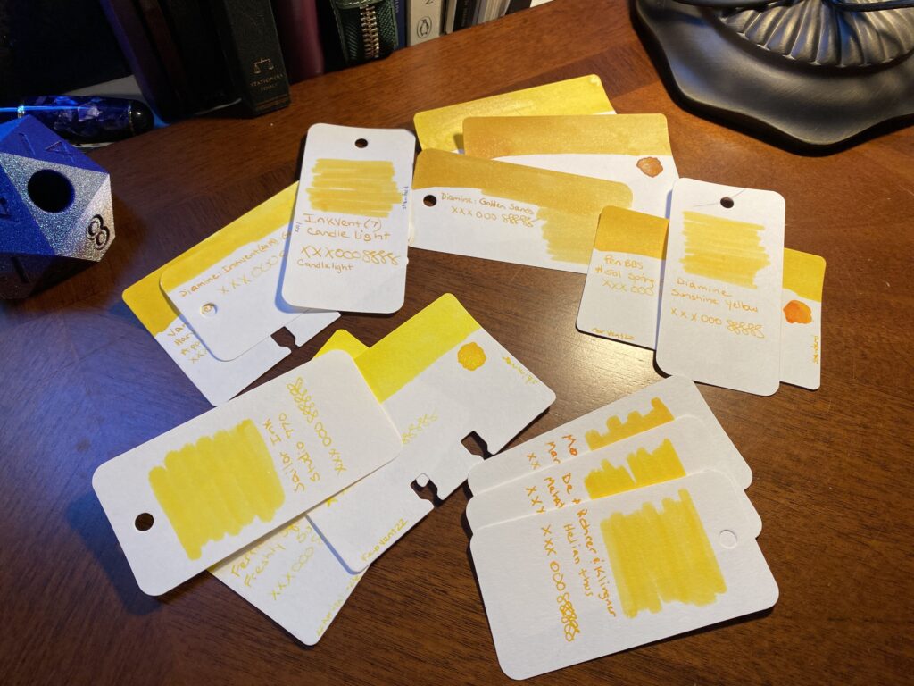
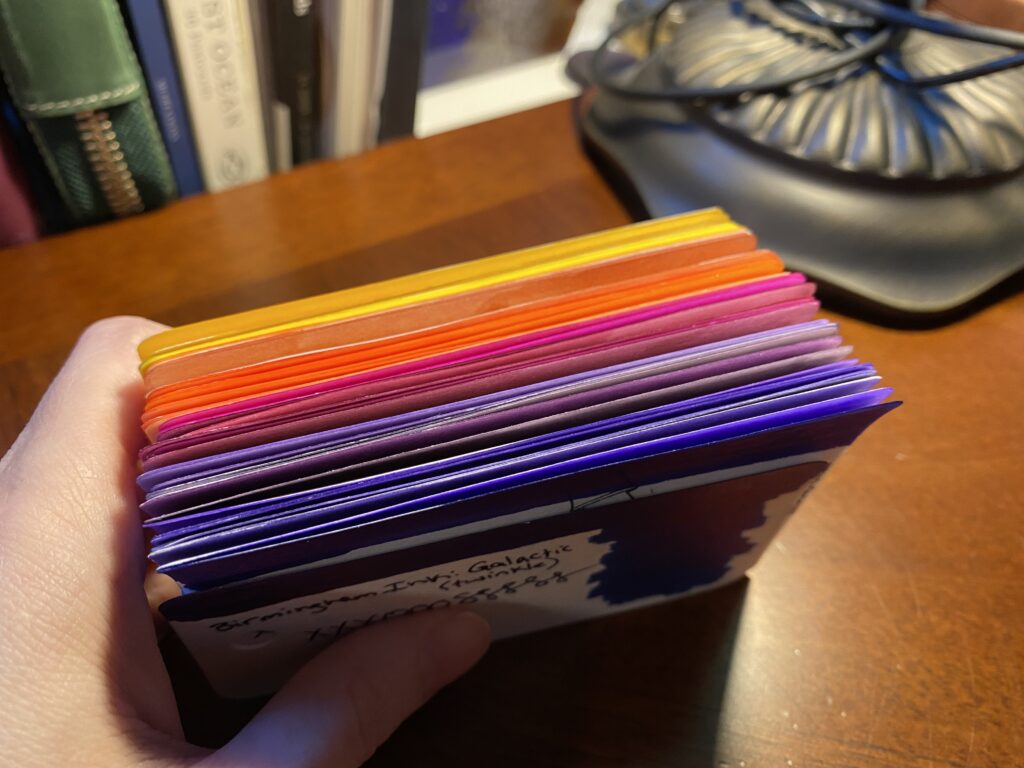
Next up are the oranges. I actually had three fairly distinct oranges – a darker orange, a sort of straight orange which is a bit brighter, and then a kind of peach color. All of these would work well in a sunset theme, but I needed to see what worked with the purples and magentas I pulled. Choices so far continue to help me make some easy choices. I’m always getting rid of colors that are darker or lighter than I want for that month’s palette. Now I remove doubles – colors that are super similar to each other – or practically identical. I ended up not being able to narrow this pile down too far, because I really liked the three distinct oranges I started with. No worries, I still have another color to look at, that should help me decide. To pick the yellows I really have to look at the writing on the card to see how readable it is. Many yellows are too hard to read when written with the nibs I use. And for the palette I’m looking for, I got rid of the darker ones as well. Actually, I use the writing on each card to make my choices. So I’ll line up the cards so the writing is side by side. The swabs are gorgeous and good for picking broad swathes of color. But often the writing turns out very different from the swab. Close enough but when I am getting down to picking a color for sure, I want to look at the writing on the card.
7 lines of sample cards overlapped so the writing on each card is closer to other cards writing.
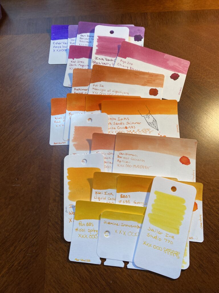
Next I narrow things down, this time I end up with 3-4 options per color. Each color gets compared to the one before it. I want a transition that reminds me of a sunset, so I’m comparing each color to the ones on either side, so I don’t end up just matching everything off the Forever Purple. Frankly, if the palette I end up with doesn’t work well with that purple – it’s fine. I have two colors that have been constant for months now, and they don’t have to go with the palette because I am keeping them for different reasons. I’ll go into that in another post.
Narrowed down choices for each color.
And lastly – my choices, and my secondary choices. This is where I narrow things down to two very similar palette’s. I do this for three reasons. Firstly, I want to be able to walk away and look at something else for a bit before making the final decision. At this point I will have been staring at these colors for at least a half hour. Second, Husband is the color expert in this house. He literally used to do that for a living, making sure colors were accurate. And third is that I like keeping him involved in my silly hobby. This is an easy for us to collaborate. And it’s fun explaining my thought process to him and what I am looking for.
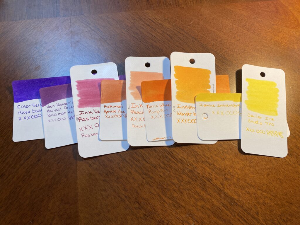
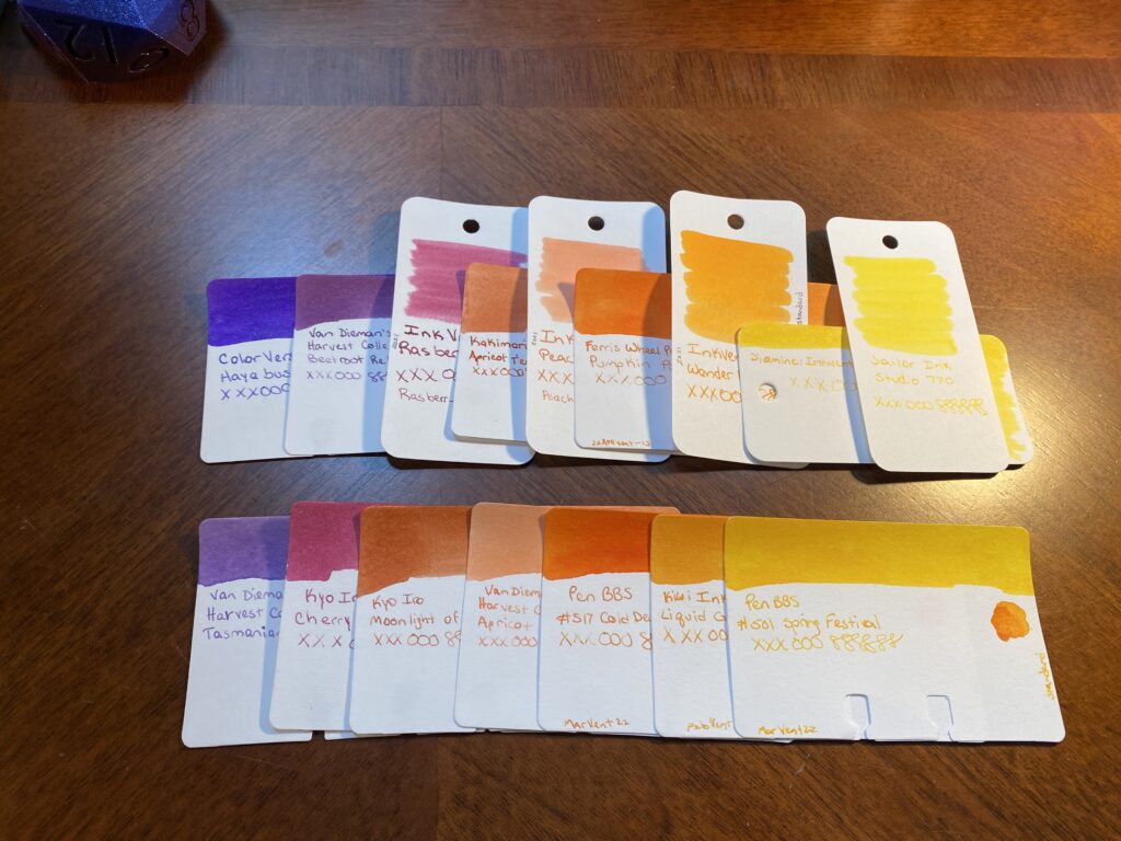
First palette option: ColorVerse, Hayabusa Van Dieman’s Harvest Collection, Beetroot Relish Diamine 2021 Inkvent, Raspberry Rose Kakimori, Apricot Tea Diamine 2021 Inkvent, Peach Punch Ferris Wheel Press, Pumpkin Patch Diamine 2021 Inkvent, Wonderland Diamine 2019 Inkvent, Gold Star Sailor Ink, Studio 770 Second Palette Option: Van Dieman’s Harvest Collection, Tasmanian Lavendar Kyo Iro, Cherry Blossom of Keage Kyo Iro, Moonlight of Higashiyama Van Dieman’s Harvest Collection, Apricot PenBBS, #517 Cold Dews Kiwi Ink, Liquid Gold PenBBS, #501 Spring Festival
And that’s where I’ll leave it today! When I’ve got these two sets of options like this I can start seriously matching pens to the possible ink colors. Often I have some ideas already – for example, I had already pulled all of my orange pens for this palette as soon as I decided on the sunset theme. I also have a new purple and a new tiny clear one I want to try. But I don’t always know which colors I am going to pick until the very end and sometimes I don’t know when a new pen might be coming in, so I keep my options open.
By next weekend – the end of the month – I will have picked both the palette and the pens, because I’ll need to set them up and I’ll reveal that next time! Until then, if you have a favorite color from this post, please share!
First palette option in a row on top, second palette option in a row on the bottom.
Oh look, the internet! Clearly this place wants to hear about the fountain pen stuff I’m all excited about. Right? Definitely. Here we go!
So I got into fountain pens last October (2021). Since then I have been keeping a set of pens inked, sampling new inks, and trying new pens. I’ll get into all that as I back track in future posts. Today I am going to wax eloquent about my current stage of fun.
I forget when I started this but I decided to stop carrying around 20 inked pens at a time, and started trying to keep to 7 at a time. Ish. This was after reading a post on the practicality of it and realizing that more than about 7 meant I just didn’t use all of the pens. Since pens can’t stay infinitely inked and still work well, it ended up being kind of a waste. Then I decided to swap them out monthly. THEN I started to pick themes for both the inks I used that month and the pens I put them in.
Which brings us to August. About half way thru the month before – so in this instance, right now, middle of July – I start looking at which inks and pens I’m going to use for the following month. I usually think of a theme a couple months before – for August I was planning on using a sunset palette. Fortunately I’ve been picking up orange pens lately – convenient eh?
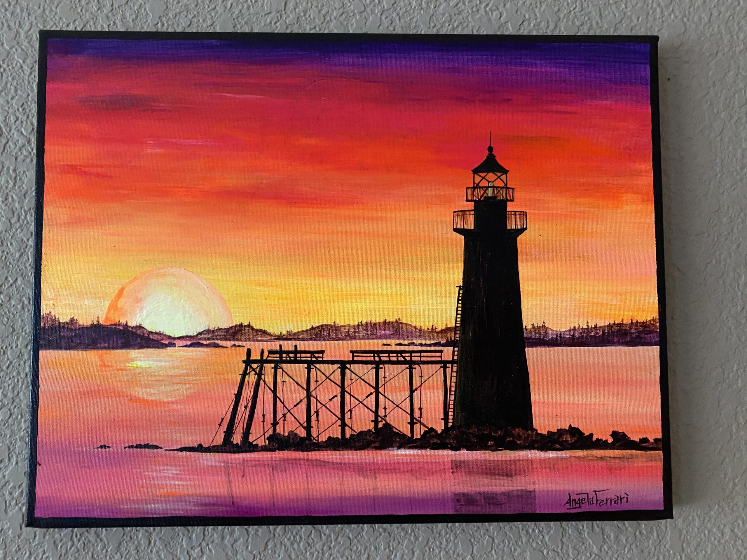
I create a new sample card every time I pick up a new ink. Since I have been sampling a new ink daily for a couple of months, I have a decent library at this point. What I like to do when I am picking out my inks is I literally walk thru every single card for whatever colors I am looking for on the next palette. In this case I was looking for purples, magentas (I do NOT like pinks usually), oranges, and yellows. I pulled from this painting my husband and I have from one of our anniversaries:
Painting, Angela Ferrari
And yes, I pulled all of those colors – ALL of them. Every single purple, magenta, orange, and yellow I had in my sample card library. Wheeeee.
When I am first pulling these colors, I do it very loosely. Is it purple? Yep. Goes in the pile. Is it green? Yep. Put it back. I look for nuance after I’ve pulled all of my main colors. Like, a purple that is so dark it’s closer to a black. Or a yellow that is too faint to read easily. I put all of those back and then I do the next thing.
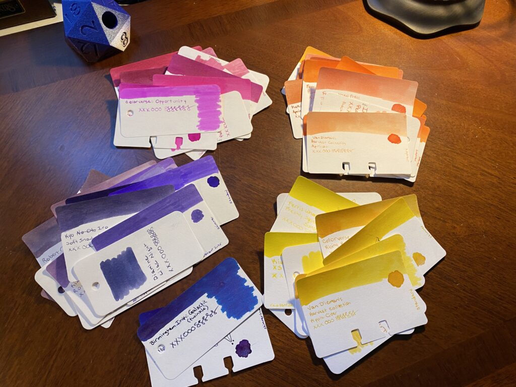
Piles of sample cards grouped by color.
Next I start to group them by color feel – there is more than one kind of purple for example. Some are more blue, some are more red. You get the idea. I like to do this because the same ink colors can show up across different manufacturer’s. Often you can get very similar colors but also they can end up having really subtle differences which is super fun! This is what I got from that step:
Purple sample cards, grouped by tone. Magenta sample cards, grouped by tone. Orange sample cards, grouped by tone. Yellow sample cards, grouped by tone. All of the sample cards piled, seen from the top down.
You should be able to see how similar the cards that are grouped together are, usually by tone or temperature or color or whatever you want to call it. They look similar. Moving on.
I REALLY like what I have come up with so far. But I need to keep narrowing it down, obviously. But rather than do that today, I’m actually going to sit with this stack for a bit. It’s got the range I think I like, it’s narrowed down to some good options – too many good options. And while I could make final decisions today, I don’t have to. Having this stack set aside, colors I can look through whenever I want to check something, colors I can visualize in my brain, I find this a very enjoyable experience. It’s part of the whole thing for me, being able to get to this step, and just think about it.
I don’t know if you’ve noticed, but the things going on in the world right now are kind of the worst. So I like to put good things in my brain, so I can concentrate on that for a nice break.
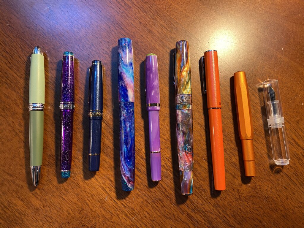
I have also picked out the pens, or at least most of them. This can change depending on which ink colors I end up picking, or a new pen might come in that I want to try. Or a new ink comes in last minute. It can change a lot of things. These are the pens I picked out:
9 pens laid out in a row.
I typically keep 9 pens inked. I’ve been pretty consistent about that since I started using the 2 portfolios I keep my main notebooks in. There is intended space for 7 pens but I can get creative and fit in 2 more. This month I want to try using a tiny pen case for Kaweco pens – but I’ll only be putting 1 Kaweco in it, with 2 other tiny pens. Which means. Technically. Ahem. I could carry…12 inked pens. Just saying.
I have some favorite pen makers these days, although I am always keen to try new ones. And I very much love tiny pens. Husband and I both super like Kaweco AL Sport, for example. We have entirely too many of them, haha. Sailor has turned out to be another favorite – the MF nib is my favorite! I tend to like finer nibs, so I’ve stuck mostly to those so far. I do have a custom nib that does a very broad line but I can also write “upside down” with it and get a finer line – closer to a medium nib I think. I use that one for Headers when I am writing dates and notes. I have also used Twsbi a great deal – they were some of my first pens, and I continue to enjoy them. I try to experiment with new kinds of pens when I can, but I definitely have favorites. For example, I have been using the two tone green pen and the sparkly purple pen on the left side of the photo above for several months in a row!
In fact, this month I am trying out two pens that are fairly new to me. I did use an Esterbook for the first time in July, and I’ll be using a second one in August. The other new one I got on Amazon haha – a friend found it, it’s adorable and tiny, and completely clear. And it doesn’t take a converter or a cartridge – it’s called an eye drop pen. You fill it with a syringe, which I’ve started using lately. Looks like fun! Depending on how many pens I do end up inking, I may end up changing my line up, but this is what I am planning on so far.
And that’s it! I do this every month. There are many steps to this…process? Project? I don’t even know what to call this – it’s woven thru my day, become critical to my sense of calm, and something I continue to find solid joy in. Whatever it’s called – there are things I do a certain way, and I plan on talking about them here. So, if you’re into fountain pens and what not, enjoy!
There are entirely too many inks to list for this post, but I will list the ones I end up choosing in another post. Here is a list of the pens in that photo:
Hong Dian 5019, Lan Tian – May Flowers (EF)
Sailor Pro Gear Slim – Purple Northern Lights (MF)
Sailor Pro Gear Slim Mini – Night Blue (MF)
James White – Nebula (F)
Esterbrook JR Paradise Pocket Pen – Purple Passion (F)
Leonardo Officina Italiana Brooks PM4 – Supernova (F)
Conklin – Coronet Orange (F)
Kaweco AL Sport – Limited Edition Orange (F)
Majohn Wancai Mini – Transparent Clear (F)
An #ActuallyAutistic #ADHD #AmbulatoryWheelchairUser With Opinions