Tag Archives: Hong Dian

September Pen/Ink Palette: Fall – Review

I enjoyed my palette this month. Fall is not my favorite season weather wise but the house I grew up in was always very very decorated for fall. Very decorated. So I guess now as an adult, I find a fall palette pleasing. I spent a lot of my growing up years in Maine, and the fall leaves there are literally a thing people will take a vacation to go see. Worth it. 

I used a dusky blue, a darker green and a light green, three different shades of orange and two of an orangish and darkish yellow. I felt that this spread covered what I remember of the woods in the autumn, on long drives in Maine. I googled fall palettes, and found one that looked about right and then winnowed down until I had what I ended up using. 

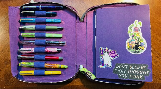
I got to try out a bunch of new inks and a couple of new pens. I made a couple of changes for the pens I started out using:
1. Sailor Pro Gear Slim – Purple Northern Lights (MF) / ColorVerse 54 Hayabusa Glistening
– This is my Forever Purple pen, continues to perform admirably! 
2. Sailor Pro Gear Slim Mini – Night Blue (MF) / ColorVerse Cat
– This is my new Forever Blue pen, had a couple of issues with it sticking a little bit, but that seems to be something I am just going to have to deal with when using ColorVerse Cat. Sad pants.
3. Esterbrook JR Pocket Paradise – Blue Breeze ( F) / PenBBS Break
– This blue ink is really perfect for a fall and I enjoyed writing with it, zero problems. Soothing, really.
4. Hong Dian 5019, Lan Tian – May Flowers (EF) / Ferris Wheel Press Moonlight Jade 
– My Magic Green pen, continues to be magic. 
5. Esterbrook JR Picket Paradise – Key Lime (F) / Wearingeul Flowing Leaves 
– I already knew I liked this pen but I ended up really adoring this shade of green. And the shimmer behaves beautifully. 
6. TWSBI Diamond 580 – Iris (F) / Kiwi Ink Quetzalcoatl
– I do love my Diamond pens. And I’ve used Quetzalcoatl before and it was as lovely as I remember. Although, it’s supposed to be a sheen AND shimmer ink, but the shimmer never comes through on page. I have two theories – one is that the paper I am using just shows sheen better. The second is that sheen always trumps shimmer. I really need to experiment more with papers…
7. Beardbarian Woodworking – Copper Eclipse Sunset (F) / Ferris Wheel Press Candy Marsala
– I really love this pen. Marsala came through lovely, and only got a little stuck once or twice, but resolved on it’s own. 
8. Majohn Wancai Mini Fountain Pen – Transparent Clear (F) Monteverde Strata – Red (F)  / Diamine 2021 Inkvent Vintage Copper
– I switched pens purely because this Monteverde pen was a sparkly red and came in my monthly Truphae box. It writes okay, gets sticky sometimes. Vintage Copper is one of my very favorite inks, but fun fact – I accidentally put some Raspberry Rose back in here when I was emptying some pens about a year ago. It doesn’t seem to have changed the color of this sample bottle of Vintage Copper, but who knows. 
9. Kaweco AL Sport – Gold (B) PenBBS 456 Fountain Pen – Autumn (F) / Kiwi Liquid Gold
– I kept finding ink inside the lid and all over the nib even when the pen hadn’t been dropped, so when my new PenBBS showed up, I switched over. I still haven’t figured out vacuum pens, but that’s on me. I love the way both of my PenBBS pens look, and the writing on this one was mostly fine. The color variations and shimmer came thru nicer with the broad nib, but this wasn’t terrible. I think the times where it felt like the ink wasn’t flowing well was something to do with me not using the vacuum part correctly. I’ll figure it out eventually. 
10. Esterbook JR Pocket Paradise Pocket Pen – Yellow (1.1m Stub) / ColorVerse Rising Reflections
– This is the first time I have used a 1.1m Stub nib and I loved it! Shows off the ColorVerse Rising Reflections shimmer beautifully!
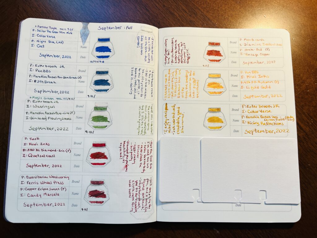

I am considering keeping Flowing Leaves and Vintage Copper for my “Monster” palette in October. I like how Flowing Leaves flows and decided it worked well for Zombie – and Vintage Copper looks good for Vampire. 

I really want to figure out how vacuum pens work. Must science it. My favorite discovery of my palette this month was the 1.1 Stub nib – it’s so good! I wish I wrote larger when journaling, I only ended up using it for headings. It was odd not using any Kaweco’s. I count this palette as a success! 

August Palette Review

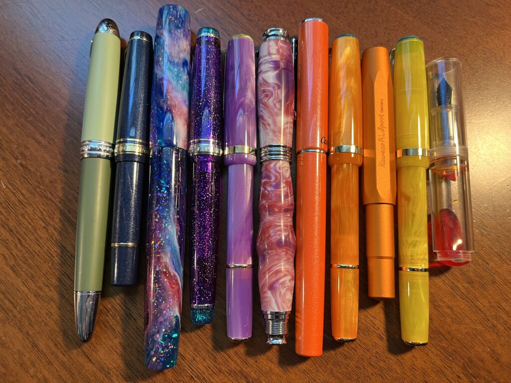
10 pens lined up horizontally, green, sparkle blue, blue/pink, sparkly purple, swirly purple, swirly magenta/pink/white, sparkly orange, swirly orange, metallic orange, swirly yellow, and clear with a sparkly orange ink visible.
August pens

Twelve pens is a lot of pens but I am happy to report that I really used most of them. There were two with weird nibs, but after I tuned them they were okay. There was a yellow that was mostly too light for me to read, so ended up doing mostly accents with it. My header pen only saw use on headers because I was worried about running out of that ink – didn’t have a lot of them. I will say switching out that one orange ink was a very good idea. 

I am now realizing how vague this is going, so let’s just list them all out instead! 

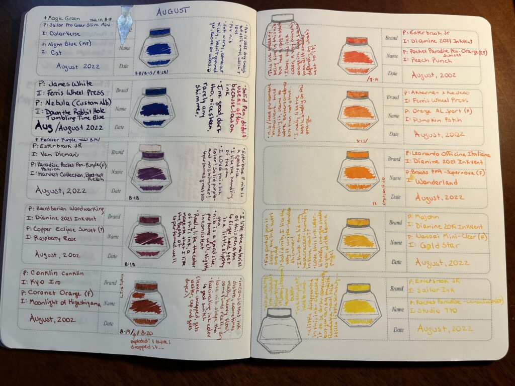
A pair of pages from the Ink Journal notebook. There are 12 pens listed by pen and ink manufacturer, then the pen and ink color, and then August, 2022. To the right (on the left page, to the left on the right page) is a stamped ink bottle, and the color of that pen ink is scribbled in there. Besides the ink bottle stamp is Shawna’s opinion on that combo. The pen/ink combos and written opinions can be found below this photo in a list.
Record of August pens and inks and FEELINGS

1. Hong Dian 5019, Lan Tian – May Flowers (EF) / Ferris Wheel Press Moonlight Jade 
– Magic Green Pen! I adore it. The end. (Refilled 9 times)
2. Sailor Pro Gear Slim Mini – Night Blue (MF) / ColorVerse Cat 
– New Forever Pen! Shall dub Forever Blue – pretty much identical experience to the Forever Purple pen, just a different favorite shimmer ink.
– “Pen is JUST long enough, but still smol, which I love. Fav nib. Ink works, comes out nicely, hasn’t gummed yet, knock on wood. :)” (Refilled 3 times)
3. James White – Nebula (Custom Nib) / Ferris Wheel Press Tumbling Time Blue
– Solid pen, didn’t use it a ton because low on ink. Ink good, dark tho, nice sheen, rarely any shimmer.
4. Sailor Pro Gear Slim – Purple Northern Lights (MF) / ColorVerse 54 Hayabusa Glistening
– Forever Purple Pen! Also adore this one. The end. (Refilled 7 times *yay*)
5. Esterbrook JR Paradise Pocket Pen – Purple Passion (F) / Van Dieman Beetroot Relish
– “Esterbrook F nib is a good size. I like the handling of the pen. I LOVE this ink color! Solid purple – and no shimmer! Performed great too.” (Refilled 1 time)
6. Bearbarian Woodworking – Copper Eclipse Sunset (F) / Diamine 2021 Inkvent Raspberry Rose
– “I like the material of this pen a ton – the finger hold spot is a little slipper tho. Nib is a good size, performs well usually, slightly inconsistent. Really like the color of this ink, a magenta I like the depth of – performed well.” (Refilled 1 time)
7. Conklin – Coronet Orange (F) / Kyo Iro Moonlight of Higashiyama
– “Inconsistent ink distro, sometimes really heavy flow, sometimes really dry. Love the nib shape tho. Fascinating ink color – glad I switched it out! (Leave uncapped, gets wetter, caped, gets dryer?)” (Refilled 2 times – exploded a little bit once, maybe because I dropped it)
8. Kaweco AL Sport Limited Edition – Orange (F) / Ferris Wheel Press Pumpkin Patch
– “Nib/feed performance inconsistent…tried tuning it, seems to work better sometimes but then not others…I really like the subtle shading on this orange.” (Refilled 1 time)
9. Leonardo Officina Italiana Brooks PM4 Limited Edition – Supernova (F) / Diamine Inkvent 2021 Wonderland
– Still love this ink. It ended up not really fitting in the palette – so when it ran out on the 20th, I just didn’t refill it.
10. Esterbook JR Pocket Paradise Pen – Orange (EF) / Diamine 2021 Inkvent Peach Punch
– “This ink ended up being fine in this nib, but had a rough start. I love this ink color, a very interesting orangish that seems to be different shades depending on what’s next to it!” (Refilled 1 time)
11. Esterbook JR Pocket Paradise Pocket Pen – Yellow (EF) / Sailor Ink Studio 770
– “Nib scratchy, ink wouldn’t flow, tuned it (baby’s bottom?) and seems better. Ink very light, hard to read. A little disappointed in this ink 0 expected it to be darker consistently but you can see the difference. Readable now! Nib still a little scratchy.”
12. Majohn Wancai Mini Fountain Pen – Transparent Clear (F) / Diamine 2019 Inkvent Golden Star
– “Fav part of pen is seeing the ink swirl around. Solid nib, I like the way it writes – can handle shimmer! I think the cap may have cracked – humidity in there now?? Love this ink color – literally changes shades as you write down a page!”

So, if I had to pick a favorite (besides my Forever Pens) it would have to be either the purple Esterbrook with Beetroot Relish in it, or the Majohn with Golden Star in it. For different reasons. Oo! Or the Beardbarian with Raspberry Rose. It was a good month!

September Ink/Pen Palette: Fall

Picking colors for my September pens and inks was a little difficult for me because the theme is “Fall” and fall colors have a lot of red in them and I do not like red. I resorted to google and ended up finding a really nice set of 5 colors – and I have no idea how to describe them professionally, but here we go! Sort of like a teal, evergreen-y type blue, a kind of muted moss green, a rust reddish, an orange that is like a yellow-orange and a yellow that is closer to an orange. Yep. Doing great. 

Remember last month when I said I might keep my blue Sailor mini with Cat in it as part of my permanent pens? Well now we have the Forever Purple, Magic Green, and now a Forever Blue. Besides those three, I realized I was looking for colors really similar to my “sunset” theme, but the biggest difference for me was the colors for August were more vibrant and the ones for September are more muted. Insert something clever here about saturation? I am sure Aaron said something about saturation at some point and clearly that did not stay in my head. 

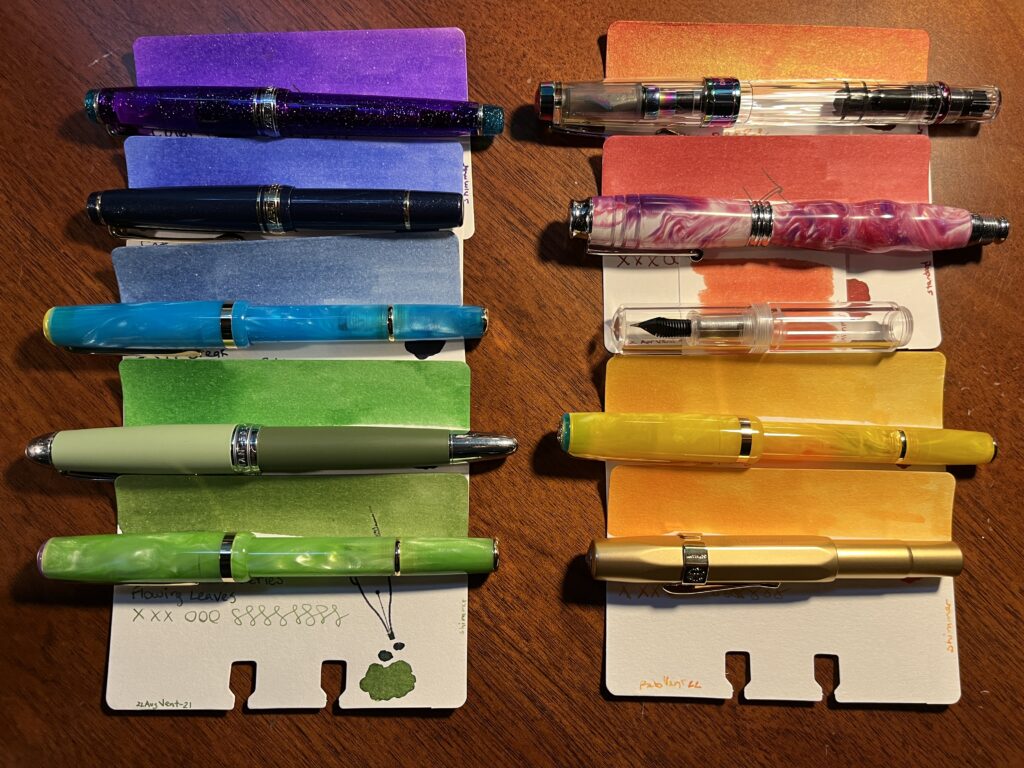
I’ve got 10 pens this month and besides the three forever pens, none of the inks/pens are being carried over from August. That’s not because I didn’t like them, but they just didn’t end up working with the muted theme I was trying. And yes, I ended up with a kind of rainbow again and I refuse to be upset by this. I like rainbows. 

Ten pens and ten sample cards in two columns. Each pen is laid on top of a sample card just below the swatch of color at the top of the card.
10 pens in two columns, one purple, two blues, two greens on the left, 3 red/orange and 2 orange/yellows on the right

  1. Sailor Pro Gear Slim – Purple Northern Lights (MF) / ColorVerse 54 Hayabusa Glistening
  2. Sailor Pro Gear Slim Mini – Night Blue (MF) / ColorVerse Cat
  3. Esterbrook JR Pocket Paradise – Blue Breeze ( F) / PenBBS Break
  4. Hong Dian 5019, Lan Tian – May Flowers (EF) / Ferris Wheel Press Moonlight Jade 
  5. Esterbrook JR Picket Paradise – Key Lime (F) / Wearingeul Flowing Leaves 
  6. TWSBI Diamond 580 – Iris (F) / Kiwi Ink Quetzalcoatl
  7. Beardbarian Woodworking – Copper Eclipse Sunset (F) / Ferris Wheel Press Candy Marsala
  8. Majohn Wancai Mini Fountain Pen – Transparent Clear (F) / Diamine 2021 Inkvent Vintage Copper
  9. Esterbook JR Pocket Paradise Pocket Pen – Yellow (1.1m Stub) / ColorVerse Rising Reflections
  10. Kaweco AL Sport – Gold (B) / Kiwi Liquid Gold

I picked up a 1.1m stub nib for one of my Esterbrook pens, and I am interested to see how it handles that shimmer ink. Yellows kind of need a broader application I think…who knows, I usually use fine nibs!

The Vintage Copper is going into one of those clear Majohn mini pens because I anticipate it being gorgeous like the one I was using in August. Twsbi diamond is one I usually enjoy, so looking forward to that, Kaweco is a known great – but a broad nib, so we shall see if I still like it. And I am reusing the Beardbarian pen because it is my favorite right now. 

Because I am not wild about all of the colors individually or in pairs, I am going to try using them as a whole palette instead of singly. I have been using a different pair of pens every day of the week, to distinguish the days, to use the pens more regularly, and the pair instead of one so I could have an easier time navigating my notes. This month I will be seeing how annoying it is to switch out every pen for every new line item in my work notebooks instead, in an attempt to not grow to dislike a single color so much I stop using it. Granted, if that does happen – and it might – I can just switch out the ink and/or pen. Still, might be interesting.

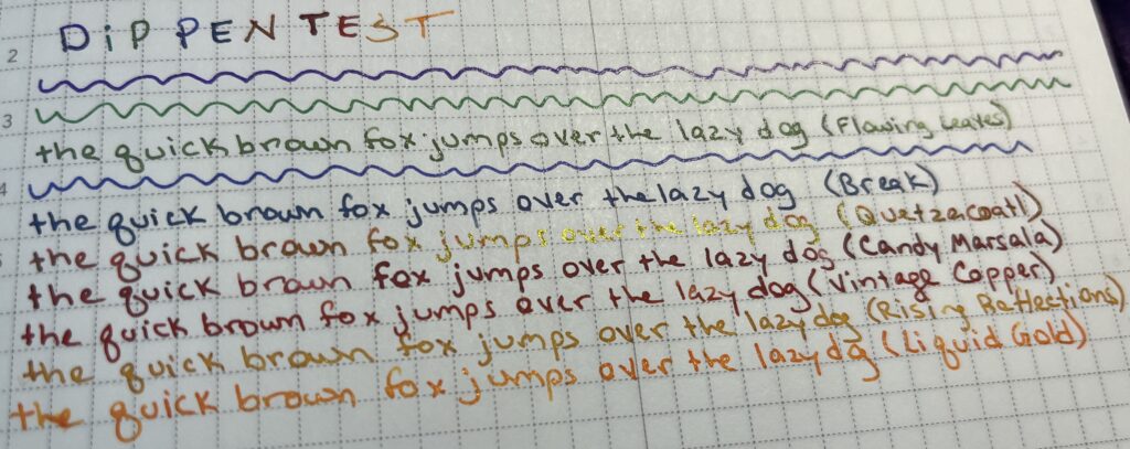
Because of the ink swap last month immediately after putting that one orange in a pen and seeing how mushy it was, I decided this month to try the inks on my usual paper before getting them into pens.

Notebook page, “Dip Pen Test,” each ink I am planning on using written out with the phrase “the quick brown fox jumps over the lazy dog” except for the three pens I am keeping. There is a shimmer green, a blue, then a red with gold sheen, two reds, a dark yellow shimmer, and an orange ish shimmer.
Each line is a different ink color

You may notice the 3 reds in there that look very similar. Because of this, the new rule (for next month) is to dip test the inks before I decide on a palette, instead of just before I put them in a pen.

Wish me luck!

August Pen/Ink Palette!

Tada! Pens and inks. I usually only ink 7-9 pens but! I am experimenting with a new carry case AND. August is the one year anniversary of me getting into all this. So! I’m going a little extra this time…

My theme is sunset, I was trying to think of good colors for the last month of summer and it made me think of a day ending, as the summer ends, and then I thought of a sunset! The idea of a sunset made me really happy at the wealth of colors I could try out. So that’s what we’re doing!

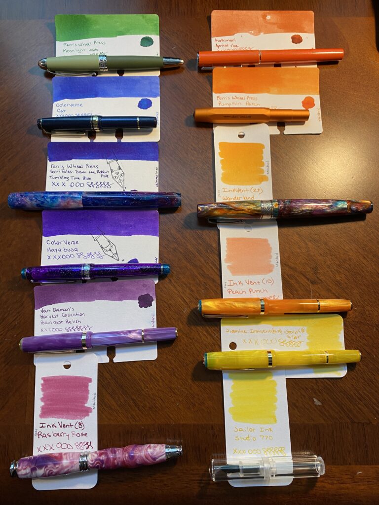
There are two columns of pens and ink sample cards laid out side by side. The left column starts with a dark green, then a blue, then a darker blue/purple, then purple, then a slightly lighter purple, and last a rose magenta color. The right side colum starts with a darker orange, then a slightly lighter orange, and then another slightly lighter orange, then a peach, then a darker yellow, and last a lighter yellow. The names of the pens and the inks are listed below the photo.
August 2022 Pens and Inks

1. Hong Dian 5019, Lan Tian – May Flowers (EF) / Ferris Wheel Press Moonlight Jade 

2. Sailor Pro Gear Slim Mini – Night Blue (MF) / ColorVerse Cat 

3. James White – Nebula (Custom Nib) / Ferris Wheel Press Tumbling Time Blue

4. Sailor Pro Gear Slim – Purple Northern Lights (MF) / ColorVerse 54 Hayabusa Glistening

5. Esterbrook JR Paradise Pocket Pen – Purple Passion (F) / Van Dieman Beetroot Relish

6. Bearbarian Woodworking – Copper Eclipse Sunset, Diamine 2021 Inkvent Raspberry Rose

7. Conklin – Coronet Orange (F) / Kakimori Apricot Tea (Edit – switched Apricot Tea out for Kyo Iro Moonlight of Higashiyama on 8.1.22)

8. Kaweco AL Sport Limited Edition – Orange (F) / Ferris Wheel Press Pumpkin Patch

9. Leonardo Officina Italiana Brooks PM4 Limited Edition – Supernova (F) / Diamine Inkvent 2021 Wonderland

10. Esterbook JR Pocket Paradise Pen – Orange (EF) / Diamine 2021 Inkvent Peach Punch

11. Esterbook JR Pocket Paradise Pocket Pen – Yellow (EF) / Sailor Ink Studio 770

12. Majohn Wancai Mini Fountain Pen – Transparent Clear (F) / Diamine 2019 Inkvent Golden Star

(You may notice the two yellow inks are in different pens than the picture shows, my mistake! The list is correct, the photo is not. And also – Apologies – I can’t seem to find links for the Diamine Inkvent inks – they originally came out in an advent calendar in 2021 or 2019. The place I grabbed bottles no longer has them – seems to be a very limited run.)

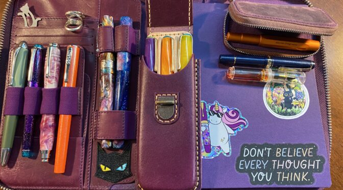
Now, where am I going to put these 12 pens you may be asking! I technically have pen loops for 7 pens across my two main portfolios. I can squeeze in 2 more by putting a smaller pen – like a Kaweco – across the top of my weekly portfolio, and another one clipped into the card slots in my larger portfolio. So that gives me 7 in my main portfolio and 2 in my weekly. See why I usually try to stay under 9 pens? Haha.

A couple of weeks ago I discovered Galen Leather makes tiny little cases for Kaweco pens. I clearly needed one, since I have entirely too many Kawecos. Once I got it I figured out I could fit 3 small pens in it. Tada! Space for 12 pens.

Here’s the thing – If all 3 of my smaller pens are in the extra tiny case, then I don’t technically have a second spot in the weekly portfolio. Oh no…but! I also picked up a full size pen case at the same time as the tiny one – and I happen to be using three Esterbrook pens this month. So! I’ve got 3 Esterbook in a big pen external case, the Sailor Mini, Orange Kaweco, and the clear Majohn in the tiny external case, and the rest of the pens in my large portfolio. Yay! This should be fun.

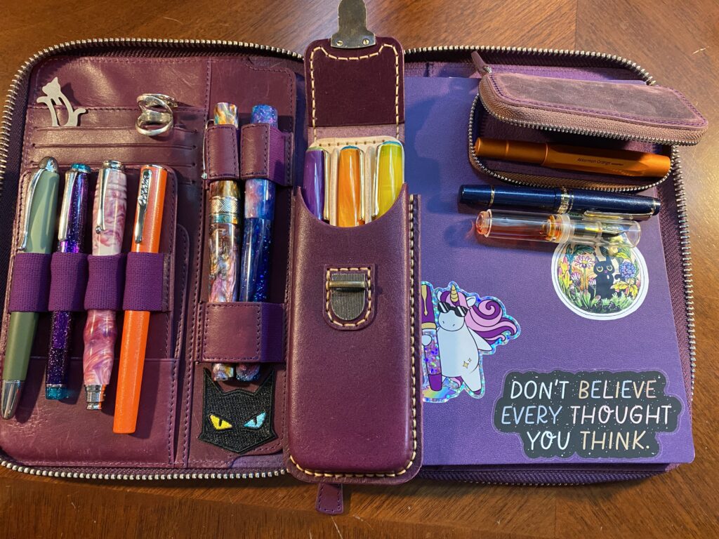
A purple folio with space on the right for a notebook. The one there is a more blue purple, with three stickers on it. One in the bottom right says “Don’t believe every thought you think.” And to the right is a unicorn with pink hair and sunglasses holding a sparkly fountain pen the same height as the unicorn. And above those is a lightbulb with a black cat and a garden inside.
On the right side of the portfolio is 4 card slots, and 6 pens. The card slots are holding a grey cat paper clip, and two ring splints. 
Set on top of the portfolio in the center is a purple external pen case that has space for 3 pens. And on the top right corner of the notebook is a smaller purple case, one pen rests inside, and 2 pens are set below it.
Purple Portfolio from Galen Leather, all 12 pens, and a fresh purple notebook!

First Impressions!
I got the pens inked this morning and I usually fill them with a syringe, so sometimes I need to do a little bit of manipulation to get them to write. Then of COURSE I have to test them…ahem.
– Magic Green – writes as well as always! (Knock on wood).
– Blue Sailor – gorgeous. I love the mini slim, and I love the MF nib!! And Cat is one of my favorite inks. Gorgeous all around.
– Sparkle Stick – had a little bit of trouble trying to prime the feed on this one, so I rinsed it, and eventually got it to write, and this ink is going to be awesome in this custom nib.
– Forever Purple – also writing wonderfully as usual!
– Esterbrook Purple – very pleased, writes well, solid color. It’s a PURPLE without SHIMMER and I like it. How dare.
– Custom Swirly – yeeees I was worried the nib in this one would be wonky, but no! Writes well out of the gate, and this is a fun ink to play with.
– Conklin Orange – this ink is WEIRD. It had a weird consistency in the first place, and it feathers like bonkers on the page…I’m going to give it a couple of days but I might end up swapping this ink out.
– Kaweco Orange – ink is struggling to flow. I need to check the nib and feed alignment, I’ll keep using it and see if I can’t loosen it up. I think I saw a post about this with like, a nick name, because this happens commonly? Haha. I’ll look for it.
– SuperNova Wonderland – writing beautifully as it did all thru July!
– Esterbook Orange – ugh. Would not write right away – unsure why, although it does have an EF nib – but no shimmer in the ink?? I let it sit for a while and it started to write, but it’s still struggling. I’ll let it sit for a longer time and see what happens.
– Esterbook Yellow – same problem as the orange, so we’ll see how it does tomorrow maybe?
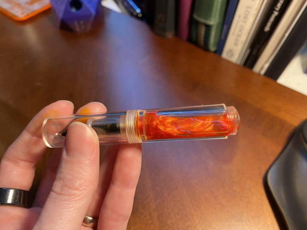
– Clear Shiny Yellow – pen is so wee and tiny and cute!! I hope this nib can handle a shimmer ink… I put a shimmer ink in this because it is truly gorgeous…
Check it out:


Keep in mind, this is all after a single use, testing the pens and inks for the first time. So much can change in a month! I will naturally complain on twitter, ahem, but I will also post a review type thing at the end of the month. It will be less in depth and more…Spoon’s weird opinions! Yay!
Enjoy!

August Palette, Picking Inks

Oh look, the internet! Clearly this place wants to hear about the fountain pen stuff I’m all excited about. Right? Definitely. Here we go!


So I got into fountain pens last October (2021). Since then I have been keeping a set of pens inked, sampling new inks, and trying new pens. I’ll get into all that as I back track in future posts. Today I am going to wax eloquent about my current stage of fun.


I forget when I started this but I decided to stop carrying around 20 inked pens at a time, and started trying to keep to 7 at a time. Ish. This was after reading a post on the practicality of it and realizing that more than about 7 meant I just didn’t use all of the pens. Since pens can’t stay infinitely inked and still work well, it ended up being kind of a waste. Then I decided to swap them out monthly. THEN I started to pick themes for both the inks I used that month and the pens I put them in.


Which brings us to August. About half way thru the month before – so in this instance, right now, middle of July – I start looking at which inks and pens I’m going to use for the following month. I usually think of a theme a couple months before – for August I was planning on using a sunset palette. Fortunately I’ve been picking up orange pens lately – convenient eh?


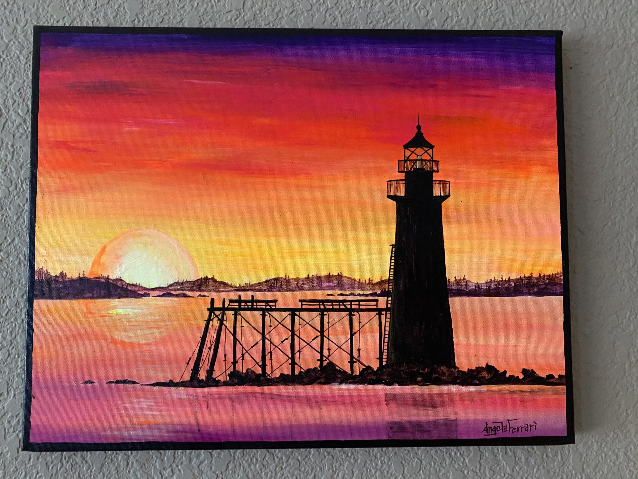
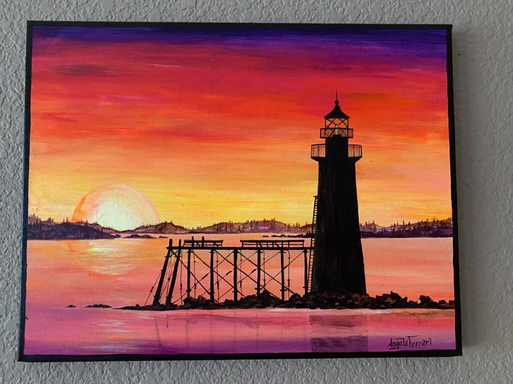
I create a new sample card every time I pick up a new ink. Since I have been sampling a new ink daily for a couple of months, I have a decent library at this point. What I like to do when I am picking out my inks is I literally walk thru every single card for whatever colors I am looking for on the next palette. In this case I was looking for purples, magentas (I do NOT like pinks usually), oranges, and yellows. I pulled from this painting my husband and I have from one of our anniversaries:

A painting of a sunset with purples, pinks, reds, oranges, and yellows. There is a lighthouse in the foreground in a dark silhouette. The ocean around the lighthouse is reflecting the sunset's pinks and purples.
Painting, Angela Ferrari

And yes, I pulled all of those colors – ALL of them. Every single purple, magenta, orange, and yellow I had in my sample card library. Wheeeee.


When I am first pulling these colors, I do it very loosely. Is it purple? Yep. Goes in the pile. Is it green? Yep. Put it back. I look for nuance after I’ve pulled all of my main colors. Like, a purple that is so dark it’s closer to a black. Or a yellow that is too faint to read easily. I put all of those back and then I do the next thing.

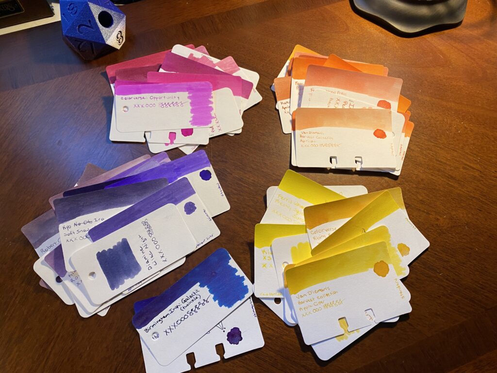
5 piles of ink sample cards. Each card has a swatch of ink at the top of the card, with the details of the ink - Brand, series, name - and an ink drop below that. There are a couple of smaller sample cards are mixed in, they only have the swatch and the inks details on them. There is a dark blue/purple pile at the bottom, and then above that there is a pile or purples. Above that is a pile of magentas. To the right is a pile of oranges. And below that is a pile of yellows. All are sitting on a dark wooden desk.
Piles of sample cards grouped by color.

Next I start to group them by color feel – there is more than one kind of purple for example. Some are more blue, some are more red. You get the idea. I like to do this because the same ink colors can show up across different manufacturer’s. Often you can get very similar colors but also they can end up having really subtle differences which is super fun! This is what I got from that step:

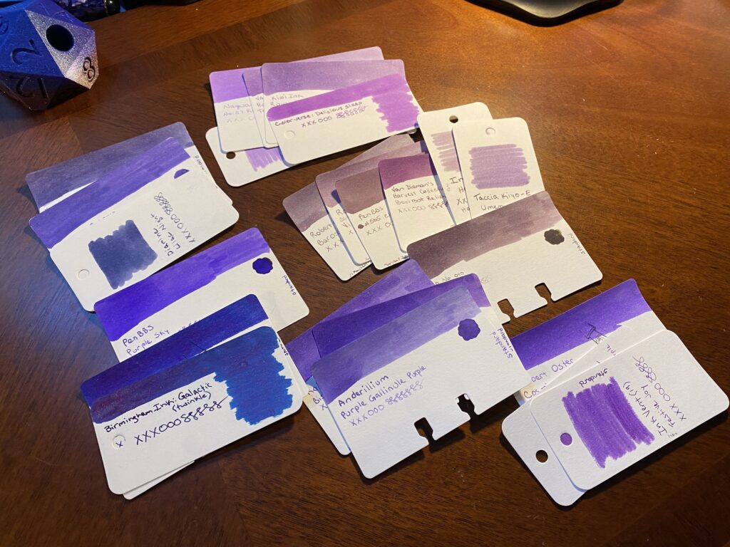
The larger pile of purple sample cards have been separated out into smaller piles, grouped by tone. The purples range from a blue/purple, dark reddish purples, dark blueish, to lighter reddish and blueish purples.
Purple sample cards, grouped by tone.
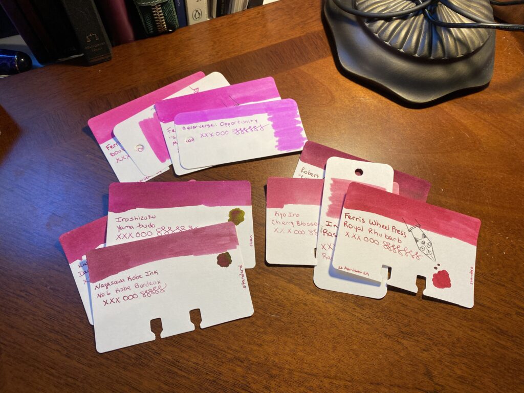
The larger pile of magenta sample cards have been separated out into smaller piles, grouped by tone. There are only three piles, one is more neon pink, another sort of a rosey pink magenta, and then the last one is a magenta that leans into the red tones.
Magenta sample cards, grouped by tone.
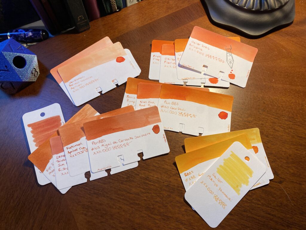
The larger pile of orangeish sample cards have been separated out into smaller piles, grouped by tone. There are some dark oranges, ones that are more peach colored, some with more red in them, some more variable, and some more yellowish.
Orange sample cards, grouped by tone.
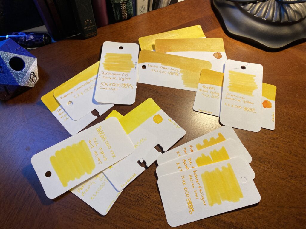
The larger pile of yellow sample cards have been separated out into smaller piles, grouped by tone. They range from a very vivid yellow to darker ranges with touches of gold or orange.
Yellow sample cards, grouped by tone.
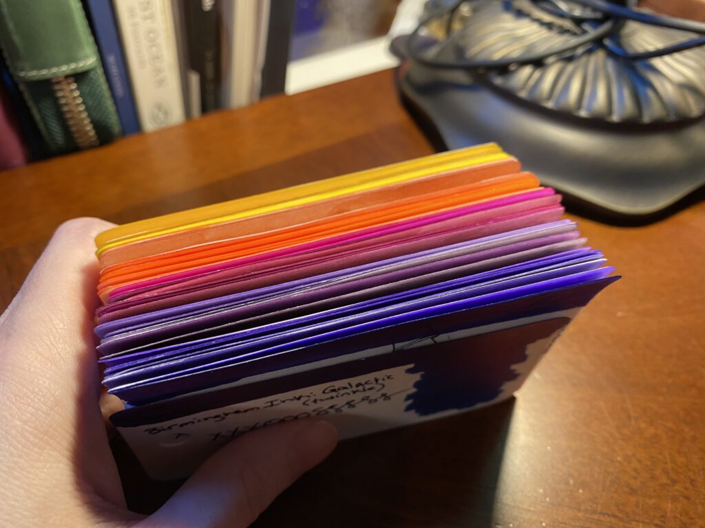
Seen from the top down, it's clear the top edges of each card has been colored as well. There is a nice range from yellows to oranges to magentas to purples.
All of the sample cards piled, seen from the top down.

You should be able to see how similar the cards that are grouped together are, usually by tone or temperature or color or whatever you want to call it. They look similar. Moving on.


I REALLY like what I have come up with so far. But I need to keep narrowing it down, obviously. But rather than do that today, I’m actually going to sit with this stack for a bit. It’s got the range I think I like, it’s narrowed down to some good options – too many good options. And while I could make final decisions today, I don’t have to. Having this stack set aside, colors I can look through whenever I want to check something, colors I can visualize in my brain, I find this a very enjoyable experience. It’s part of the whole thing for me, being able to get to this step, and just think about it.


I don’t know if you’ve noticed, but the things going on in the world right now are kind of the worst. So I like to put good things in my brain, so I can concentrate on that for a nice break.


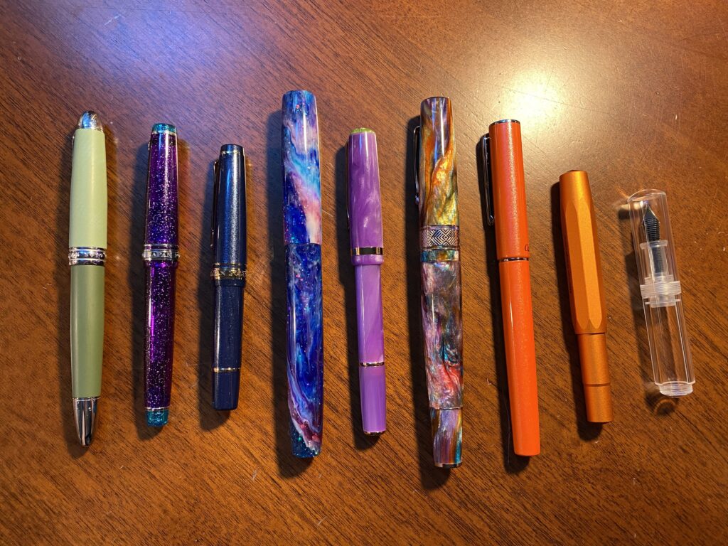
I have also picked out the pens, or at least most of them. This can change depending on which ink colors I end up picking, or a new pen might come in that I want to try. Or a new ink comes in last minute. It can change a lot of things. These are the pens I picked out:

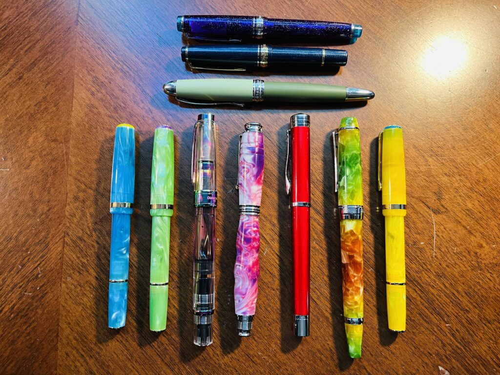
9 pens, starting from the left: two tone green, sparkly purple, sparkly blue, sparkly and swirly blue/purple/pinks, swirly purple, swirly and sparkly orange/purple/blue/green/yellow/pink, sparkly orange, a metallic orange, completely clear and tiny.
9 pens laid out in a row.

I typically keep 9 pens inked. I’ve been pretty consistent about that since I started using the 2 portfolios I keep my main notebooks in. There is intended space for 7 pens but I can get creative and fit in 2 more. This month I want to try using a tiny pen case for Kaweco pens – but I’ll only be putting 1 Kaweco in it, with 2 other tiny pens. Which means. Technically. Ahem. I could carry…12 inked pens. Just saying.


I have some favorite pen makers these days, although I am always keen to try new ones. And I very much love tiny pens. Husband and I both super like Kaweco AL Sport, for example. We have entirely too many of them, haha. Sailor has turned out to be another favorite – the MF nib is my favorite! I tend to like finer nibs, so I’ve stuck mostly to those so far. I do have a custom nib that does a very broad line but I can also write “upside down” with it and get a finer line – closer to a medium nib I think. I use that one for Headers when I am writing dates and notes. I have also used Twsbi a great deal – they were some of my first pens, and I continue to enjoy them. I try to experiment with new kinds of pens when I can, but I definitely have favorites. For example, I have been using the two tone green pen and the sparkly purple pen on the left side of the photo above for several months in a row!


In fact, this month I am trying out two pens that are fairly new to me. I did use an Esterbook for the first time in July, and I’ll be using a second one in August. The other new one I got on Amazon haha – a friend found it, it’s adorable and tiny, and completely clear. And it doesn’t take a converter or a cartridge – it’s called an eye drop pen. You fill it with a syringe, which I’ve started using lately. Looks like fun! Depending on how many pens I do end up inking, I may end up changing my line up, but this is what I am planning on so far.


And that’s it! I do this every month. There are many steps to this…process? Project? I don’t even know what to call this – it’s woven thru my day, become critical to my sense of calm, and something I continue to find solid joy in. Whatever it’s called – there are things I do a certain way, and I plan on talking about them here. So, if you’re into fountain pens and what not, enjoy!

There are entirely too many inks to list for this post, but I will list the ones I end up choosing in another post. Here is a list of the pens in that photo:

  • Hong Dian 5019, Lan Tian – May Flowers (EF)
  • Sailor Pro Gear Slim – Purple Northern Lights (MF)
  • Sailor Pro Gear Slim Mini – Night Blue (MF)
  • James White – Nebula (F)
  • Esterbrook JR Paradise Pocket Pen – Purple Passion (F)
  • Leonardo Officina Italiana Brooks PM4 – Supernova (F)
  • Conklin – Coronet Orange (F)
  • Kaweco AL Sport – Limited Edition Orange (F)
  • Majohn Wancai Mini – Transparent Clear (F)