Tag Archives: Opinions

Magic Green & Forever Purple

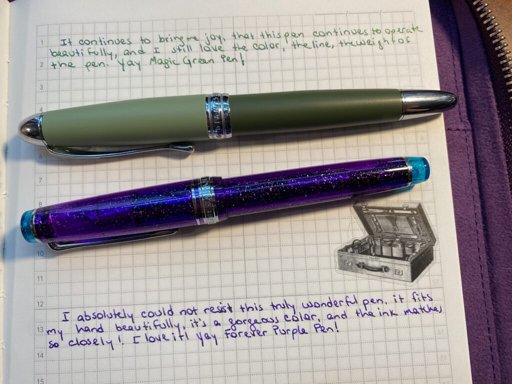
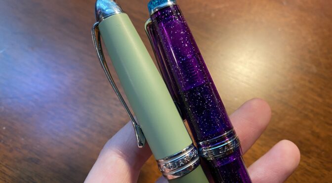
I have referred to my Magic Green pen and my Forever Purple pen a couple of times, so I figured I should explain what that is all about. So first, the pens and inks in question are actually:

Magic Green = Hongdian 5019 – Lan Tian May Flowers (EF), with Ferris Wheel Press Moonlit Jade ink

Forever Purple = Sailor Pro Gear Slim – Northern Lights (MF), with ColorVerse Hayabusa ink

Little bit of history to set context. I’ve only been playing with fountain pens and inks for about a year now, and when I first got started, believe it or not, I did not know shimmer inks existed. And when I realized they did, I went a little out of control on sampling as many as I could get my hands on. In December I sampled Van Dieman inks, mostly shimmer if I recall correctly, and I put Twilight Mist (?? Check) in a pen (???) and – it wouldn’t write. Like. At all. Not right after I inked it. Not after I tried my tricks to make it work. Nothing.

This was the first time I had run into this, so I started to do some research. I figured it had something to do with the shimmer particles gumming up the feed and I was right according to my research. Which…sucks. Sigh. I love shimmer inks AND fine nibs and they do NOT mix well sometimes…slash always. Always meaning I can usually get the pen to write, but it’ll get stuck some times. And I have a couple of ways to un stick them and I’m slowly figuring out which techniques work best with different pens. But still.

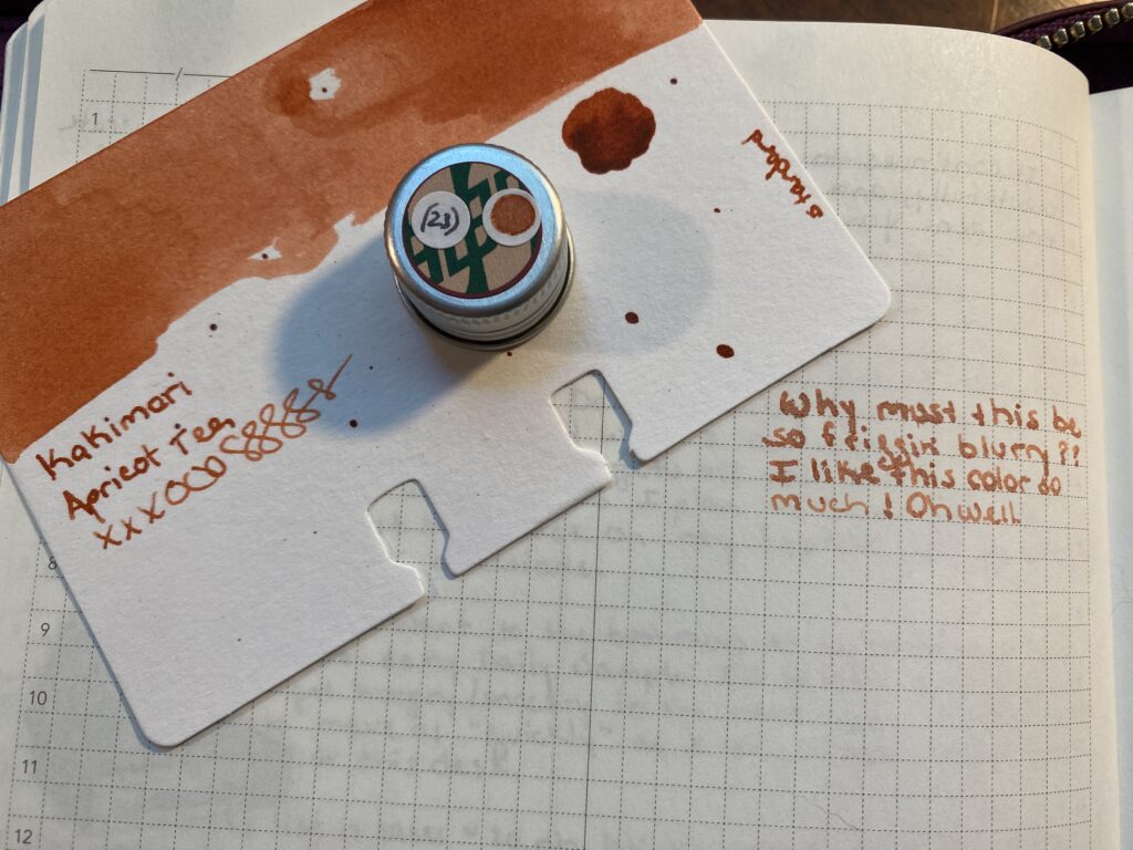
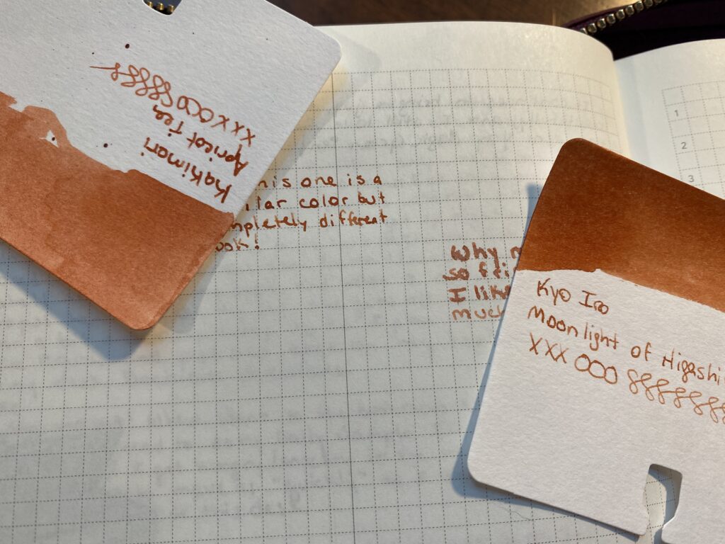
I picked up a Hongdian from a Truphae box in February (I think? That’s when this got inked for the first time at least, so pretty safe bet at the time). I wasn’t sure what to put in it. But shortly after that I picked up the Ferris Wheel Press Jade collection (of 2 inks) after a friend suggested it I check them out. I’d been trying out different shimmer ink manufacturer’s to try and find one that did not clog pens! I thought the pen looked a little odd with the two tone muted greens, but I liked the heft and the balance and I thought, hey green pen, green ink, let’s try it. I super expected it to clog immediately, due to it having an Extra Fine nib. 

Notebook page with the following text: “It continues to bring me joy, that this pen continues to operate beautifully, and I still love the color, the line, the wright of the pen. Yay Magic Green Pen!” In a dark green ink with silver shimmer. Below the text is a two tone green pen with silver hardware. Below that is a sticker of an old Victorian suitcase.
Magic Green pen with writing sample!

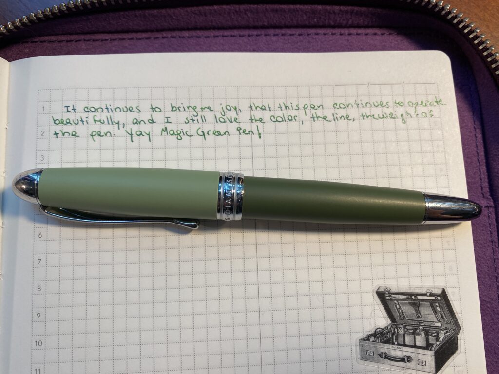
So imagine my surprise when my Hongdian pen wrote beautifully with a shimmer ink in it – out of an EXTRA fine nib! Yay! Then, like weeks later, when it wouldn’t write anymore, I rolled my eyes and assumed the feed was clogged, and started trying all my techniques to unclog it and none of them worked and I was so grumpy! I open it up to try to clean the bits more thoroughly and realize – it wasn’t clogged. It was out of ink! At this point, a pen NOT clogging on a shimmer ink at least a LITTLE bit was unheard of, in my experience to date. I immediately refilled it – and it wrote – and it continued to write without clogging. Then I needed to refill it a second time – so I did – still no clogging. Definitely not my normal at that point. (Still, really, not my normal out of a nib that fine.) And so, I decided – to do Science. 

I ended up deciding to carry the pen over from using it in March into my rainbow palette for April. I started doing palette’s in January and the idea was I would switch out ALL of the pens every month. This was the first time I carried a pen over. I felt guilty about it – I had other pens to try – but. I wanted to see how far it would go. For Science. Then I made it thru April with no issues, and decided to carry it over into May…then June…

Basically I decided to keep refilling it until it clogged. And I am still waiting, 6 months later (knock on wood). I have refilled it a total of 8 times to date, all with the same ink. I dip filled it (dib the entire nib into the ink and suck it up with the converter) 6 times, and the 7th and 8th I used a syringe to pick up the ink and put it into the converter before plugging it into the nib. And still no issues. 

Truly. A magic pen. Let’s see how long this goes! For Science indeed!  

The same suitcase sticker is at the top of this photo, below that is the following text: “I absolutely could not resist this truly wonderful pen, it fits my hand beautifully, it’s a gorgeous color, and the ink matches so closely! I love it! Yay Forever Purple Pen!” In dark purple ink with a pale gold shimmer. Below that is a purple pen with silver shimmer and a light blue color for the top and bottom and silver hardware.
Forever Purple pen and writing sample!

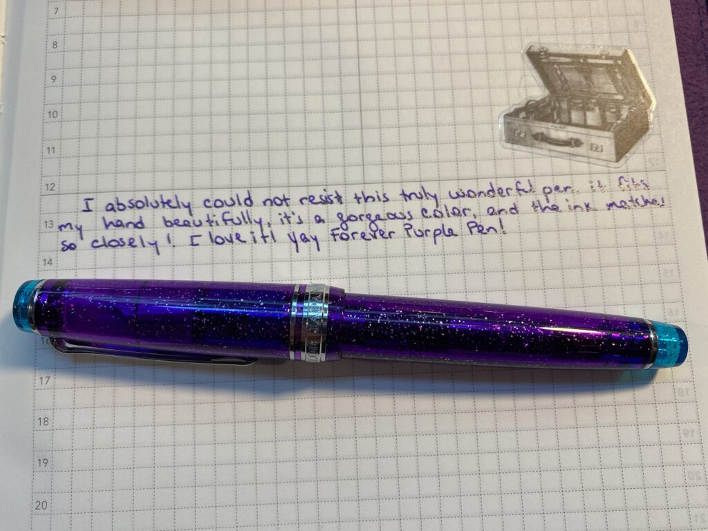
Which brings us to Forever Purple, the Sailor Pro Gear Slim. I forget which site sent me the email about the pretty purple Sailor pen but I made squealy noises when I saw it for the first time because it was the perfect purple and it had silver sparkles and I NEEDED it. It’s a fairly expensive pen, but it was around my birthday…so I decided it was okay to get it for myself for my birthday! (Husband helped haha). It was ONLY available at that point with the MF nib, which I had not tried yet, so figured I’d give it a go. I also had no idea what “slim” meant at that point, so when it arrived and I realized “slim” meant “smol” I was ecstatic. It’s a good bit shorter than regular pens (that’s a technical term “good bit” trust me look it up cough) and it has a slightly narrower (or slimmer!) barrel but not too narrow and it was light weight which is good for my hands. I was so very, very happy. And I had the perfect ink to put in it! Hayabusa was made for this pen. Not really, but LOOK at it. They match so well! 

I started writing with it, wrote well right off the bat, and the line this nib creates is so gorgeous. It’s such a clean line, not rounded, not to thick, not too spidery thin. Perfect. My new favorite thing. And I instantly decided to never put it down again haha. So I’ve been using it since April – and it does clog a little, like all of a sudden the ink I am putting down is ALL shimmer and then starts getting thinner and harder to get out of the nib. I usually just – gently – press down a little more than usual for some straight down lines and that solves the problem. I think I tried rinsing it once, but I am pretty sure that was another time I was all eye rolly about a shimmer ink not writing well and it was just out of ink, not clogged. I’ve been using it for about 5 months – and refilled it 9 times, ahem. I clearly use this pen more than the others by a good deal – even my Magic Green! The first seven refills were by dipping into the ink. The last two were with a syringe. 

These are my two favorite pens at the moment, and I do not foresee a time that I will retire them from my palette. I’ve come up with a lot of excuses to keep them in my rotation. For May I had a blue palette and decided the green and purple were helpful as accent inks. In July I had a summer theme – bright, vibrant colors – and I decided the green and purple were good grounding colors, because they are a little on the darker side. See? I can logic anything. 

And that’s it! Good story, eh? Thought so. I am sure I will add more to my Forever collection moving forward – for example I just inked up a Sailor Pro Gear Mini Slim MF that is blue with silver sparkles and put ColorVerse Cat in it. Which is a strong contender for possible future foreverness. I assume I will build a rainbow at some point, of forever pens. This sort of defeats the purpose of trying out new pens every month but I also think finding the perfect set of forever pens will take me a while, so I’ll allow it. 

The previous two photos combined.
Both pens and writing samples!

Apricot Tea vs Moonlight

I started the August Pen/Ink Palette with an ink called Apricot Tea from Kakimori in the Conklin pen. I pick my colors using my sample cards and the sample book where I wrote out some stuff on the kind of paper I usually use right now. I currently don’t pull the ink bottles until the day I am going to fill the pen – which might change in the future haha. 

A hand holding a very small clear glass bottle with a silver cap with an opaque orange liquid inside.
Look at this tiny adorable bottle of ink! Also check out the milky texture…

When I pulled this ink out of the drawer to ink my pen I hesitated. The consistency or texture of the ink was more…milky? Viscous. That’s the word I want. Instead of the watery consistency I am used to. It seemed odd. Different from the majority of my other inks. So I rechecked the sample book…seemed fine? And I shrugged and put it in the Conklin Coronet Orange to check it out. 

A notebook page with Kakimori Apricot Tea ink sampled on it in various ways. It is not blurry.
Kakimori Apricot Tea sample page, which is NOT blurry. Rar.
A sample card with an orange ish swap at the top, text reads “Kakimori Apricot Tea xxxooosssssss” and a silver cap is resting on the card, has a sticker with an orange ish dot and a sticker with (23) written on it. The sample card is resting on a notebook page. There is text written on the page, it reads “Why must this be so friggin blurry?? I love this color so much! Oh well.
Kakimori Apricot Tea – so blurry.

That’s when things started to go wrong. When I wrote with this ink in this pen it was really feathery. What I mean by that is instead of nice, crisp, clean lines, the ink sort of blurs and soaks further into the page, and if you look really closely you can see the ink sort of feathering out and blurring the edges of the line. I am sure there is a cool art application for this, but I am not an artist in the classical sense, so mostly this is just annoying to me. 

Zoomed in on the text “Why must this be so friggin blurry?? I like this color so much! Oh well.”
Look at the feathering! I actually had trouble taking this pick because I couldn’t tell if it was in focus or not!!! Do not like.
The backside of a notebook page where you can clearly see the ink showing thru.
Also look at this bleed thru??? It’s so bad! Moonlight didn’t do this at ALL and neither do my other inks, including the suuuuper dark ones I’m using this month!!

I thought maybe the ink just needed to settle, so I left the pen alone over night but the next day it was still blurry. Which makes me grumpy. So I started investigating what was going on – was it the ink? Was it the pen? Well, I had made the original sample in the sample book with my glass dip pen – which was not blurry, for the record. I figured a good place to start is by replicating that, glass dip pen, dipped into ink bottle, write on paper, see what happens. I was extremely disappointed to see that the ink blurred with the glass dip pen this time. I’m not sure what happened between when I sampled it originally at the beginning of the year, and when I sampled it this month. From what I’ve read it is most likely a difference in the paper between the books. But, it could be the ink deteriorating as well – or even something like temperature maybe? It requires more research yay! I do like research.

I had a bit of a conundrum – do I write with a blurry ink all month and be grumpy every time I do – meaning I prolly wouldn’t use the pen? Or do I swap it out, right now. After consulting with husband who I would need to help me with the psychical side of things (like rinsing out the nibs and converters for me), I decided to swap them. But which ink do I use instead?

Apricot Tea sample card looks more like the Moonlight page sample, and vice versa!

I narrow my inks down for the monthly palette usually into two sets of options. I have so many samples now that I can get some good variety and some subtlety, which means I sometimes end up with colors that are super close to each other in both palettes. For the Apricot Tea, it’s partner in the other palette was Moonlight of Higashiyama from Kyo Iro. They look very similar. This time, before putting it in the pen, I dip sampled it and wrote on the paper I’d be using it on the most. What was funny is the sample card colors are almost the opposite of the sample I wrote out that day.

There is a sample card on the right side of this image with an orange ish swap of color at the top, and the text says “Kyo Iro Moonlight of Higashiyama xxxooosssss” and has a silver cap resting on it. The cap has a sticker dot of the orange ish color on it, and a sticker dot with (6) written on it. To the left of this card on a notebook page is the following text, “So this one is a similar color but completely different look!”
Kyo Iro Moonlight of Higashiyama! And a clear line sample…

And the results were – Moonlight was not blurry, but was the right kind of color I wanted for that spot in my palette. Looks like we have a winner! I’ve used this one in the pen a couple of times now – just short writing – and it looks good so far. So I’ll use this one for August and report back when I’m done! 

This kind of thing happens often enough that I am trying to think of ways to avoid this. For September I will be dip testing the inks before I decide on the palette finally for sure. The glass dip pen doesn’t always give me a good idea of what it will look like coming out of a pen, so I picked up a new metal tipped dip pen by Pilot – hope it shows up before September! I am hoping this gives me a better idea of what I’ll be seeing from the pen. What I’ll be looking for is how the ink shows up on the page color wise, how thick it runs, or how dry is the ink, how crisp are the edges of the line (although that is often more influenced by the nib you’re using, I’ve noticed), and how long it takes to dry. I might try dipping the actual nibs I am planning on using in the inks I am thinking about…not sure how that would work out…I’ll think about it, maybe give it a try. And let you all know how it goes!