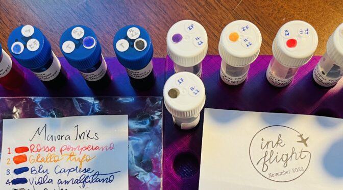
November begins! This month I got Maiora inks from Truphae and Octopus Fluids from Ink Flight! Interestingly named inks, I must say.
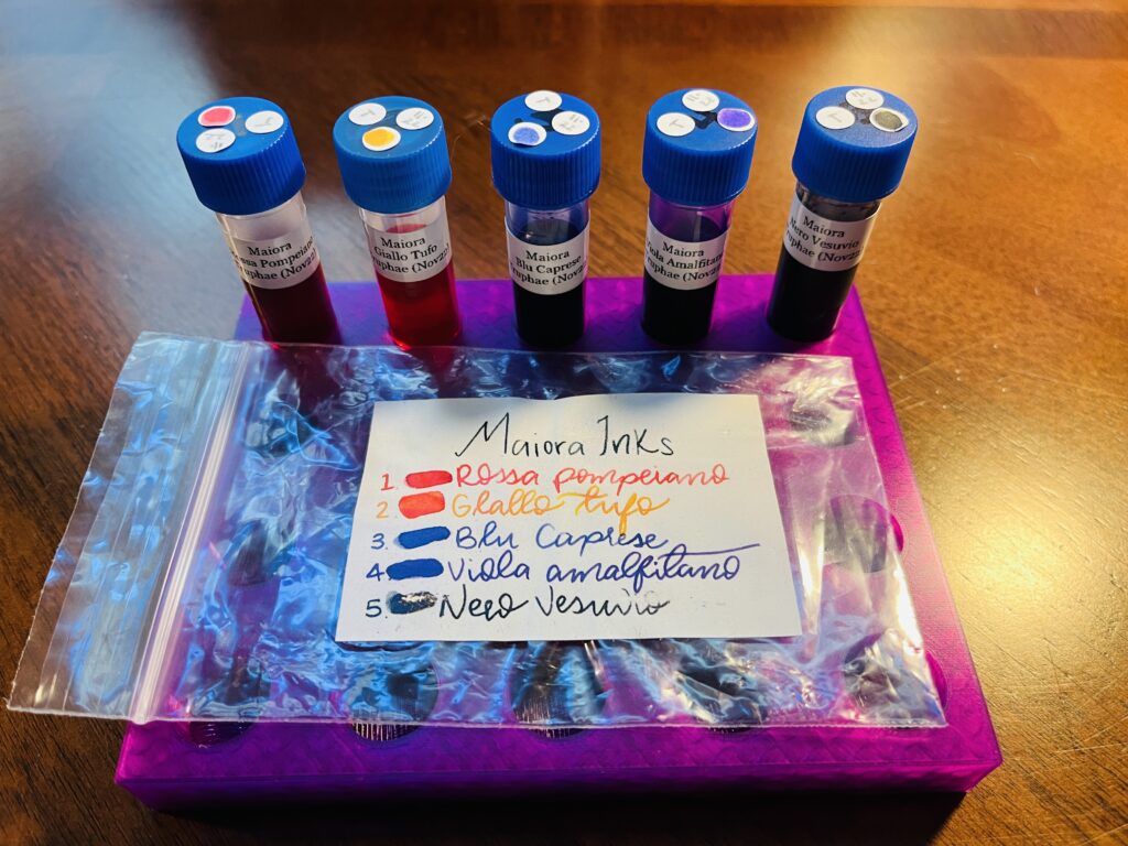
Maiora inks are made in Italy and are most often described as vibrant when googled. I have been super tired lately so I didn’t get to look into this brand as much as I’d like. I know I’ve seen other reviews of it and they have a good reputation.
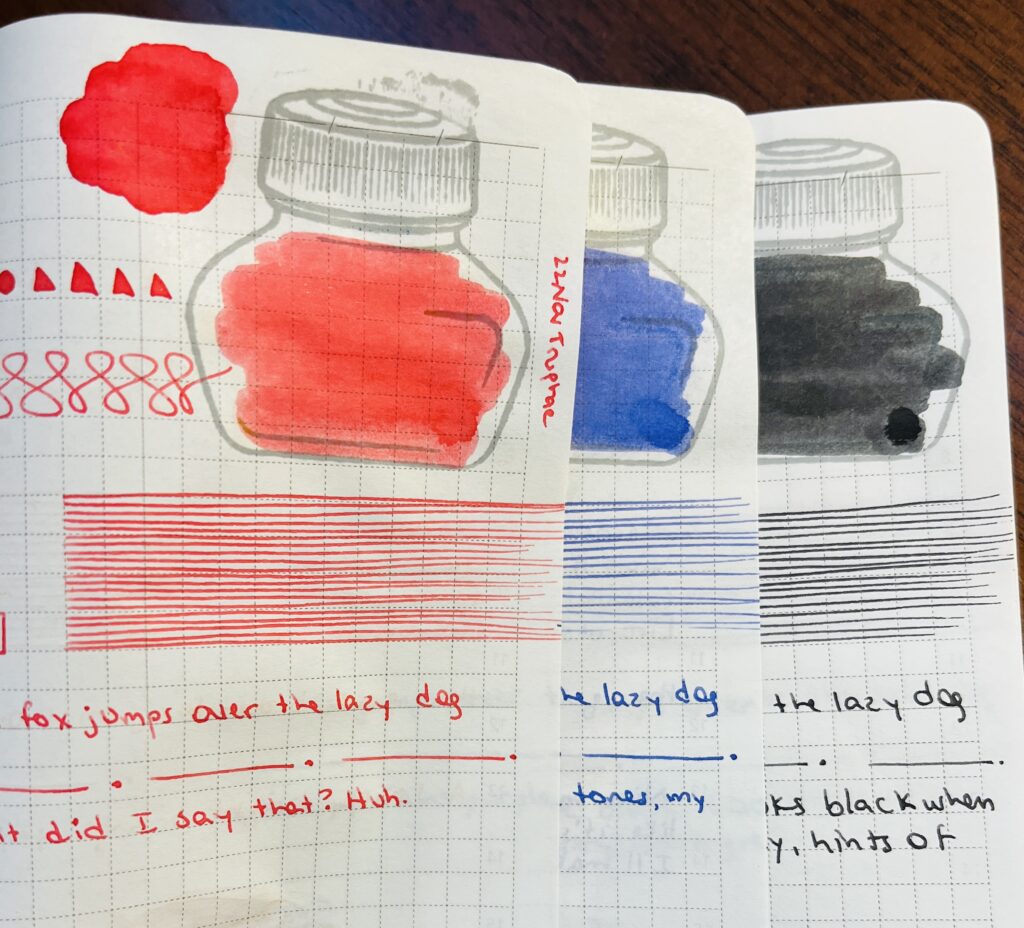
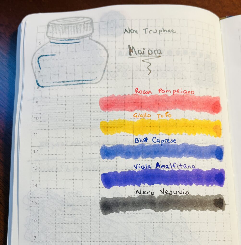
- Rossa Pompeiano, looks red in the photo but in person it looks like a nice pink to me.
- Blu Caprese, a purply blue, or a blue with faint purple tones, my favorite!
- Nero Vesuvio, tough to find a true black ink. Looks black when wet, but dries to a very dark grey, hints of brown undertone.
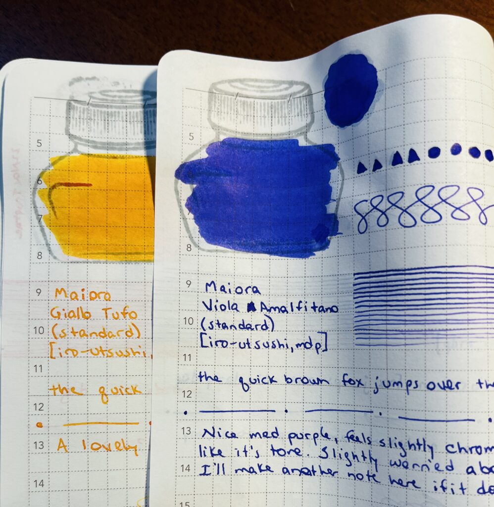
- Giallo Tufo, a lovely bright orange, yum!
- Viola Amalfitano, nice medium purple, feels slightly multi chromatic, I really like it’s tone. Slightly worried about staining my metal nib – but ended up fine.
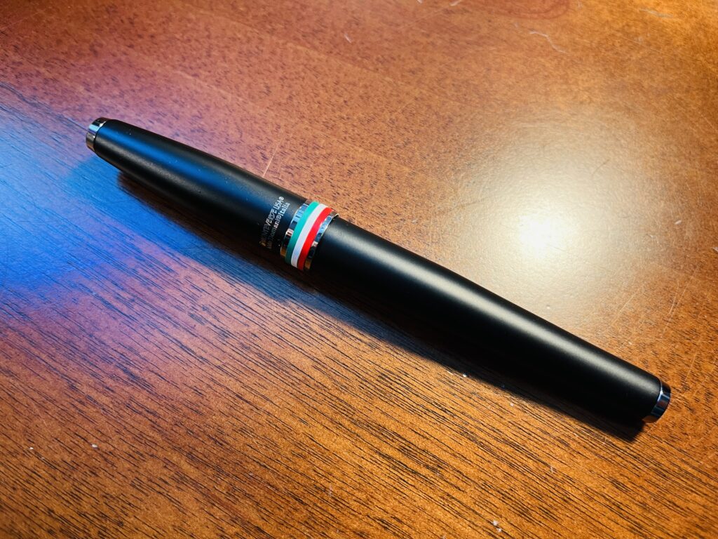
- I haven’t tried this pen yet, and I’m not sure when I will. The Monteverde pens I have tried I liked, but the coloring of this one isn’t something I usually use.
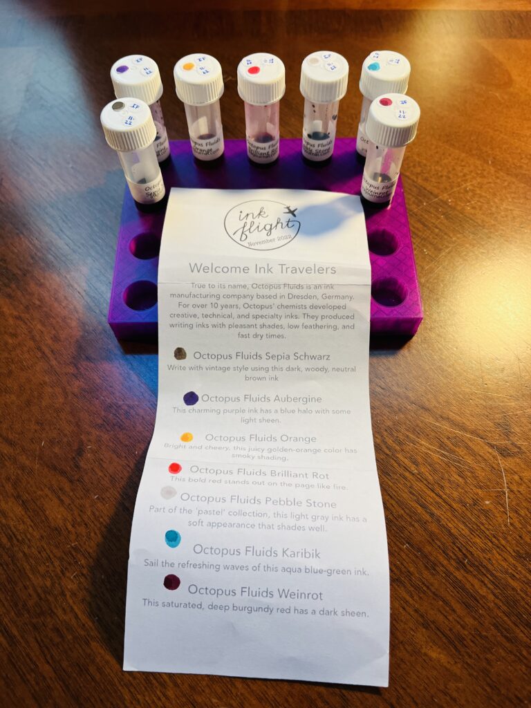
Octopus Fluids – these inks are pigmented, water proof and smudge proof – I think. Because of that I was super careful with them when I did the samples, and I expected to have some trouble keeping my metal nib clean. I only had an issue with one ink which I’ll describe below. I will include the text on the piece of paper that describes the inks below my own thoughts and in quotations.
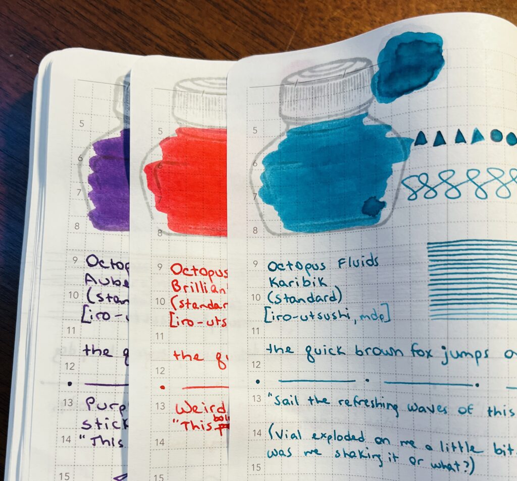
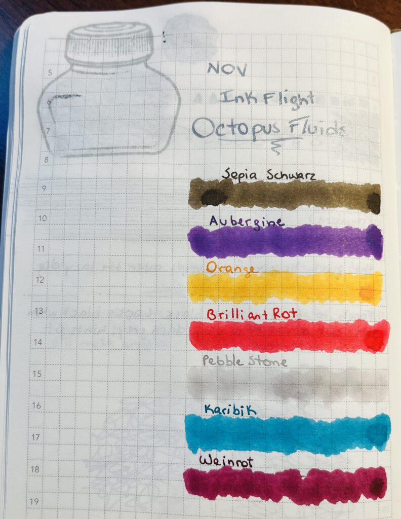
- Aubergine, purple! It’s pretty! Concerned about how sticky it is though. I had some trouble getting it cleaned off the holder for my metal nib. And I did not see the halo or the sheen, but that might be the paper I am using.
“This charming purple ink has a blue halo with some light sheen.” - Brilliant Rot, weird name but okay! Very bright red.
“This bold red stands out on the page like fire.” - Karibik, nice turquoise, although I did get it all over me! I shake the vials gently before sampling and when I opened the lid it burst out all over me and my desk! I think it was me though and not due to the ink haha.
”Sail the refreshing waves of this aqua blue-green ink.”
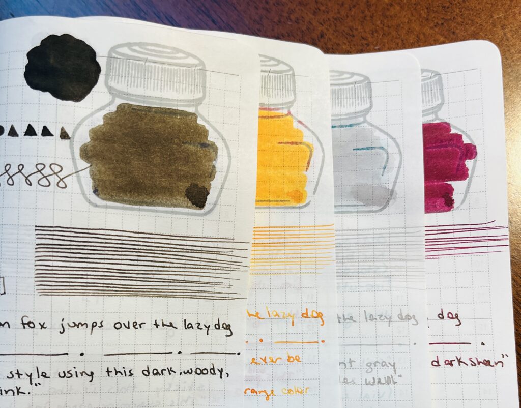
- Sepia Schwarz, kind of a smoky brown. I drew a tree. Which I will not be showing the internet haha.
“Write with vintage style using this dark, woody, neutral brown ink.” - Orange, pretty orange! Bright, yellow tones. Did not see any shading but again, could be my paper.
“Bright and cheery, this juicy golden-orange color has smoky shading.” - Pebble Stone, very light grey, and I thought I saw some purple hints in it.
“Part of the ‘pastel,’ this light grey ink has a soft appearance that shades well.” - Weinrot, dark maroon or burgundy I think, with very faint sheen.
“This saturated, deep burgundy red has a dark sheen.”
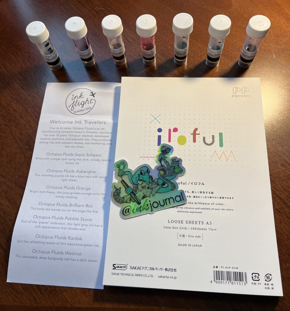
The inks turned out really cool, I liked all of the colors. I worry about pigmented inks in my pens and have even had warnings accompany some of them about not using them in that particular pen. Here is where I show my inexperience! Actually, the entire pack highlighted how much I still have to learn. For example, I thought this paper would be awesome to use, it’s a fancier grade and everything. But some of my pens end up sort of going dry and skipping when I write on it. Not sure why. Discovered a hard surface under the page instead of another page or a softer surface does help, but! Must still investigate. And I continue to love these stickers.
I enjoy how these subscriptions keep exposing me to new inks, pens, and accessories. I don’t know how long I’ll keep doing them but as of next month I’ll have been subscribed to Truphae for an entire year! They are certainly still fun.

