I have added Ink Flight subscriptions to my monthly fun! I had to, there are 7 samples per month, so of course I needed it. I also noticed they have some other fun stuff, like stickers or puzzles, and I thought heck why not. Trying new inks is a greatly pleasing and calming for me.
Anyway!
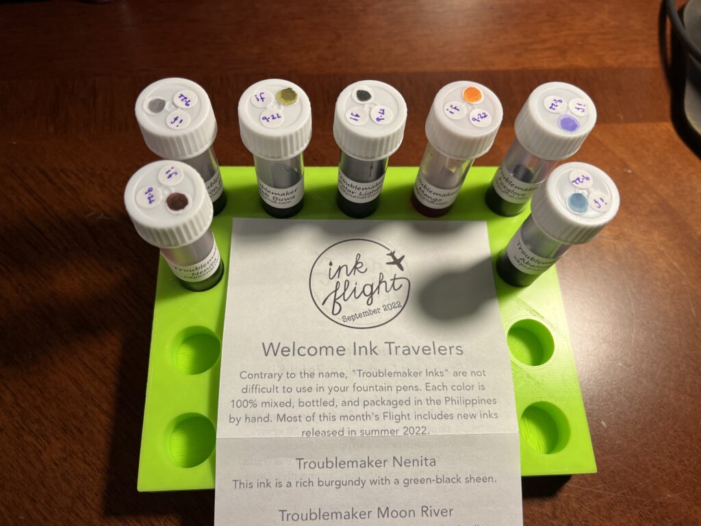
September Ink Flight Sample Subscription was for Troublemaker inks – which I haven’t tried yet, but now I want to get a bunch more! I enjoyed these inks a lot, they stayed on the metal nib, and applied to the paper pleasingly. There are several multi-chromatic inks, which are becoming my favorite thing these days, and the shimmer inks looked well distributed.
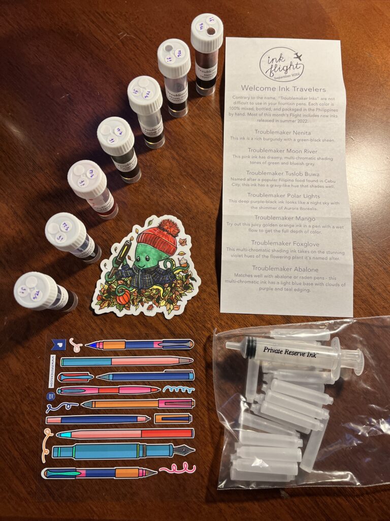
There was also an adorable sticker of an octopus wearing flannel and a knit hat, holding a pen and tea – clearly intended for my October Captain’s Log. The cartridge kit is something I am very excited about because I was thinking about getting into refillable cartridges so I can use some tinier pens and here comes this kit! And the pen stickers are shiny, which is delightful. I really enjoy the descriptions Ink Flight sends with the inks because I’ve been learning a lot from how folks with more experience describe inks.
Now for the inks!
Troublemaker:
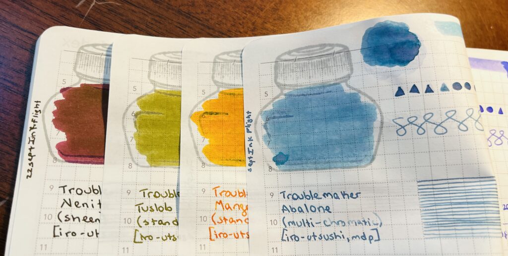
Nenita, Ended up sort of a maroon color but the green sheen on top made it more brown than anything else.
Tuslob Buwa, Goose poop. I think I have three different samples in this shade now…ew?
Mango, I really liked the color and the way it shades when written, I’ll be using this one in my October Pen/Ink Palette! (Monster theme, this one is for Pumpkin Head!)
Abalone, This is a really pretty blue, very much in the denim realm, but I would call this one a soft denim, it’s supposed to be multi-chromatic, but I wasn’t getting any of the lavender to come thru – maybe I need a different paper!
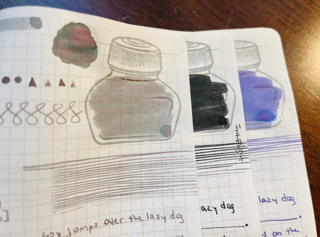
Moon River, I’d call this one a sort of grey ish lavender, doesn’t come across in the picture very well but it’s a really interesting multi-chromatic shading ink. I do like my weird grey inks.
Polar Lights, Sort of a super dark avocado green, looks black, but has a light blue shimmer that looks really neat in pools. Might be fun in a broader nib. The description says it’s a purple black ink and I super disagree! 😂
Foxglove, Fun shading lavender, light but should be fairly readable. I see pinks and blues in the multi-chromatic bits and these make me want to try a multi-shader palette some month! Maybe February…
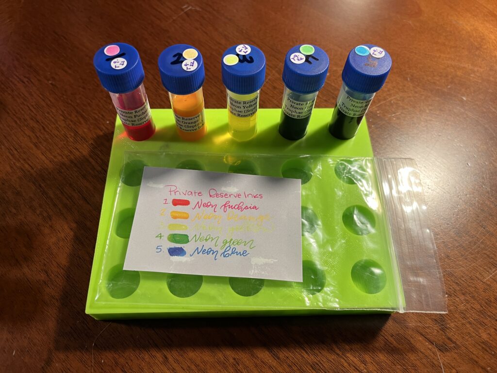
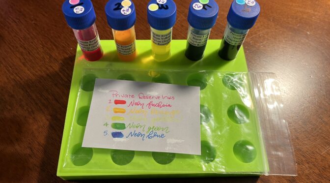
My Truphae Sample Subscription this month was of Private Reserve Neon inks. I think this is the third pack of Private Reserve inks I’ve gotten from Truphae so far. I’ll need to go back and piece things together, but I’ve sampled an Infinity pack and a Silvers pack prior to this, for sure. Anyway! Neons aren’t my usual thing, but I think I would like to try these out on a fountain pen friendly black paper at some point.
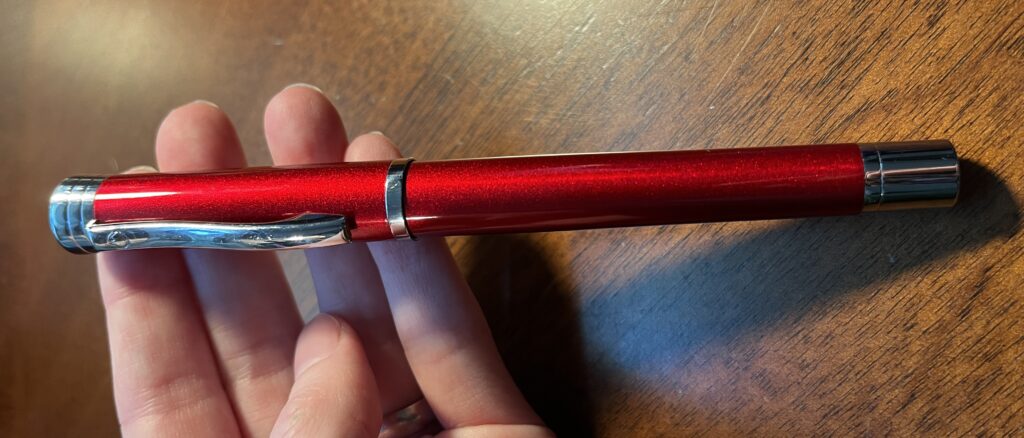
The subscription I have from Truphae includes a pen, and this month I got a Monteverde Strata, Red with a Fine nib. I got it in time to use for my September Pen/Ink Palette. I will talk more about that combo in the Palette post, but the reason I wanted to use it was the sparkly red finish, the weight felt nice in my hands, and I have had good experiences so far with Monteverde pens. It worked out well, and I’ll be using it in October as well!
Now for the inks!
Private Reserve:
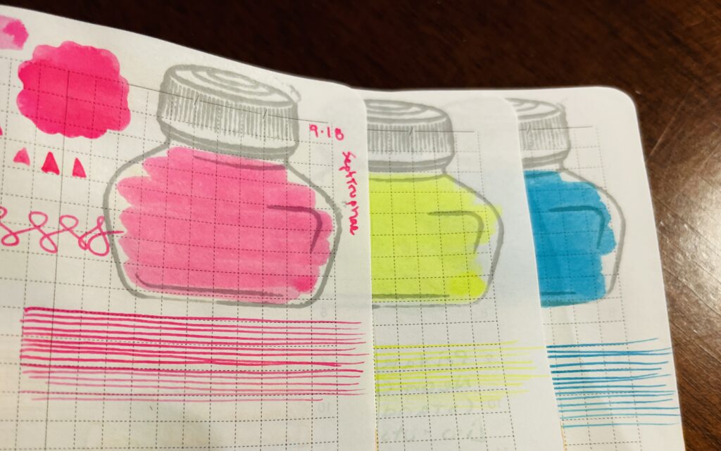
Neon Fuschia, this ended up being suuuuper pink, which is not my favorite color haha.
Neon Yellow, so bright, so unreadable! Curious how readable it would be on a black paper…
Neon Blue, as usual, this one was the darkest of the bunch. Not sure I would call it neon per se, but it is on the brighter side.
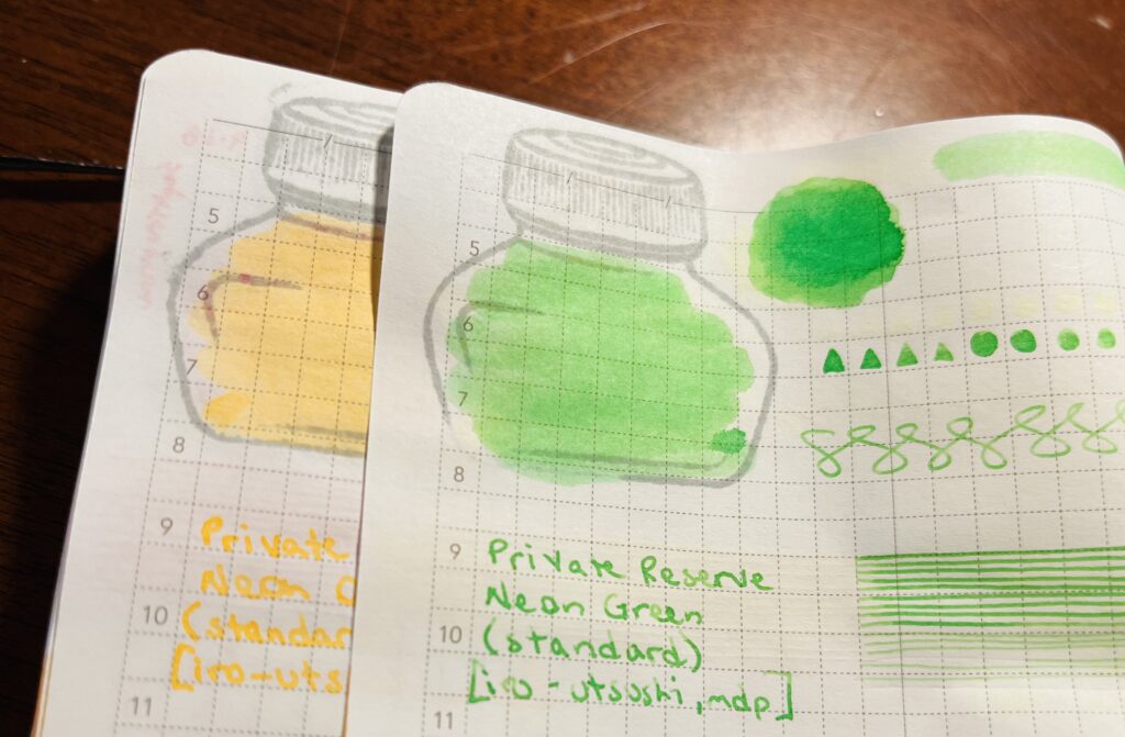
Neon Orange, very light, almost seems washed out, not as vibrant as the pink or yellow.
Neon Green, Not sure I would call this one neon either, but it is bright.
Over all, not sure I’ll end up using any of these anytime soon, but they will probably end up useful at some point! Now, where can I find nice and fountain pen friendly black paper…hmmm…
And that’s September!

