Tag Archives: Vinta

November Daily Samples, Review: 2022 Samples Review

Whew, using the word review twice in one title is super annoying. I’ll have to think of something better the next time I do this. Anyway – this month’s daily samples are using 8 different ink brands.
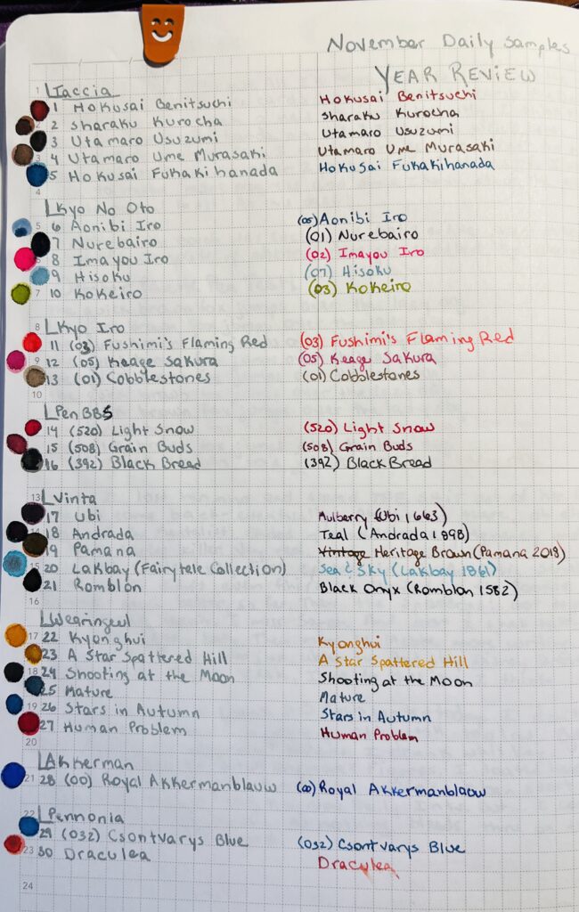
A notebook page with a list of inks (these will be shared in the posts below) written in silver ink and then rewritten to the right in the color of the ink named. At the top of the page the text reads “November Daily Samples Year Review” in silver ink.

I pulled each sample randomly from a pile that gives me enough samples for November and January. Then I grouped the inks by brand, so I’ll be showing them grouped like that here. However! I wasn’t thinking and did not take the opportunity to order them by number – if they had one – or by series – if they had one. So, in January, I have to remember that! But, let’s look at the November daily samples:
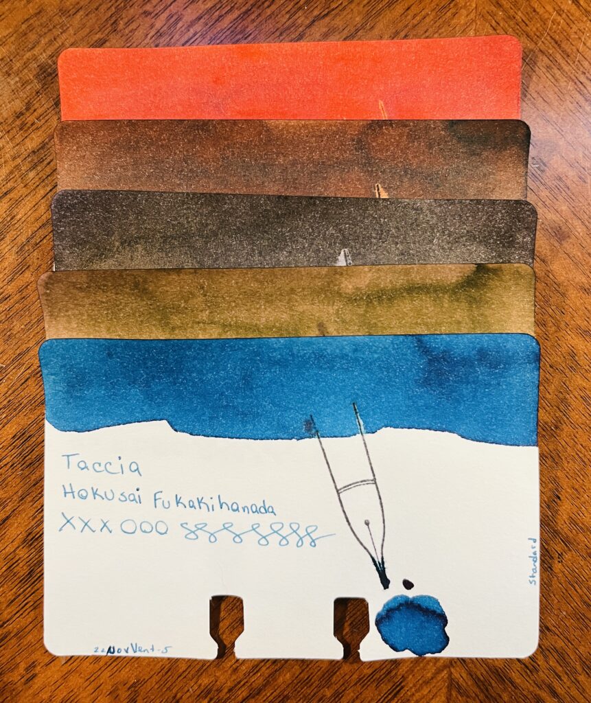
5 ink sample cards stacked on top of each other. Only the bottom one is visible, and you can see the ink swatch at the top, the name of the brand of ink, the name of the ink, xxxooosssssss, a stamp of a fountain pen nib, a pool of the ink, text at the bottom left reading “22NovVent-5” and on the right edge of the card is the text “standard.” From top to bottom there is a reddish ink, three various brown inks, and a blue ink.
Taccia: Hokusai Benitsuchi, Sharaku Kurocha, Utamaro Usuzumi, Utamaro Ume Murasaki, Hokusai Fukakihanada

Taccia:
Hokusai Benitsuchi: rusty brown, dark red with orange hints.
Sharaku Kurocha: Brown. Very straightforward brown.
Utamaro Usuzumi: Black, slight sheen.
Utamaro Ume Murasaki: A brownish pink.
Hokusai Kukakihanada: Ocean/whale blue – maybe not literally, but that is what it makes me think of?
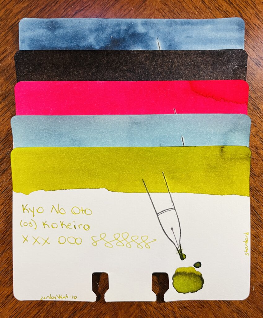
5 ink sample cards stacked on top of each other. Only the bottom one is visible, and you can see the ink swatch at the top, the name of the brand of ink, the name of the ink, xxxooosssssss, a stamp of a fountain pen nib, a pool of the ink, text at the bottom left reading “22NovVent-10” and on the right edge of the card is the text “standard.” From top to bottom there is a blue, a black, a pink-red, a lighter blue and a light green.
Kyo No Oto: Aonibi Iro, Nurebairo, Iamyou Iro, Hisoku, Kokeiro

Kyo No Oto:
05 Aonibi Iro: Mushy denim blue.
01 Nurebairo: I can’t tell if this is sheen or not? I feel like it is. Super darkest blue with just like…a wet colored sheen honestly?
02 Iamyou Iro: Bright pink, red tones.
07 Hisoku: Light to medium blue, readable, might be chromatic…
03 Kokeiro: Writes out like pea soup, dries to a goose poop greeny brown.
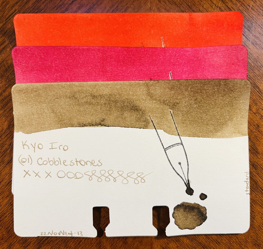
3 ink sample cards stacked on top of each other. Only the bottom one is visible, and you can see the ink swatch at the top, the name of the brand of ink, the name of the ink, xxxooosssssss, a stamp of a fountain pen nib, a pool of the ink, text at the bottom left reading “22NovVent-13” and on the right edge of the card is the text “standard.” From top to bottom there is a orangey-red, a pink, and a light brown.
Kyo Iro: (03) Fushimi’s Flaming Red, (05) Keage Sakura, (01) Cobblestones

Kyo Iro:
03 Fushimi’s Flaming Red: Bright red, leaning towards a dark pink.
05 Keage Sakura: Nice cherry blossom pink.
01 Cobblestones: A really soft brown, or a brown tuned grey? Perfect for cobblestones.
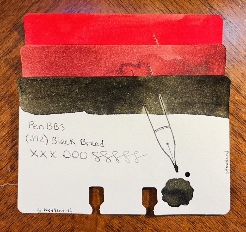
3 ink sample cards stacked on top of each other. Only the bottom one is visible, and you can see the ink swatch at the top, the name of the brand of ink, the name of the ink, xxxooosssssss, a stamp of a fountain pen nib, a pool of the ink, text at the bottom left reading “22NovVent-16” and on the right edge of the card is the text “standard.” From top to bottom there is a brighter red, a more sedate red, and a blackish brown.
PenBBS: (520) Light Snow, (508) Grain Buds, (392) Black Bread

PenBBS:
520 Light Snow: Fall red, orange tones when it’s written lighter.
508 Grain Buds: Makes me think of coffee, both to drink when it’s dark and to stain.
329 Black Bread: Black! A very dark grey is what it dries to.
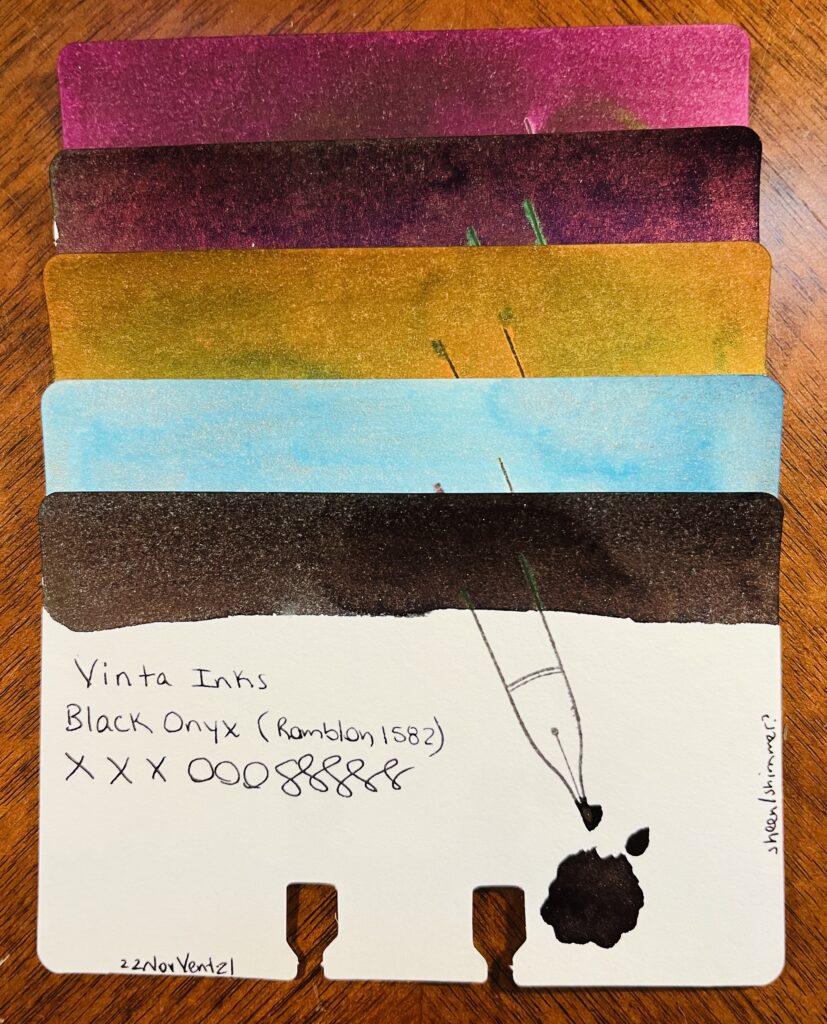
5 ink sample cards stacked on top of each other. Only the bottom one is visible, and you can see the ink swatch at the top, the name of the brand of ink, the name of the ink, xxxooosssssss, a stamp of a fountain pen nib, a pool of the ink, text at the bottom left reading “22NovVent-21” and on the right edge of the card is the text “standard.” From top to bottom there is a a light maroon, a darker maroon, gold, light blue, and a dark brown.
Vinta: Ubi, Andrada, Pamana, Lakbay, Romblon

Vinta:
Mulberry Ubi 1663: Mulberry purple, dark, only noticeably purple in the light.
Teal Andrata 1898: Dark teal hidden under a purple sheen – or at least it looks like an almost black purple, I suppose it could be read mixing with the teal?
Heritage Brown Pamana 2018: Orangey brown with a green sheen.
Sea & Sky Lakbay 1861: Pretty, light blue, pink shimmer, not sure how much the shimmer comes thru, but when it does, pretty! Kind of dirty looking in the swatch tho.
Black Onyx Romblon 1582: Black/green undertones to the ink, faint dark purple sheen, and a very faint shimmer? Can’t see it in the vial, just the swatches. In writing it’s hard to see because of the sheen so…secret shimmer? I like it tho. For a black ink, nice subtle colors if you look at it right.
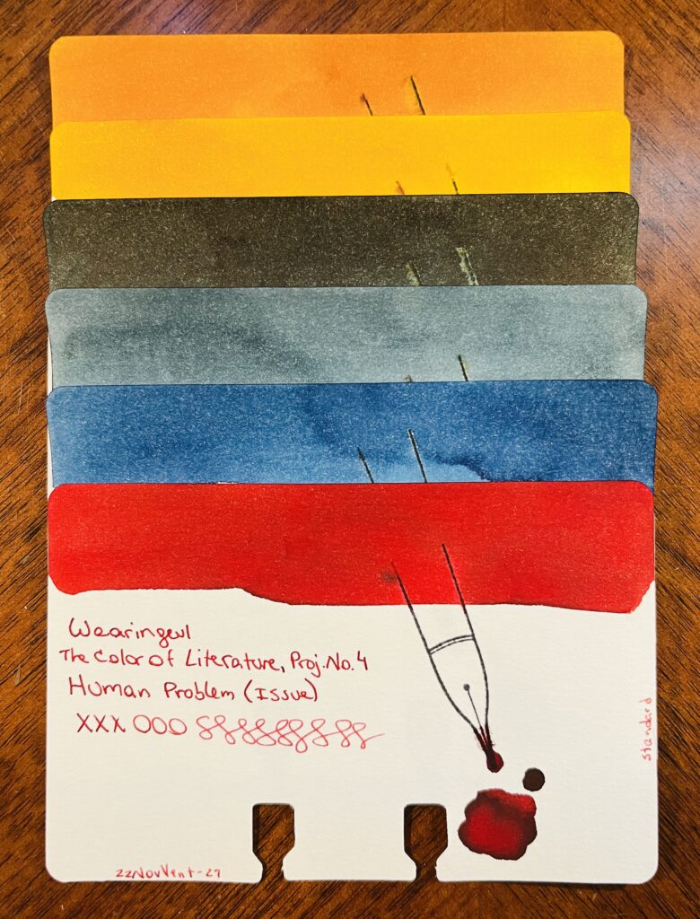
6 ink sample cards stacked on top of each other. Only the bottom one is visible, and you can see the ink swatch at the top, the name of the brand of ink, the name of the ink, xxxooosssssss, a stamp of a fountain pen nib, a pool of the ink, text at the bottom left reading “22NovVent-27” and on the right edge of the card is the text “standard.” From top to bottom there is an orange ish, then a yellow, a dark greenish, lighter blue, darker blue, and a bright red.
Wearingeul: Kyonghui, A Star Spattered Hill, Shooting at the Moon, Mature, Stars in Autumn, Human Problem

Wearingeul:
Color of Literature, Project 4, Kyonghui: A sort of tan gold…reminds me of the color you’d see on plastics from the 80’s.
Color of Literature, Project 1, A Star Spattered Hill: A buttery yellow, warm brown tone, gold shimmer. Pretty!
Color of Literature, Project 1, Shooting at the Moon: Dark ink with a faint sheen. The color reminds me of a night sky and that hazy halo that you can see sometimes around the moon.
Demian Literature, Mature: Medium denim blue, grey tones as it dries.
Color of Literature, Project 1, Stars in Autumn: Medium to dark blue with blue shimmer. I feel like I really like this one, the swatch came out really pretty.
Color of Literature, Project 4, Human Problem (Issue): Interesting that an ink called ‘Human Problem’ is the color of blood?
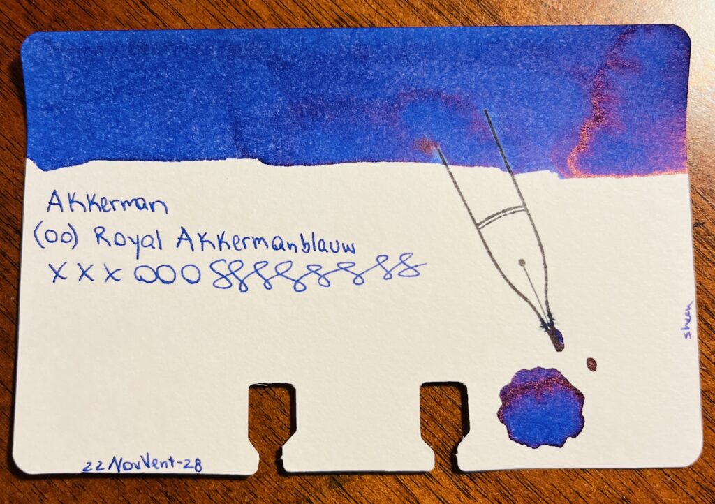
A single sample card, blue ink with a reddish sheen swatch on the top. The text says “Akkerman (00) Royal Akkermanblauw, xxxooosssssss and 22NovVent-28. On the right side of the card the text says “sheen” and there is a pool of ink below a stamp of a nib.
Akkerman: (00) Royal Akkermanblauw

Akkerman:
00 Royal Akkermanblauw: Medium dark blue, reddish sheen, looks purple. Subtle.
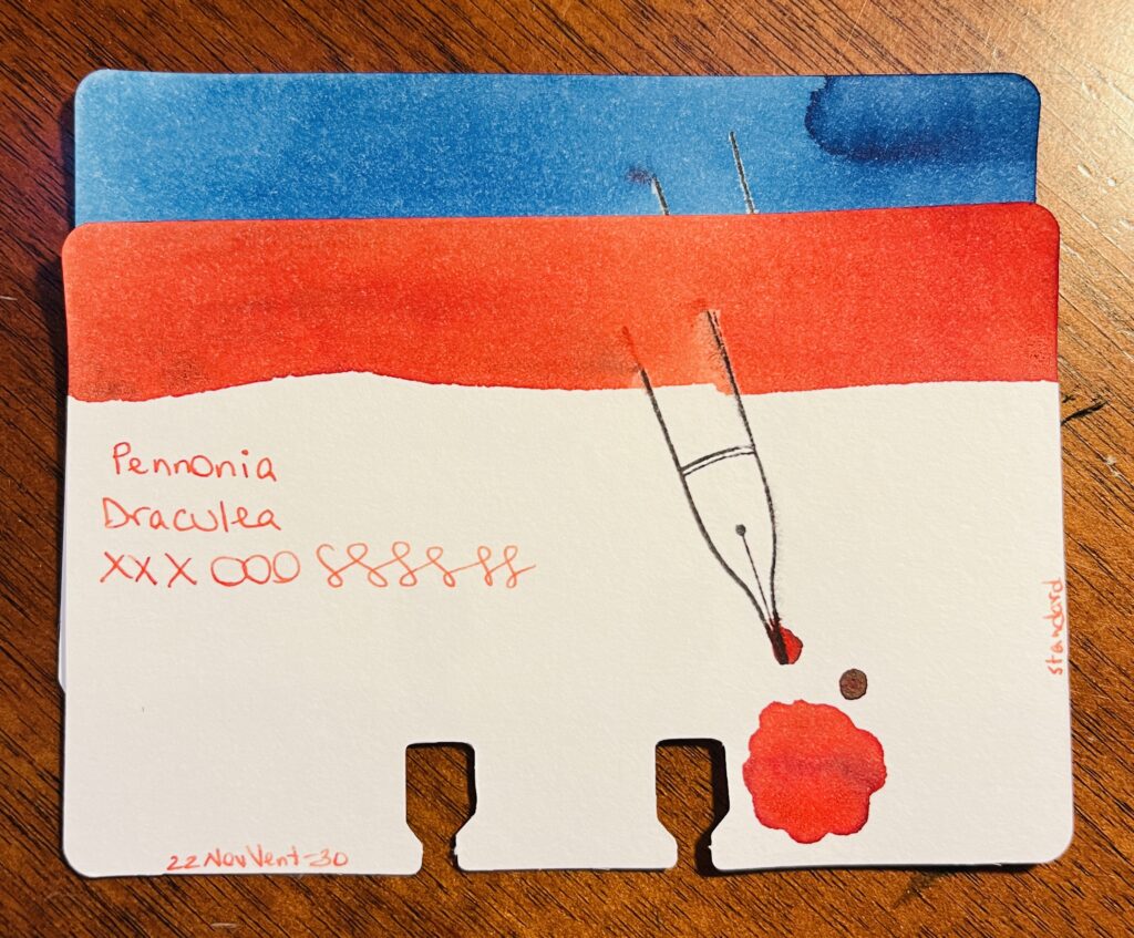
2 ink sample cards stacked on top of each other. Only the bottom one is visible, and you can see the ink swatch at the top, the name of the brand of ink, the name of the ink, xxxooosssssss, a stamp of a fountain pen nib, a pool of the ink, text at the bottom left reading “22NovVent-30” and on the right edge of the card is the text “standard.” From top to bottom there is a lighter blue and an orange ish red.
Pennonia: (032) Csontvarys Blue, Draculea

Pennonia:
032 Csontvarys Blue: A sort of sky blue with denim darker blue tones.
Draculea: An orangeish red? Or a reddish orange? Sort of a fall color.

It was nice revisiting these brands. I am looking forward to finishing out these in January!
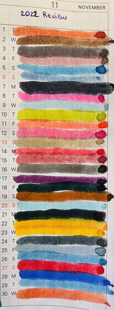
A notebook page with lines of ink colors on lines numbered 1- 30. At the top in a purple ink is text reading 2022 Review.
Month of iiiiinks!
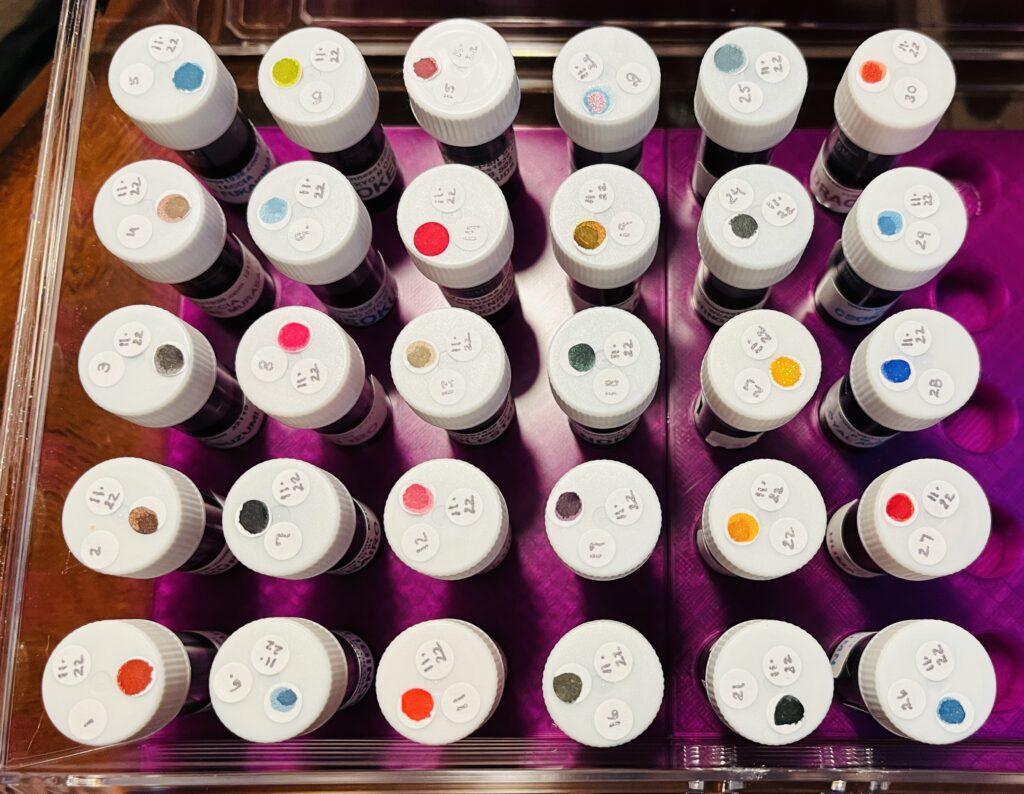
30 ink vials from the top, only the white caps can be seen, each has 3 stickers. The vials are labeled 1-30, and each has the date 11.22, and each has a single color dot.
Look at all of those pretty vials of ink!