February Palette Review!

Hullo folks, this one is being posted suuuuper late because February was a ROUGH month in our house. Lotsa meltdowns, broke my favorite fountain pen (Magic Green), lotsa possible exposure to covid, all kinds of fun stressful things. But never mind! Let’s talk pens. And inks. Fun stuff for real real.

Pen/Ink Palette:
My theme for February was our wedding colors, purple and green because I do not like reds and pinks so when I think of love, I think of those colors! I did include one pink but it was more of a peach so, cheated a little bit.
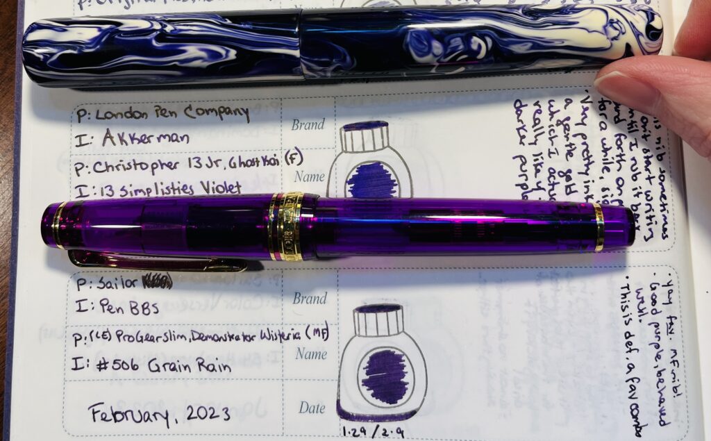
Two pens on a palette journal page. One is a slightly translucent warm purple with gold trim, and the other is a swirly cool purple mixed with white.
Sailor Pro Gear Slim and a London Pen Co. Christopher 13 Jr., loved for different reasons haha.

Favorite:
I had a tie in favorites this month. Both of these pens worked so well with the inks in them – and NEITHER ink was a shimmer! Yeah, surprised me too. I had Akkerman 13 Simplisties in the London Pen Co. pen, and PenBBS #506 Grain Rain in the Sailor. They were very soothing to write with which I definitely needed the latter half of the month. Very reluctant to put these away when the ink ran out!

Least Favorite:
I am going to write about the Magic Green drama in another post, so I’ll put a different pen in this spot.
There were actually a couple of pen combos I was having trouble with this month, I really need to stop buying vacuum pens for example. But the least favorite I settled on was a Mad Science Pen Company pen with a 1.1 stub nib and Diamine Inkvent 2022 Alpine. Pen worked great, fine performance flow wise. But the ink was basically black on most of the papers I used it with. Very very faint green in the right light. Silver sheen was pretty visible, but I found the whole thing kind of unappealing. So I think I found one of the few shimmers that looks WORSE in a broad nib! I will do a comparison. Some day.

Learned:
Uhm. I think the biggest thing I learned was really WHY the Magic Green pen was magic for me. Oh and that I really do not like vacuum pens. I have 3. I think I am done at this point haha. Oh and the Osprey nib was annoying – I don’t think flexible nibs are for me. Two years in a row I had a very disappointing February pen/ink experience. Ah well. Third years the charm right?

Daily Samples:
I forget exactly why I picked up so many PenBBS samples but. I did. So another month of PenBBS samples! I do like how these inks behave overall, so this was a nice, chill, reliable start to my day!
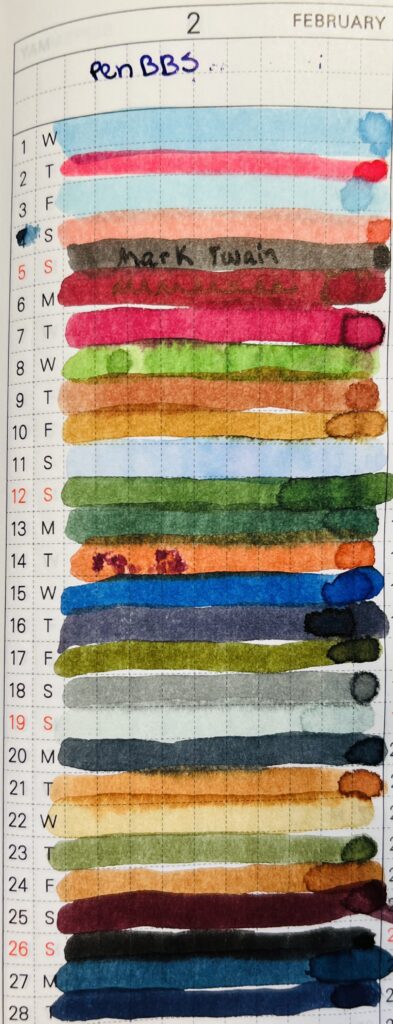
“PenBBS” and “February” are at the top of the page. There are 30 different colored thick lines of ink. Each line is numbered 1-30.
I have started using this part of the notebook to find colors I want to use for my palette – and it is brilliant.

Favorite:
Honestly, I was mostly just enjoying how the ink performed. But wasn’t too excited about the colors this month. I did enjoy the weird of #408 Xiamen on the 11th. You can kind of see it in the photo how the ink sort of shades, it’s mostly a pastel blue but there are brief and very faint hints of pink. It’s too light to write with but I bet the chromatography of it is going to be SUPER fun. Whenever I get into that.

Least Favorite:
No real strong feelings for the daily samples this month so I guess I’ll go with #387 Mark Twain because it ended up being a pretty basic black. I don’t think I have ever used a black ink. Nor will I!

Learned:
I should probably stop just buying sets of ink to get all of the numbers. Maybe. But it is easier. I am not sure how much longer I’ll end up doing daily samples, which I realized this month. I still find it soothing, and I still appreciate including it in my daily routine. And I DID just start a year long planner for this haha. I probably won’t abandon this until I find something else to replace it, but I will be building some fairly odd palettes in future, often augmented by the Subscriptions samples.

Subscription Samples:
Nope! I got Truphae and Ink Flight but I did NOT sample them in February because for my March Daily Samples, I only had 20 inks. And 12 samples fills in the last 11 needed nicely.

So that’s it. I was incredibly focused on March starting for a couple of reasons – I am trying out planner specific stickers in March from HubmanChubgirl for one, which could be fun – and for another thing, it would be a brand new month to hopefully not go horribly. Also, one month closer to my birthday, yay!
Thank you for your patience my delightful readers!

Letter 5, Auster to Verin: “BookMark!”

Whew V, do I have a lot to tell you! 

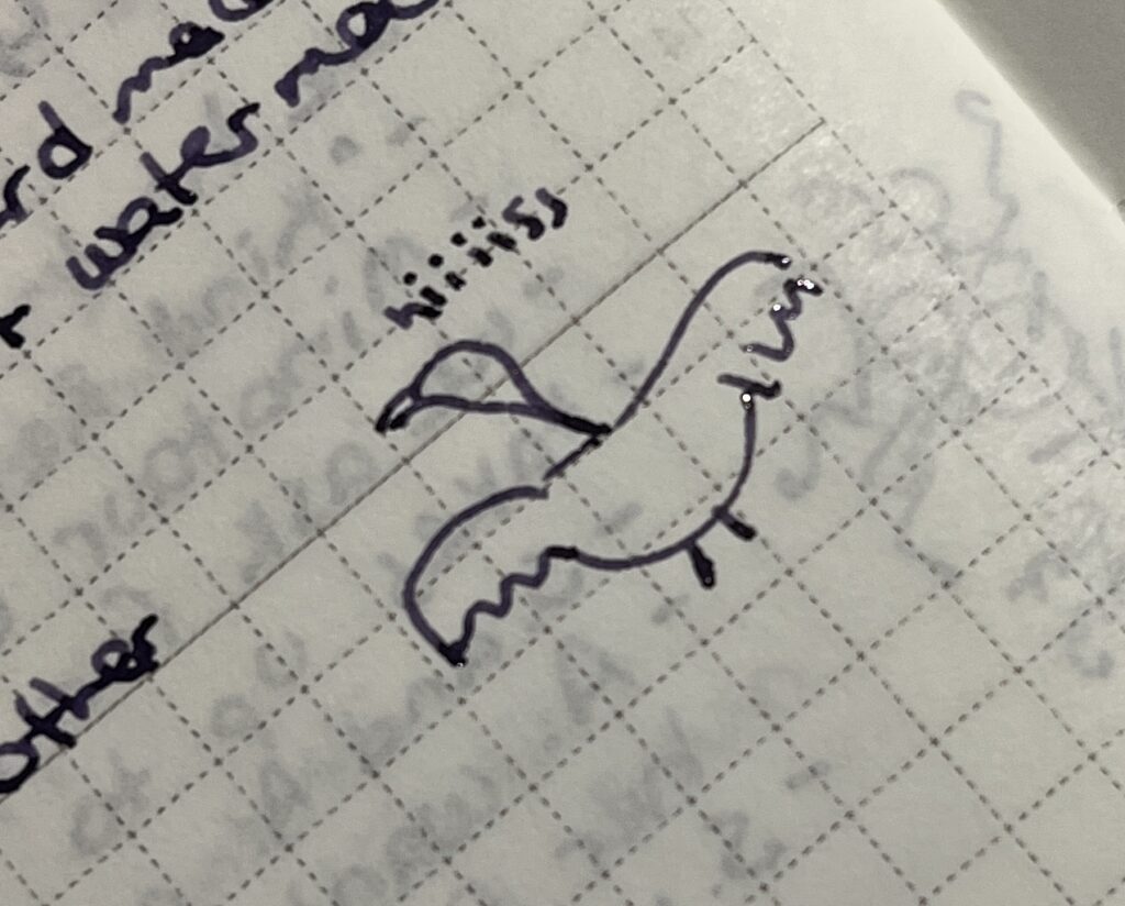
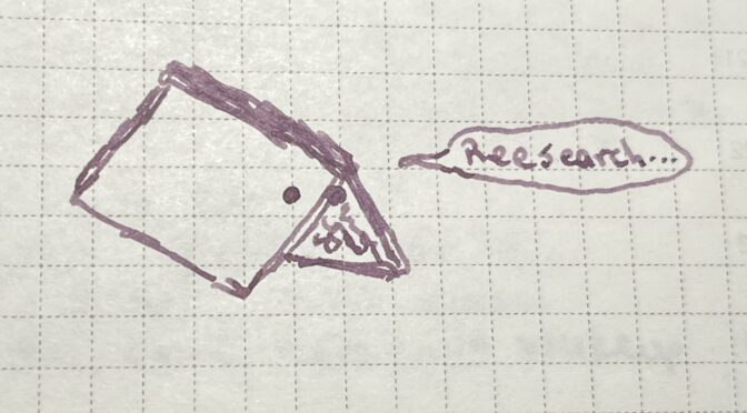
A very bad line drawing of a half snake half goose saying “hiiiiissss”

But first – sneese SUCK. They’re half snake and half geese and all mean! I did not enjoy that bit, but I got rid of them by making balls of light for them to chase. Smart, right? Yes. I am smart. 

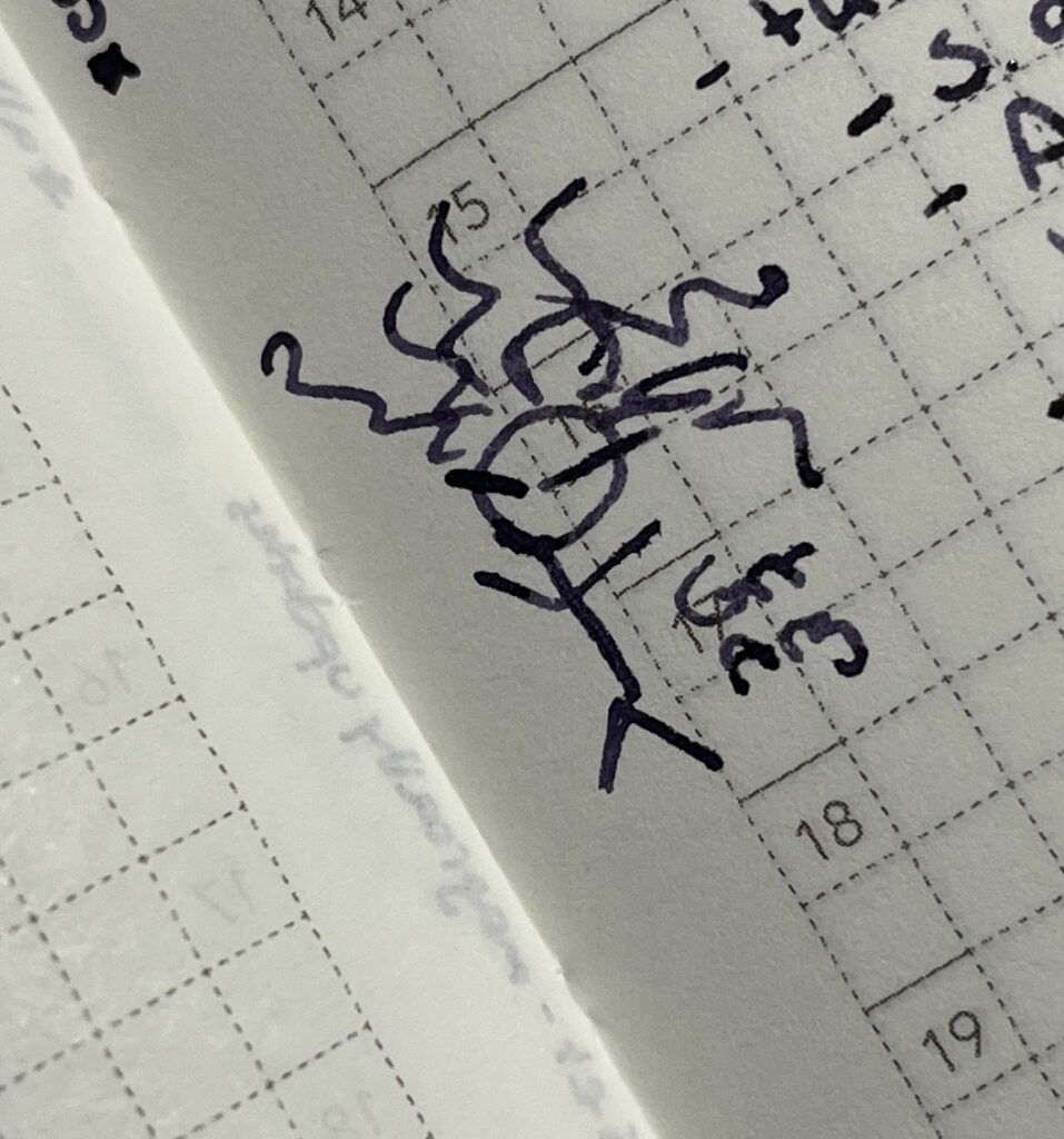
A very bad line drawing of a Gorgon, saying “Grrr Arg”

This was on the way to investigate that Gorgon thing, and was not what we thought! She’s under a curse, because she said she thought she was prettier than the Goddess Mithra, who apparently took offense. So now as a Gorgon, this poor lady has to guard the Eye of Shar – yeah I don’t know what that is. YET. 

We headed back to the Library because I had some serious research to do, and turns out Mithra and Ioun and Shar are triplets! Go figure, right? Shar hasn’t been seen since the Portal Wars tho, which is like, forever. Her followers are still around but their religion sort of collapsed into some kind of cult when she disappeared. They are very bad news. There might be a secret temple tho! Seeeeecret TEMPLE. Fun. 

Oh, while I was doing this research? Yeah, you know my notebook? The one I carry around all the time and am scribbling in constantly? I had that open on a shelf while I was looking something up, and a spectral version floated up out of it and suggested another place to look. Out loud. My book was talking to me. Not the weirdest thing to happen to me, but still. I named him BookMark, we call him ‘Mark for short and heck does he like to do research! And he is good at it, we make a good team.

However the Library did not have a ton on Shar, and Patricia, the head librarian? She suggested we go try the Library of Tyr, which is where Speak was, so perfect, and we haded there. Speaking of secret – they have secret areas in their library that only I can see the entrances of! I felt like the coolest kid in town. And ‘Mark picked up another word to repeat at odd times – “research” from before and now “knowledge” which was the secret passcode to get into the secret room in the library. 

Anyway. Confirmed Shar is bad news, probably super evil, and her sisters locked her away. (Don’t get any ideas, you.) 

We have to head back, Speak got put in charge of a sort of rescue mission and I want to stay with her. She keeps me safe. Like you used to. I miss you so much! This adventuring stuff is scary a lot, but mostly very fun? I hope I am getting better at all of this! Hope to see you soon, love you oodles and doodles!

For true and always, 
Auster Truestone

Letter 4, Auster to Verin: “Home Library”

Hey V, just a quick note, we are swinging thru town to grab supplies and so I can drop off the TWO books I have recovered. That’s right. Two so far. I am the awesomest. While I was dropping those off at the Library, I got my notes copied so far, in case…well. In case. And so folks here can do some research if they want. I used to do that when I was still beginning here – taking neat adventurers notes and turning them into something readable and researching the things they came across…and now I am the adventurer! I feel so cool right now. 

Oh and I looked up the Goddess Ioun and like…I should be careful with her, but I think it’ll be okay because she is the Goddess of Knowledge and like…that works? For me? I need to do some more reading… poor me. 

I heard about some artifacts you might be interested in, but we have to go check out a possible Gorgon situation, so I am going to go do that! 

Hope you’re having as much fun as I am! Love you oodles and doodles.

For true and always, 
Auster Truestone

Letter 3, Auster to Verin: “Tower Stuff”

Verin!!! You will NOT believe what I have been up to!! 

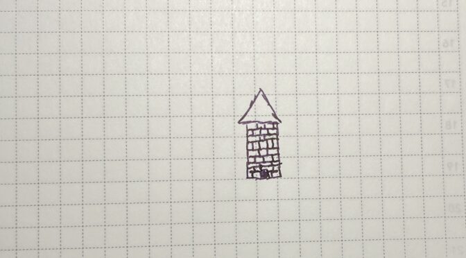
Okay, so you know that last letter, I said I was heading to this tower with my friends? Okay, well, we got there. Also, I am not good at drawing maps. Oh and I found a shiny rock.

So this tower is bonkers, half of it fell into the ocean ages ago, and of course the bit we wanted was under water. To get to it, I had to swim. I did not like it Veri. I did not like it at all. I am not good at swimming!!

Oh but while I was trying to do that, Speak got me some Demonic Octopus Ink! It is impermeable to water!!! Which is so neat. I am going to try and see if I can make something like it for my own inks, that would be super handy. 

Okay so this tower, right? It has a copy of every book every written. Seriously. I was just looking around and FOUND one of my missing books! Well, not the exact book that is missing, this one is newer but STILL. I am so excited. 

While looking for a book to give us any idea of what is going on in the tower (these guys are fighting over a glowing orb, I wasn’t really paying attention) I ended up getting cursed, TO NOT BE ABLE TO READ ANYTHING VERIN. NOT COOL. While I was freaking out about that, the Goddess Ioun spoke to me. And if I agreed to dedicate myself to her, she would fix the curse. Veri, I can not explain to you what was happening in my head at that moment, I was devastated, and panicking, and …oof even thinking about it getting me all worked up, so! Long story short, I agreed, curse lifted, I am dedicated to the Goddess Ioun now, no big deal.

Anyway! I found a book with a ton of info in it but Veri, it was written in CELESTIAL. I told you it was worth learning. You all laughed at me, but I told you. AND IT HAS AN INDEX. Oh I was in heaven and I just started inhaling the thing thru my eyeballs while everyone else did a bunch of other stuff (super was not paying attention ahem, book). This book is so cool I can’t wait to show it to you! This is where I found out about this tower containing every book ever written, and there are these automatons that will bring me any book I want! This is, of course, at the base of the tower. And we were in the top. So. Useless at the moment, but I am going to get back there! Ooo maybe we could go together!

Uhm, things got a little chaotic and we had to kind of run away, but! We used these travel circle things and I took a bunch of notes (as usual, hush) and sketched the symbols and what not – I want to show you when we meet up again, I think you would be really interested, seems like your kind of thing!

Well, we’re going to head back to town in a bit, so, I’ll just send this off to you now. Hope you’re doing alright! Miss you sis!

Love you oodles and doodles! 

For true and always, 
Auster Truestone

January Review: All of the things!

Okay, let’s take a look at what I played with in January. Second January I have been doing all of this by the way! I remember being super frustrated with shimmer inks January of 2022. But I have learned a lot since then – still more to learn tho, haha. Keeps things interesting. 

Pen/Ink Palette:
I went with “Ice” as a theme, and picked out some really pale and icy blues, purples, and teals. I actually enjoyed every single pen/ink combo. It was tough to pick a favorite. One thing that ended up being a little annoying was having my Magic Green and Favorite Purple pen still being inked but I didn’t use them very much. Considering putting one or both of them away.

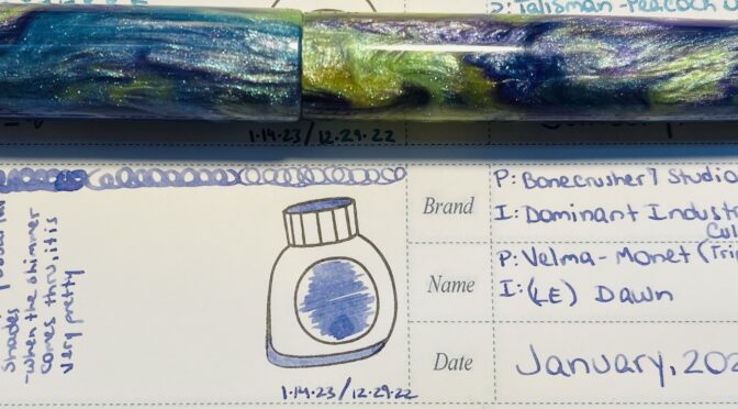
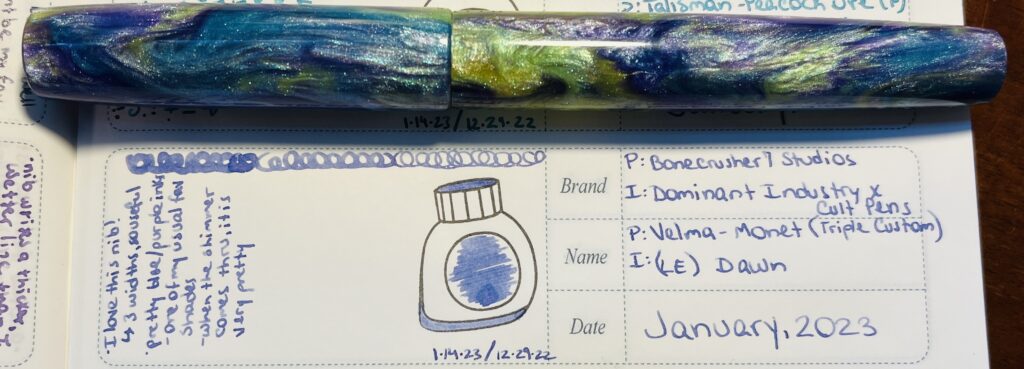
A blue/purple/yellow sparkly pen placed horizontally above an entry in a notebook listing the name of the ink and pen, a sample of the ink in an ink bottle stamp, and a brief review.
I use a notebook from Ink Flight to record the palette’s I use every month. Here you can see my comments on this combo: “I love this nib! 3 widths, so useful. Pretty blue/purple ink, one of my usual favorite shades. When the shimmer comes thru it is very pretty.” And on the right I list the pen and ink details.

Favorite:
While it was tough to choose, the one that ended up being my favorite combo was a Bonecrusher7 Studios pen, using a custom three-grind pen from Jose Munera, and filled with a limited edition ink, Dawn, from a Dominant Industry and Cult Pens collaboration. The ink really worked well both from the 1.1m stub grind, and the MF grind side. I’ve played with different custom nibs before and often the ink only looks right from one side or the other, so I was happy to find a combo that worked well with all of the grinds on this nib. 

Least Favorite:
This may have been my own fault, but my least favorite combo was an Iron Feather Creative pen, filled with A Watery Star, from Wearingeul. I don’t think it was the pen or the inks fault, but it ended up writing a much different blue than I expected, way darker, and bled thru the paper! Completely wrong from an ink I sampled as a shading medium blue with shimmer! But after a couple of days I got to thinking…I had put Thunderbolt from Diamine in this pen the month before, which looks exactly like the dark ink coming out right now…so maybe the nib wasn’t cleaned out enough? Something to keep in mind when I am cleaning it this time! I am going to use the cleaner liquid this time instead of just water. 

Learned:
I’m betting the things I learn every month will end up being from whatever my least favorite pen/ink combo was. Like, in this case, I learned that even if you THINK the nib is clean, it might not be. And I need to look into some more ways to make SURE they are clean when I am done cleaning them!

Daily Samples:
Okay, I ran into a conundrum. Last year, when I had decided to go back thru every ink brand I had sampled in 2022 and pick up the last couple of each that I hadn’t sampled yet, I ended up with…a lot of inks. More than I could sample one a day in November. I decided not to worry about it at the time haha, and so January 2023 was arriving…I discovered I had enough PenBBS samples for another whole month…which is what I am doing in December. Then the hodge podge that was left meant I needed 10 more samples for the month of January, and since I get 11 with the Ink Subscriptions I get monthly I thought, you know what! And just added them to the Daily Samples for January to fill that out. And I got super lucky! I had only previously sampled one of the inks from the Ink Flight subscription. Hooray! 

Therefore! This section will be just touching on the samples that I did not get in one of my subscriptions. 

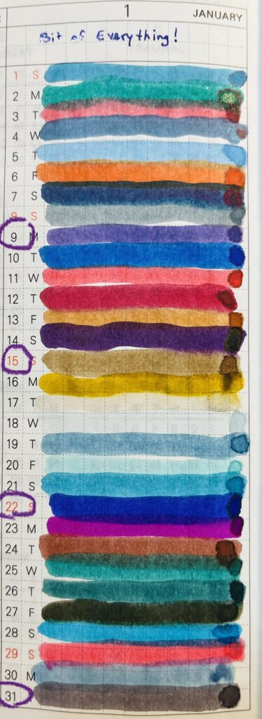
Lines of ink colors applied to a Monthly planner section that gives one line to every day. The numbers 9, 15, 22 and 31 are circled.
So many colors! I circled the dates for the inks I will reference below, 9, 15, 22, and 31.

Favorite:
A purple, so surprised. Taccia Naka Murasaki (January 9), a solid cool purple, and has that “dusty” feel that I like. I think this will go quite nicely in any of my purple palettes, and it is on the darker side, so easy to read. Probably going to be a little tough to tell it is a purple in darker lights tho.

Least Favorite:
Another surprise, my least favorite was a brown. (Being sarcastic by the way haha). Kyo No Oto, #10 Ochiguriiro (January 15). It’s a softer brown, which shares a little to a darker brown, has sort of deep yellow tones, and…I just don’t like browns. If you like browns, this is probably a good one tho, it behaved really well on my dip pen. 

Learned:
I don’t think I can completely guarantee that I have no brown ink samples in any of my reviews, but I can certainly try! This is definitely confirming for me that random ink samples are fun but only in small amounts, like the ink subscriptions. I have March figured out but I am going to have to do a think about what I am going to do in April. 

Ink Subscription Samples:
As I said, I actually sampled these in my Daily set, but I still! Gets it’s own section. And I got to play with Lamy inks from Truphae – which I have never tried before – and Anderillium from Ink Flight – which I have tried before, but out of the 7 I had only sampled one before. Also, I keep getting Monteverde pens in my Trupha subscription box haha, and the one from this month has not been tried yet! Next time I need a red pen I guess. 

Favorite:
The Lamy inks were all vaguely sheen-y inks, seemed to be a jewel themed pack. I ended up liking their Azurite (January 22) out of all 11 the best. It’s a very blue purple with a light green subtle sheen. I am guessing the sheen will only present itself in finer nibs by taking one thousand years to dry but otherwise I’ll need a broader nib to get it to show up visibly. 

Least Favorite:
For variety, let’s say the black ink, instead of the brown, was my least favorite…Anderillium, Common Loon Black (January 31). Nothing against the ink really, I just…think black inks are boring. Now! I could be wrong. But currently I have only seen one black ink I really enjoyed, and this was not it. Happy to be wrong some day tho.

Learned:
Well…I guess I confirmed that I am still sus of sheen inks, and I still don’t like brown/black inks no matter what. But maybe I was not paying enough attention…

Whew, let’s see what we’ve got next month, shall we?

Letter 2, Auster to Verin: “Chicken named Fry”

Hi Verin! 

Me again, your favorite sister, haha. We’re really on an adventure now! Kurtz has this chicken he named Fry, and we’re not allowed to eat him. Oh and I met a bunch of pixies and they really do like shiny things and I trained like, all of them, copper for their pixie dust. I am positive I have seen something about using it in ink, but I left my ink experiments book back at the library so I’ll have to check on that later. 

I met this Paladin Leon, and he looks so familiar for some reason! Do you know him? I can’t remember if I have met him somewhere before…he’s really nice tho. 

Things aren’t too exciting yet, we ended up in a village where I could buy buttons – shiny ones – in case we run into any more pixies. And an actual bottle of Ink of Arcanum! I don’t usually use it much but I’m a little worried about running out while we’re out on an adventure and this could work as a base I suppose. If I am in a hurry. Maybe. We’ll see. 

Our guide to this tower we’re trying to get to is a 14 year old named Tony. Seriously. He rolls his eyes like 8 times a minute, but he seems to know what he’s doing so! Hopefully we should be fine? Wish me luck!

I know this one is a bit shorter, but I just wanted to say hi! Hope you’re doing well, and looking forward to hearing all about your adventures back! Hint hint. 

Love you oodles and doodles!

For true and always, 
Auster TrueStone

December 2022: Palette, Daily Samples, and Subscription Samples, All together now…

Trying something different! Instead of multiple posts, I’m going to just share a couple things from each.

Let’s start with the Pen/Ink Palette.
December’s pen/ink palette theme was more of an intention to use only inks from Diamine Inkvent 2021 than a proper theme. My favorite over all ended up being one I added from the 2022 Inkvent however haha – so the favorite here will be my second favorite. I really liked this palette, I found it very comfortable over all.

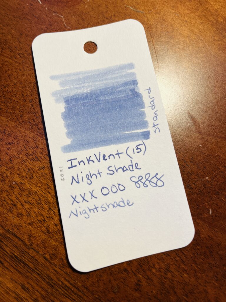
A sample card with a color swatch at the top, and the text says “Inkvent (15) Nightshade xxxooosss, standard, 2021” all of this is in an ink that looks like a light blue in this photo.
One of my sample cards from the beginning times! I do them very differently these days. And the ink ends up looking more purple in the notebooks I am using, hard to catch in a photo.

Favorite: (second favorite…) Diamine Inkvent 2021, Nightshade and the London Pen Company Christopher 13 Jr. pens.
This ink was not in this pen this month – but they were my favorites respectively. I have actually used this ink in a couple of palette’s this year, but! The thing that makes it my favorite is that it’s one of those blue-purples. It operates really well, no skipping, good level of wetness, doesn’t smudge.

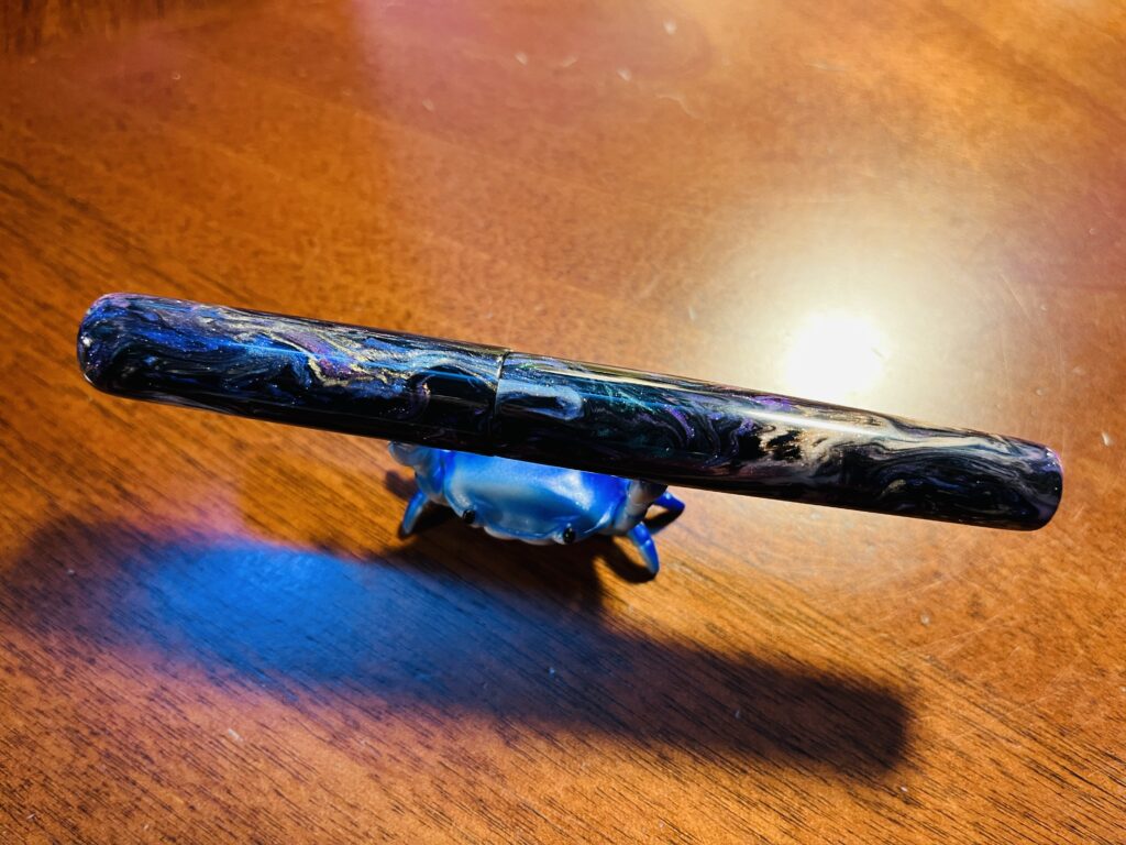
A crab pen stand holding a shimmery pen.
My crab stand is adorable, ahem. But this pen! Look at this gorgeous pen! It’s the perfect size and weight for me. And those colors!

I really enjoyed the shape and weight of this pen model. And the two I have are gorgeous colors.

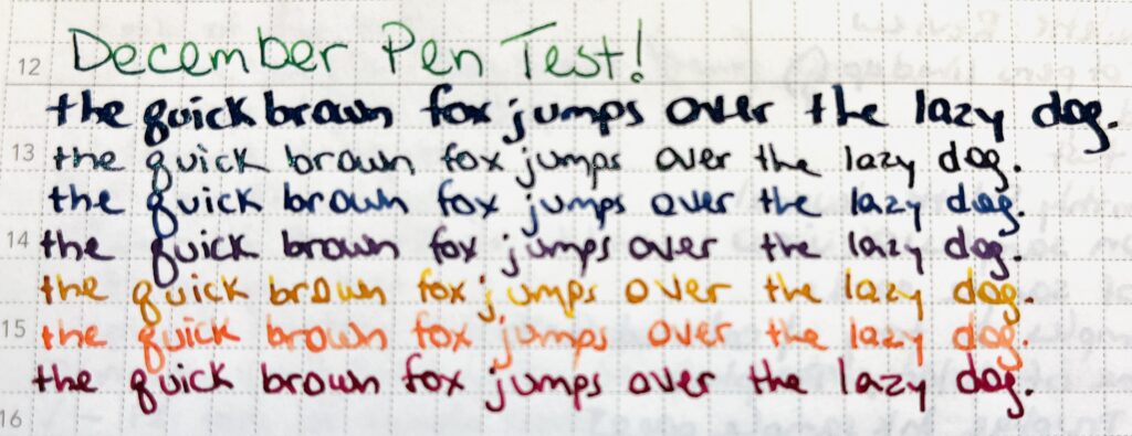
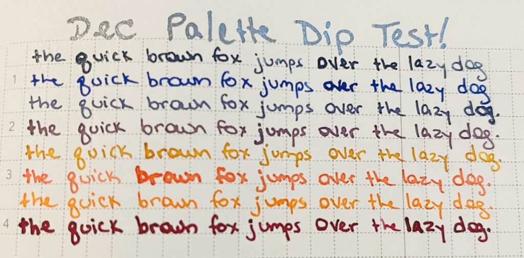
Text reads: “December Pen Test” in a green ink. And the pangram “the quick brown fox jumps over the lazy dog.” The pangram is repeated 7 times, each line is a different color.
Candlelight is the fifth pangram line down, it is mostly a golden yellow, there is significant shading from an almost unreadable pale yellow to a darker golden brown color. (Nightshade is the third pangram line down for the record.)

Least Favorite: Diamine Inkvent 2021, Candlelight
There is nothing really wrong with this ink, but I found it a little annoying to read as I was writing it and after it dried. It shades pretty significantly, I am hoping that is visible in that picture of my writing sample.

Learned: A balanced palette is really important for my mental health. This is more of a year long thing I learned, but it really solidified for me this month. So if there is a pen and ink combo I don’t like, as soon as I’ve realized that, swapping it is a good idea.

Now, Daily Samples!
This month I went through Diamine Inkvent 2022 Advent Calendar. A complete mystery set of samples is a double edged sword. There were more browns than I like, but at least there was a healthy dose of shimmer inks!

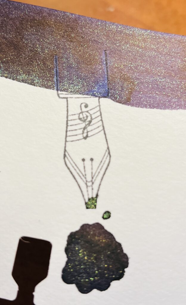
Close up of a sample card. All that can be seen is a piece of the swatch across the top of the card, a stamp of a nib, and a pool of the same ink that is seen in the swatch appearing to drip off of the nib.
Look at that pretty color! You can see the dark warm purple color with several different light colors of shimmer.

Favorite: Diamine Inkvent 2022, Solar Storm
Hands down my favorite. I liked it so much and so instantly that I added it into my palette right away. After using it all month I have decided it is a little dark for my tastes over all, and more of a warm purple, when I prefer cool purples. But the shimmer, is so fantastic. So really my favorite thing is the way the shimmer works in this ink!

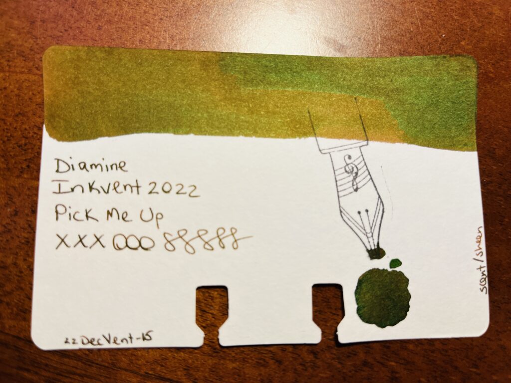
Sample card with a long swatch of color at the top, and a stamp of a nib on the right side. There is text reading “ Diamine, Inkvent 2022, Pick Me Up, xxxooosssss, 22DecVent-15, scent/sheen”
Icky green/brown color. Where it looks sort of golden in this photo is actually a lot browner.

Least Favorite: Diamine Inkvent 2022, Pick Me Up
I do NOT like scented inks. And heck this one was scented. AND it’s brown, my least favorite ink color. And to top it all off, the scent was one of those things that I recognized but couldn’t place, and I still haven’t figured it out so it continues to bug me. Triple threat.
There were other scented inks, and since they were behind sealed Advent Calendar style doors, they were always unexpected. I hated it. Fortunately a friend of mine opened her calendar ahead of time and was able to give me warnings for the days they would show up. Very helpful! I’m not sure I would have been able to finish the set of samples otherwise.

Learned: There were a couple of inks in this set that look a lot like inks from the 2021 Inkvent. I saw some folks be upset about this on Instagram. But it made me think, what if they look really similar, but they are different somehow? How are they different? Why would they release the same shade of ink with a different name (beyond the obvious consumer marketing nonsense)? I want to look into this some more.

Last but not least – the Subscription Samples.
This month I received Kaweco Inks from Truphae (and a Lamy pen? Seems off that is isn’t a Kaweco pen??) and I received Ferris Wheel Press inks from Ink Flight. Unfortunately I got a lot of duplicates from Ferris Wheel Press, since I sampled all of the inks they had at the time in April for that months Daily Sample set. Also unfortunately overall, none of the inks really stood out either way.

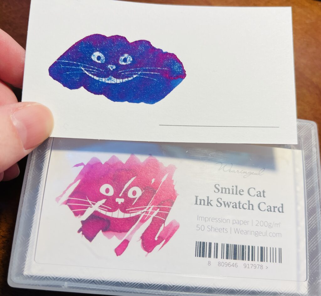
A container of Wearingeul Smile Cat Ink Swatch Cards, 200g’m, 5 sheets and a single swatch card above it with a blue ink with purple sheen and silver shimmer.
I REALLY like these cards but I’m not sure what I should use them for…

Favorite: So instead of a favorite ink sample, my favorite thing from these subscriptions this month were the Wearingeul Sample Cards. They have a kind of hydrophobic impression in the shape of the Cheshire Cat smile from Alice in Wonderland and when ink is applied over it, over about a minute the ink will move off of the hydrophobic spots and reveal the smile. It is SUPER cool looking. I took a video, I’ll try to put it on my twitter when this post goes up.

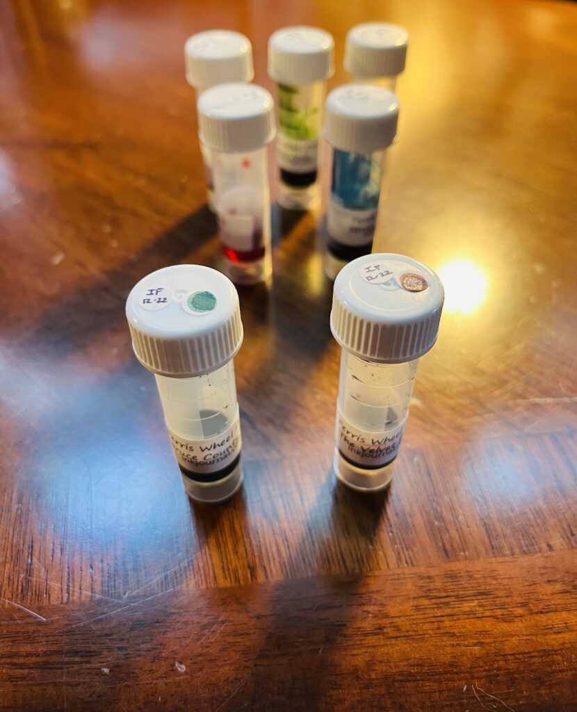
7 sample vials with ink in them. They all have white lids, but only the front 2 have labeled dots on top.
I was able to sample 2 of them, and at least one of those was shimmer, so yay.

Least Favorite: Again, none of the inks stood out as my least favorite since none of them stood out in any way really. Maybe I am just indecisive this month. And while the Lamy pen I got from Truphae is purple…Lamy’s are not my favorite pens. I do really like the tear-off notepad from Endless. So! I guess my least favorite thing from the Subscription Samples was the duplicate inks I got.

Learned: My reaction to the duplicates was a high level of disappointment. This was not Ink Flight’s fault, for the record – I really enjoy the subscription boxes both companies send out. I just have a ton of ink samples at this point, so it’s my own fault! But the thing I learned is that I really need to figure out how to handle this better so I am not so disappointed.

Overall I most enjoyed the Palette I used this month. The Daily Samples and the Subscription Samples ended up being a little frustrating. Fortunately nothing super terrible and some new favorites mixed in, which I really appreciate.

Next month (next YEAR) I’ll be using a mix of brands for the Daily Samples, a bunch of Kaweco pens and shimmer inks in my Pen/Ink Palette (theme: Ice), and looking forward to whatever I get in my subscriptions! I expect to run into the usual problems with shimmer inks and fine nibbed pens – sigh – and I am guessing the mix of sample inks is going to be frustrating somehow due to the random grab bag effect. But, as usual, looking forward to finding some joy in all of this!

November Daily Samples, Review: 2022 Samples Review

Whew, using the word review twice in one title is super annoying. I’ll have to think of something better the next time I do this. Anyway – this month’s daily samples are using 8 different ink brands.

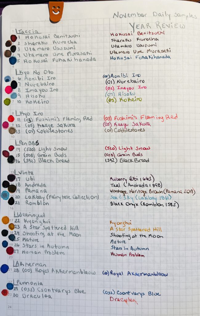
A notebook page with a list of inks (these will be shared in the posts below) written in silver ink and then rewritten to the right in the color of the ink named. At the top of the page the text reads “November Daily Samples Year Review” in silver ink.

I pulled each sample randomly from a pile that gives me enough samples for November and January. Then I grouped the inks by brand, so I’ll be showing them grouped like that here. However! I wasn’t thinking and did not take the opportunity to order them by number – if they had one – or by series – if they had one. So, in January, I have to remember that! But, let’s look at the November daily samples:

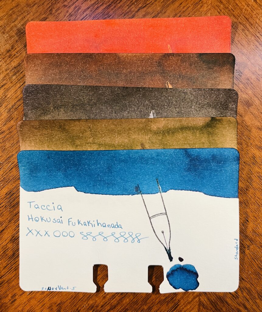
5 ink sample cards stacked on top of each other. Only the bottom one is visible, and you can see the ink swatch at the top, the name of the brand of ink, the name of the ink, xxxooosssssss, a stamp of a fountain pen nib, a pool of the ink, text at the bottom left reading “22NovVent-5” and on the right edge of the card is the text “standard.” From top to bottom there is a reddish ink, three various brown inks, and a blue ink.
Taccia: Hokusai Benitsuchi, Sharaku Kurocha, Utamaro Usuzumi, Utamaro Ume Murasaki, Hokusai Fukakihanada

Taccia:
Hokusai Benitsuchi: rusty brown, dark red with orange hints.
Sharaku Kurocha: Brown. Very straightforward brown.
Utamaro Usuzumi: Black, slight sheen.
Utamaro Ume Murasaki: A brownish pink.
Hokusai Kukakihanada: Ocean/whale blue – maybe not literally, but that is what it makes me think of?

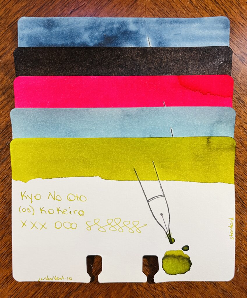
5 ink sample cards stacked on top of each other. Only the bottom one is visible, and you can see the ink swatch at the top, the name of the brand of ink, the name of the ink, xxxooosssssss, a stamp of a fountain pen nib, a pool of the ink, text at the bottom left reading “22NovVent-10” and on the right edge of the card is the text “standard.” From top to bottom there is a blue, a black, a pink-red, a lighter blue and a light green.
Kyo No Oto: Aonibi Iro, Nurebairo, Iamyou Iro, Hisoku, Kokeiro

Kyo No Oto:
05 Aonibi Iro: Mushy denim blue.
01 Nurebairo: I can’t tell if this is sheen or not? I feel like it is. Super darkest blue with just like…a wet colored sheen honestly?
02 Iamyou Iro: Bright pink, red tones.
07 Hisoku: Light to medium blue, readable, might be chromatic…
03 Kokeiro: Writes out like pea soup, dries to a goose poop greeny brown.

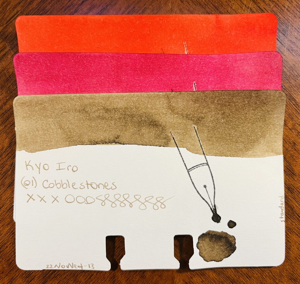
3 ink sample cards stacked on top of each other. Only the bottom one is visible, and you can see the ink swatch at the top, the name of the brand of ink, the name of the ink, xxxooosssssss, a stamp of a fountain pen nib, a pool of the ink, text at the bottom left reading “22NovVent-13” and on the right edge of the card is the text “standard.” From top to bottom there is a orangey-red, a pink, and a light brown.
Kyo Iro: (03) Fushimi’s Flaming Red, (05) Keage Sakura, (01) Cobblestones

Kyo Iro:
03 Fushimi’s Flaming Red: Bright red, leaning towards a dark pink.
05 Keage Sakura: Nice cherry blossom pink.
01 Cobblestones: A really soft brown, or a brown tuned grey? Perfect for cobblestones.

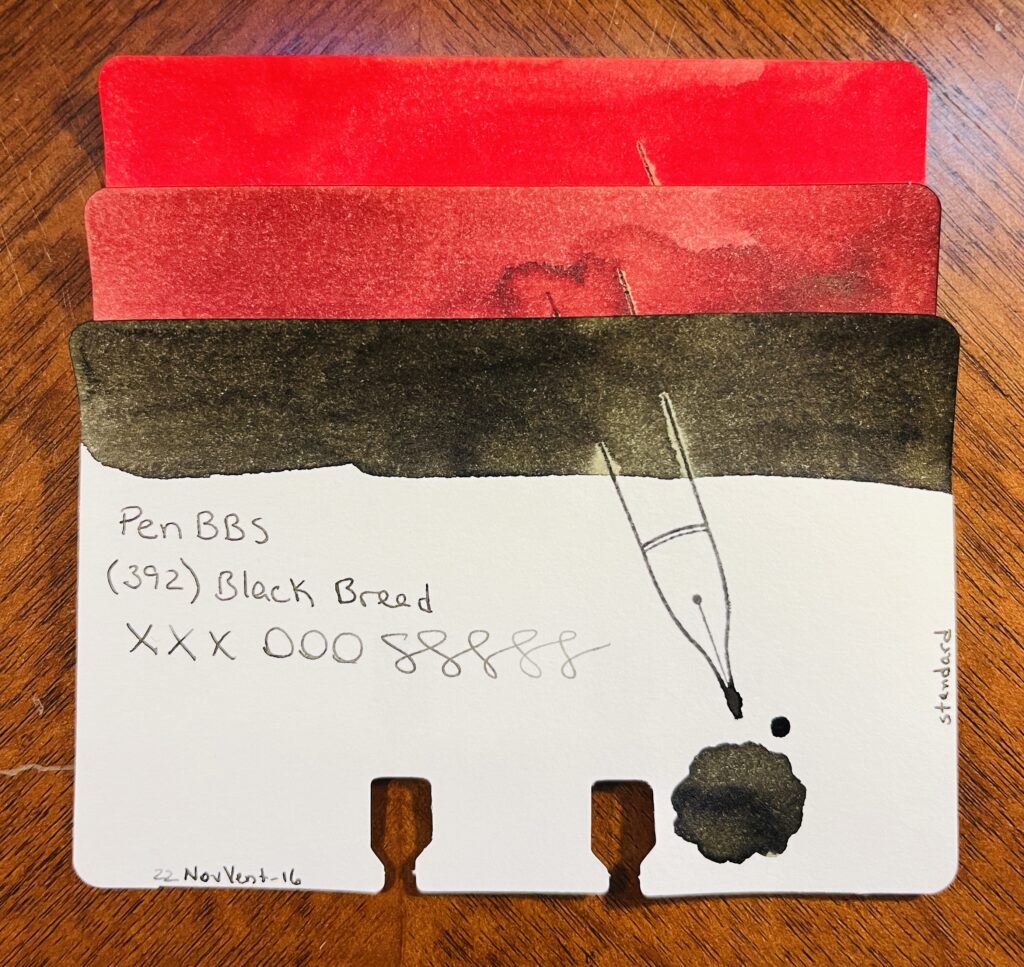
3 ink sample cards stacked on top of each other. Only the bottom one is visible, and you can see the ink swatch at the top, the name of the brand of ink, the name of the ink, xxxooosssssss, a stamp of a fountain pen nib, a pool of the ink, text at the bottom left reading “22NovVent-16” and on the right edge of the card is the text “standard.” From top to bottom there is a brighter red, a more sedate red, and a blackish brown.
PenBBS: (520) Light Snow, (508) Grain Buds, (392) Black Bread

PenBBS:
520 Light Snow: Fall red, orange tones when it’s written lighter.
508 Grain Buds: Makes me think of coffee, both to drink when it’s dark and to stain.
329 Black Bread: Black! A very dark grey is what it dries to.

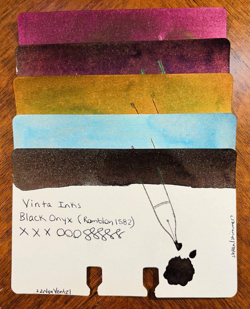
5 ink sample cards stacked on top of each other. Only the bottom one is visible, and you can see the ink swatch at the top, the name of the brand of ink, the name of the ink, xxxooosssssss, a stamp of a fountain pen nib, a pool of the ink, text at the bottom left reading “22NovVent-21” and on the right edge of the card is the text “standard.” From top to bottom there is a a light maroon, a darker maroon, gold, light blue, and a dark brown.
Vinta: Ubi, Andrada, Pamana, Lakbay, Romblon

Vinta:
Mulberry Ubi 1663: Mulberry purple, dark, only noticeably purple in the light.
Teal Andrata 1898: Dark teal hidden under a purple sheen – or at least it looks like an almost black purple, I suppose it could be read mixing with the teal?
Heritage Brown Pamana 2018: Orangey brown with a green sheen.
Sea & Sky Lakbay 1861: Pretty, light blue, pink shimmer, not sure how much the shimmer comes thru, but when it does, pretty! Kind of dirty looking in the swatch tho.
Black Onyx Romblon 1582: Black/green undertones to the ink, faint dark purple sheen, and a very faint shimmer? Can’t see it in the vial, just the swatches. In writing it’s hard to see because of the sheen so…secret shimmer? I like it tho. For a black ink, nice subtle colors if you look at it right.

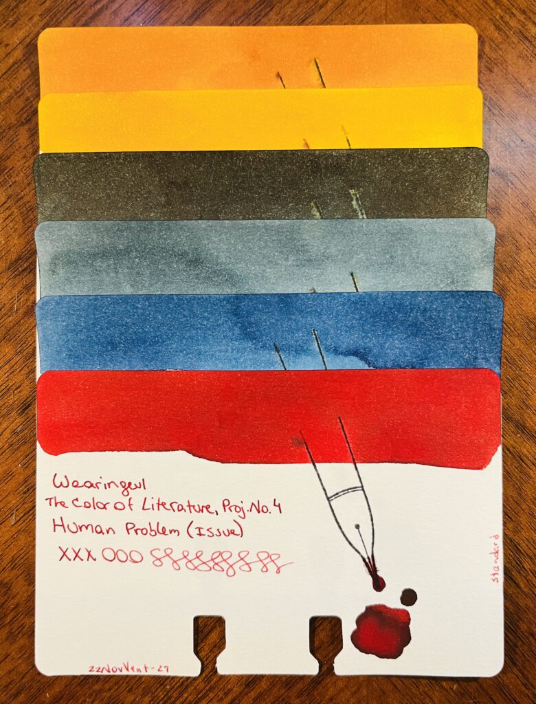
6 ink sample cards stacked on top of each other. Only the bottom one is visible, and you can see the ink swatch at the top, the name of the brand of ink, the name of the ink, xxxooosssssss, a stamp of a fountain pen nib, a pool of the ink, text at the bottom left reading “22NovVent-27” and on the right edge of the card is the text “standard.” From top to bottom there is an orange ish, then a yellow, a dark greenish, lighter blue, darker blue, and a bright red.
Wearingeul: Kyonghui, A Star Spattered Hill, Shooting at the Moon, Mature, Stars in Autumn, Human Problem

Wearingeul:
Color of Literature, Project 4, Kyonghui: A sort of tan gold…reminds me of the color you’d see on plastics from the 80’s.
Color of Literature, Project 1, A Star Spattered Hill: A buttery yellow, warm brown tone, gold shimmer. Pretty!
Color of Literature, Project 1, Shooting at the Moon: Dark ink with a faint sheen. The color reminds me of a night sky and that hazy halo that you can see sometimes around the moon.
Demian Literature, Mature: Medium denim blue, grey tones as it dries.
Color of Literature, Project 1, Stars in Autumn: Medium to dark blue with blue shimmer. I feel like I really like this one, the swatch came out really pretty.
Color of Literature, Project 4, Human Problem (Issue): Interesting that an ink called ‘Human Problem’ is the color of blood?

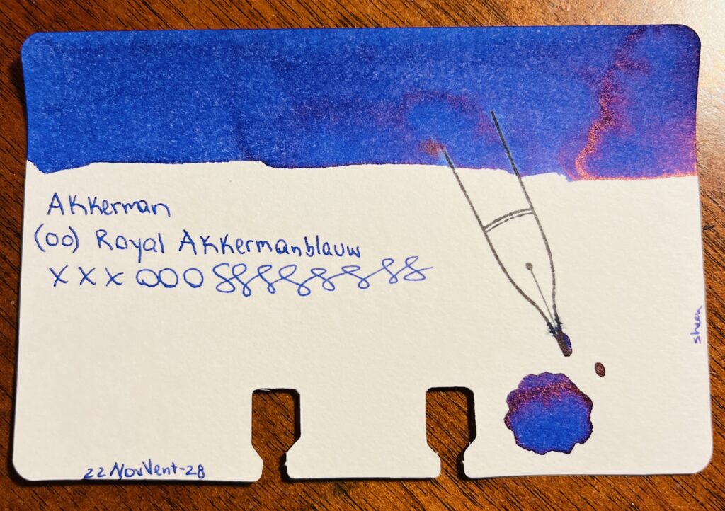
A single sample card, blue ink with a reddish sheen swatch on the top. The text says “Akkerman (00) Royal Akkermanblauw, xxxooosssssss and 22NovVent-28. On the right side of the card the text says “sheen” and there is a pool of ink below a stamp of a nib.
Akkerman: (00) Royal Akkermanblauw

Akkerman:
00 Royal Akkermanblauw: Medium dark blue, reddish sheen, looks purple. Subtle.

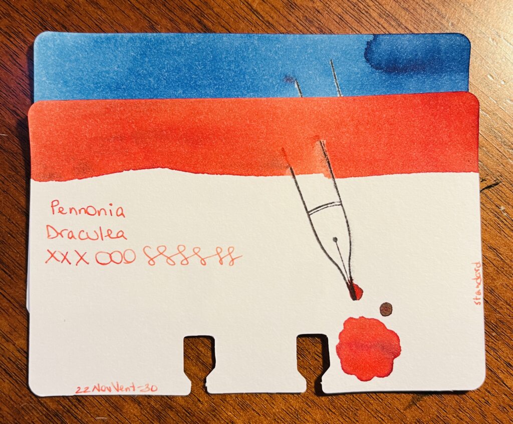
2 ink sample cards stacked on top of each other. Only the bottom one is visible, and you can see the ink swatch at the top, the name of the brand of ink, the name of the ink, xxxooosssssss, a stamp of a fountain pen nib, a pool of the ink, text at the bottom left reading “22NovVent-30” and on the right edge of the card is the text “standard.” From top to bottom there is a lighter blue and an orange ish red.
Pennonia: (032) Csontvarys Blue, Draculea

Pennonia:
032 Csontvarys Blue: A sort of sky blue with denim darker blue tones.
Draculea: An orangeish red? Or a reddish orange? Sort of a fall color.

It was nice revisiting these brands. I am looking forward to finishing out these in January!

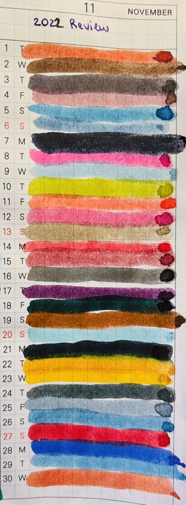
A notebook page with lines of ink colors on lines numbered 1- 30. At the top in a purple ink is text reading 2022 Review.
Month of iiiiinks!
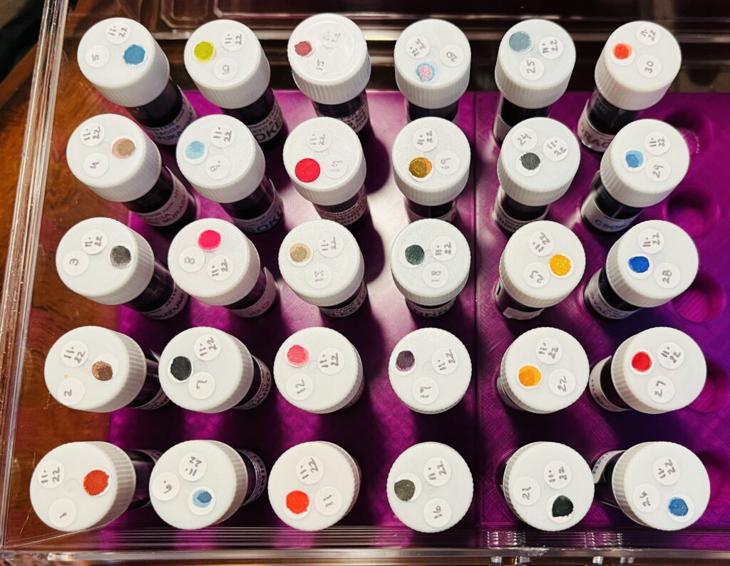
30 ink vials from the top, only the white caps can be seen, each has 3 stickers. The vials are labeled 1-30, and each has the date 11.22, and each has a single color dot.
Look at all of those pretty vials of ink!

December Daily Samples: Diamine Inkvent 2022

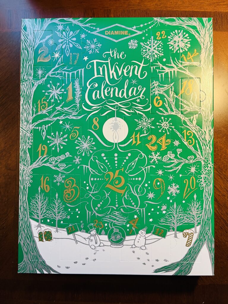
I am so excited for this – this Inkvent calendar is what got me into a daily sample last year, when I realized the ritual brought me calm and quiet joy. I was so excited when I got the 2021 box that I started it in October! And then quickly learned the community does NOT appreciate spoilers, ahem. So this year when it arrived I quickly “hid” it from myself in the closet haha.


I loved this box so much I tried to find samples for the very first box in 2019 – I believe it is referred to as the Red box, 2021 is the Blue box, and 2022 is the Green box. I didn’t find all of the inks from 2019 in sample form, unfortunately, but I made what I could find plus some random ones I filled in the gaps with work for November 2021 Daily Samples anyway!


Anyway enough about older Inkvents – although I can unfortunately say nothing about this years Inkvent, as I don’t want to spoil it for myself – or the community! So there is no list of the inks I’ll be sampling this month. We’ll see if I have enough energy to insta my samples every day or whether you will all have to wait until I post the review in January! And if you are also doing the 2022 Diamine Inkvent calendar, hooray! I hope you enjoy it.

The 2022 Diamine Inkvent calendar, which is a green box with a snow scene in white, and numbered doors in gold.

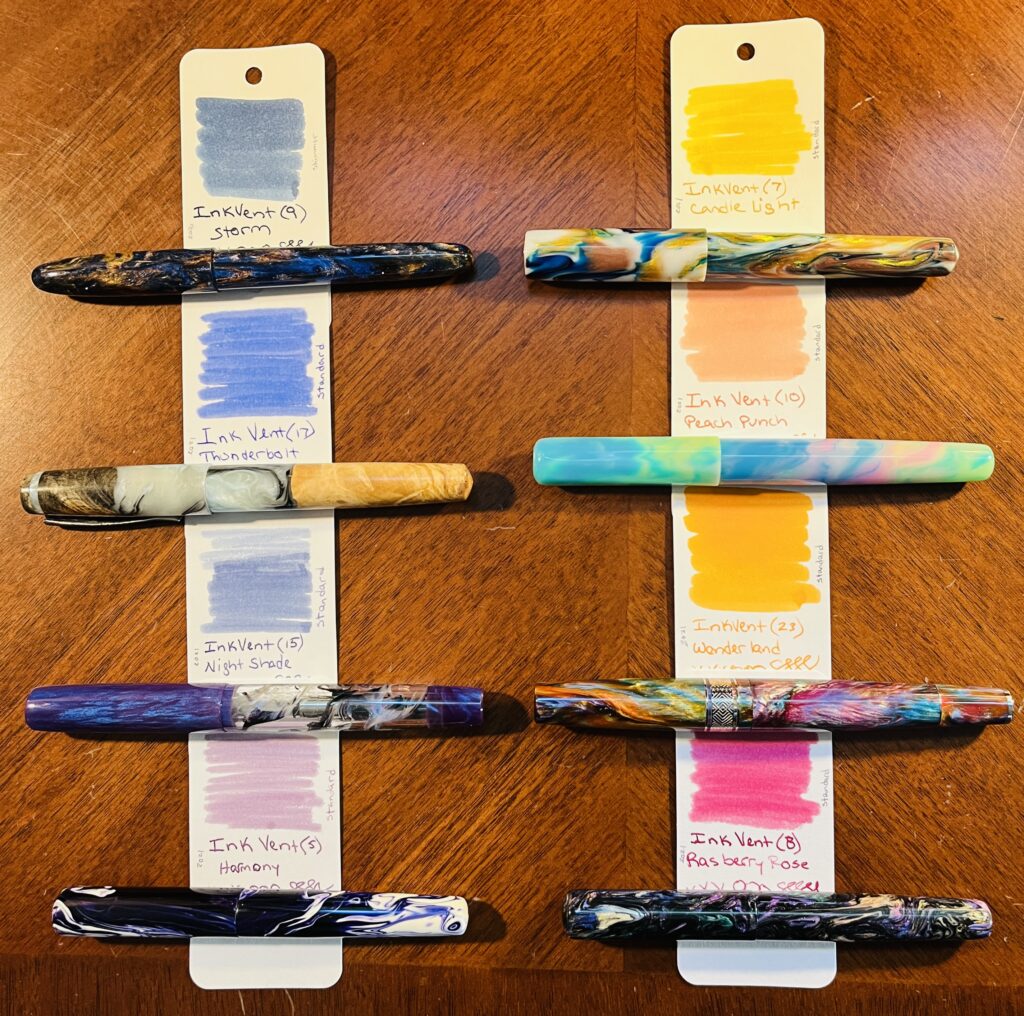
December Pen/Ink Palette: Diamine Inkvent 2021

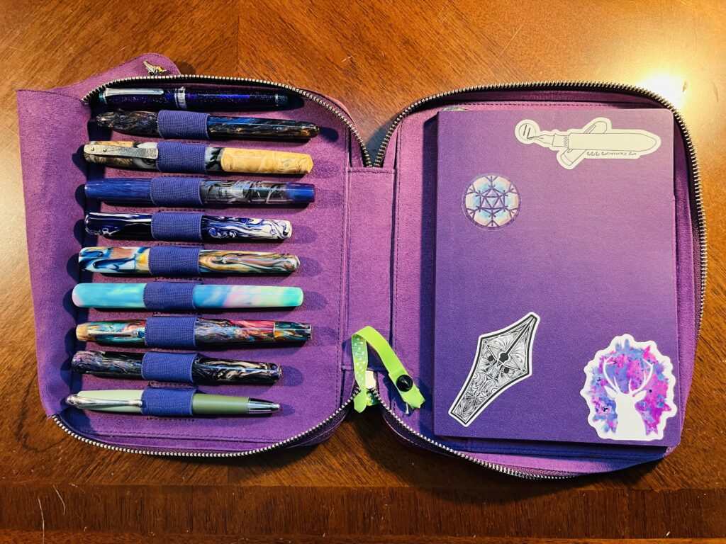
A pen and notebook portfolio. There are 10 pens, most made out of resin, some wood, and some metal types. The notebook is purple and has 4 stickers on it. One is a snowflake with a d20 in the center, then a nib with dancing etching, then a white fountain pen, and last a white silhouette of a deer with purple and pink background.
My lovely pen palette and December notebook!

For December I decided to only use inks from last year’s Diamine Inkvent. The pens are just shiny and I like them. I also kept the Magic Green pen and the Forever Purple pen. I want to try to keep the green pen filled for a full year, so need to keep it going until March 2023. And I don’t think I could exist without a really solid purple ink, so had to keep that one! The rest of the palette inks are a mix of Inkvent ones I have used before and some I’ve always wanted to try but I couldn’t fit them into other palette’s this year.

8 ink sample cards, each with a pen below where the name of the ink is written. The left column starts with a shimmer blue, then another brighter blue, then a blue purple, and a less saturated purple. The right column starts with a yellow, a sort of pinkish orange, a solid orange and what looks like a magenta but is more of a raspberry color.
December Pen/Ink Palette combos!

And just to list all of those out, if you’re curious! I couldn’t find links for any of the inks, my apologies, but if you google the names you can read a lot of different reviews. Or wait for mine in January!
And the links for the pens are mostly going to be to the creator themselves or the model of pen from that creator. Most of these pens use resin blanks from various other creators, and aren’t available all of the time, but I wanted you all to be able to find the creators at least!

  1. Hogtown Pens – (Turnt) Painted Desert (1.1m) / Diamine Inkvent 2021, Storm
  2. Iron Feather Creative – Hybrid Burl/Aluminite (F)/ Diamine Inkvent 2021, Thunderbolt
  3. Bonecrusher7 Studios – Purple Demonstrator (F) / Diamine Inkvent 2021, Nightshade
  4. London Pen Company – Christopher 13 Jr, Purple Smoke (F) / Diamine Inkvent 2021, Harmony
  5. Iron Feather Creative – Original Pour Blue/Gold/White (F) / Diamine Inkvent 2021, Candle Light
  6. London Pen Company – Christopher 14, Unicorn (F) / Diamine Inkvent 2021, Peach Punch
  7. Leonardo Supernova (F), Diamine Inkvent 2021 Wonderland
  8. London Pen Company – Christopher 13 Jr, Oil Slick (F) / Diamine Inkvent 2021, Raspberry Rose

I am very excited to try these pens – picked up a couple of new brands. And I really like the ink palette, it feels nice, the colors are pretty. Wish me luck that they all work well!

Title is in silver ink, text is  Dec Palette Dip Pen. The phrase “the quick brown fox is jumped over the lazy dog” is written out 8 times, each line is the color of an ink from the palette.
December Palette Dip Test!