Picking colors for my September pens and inks was a little difficult for me because the theme is “Fall” and fall colors have a lot of red in them and I do not like red. I resorted to google and ended up finding a really nice set of 5 colors – and I have no idea how to describe them professionally, but here we go! Sort of like a teal, evergreen-y type blue, a kind of muted moss green, a rust reddish, an orange that is like a yellow-orange and a yellow that is closer to an orange. Yep. Doing great.
Remember last month when I said I might keep my blue Sailor mini with Cat in it as part of my permanent pens? Well now we have the Forever Purple, Magic Green, and now a Forever Blue. Besides those three, I realized I was looking for colors really similar to my “sunset” theme, but the biggest difference for me was the colors for August were more vibrant and the ones for September are more muted. Insert something clever here about saturation? I am sure Aaron said something about saturation at some point and clearly that did not stay in my head.
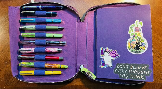
I’ve got 10 pens this month and besides the three forever pens, none of the inks/pens are being carried over from August. That’s not because I didn’t like them, but they just didn’t end up working with the muted theme I was trying. And yes, I ended up with a kind of rainbow again and I refuse to be upset by this. I like rainbows.

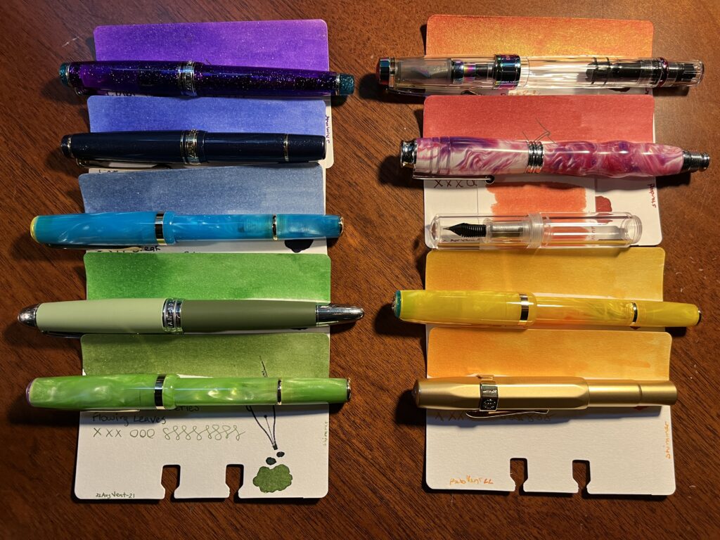
- Sailor Pro Gear Slim – Purple Northern Lights (MF) / ColorVerse 54 Hayabusa Glistening
- Sailor Pro Gear Slim Mini – Night Blue (MF) / ColorVerse Cat
- Esterbrook JR Pocket Paradise – Blue Breeze ( F) / PenBBS Break
- Hong Dian 5019, Lan Tian – May Flowers (EF) / Ferris Wheel Press Moonlight Jade
- Esterbrook JR Picket Paradise – Key Lime (F) / Wearingeul Flowing Leaves
- TWSBI Diamond 580 – Iris (F) / Kiwi Ink Quetzalcoatl
- Beardbarian Woodworking – Copper Eclipse Sunset (F) / Ferris Wheel Press Candy Marsala
- Majohn Wancai Mini Fountain Pen – Transparent Clear (F) / Diamine 2021 Inkvent Vintage Copper
- Esterbook JR Pocket Paradise Pocket Pen – Yellow (1.1m Stub) / ColorVerse Rising Reflections
- Kaweco AL Sport – Gold (B) / Kiwi Liquid Gold
I picked up a 1.1m stub nib for one of my Esterbrook pens, and I am interested to see how it handles that shimmer ink. Yellows kind of need a broader application I think…who knows, I usually use fine nibs!
The Vintage Copper is going into one of those clear Majohn mini pens because I anticipate it being gorgeous like the one I was using in August. Twsbi diamond is one I usually enjoy, so looking forward to that, Kaweco is a known great – but a broad nib, so we shall see if I still like it. And I am reusing the Beardbarian pen because it is my favorite right now.
Because I am not wild about all of the colors individually or in pairs, I am going to try using them as a whole palette instead of singly. I have been using a different pair of pens every day of the week, to distinguish the days, to use the pens more regularly, and the pair instead of one so I could have an easier time navigating my notes. This month I will be seeing how annoying it is to switch out every pen for every new line item in my work notebooks instead, in an attempt to not grow to dislike a single color so much I stop using it. Granted, if that does happen – and it might – I can just switch out the ink and/or pen. Still, might be interesting.
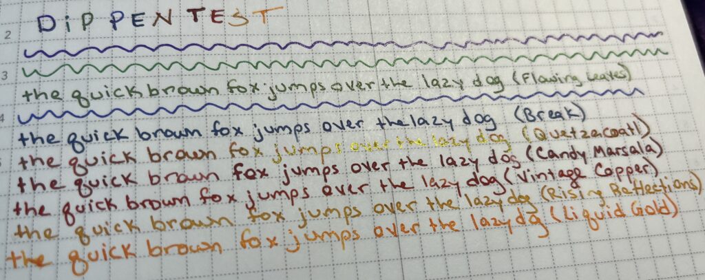
Because of the ink swap last month immediately after putting that one orange in a pen and seeing how mushy it was, I decided this month to try the inks on my usual paper before getting them into pens.

You may notice the 3 reds in there that look very similar. Because of this, the new rule (for next month) is to dip test the inks before I decide on a palette, instead of just before I put them in a pen.
Wish me luck!

